Figma Typography Variables: how to organize your new Design Tokens
Setting up text variables and a solid typography structure takes some thought. If you're unsure how your Design System can integrate the typography variables, I can help you figure out the next steps.
Riccardo Marconato
Apr 17, 2024
Figma has added typography to its variables, making Design System management more complete. There are some performance issues right now, but they'll be fixed soon. I want to share how you can set up your new typography variables with what Figma currently offers. I'll update this as new features come out.
[Update 15 May 2024: all the performance issues have been solved by the Figma team 🎉]
What's next with text styles?
Until recently, managing typography meant just using text styles. Now, with new typography variables, text styles are still crucial. They quickly bundle rules like font-family, font-size, and font-weight. An example of common text styles:
heading 1heading 2heading 3paragraphlabelcaption
Unfortunately, this text styles structure is obsolete because is a mixture of visual information and semantics

Now a text style should be just a set of rules, with no semantics, while Heading 1 and Heading 2 show semantics by defining importance and hierarchy.What if you want to create a large text that functions as a Heading 2 but appears bigger than a Heading 1?
Heading 2 might be bigger than Heading 1, even if it's less important. You might pick text styles by size, like using Heading 1 for big text or captions for small ones, but that's not always ideal. It's time to name text styles for what they really are, based on their features: size, font weight, and spacing.
80px medium, negative spacing20px regular, standard spacing16px regular with large spacing
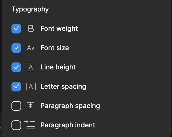
There are more parameters, such as paragraph spacing, but it's up to you which ones to include. For example, I don't include spacing in that way, as I have one specific space for each font size.

The Typography Scale
I created a typography scale for my Design System and integrated it into all the related design files. It is a list of text styles structured in this way:
type-of-font/size/font-weight
Few examples:
sans-serif/x500/delicate
serif/x250/delicate
serif/x100/standard
display/x400/robust
mono/x075/delicate
Type of Fonts
serif, sans serif, display, and mono.
serif
sans-serif
display
mono
Each project can include up to four different font families, either from the same typeface or from different ones. You might not use all of them; in some projects, I only use serif and mono, or a combination of serif and sans-serif with a few accents in mono.
Font Size
Using a base of x100 to represent 1em (which is 16px in my case), I have compiled a list of font sizes ranging from 160px to 10px. 160px is x1000, 120px is x750, 80px is x500, etc.
Letter Spacing
Each font size is paired with optimal letter spacing and line height, calculated specifically for that size. For instance, an 80px font size has negative letter spacing to achieve a fresh and modern look, while a 10px font size requires positive letter spacing to enhance readability due to its small size.
I've got Design Tokens for letter spacing ready in case I need to tweak things for different font families. I usually stick to my letter spacing, no matter selected modes or font, but some typefaces are just so different that you have to adjust the spacing.
Font Weight
I labeled them Delicate, Standard, Robust, and Intense. I went with these names because each font family has different weights. Sometimes, you might want to use Thin or Light for the lightest weight, which I've called "Delicate." Meanwhile, "Robust" could cover black, bold, or extrabold weights.

Text Variables: Tokenizing Typography
Figma Variables, also known as Design Tokens, help keep your design style consistent. You can edit a token once, and it updates everywhere in your design files automatically. This is especially handy for typography, making it easy to change font size, weight, or typeface without updating each instance manually.
Structuring your Design Tokens depends on various factors. In this post, I will share my approach to organizing them effectively.
The Foundation
Every design system starts with a foundation, regardless of what you call it. This foundation is the core of your work, setting the basis for everything and ensuring design consistency. For instance, it includes deciding on fonts and their weights. Personally, I use four different font families, each with four weights.
sans-serif: Manrope
serif: Garamond
display: Bricolage Grotesque
mono: Roboto Mono

For each of them, I defined four distinct weights: Delicate, Standard, Robust, and Intense. For instance, the sans-serif-font-weight-delicate might correspond to Light, while the sans-serif-font-weight-robust could correspond to Medium.

The Theme Collection includes variables for different font families and weights for each mode. It's important for my Design System to be themed. I use the same method for sizes, line heights, and spacing. I set up a typography scale and assign basic size variables to the Device Collection because these can change for desktop, tablet, or mobile. The text styles I make with font type, size, and weight are foundational and have basic design tokens.
For example,
serif/x100/robust
font-family: foundation/serif/font-family
font-weight: foundation/serif/font-weight-robust
font-size: foundation/x100/font-size
line-height foundation/x100/line-height
letter-spacing: foundation/x100/letter-spacing
paragraph-spazing: foundation/x100/paragraph-spacing

This approach is both straightforward and scalable, providing a clear perspective on managing typography sizing and spacing.
Adding Platform for Semantics
Once the Design System is set up, we move to Design Tokens by creating semantics. These tokens, or variables, make the Design System consistent, scalable, and powerful.

A Design System used across different products, like a website and a web app, needs to be flexible. For instance, both might have a page title, but the website's title could be bigger than the web app's. This is where semantic design tokens come in handy. They let you choose font settings from general and specific themes. For instance, the font for Website/Heading 1 could be sans-serif, chosen based on the foundation.
Website/Heading/font-family = Foundation/sans-serif/font-family
Alternatively, if you opt to use the Foundation Serif, then:
Website/Heading/font-family = Foundation/serif/font-family
This approach ensures your design system is themed, responsive across various devices, and easily managed by defining how your products utilize foundational design tokens.

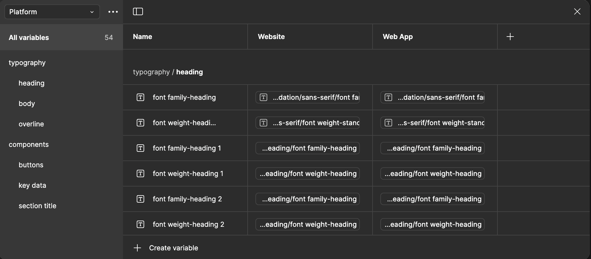
Another great approach is creating a Platform collection, in this way:

Each mod is a different platform, like Website or Web App, and give you another level of variable control. In that way, Website and Web app shares same brand direction but use sightly different variables that adapt to the selected platform.
Final Thoughts
Design Tokens are key for building a strong and adaptable Design System. By starting with a solid foundation and using semantic variables, you ensure consistency and flexibility. Token-based theming allows your design system to easily adjust to various products and devices.

Riccardo Marconato
I design high-end digital experiences and visual design for the crypto/Web3, AI, and tech industries.


