CoffeeTech gives industrial roasters the art direction of a fashion label
A B2B machinery maker that sells with typography and one rust accent instead of a spec table. The restraint is the whole trick.
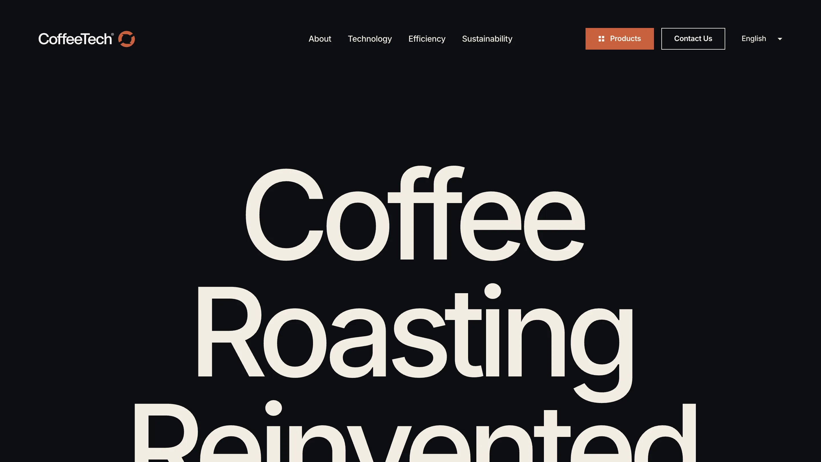
CoffeeTech took awwwards Site of the Day on 16 July, and it's the kind of win I enjoy more than the usual WebGL showpiece. This is a company that builds professional coffee roasters, machines that live in a workshop, and Or Halevi has given the catalogue the art direction of a fashion label. Near-black canvas, cream type, one rust accent. That's the entire kit.
Type big enough to run off the screen
The home sets 'Coffee Roasting Reinvented' in a cream grotesk so large the last line breaks past the bottom of the first screen. I like the nerve of it. A B2B site usually spends that space on a value proposition and three benefit columns, and here the type just carries. The nav stays quiet above it: About, Technology, Efficiency, Sustainability, plus a language switcher, which tells you the buyer is international without a word of copy about it.
One accent, used twice
Count the rust in the whole site. It's on the Products button and on the product name. Nowhere else. Everything else is cream on near-black, so those two moments read as the only places you're meant to click or look. This is the thing I keep having to relearn on my own projects: an accent stops being an accent the moment it shows up in five places.
The machine is the photography
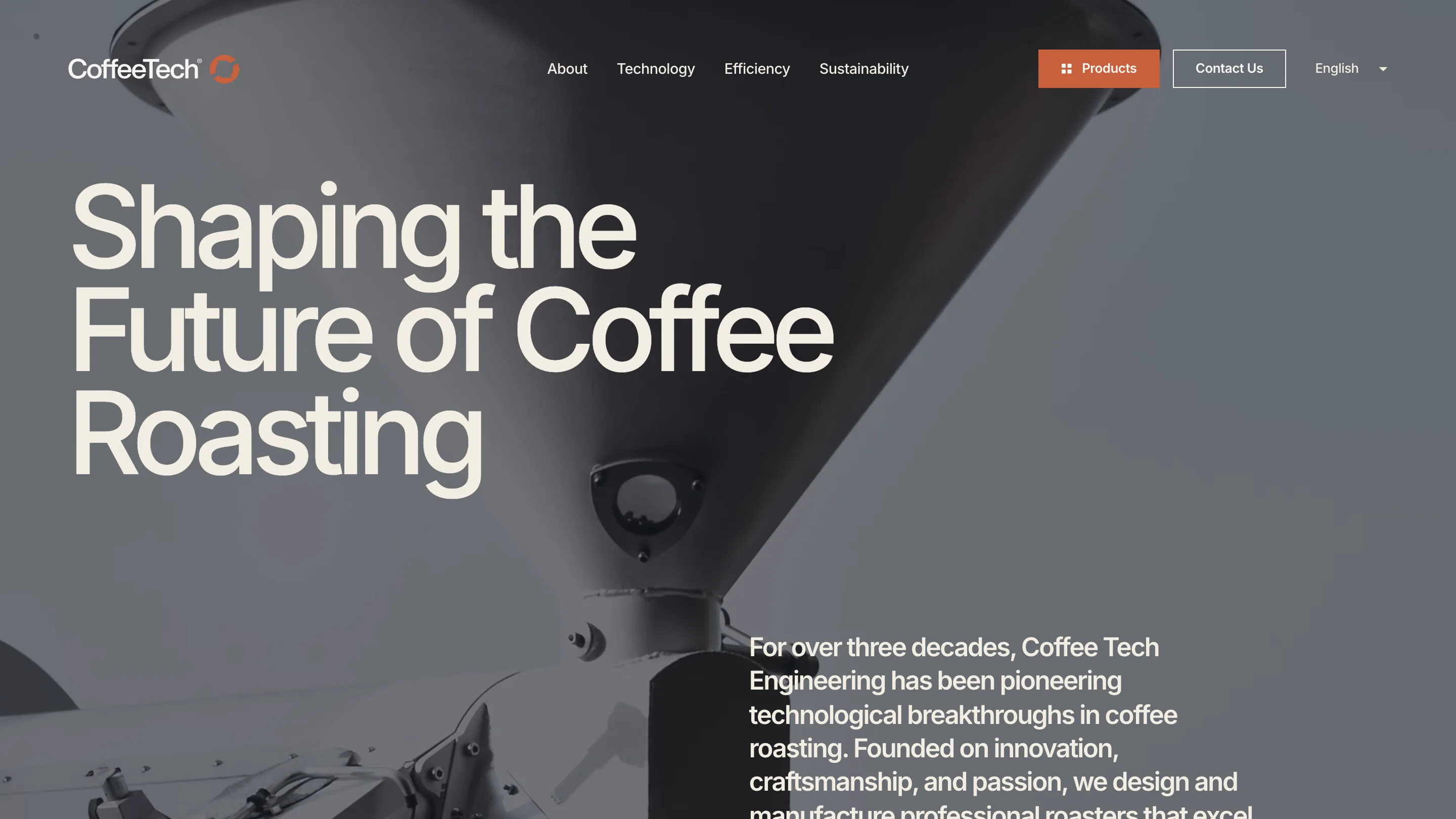
On About, a desaturated shot of a steel hopper fills the frame, the headline sits over it in cream, and the copy about three decades of Coffee Tech Engineering is pushed down to the bottom right corner. The machine is shot like an object worth looking at rather than a product on a white background. That decision does more for the brand than any adjective in the paragraph next to it.
What I'd borrow
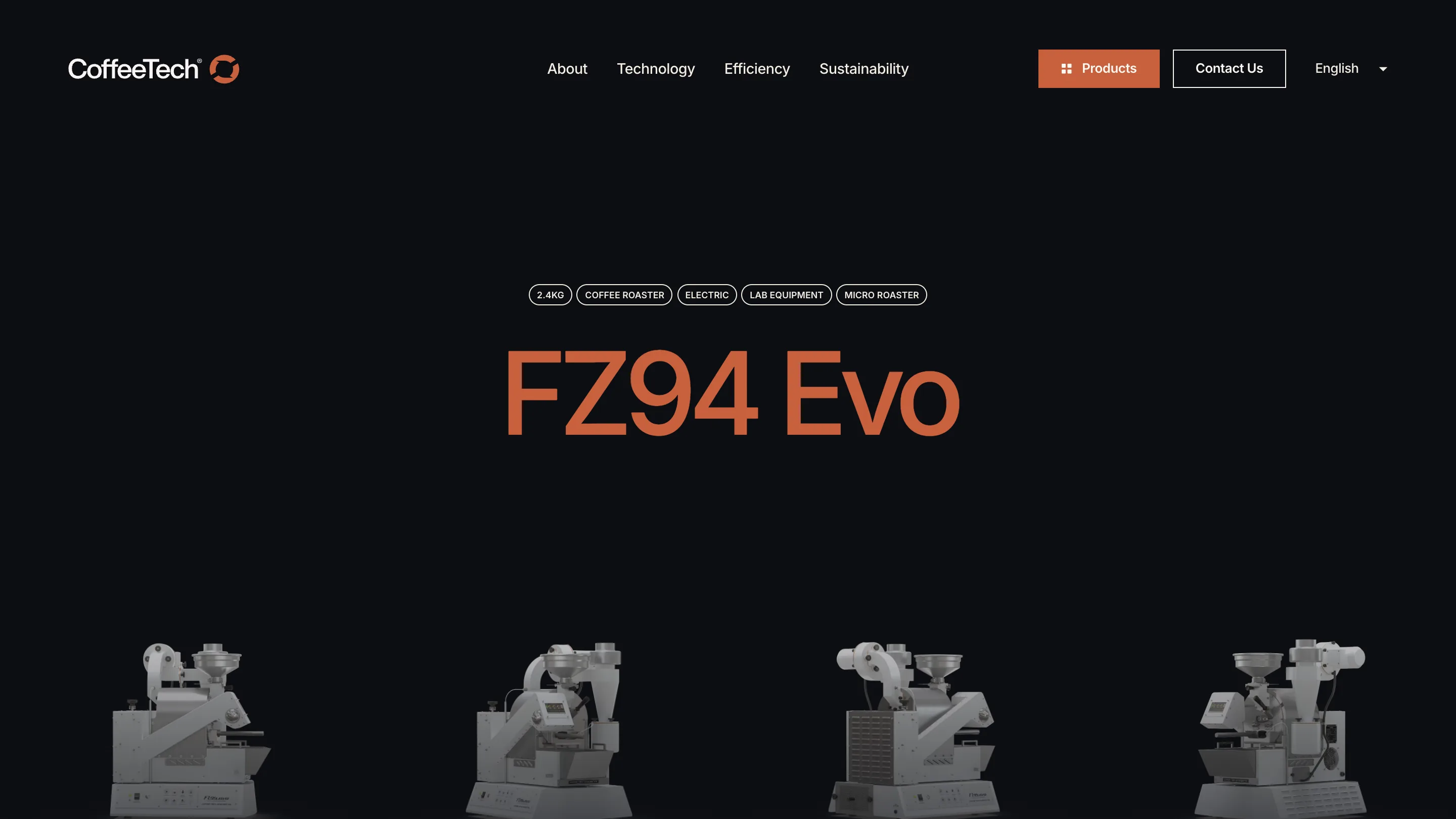
The product page is the smartest screen. The specs that would normally sit in a table are a row of outlined chips at the top: 2.4KG, COFFEE ROASTER, ELECTRIC, LAB EQUIPMENT, MICRO ROASTER. You scan the machine's whole identity in a second. Under it the name FZ94 Evo runs huge in rust, then four angles of the roaster in a line. A spec sheet turned into a poster, and it still answers the buyer's questions. Next time I'm handed a technical product with a long attribute list, that chip row is where I'll start.
See it live at coffee-tech.com.
Featured: Or Halevi