Top Picks · 3 min · 30 July 2026
Ciao Energy spins its whole range on a single turntable
A French energy drink launch that treats the homepage as one rotating rig of cans. Scroll turns the platter, the background floods with the flavour's colour, and the product does the talking.
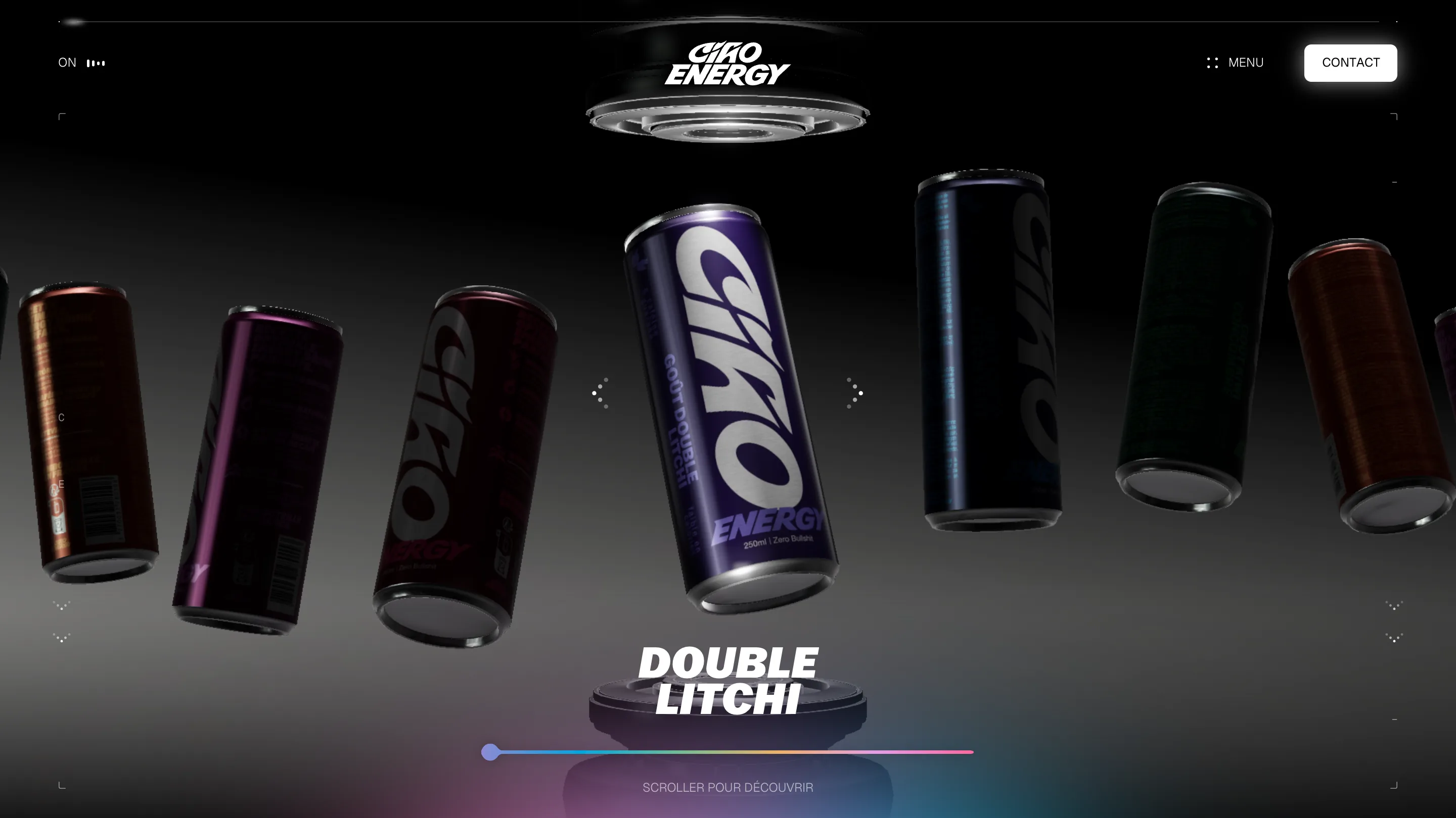
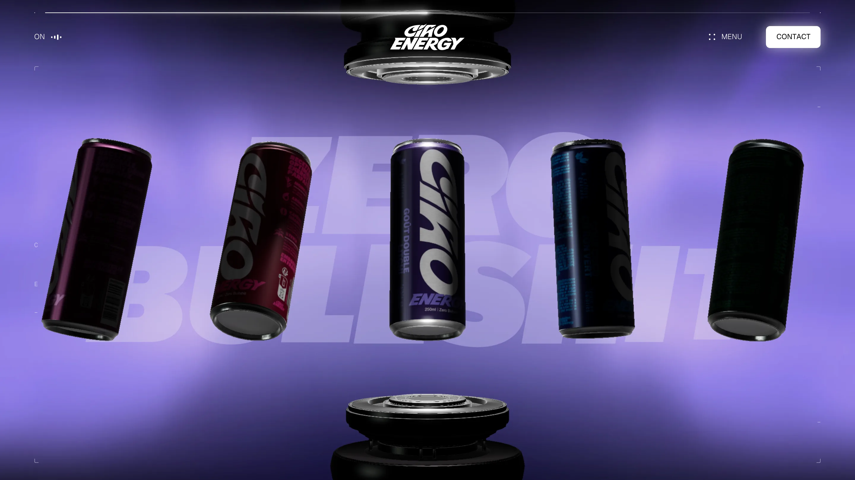
I opened Ciao Energy expecting the usual product grid and got a turntable instead. The whole homepage is one rig: six cans hang in a black void between two heavy discs, top and bottom, and scrolling spins them past you like a carousel on a record player. No hero image, no feature row. The range is the interface.
It's the launch site for a French energy drink, built by Skaald, and it took awwwards Site of the Day plus a Developer Award on July 30, 2026. I rate it high. Here's what stood out.
The set is a photo studio, not a web page
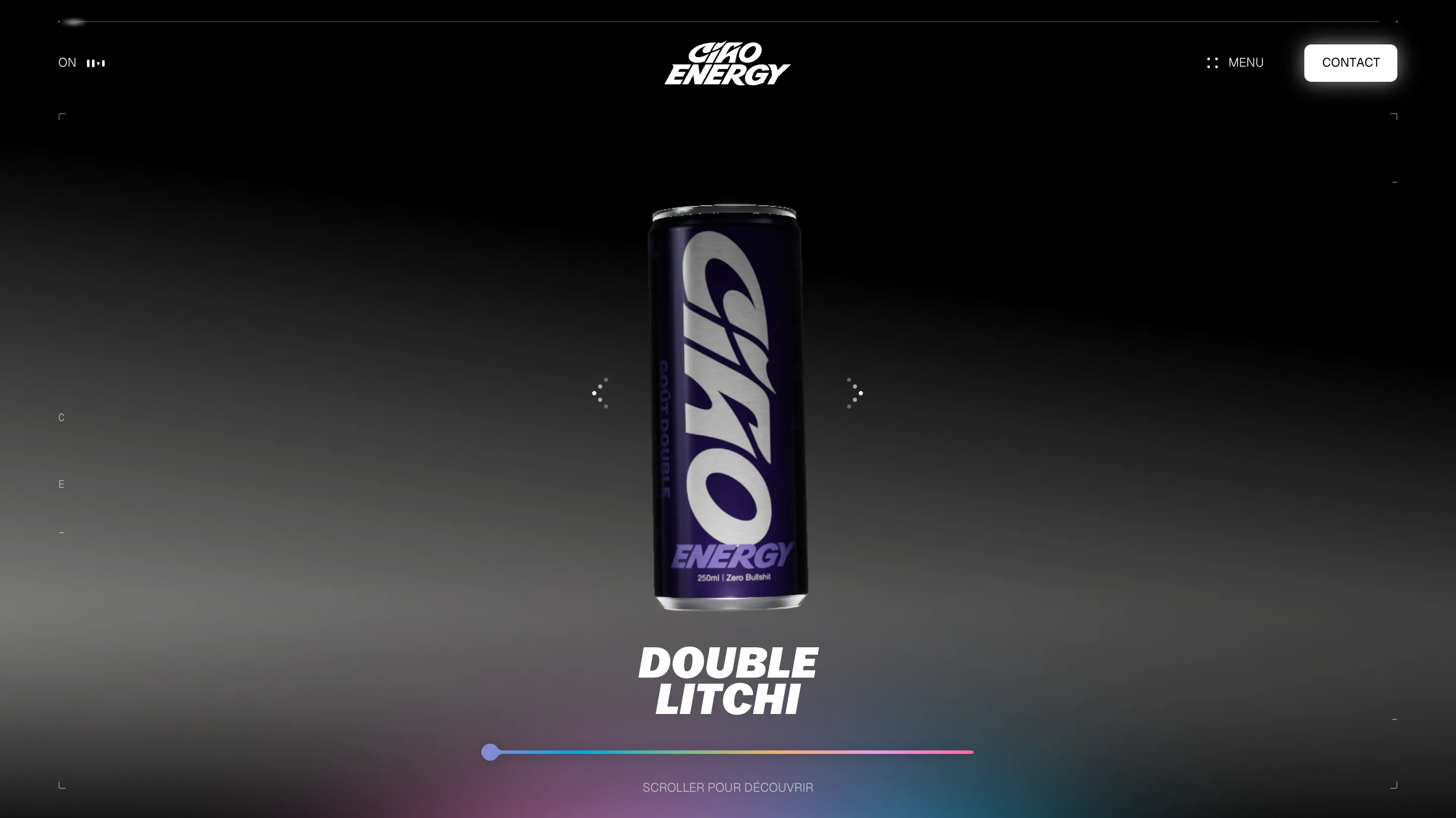
Look at the framing. Thin crosshair ticks sit in every corner, the letters of the brand run vertically down the left edge, and the light falls off into pure black at the top. It reads like a product shoot lit on a sweep. That one decision does the heavy lifting: the cans look expensive because the site treats them the way a photographer would, one light, deep shadow, a lot of empty room around the subject.
Scroll spins the rig
The clever part is the mechanic. That rainbow bar across the bottom marks your position on the carousel. Scroll and the whole rig turns, one can rotating to centre while the label swaps to Double Litchi and the next flavour is already visible at the edge. "Scroller pour découvrir" tells you what to do and the 3D does the rest. I've seen a hundred sites hijack the scroll wheel and lose me. This one earns it, because every notch moves the product, and the product is the point.
Colour comes from the flavour
The background doesn't stay black. Land on a can and the whole void floods with that flavour's colour, a deep litchi purple with a giant ghosted "ZERO BULLSHIT" set behind the cans. That's the brand line, used as art direction instead of a badge. Each flavour gets its own lighting, so the site carries six moods without six templates.
The wordmark is doing real work
The logotype is a fat italic display cut with a swashed C and a round O, the kind of energetic script that suits a drink promising a jolt. They wrap it huge around each can in the render, so the type you read in the nav is the type you read on the product. Brand and package speak with one voice. Small thing, but it's the gap between a skin and a system.
What I'd steal
The turntable move, mostly. When you sell a range of near-identical objects that differ by colour and flavour, skip the grid. Put them on a rig, light them like a studio, and let one control, the scroll, reveal them in sequence. And the restraint: this whole thing is a black room, one product, one accent colour at a time. It's loud where it counts and quiet everywhere else. That's the pick.