Top Picks · 3 min · 6 August 2026
No Art frames its festival video inside a monospace contact sheet
A scrappy marker logo sitting inside a clinical monospace grid, with crop marks on everything. That tension is why I rate it.
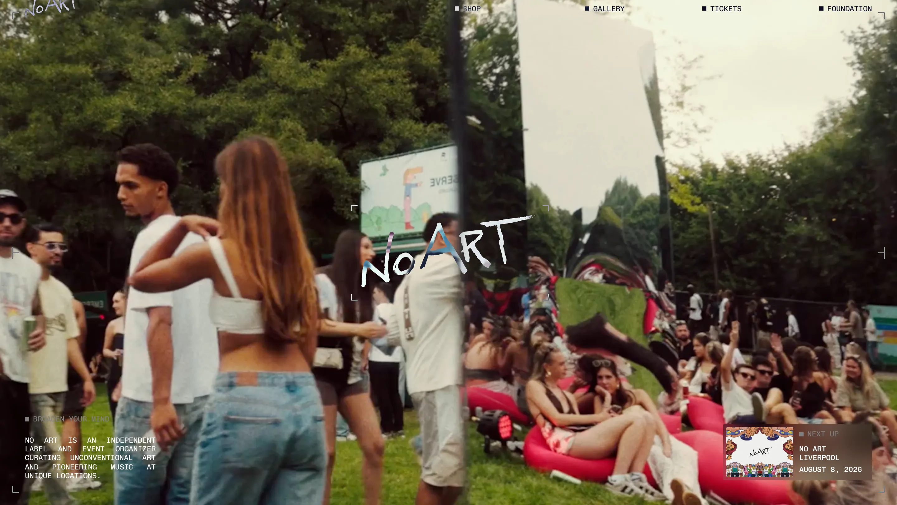
I opened No Art expecting a music label site and got a film archive that happens to sell tickets. The homepage is full-bleed festival video: a crowd in a park, a chrome sculpture in the middle bending the whole scene back on itself. Over that, a rigid monospace layer. All-caps nav, square bullets, justified body type, L-shaped crop marks pinning the corners of the frame. It took awwwards Site of the Day and a Developer Award on August 6, 2026, built by BORING. It earned both.
The thing I keep coming back to is one small tension. The wordmark is a scrawl, a marker drawing of "No Art" with a shimmering chrome fill, dead center over the video. Everything around it is the opposite: monospace, letter-spaced, filed and labeled like a lab report. A hand and a machine in the same frame. Most sites pick one voice. This one runs both and lets them rub against each other.
The crop marks are the whole system
Look at the corners. Every surface gets the same L-shaped registration marks you'd see on a print proof or a contact sheet. The homepage viewport has them. So does the "NEXT UP" card in the bottom right, the one showing No Art Liverpool on August 8. It reads like film, like each screen is a frame you could cut out and mount.
What I'd steal is exactly that: one framing device applied at every scale. It costs almost nothing and it makes a busy, video-heavy page feel edited instead of loud. The monospace does the same job. Bracketed numbers like [01], a justified paragraph that opens "NO ART IS AN INDEPENDENT LABEL AND EVENT ORGANIZER," nav items each tagged with a colored square. It's the voice of an archive, and it holds the cinematic footage down so it doesn't run away with the page.
The gallery is a literal contact sheet
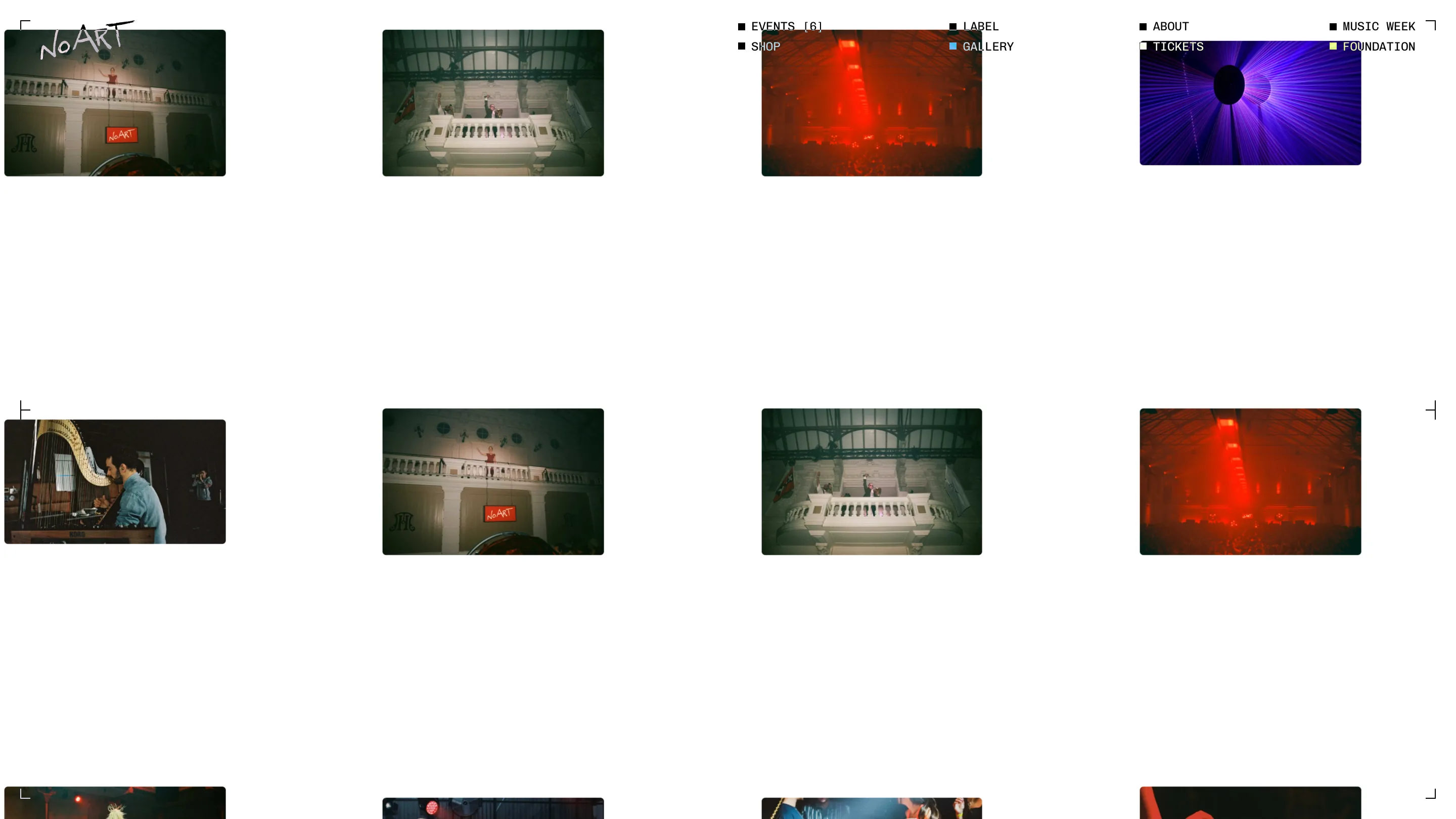
The Gallery page drops the pretense and just is one. A grid of small film stills on white, each thumbnail cornered by its own crop marks: a grand hall with a balcony, a red-lit crowd, a purple laser wash, someone at a harp. Lots of white between the rows. It's the coldest, most confident page on the site, and it works because the images are warm enough to carry it. The system stays out of the way and lets the photography talk.
The label turns records into the interface
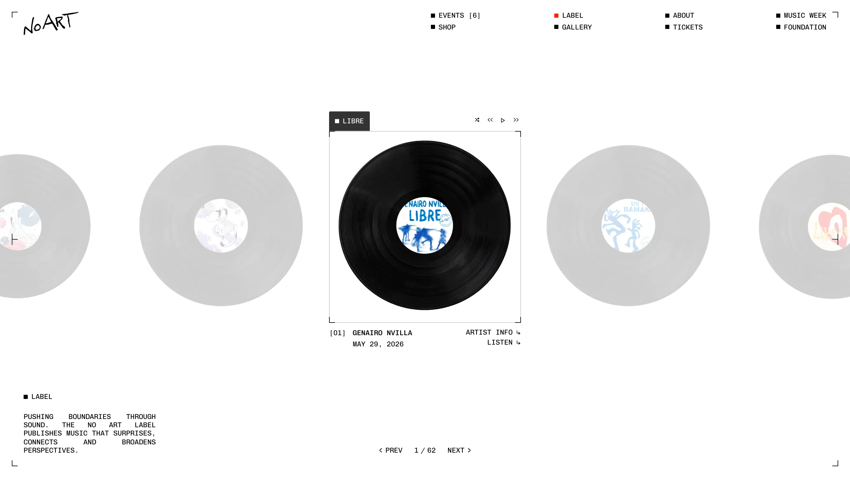
The Label page is my favorite moment. A vinyl carousel: one black record in focus (LIBRE by Genairo Nvilla, May 29, 2026), ghost-grey records fading out on either side, player controls tucked above the frame. You page through 62 releases and the record is the thing you click to hear it. The object and the interface are the same object. That's a real idea, not a decoration, and it fits a label better than any grid of album squares would.
What I'd rate it
Strong pick. It's a lot of moving parts, video, a scrawled logo, a clinical grid, a spinning record, and none of them fight because the crop-mark frame holds them together. The move worth taking home is the one framing device used everywhere. Pick your version of the crop mark and put it on all of it.