Brand identity, website and CMS · 2026
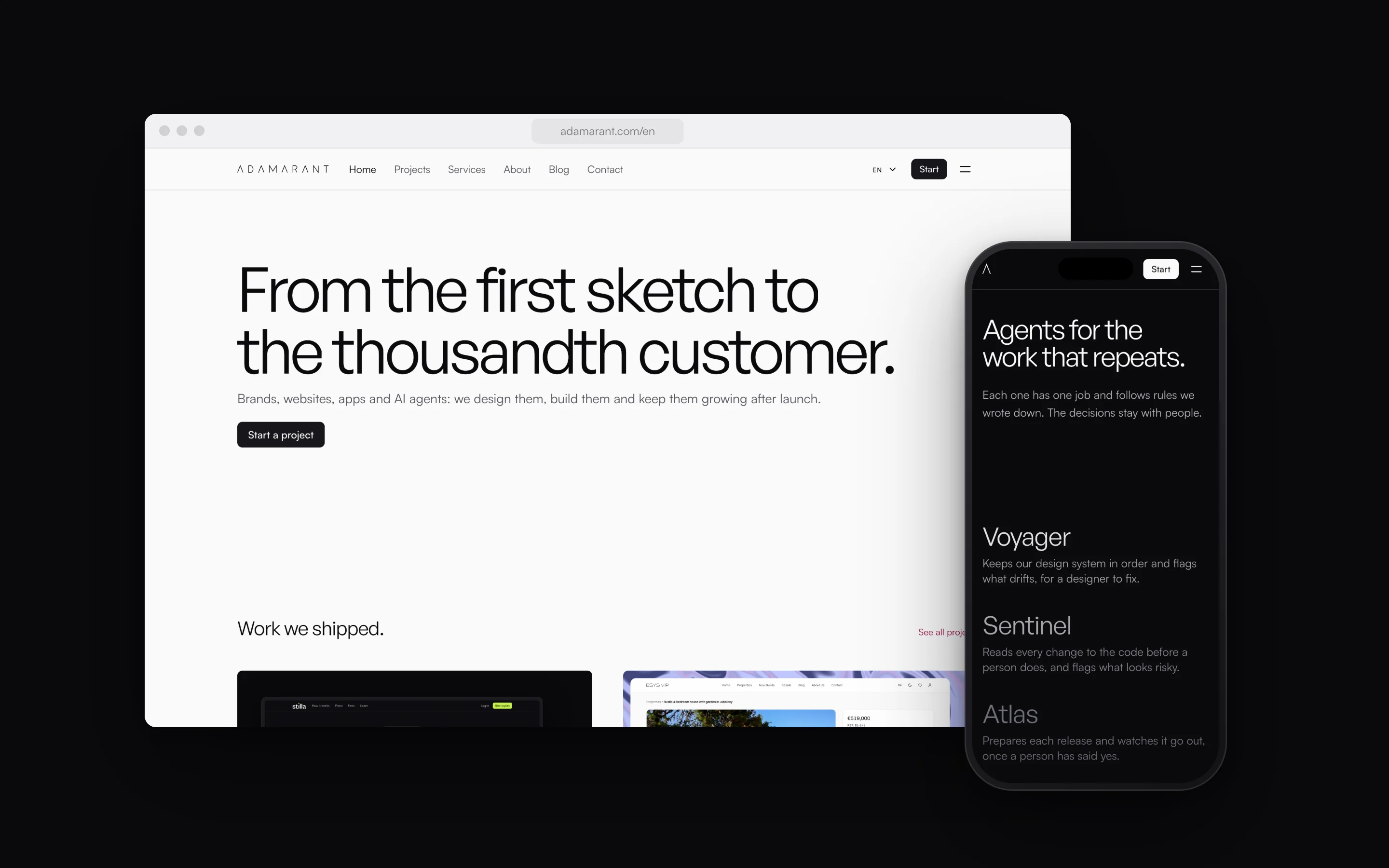
Adamarant is the studio where I design and build brands, websites, apps and AI agents. I designed its brand, the website in three languages and the CMS it runs on, with a drawing for every service and a cover for every article.
The brief
The site had to say what the studio does in one sentence, put the work right under it, and lead a visitor to a first call or a written estimate.
It also had to run on very little of my time: three languages, a blog that keeps growing, and every page edited in one CMS.
The brand
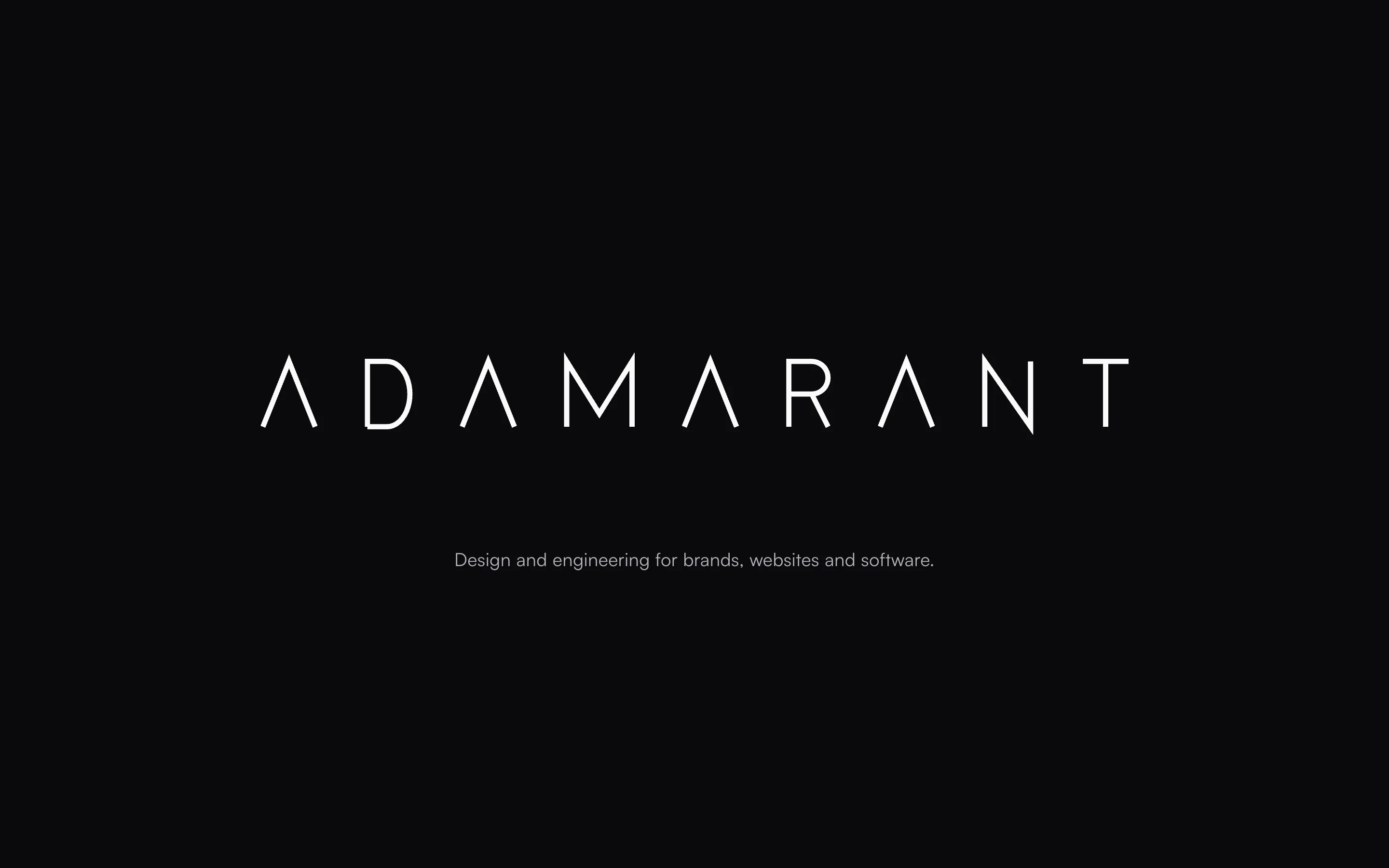
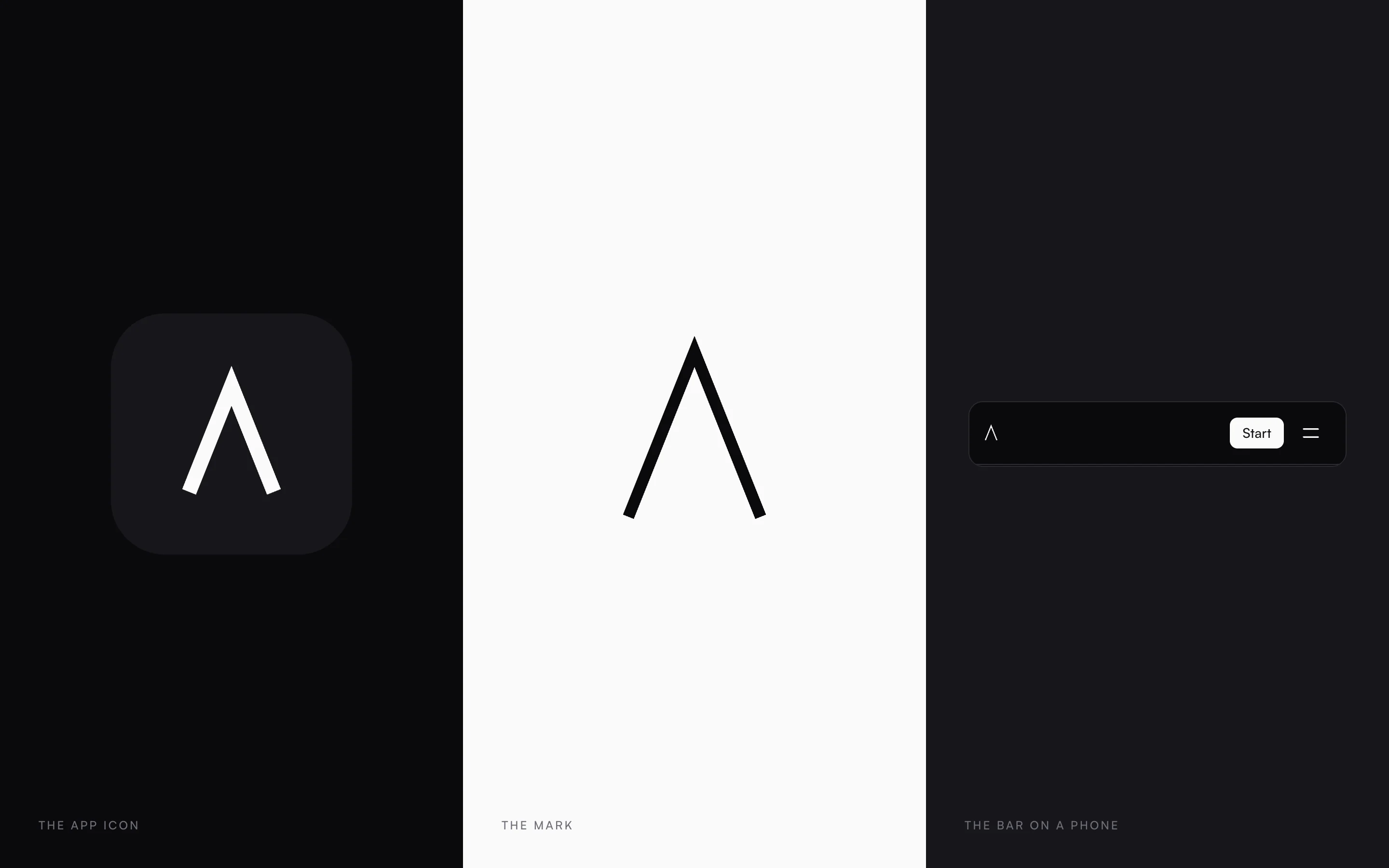
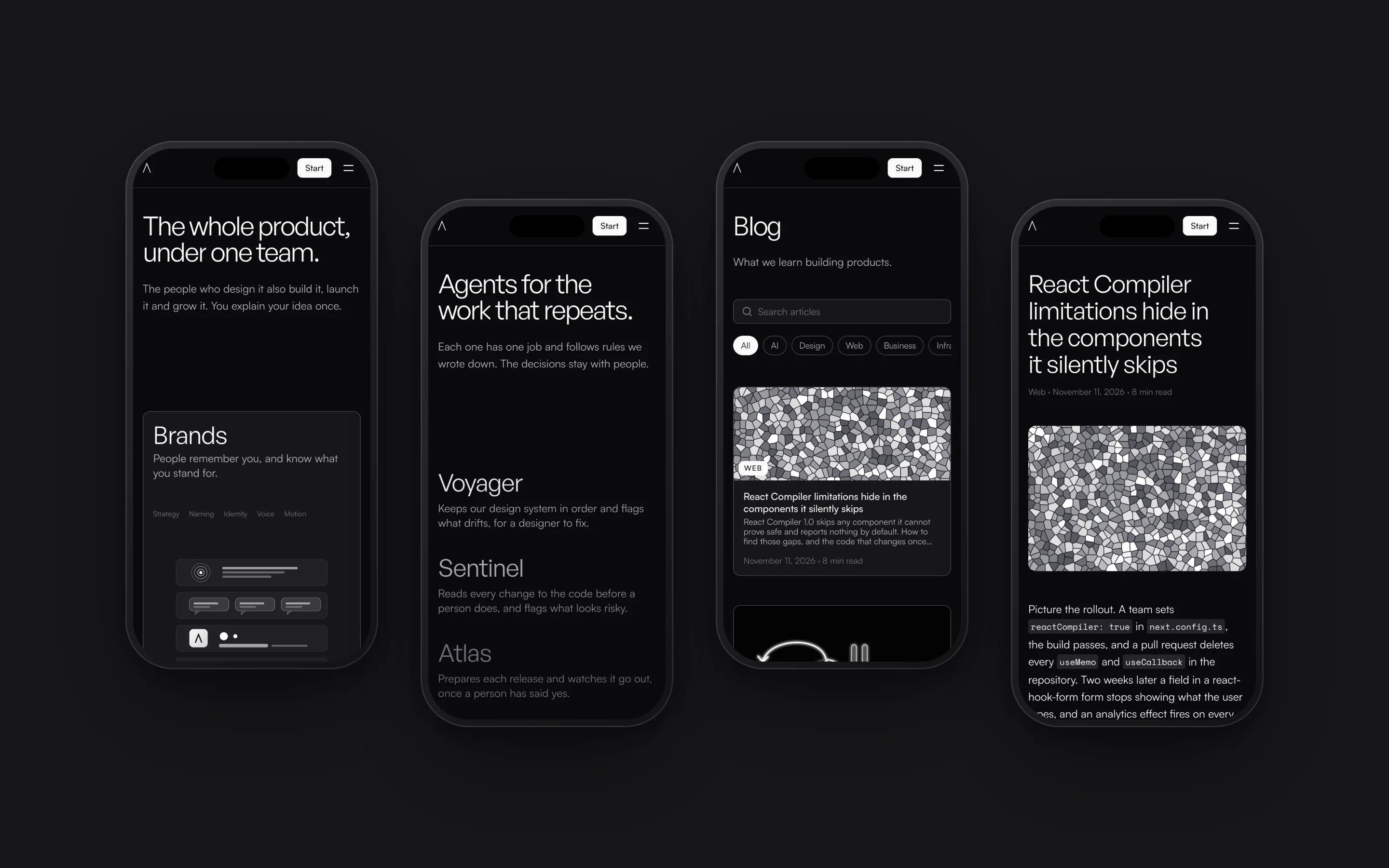
The wordmark is drawn with a single thin line, the same in every letter. Its first letter, the open A, stands alone as the mark: it is the app icon, and it takes the wordmark’s place in the bar on a phone.
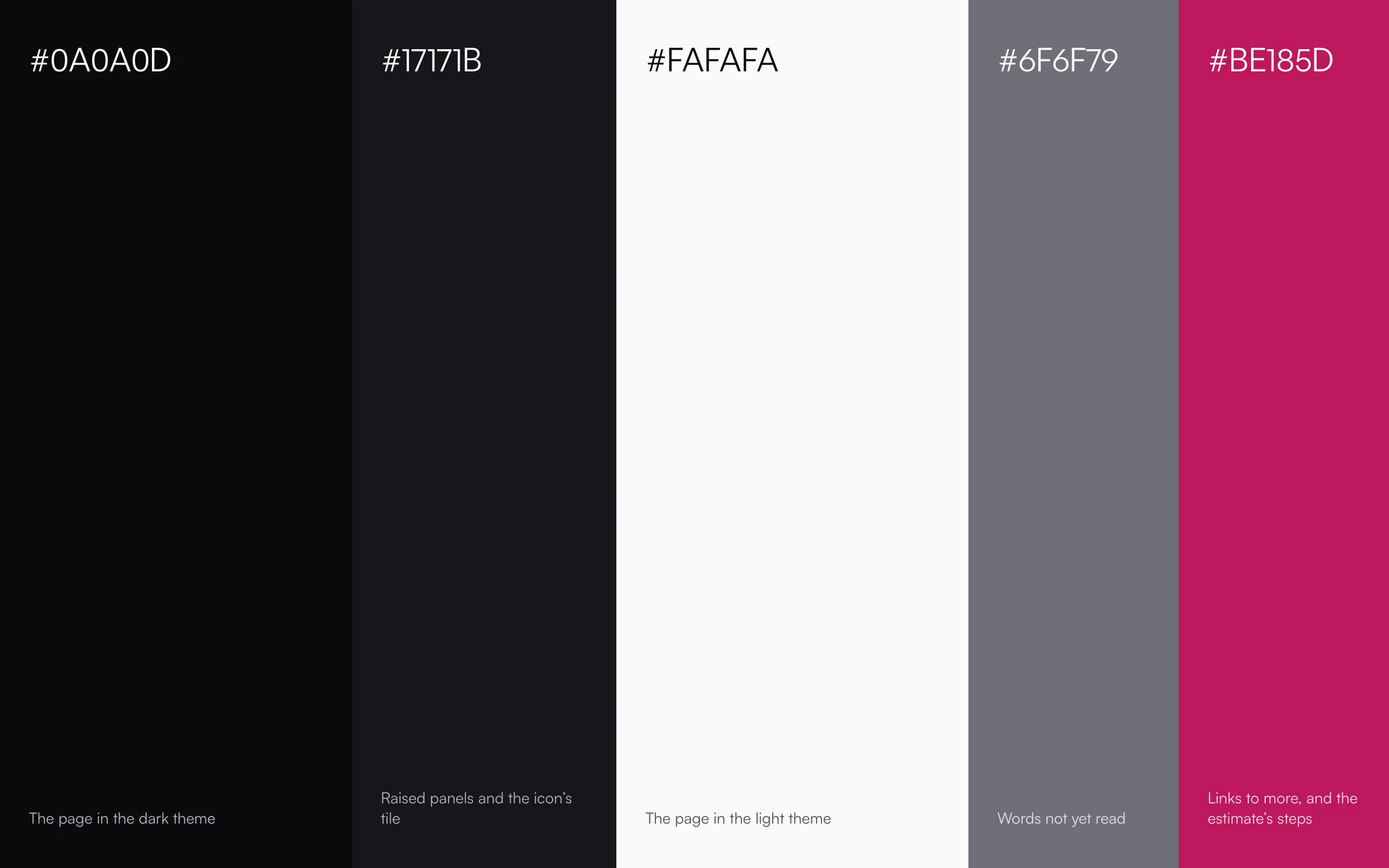
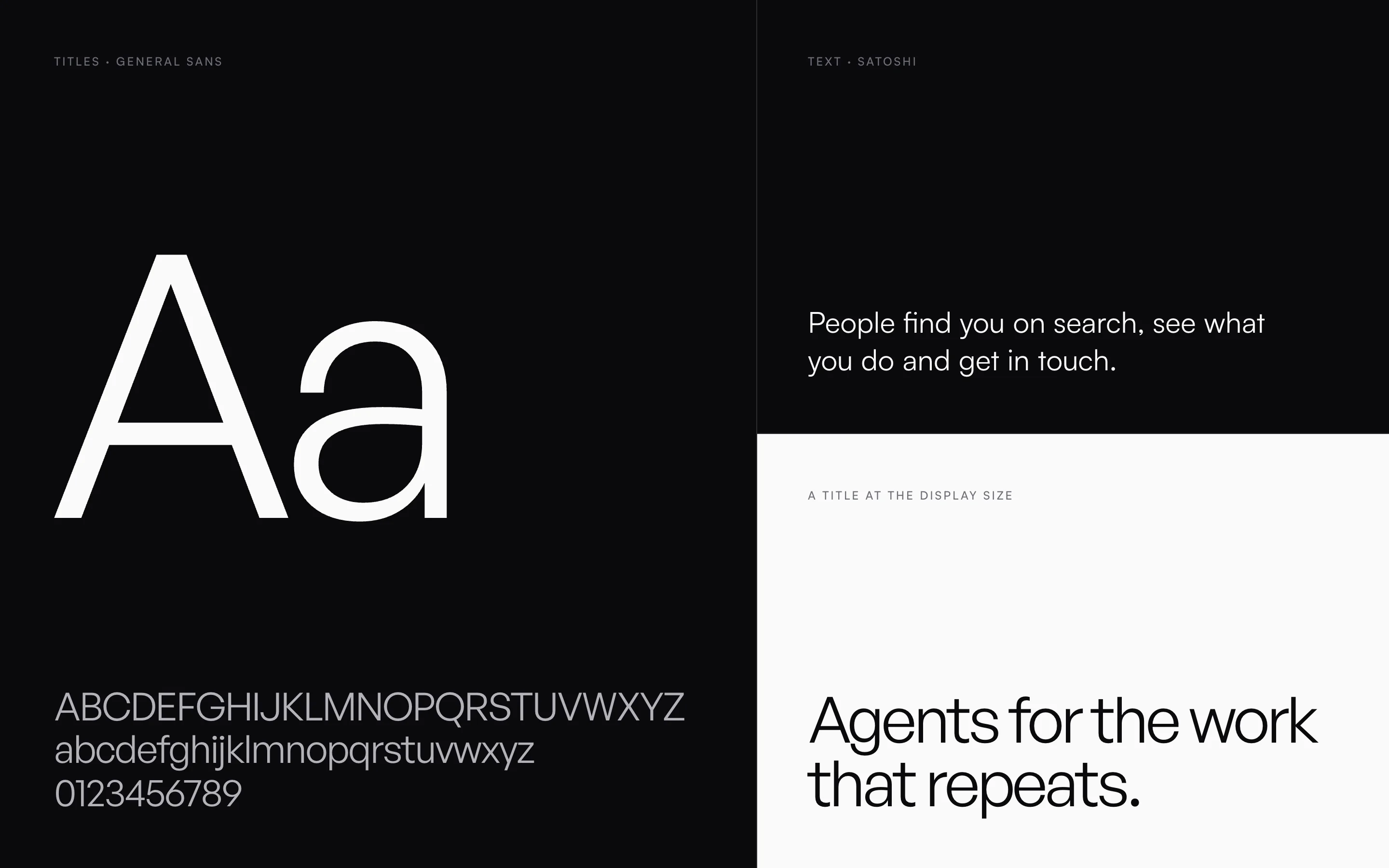
The site is black and white. Amaranth, the colour in the name, marks the links that lead to more and the steps of the estimate. General Sans sets the titles and Satoshi the text.
The website
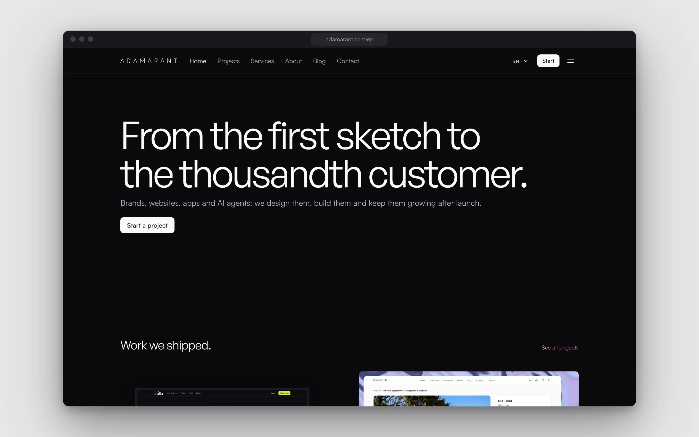
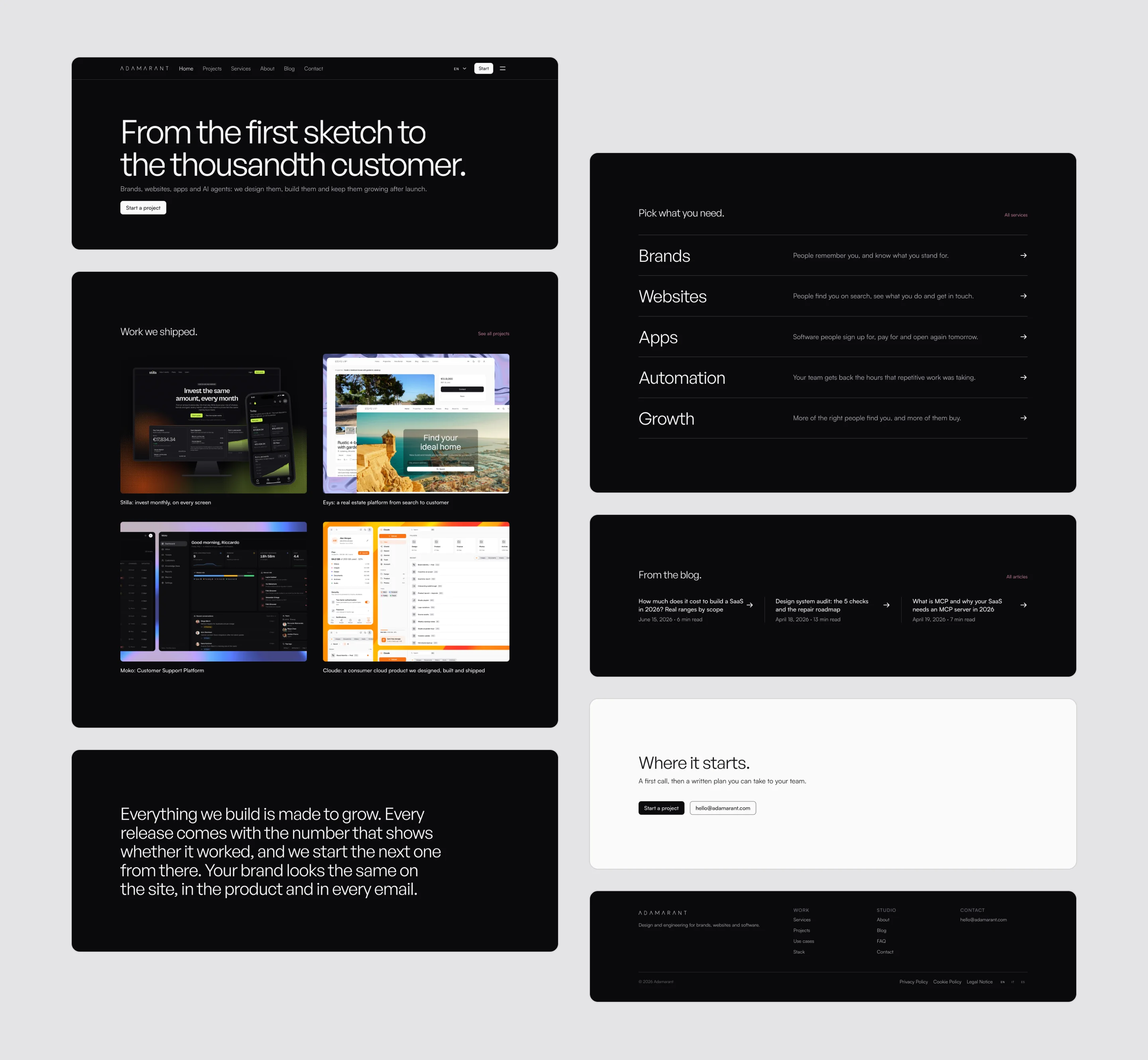
Each band of the home says one thing: what the studio makes, the work, the services, how it builds, a few articles and the way to start. The only pictures on it are the work’s own.
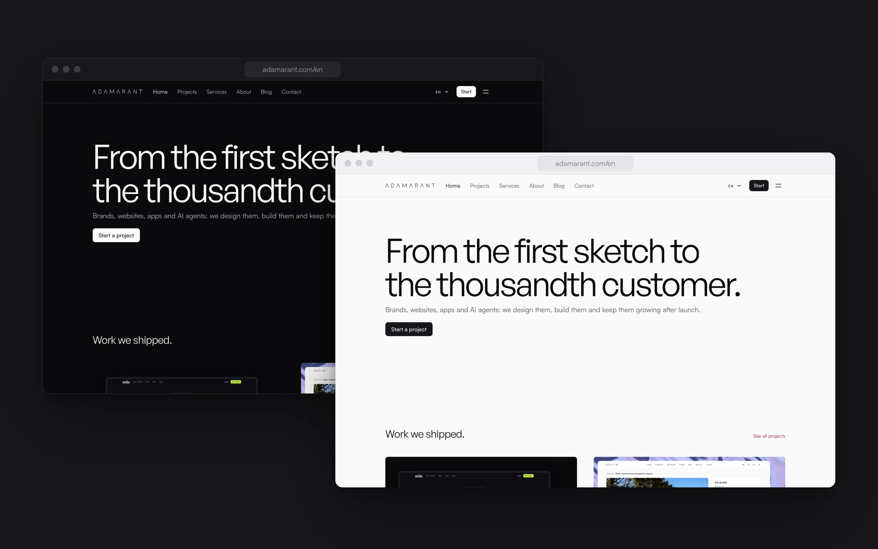
Every page follows the reader’s settings into the dark or the light theme.
The pages
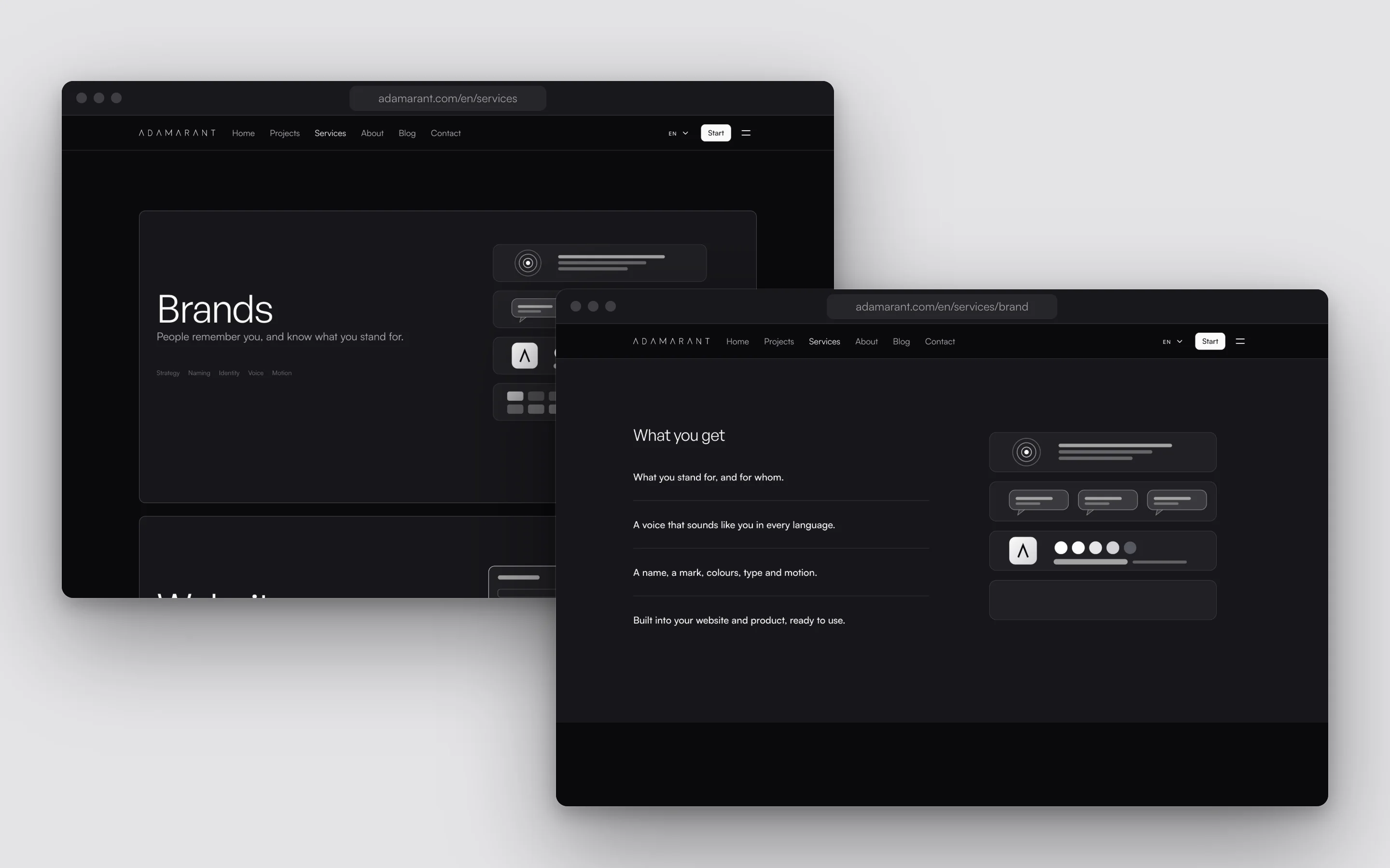
The services stack as you scroll, one card over the last, each with its drawing. A service’s page opens on a paragraph that fills in as it is read, then lists what you get.
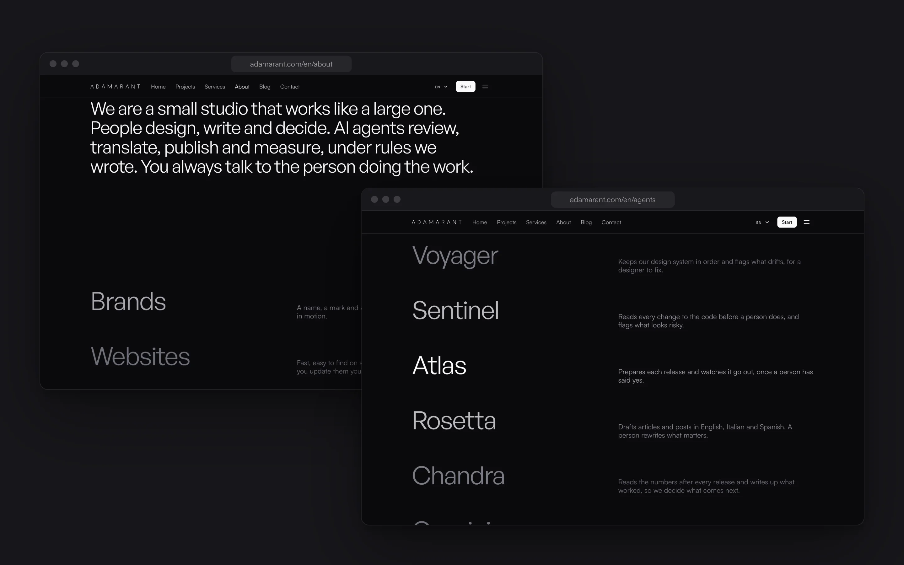
The About and the Agents pages are read one line at a time: the line crossing the middle of the screen is lit, and the others wait in grey.
The drawings
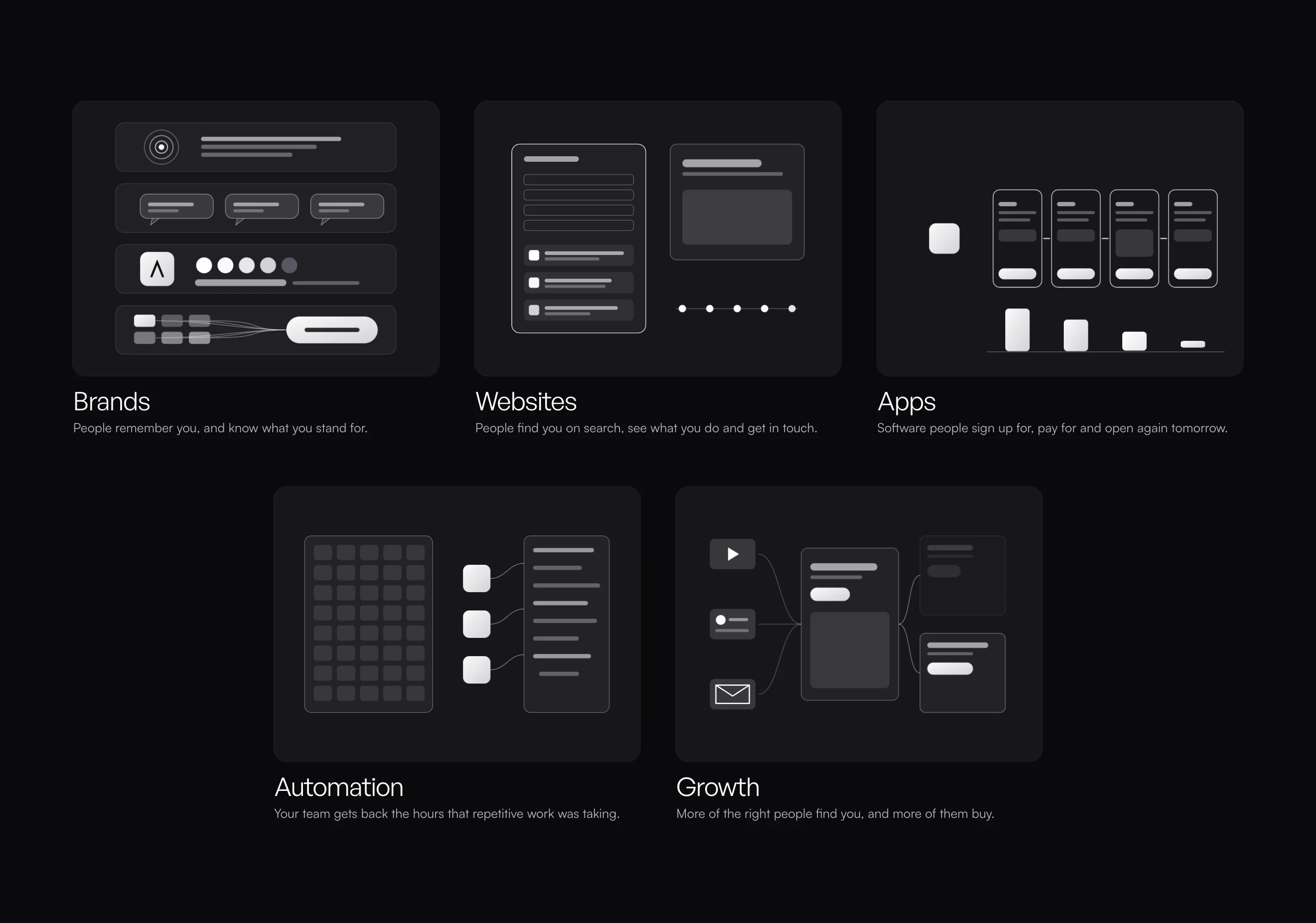
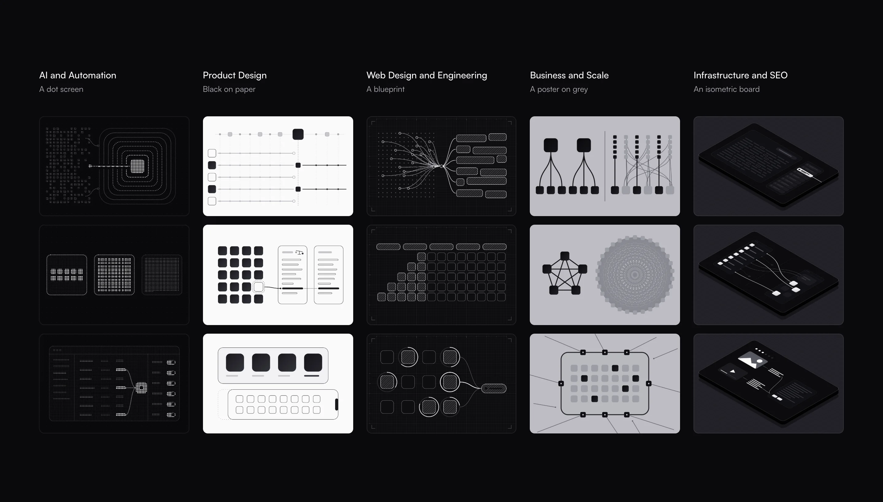
The site’s drawings are made with one kit: small tiles that are lit or off, and the lines between them. They are white on the dark page and black on the light one, and there are no words in them.
Each service has a drawing that moves, and every movement in it shows something the sentence beside it says.
Three languages
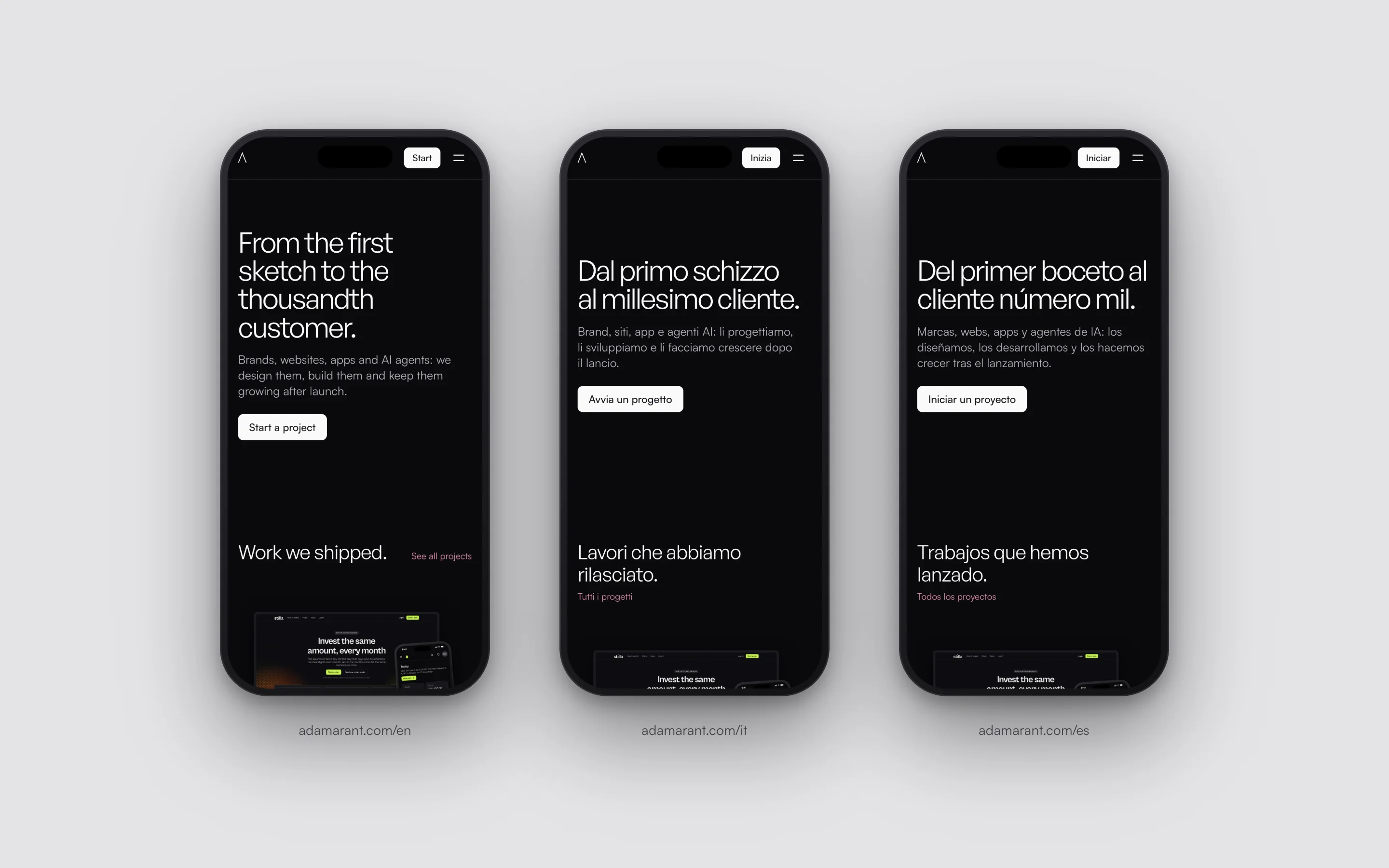
Every page is in English, Italian and Spanish, each at an address of its own, and the site opens in the language of the reader’s browser.
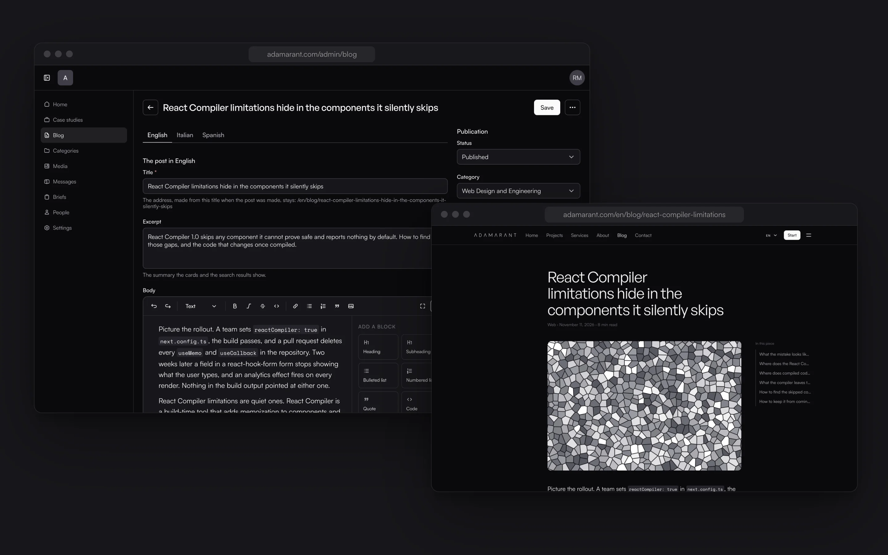
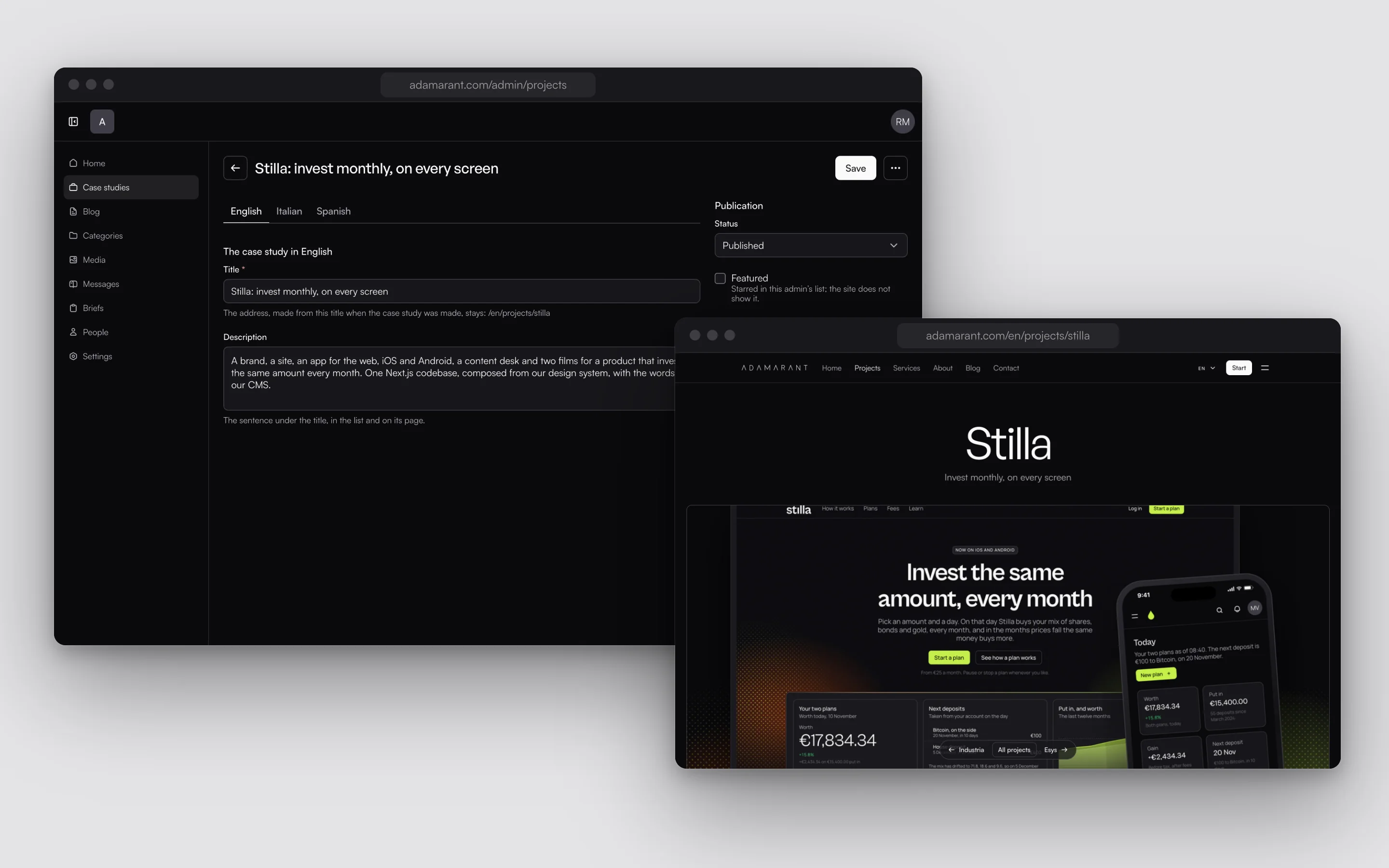
In the CMS an article or a case study keeps its three languages side by side, one tab each.
The blog
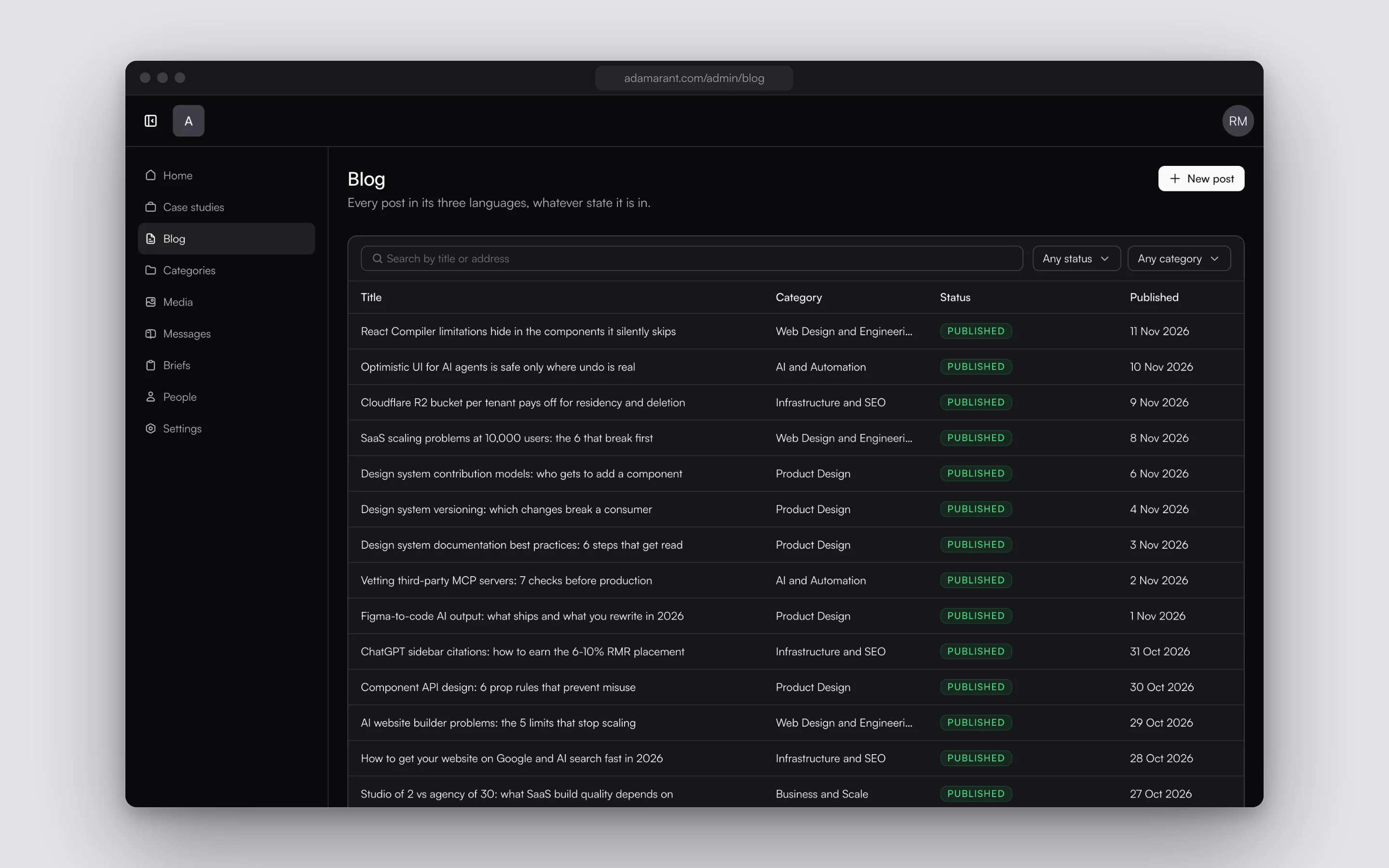
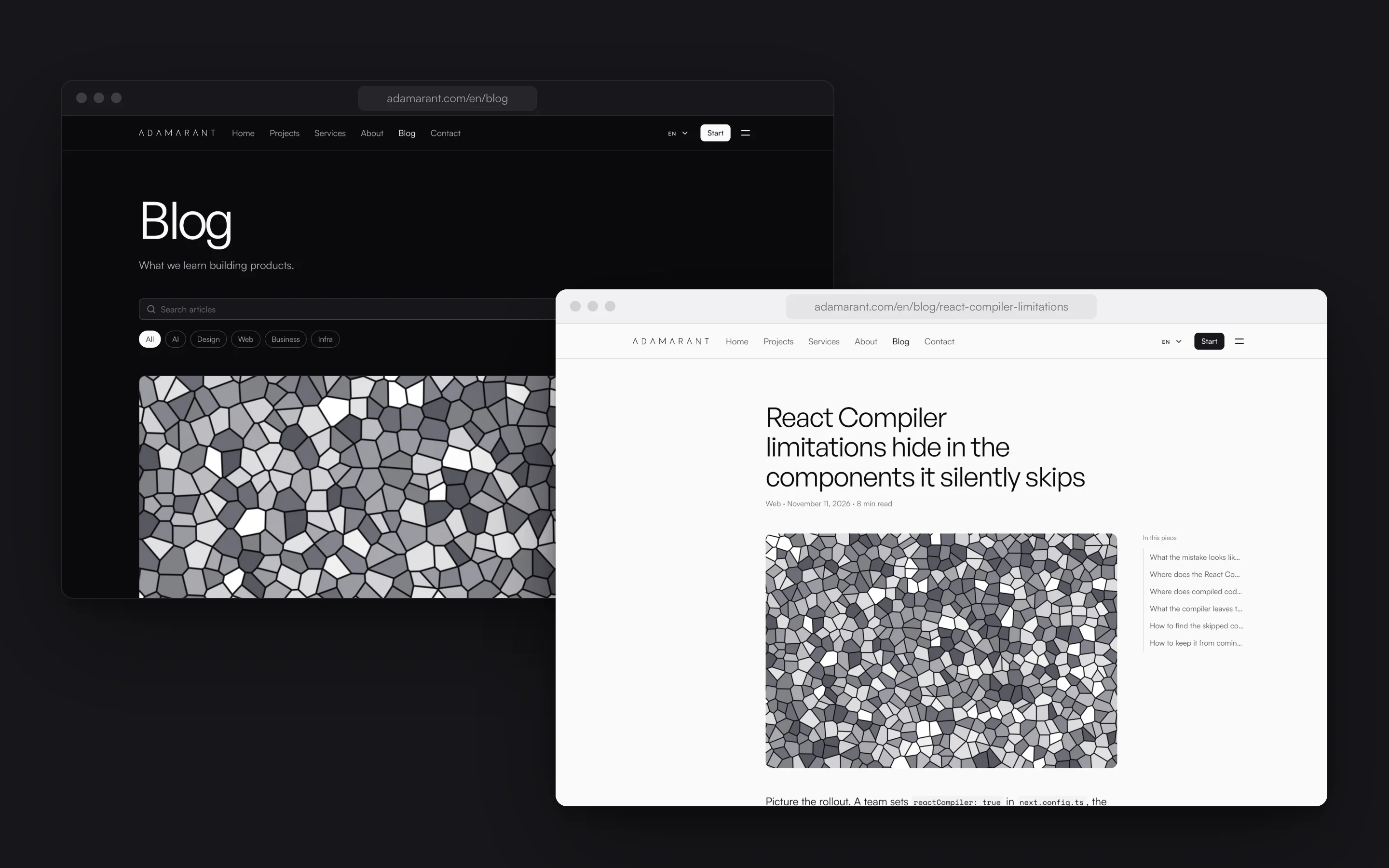
The blog is where the studio writes about its work: what a SaaS costs to build in 2026, how to audit a design system, what an MCP server is for. Every article is in the three languages, and a letter on the first of each month sends the past month’s articles to the readers who signed up.
The covers
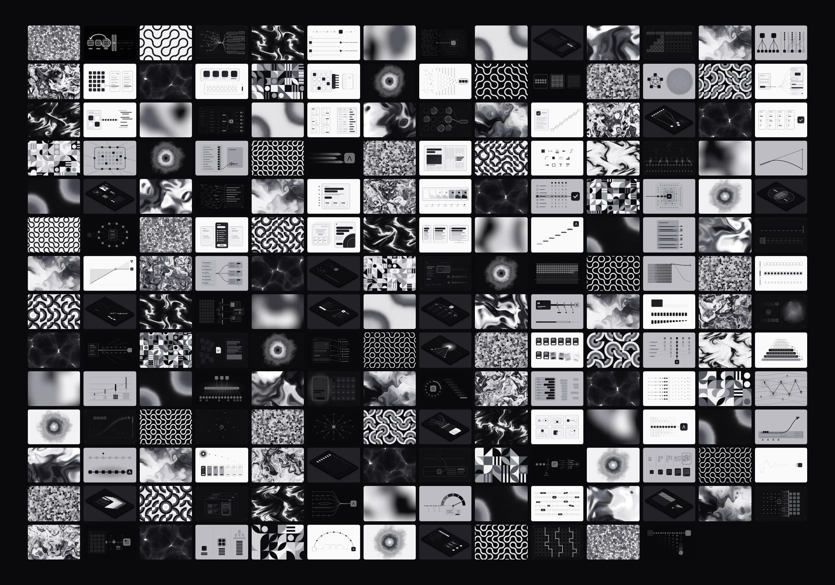
Every article gets a cover made by code. About half are drawings of the article’s idea in the style of its category: a dot screen for AI, black on paper for design, a blueprint for the web, a grey poster for business and an isometric board for infrastructure.
The rest are patterns and shaders in the same greys.
The estimate
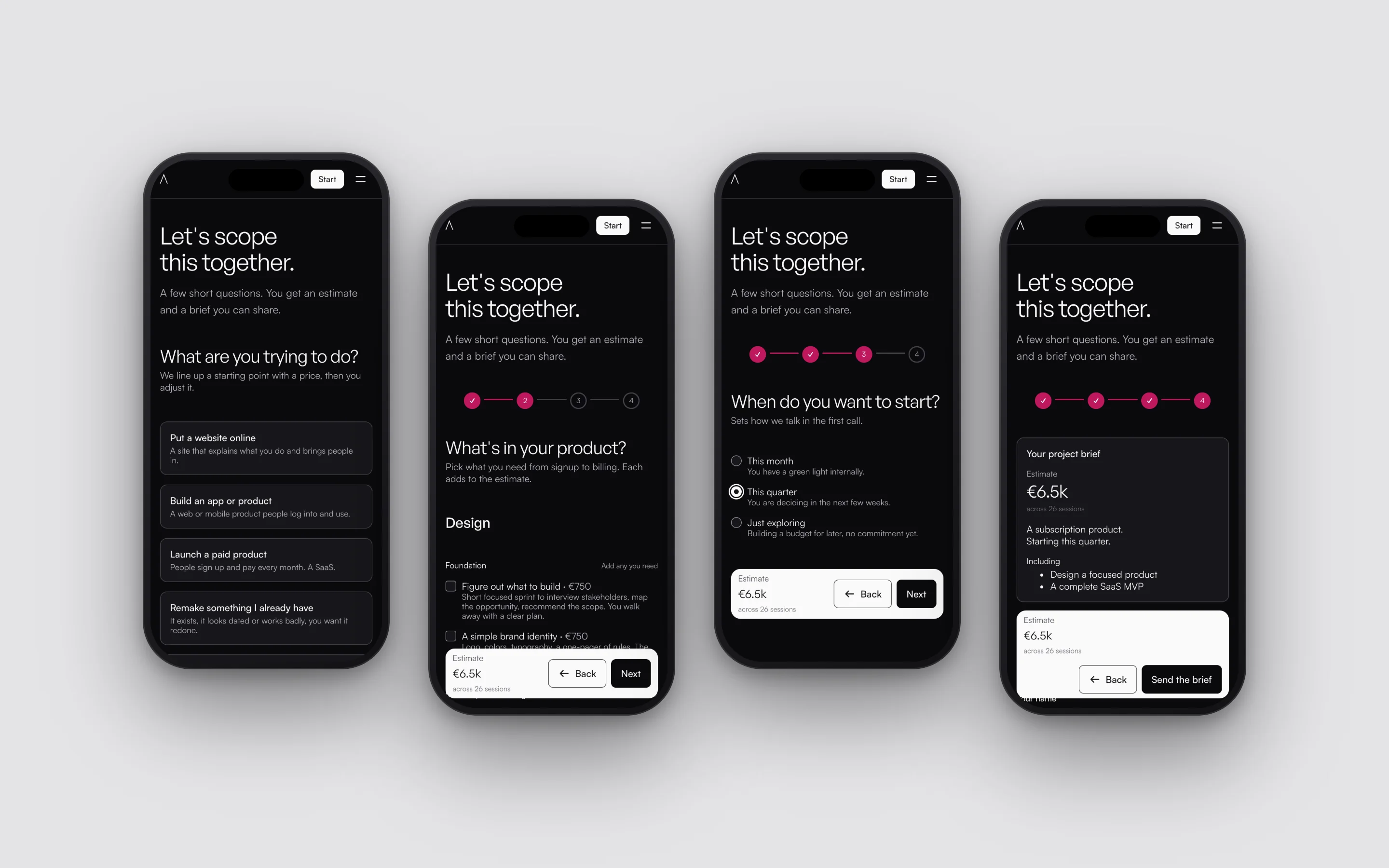
Start a project opens a few questions in place of a form: what you are trying to do, where you are with it, what the product needs and when you want to start. The estimate moves with every answer.
At the end the brief can be sent to the studio, or kept as a link to share with a team.
The design system
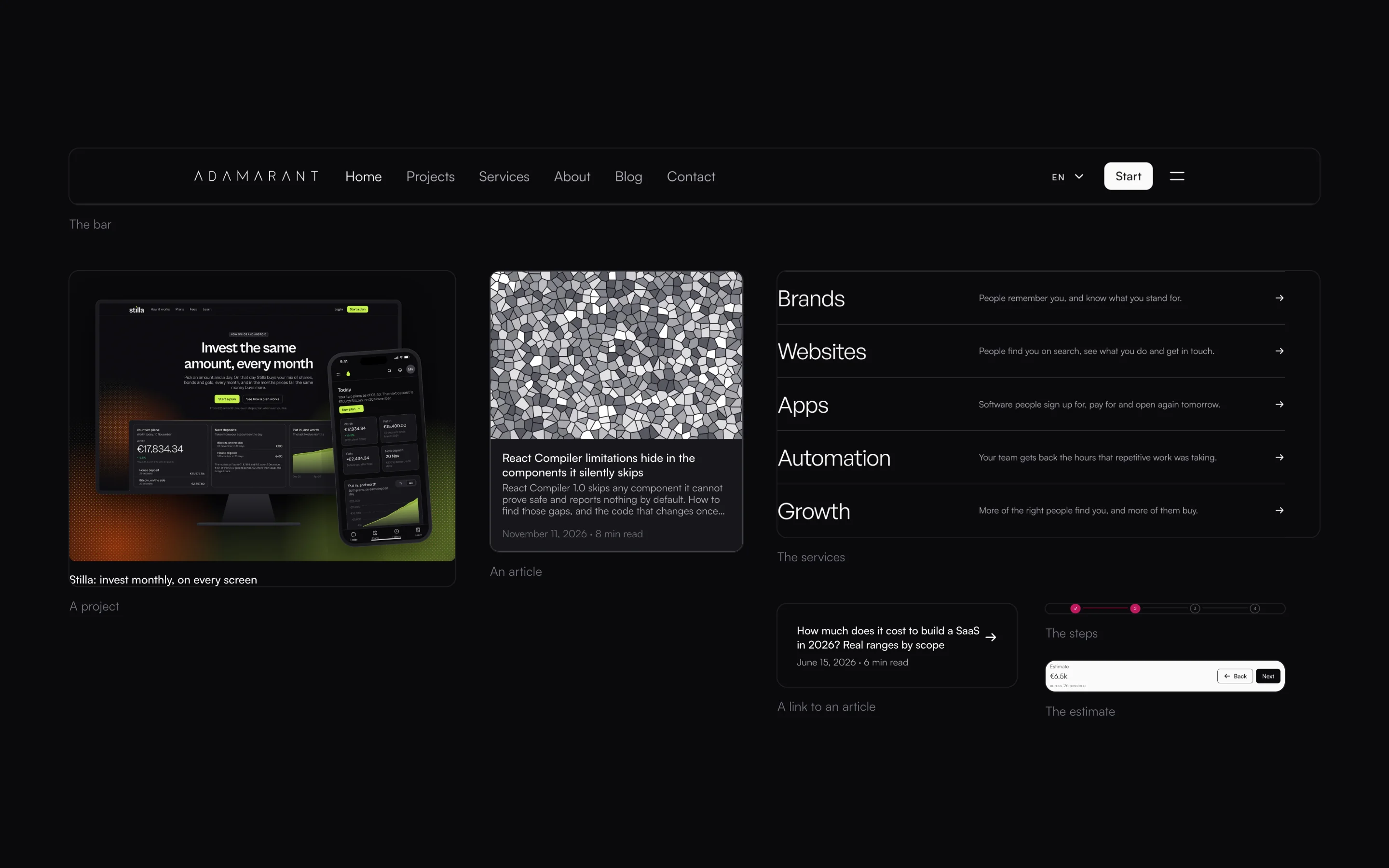
The site is built on OS, my design system: the bar, the cards, the forms, the estimate’s steps and the footer are its parts, with Adamarant’s colour set once for all of them.
Three things are the site’s own: the paragraph that fills in as it is read, the list lit one line at a time, and the services that stack as you scroll.
The CMS
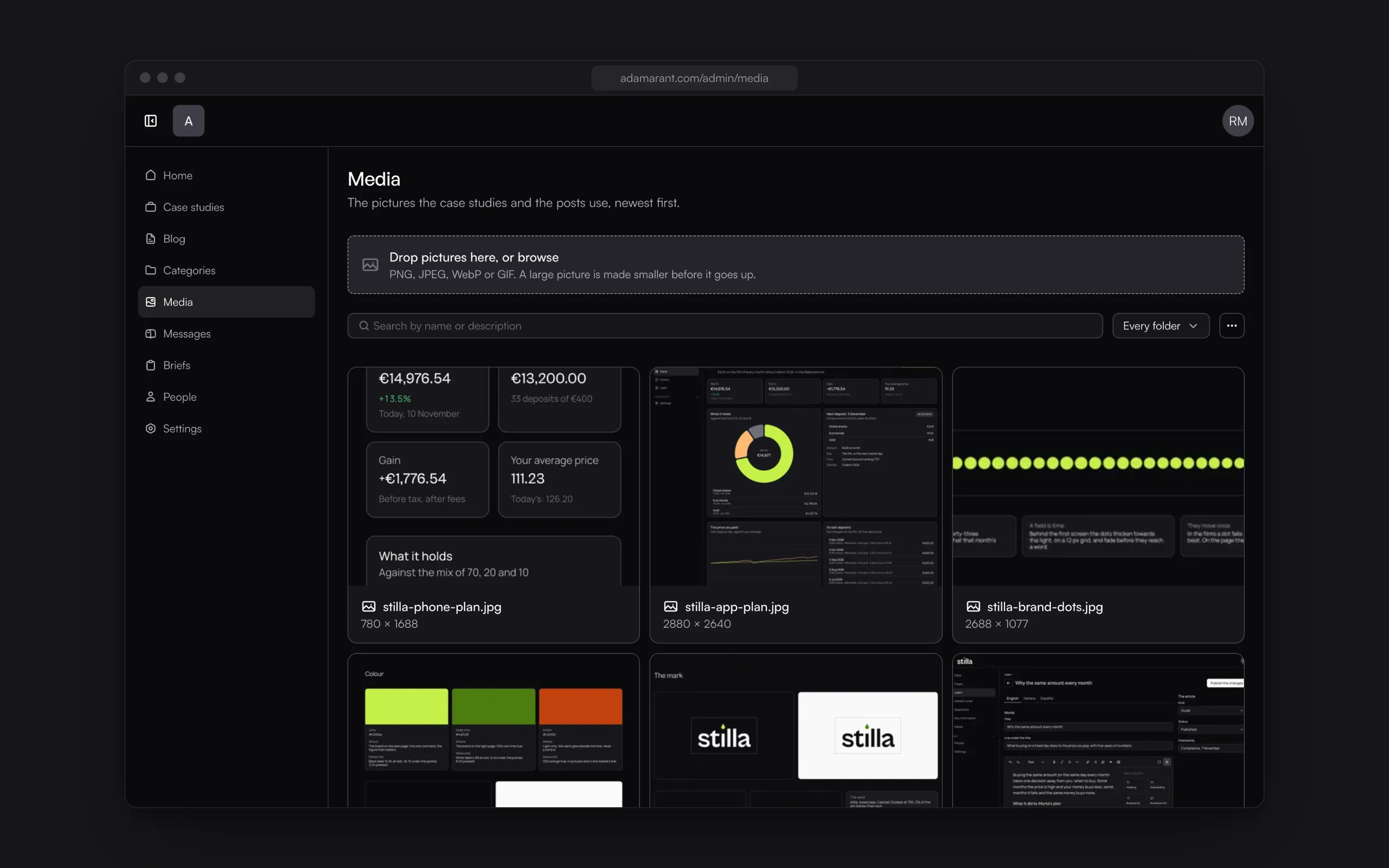
The studio runs the site from OS CMS: the case studies, the articles, the pictures, the messages and the briefs sent from the estimate. A case study can be read as a draft on its own page before it is published.
Signing in takes a second factor, and each person sees only the sections they are given.