Izanami lets one carved seal hold up an almost empty hero
Izanami took awwwards Site of the Day with a near-black hero that is mostly fog and empty space, anchored by a single carved seal. Here is the craft I would steal.
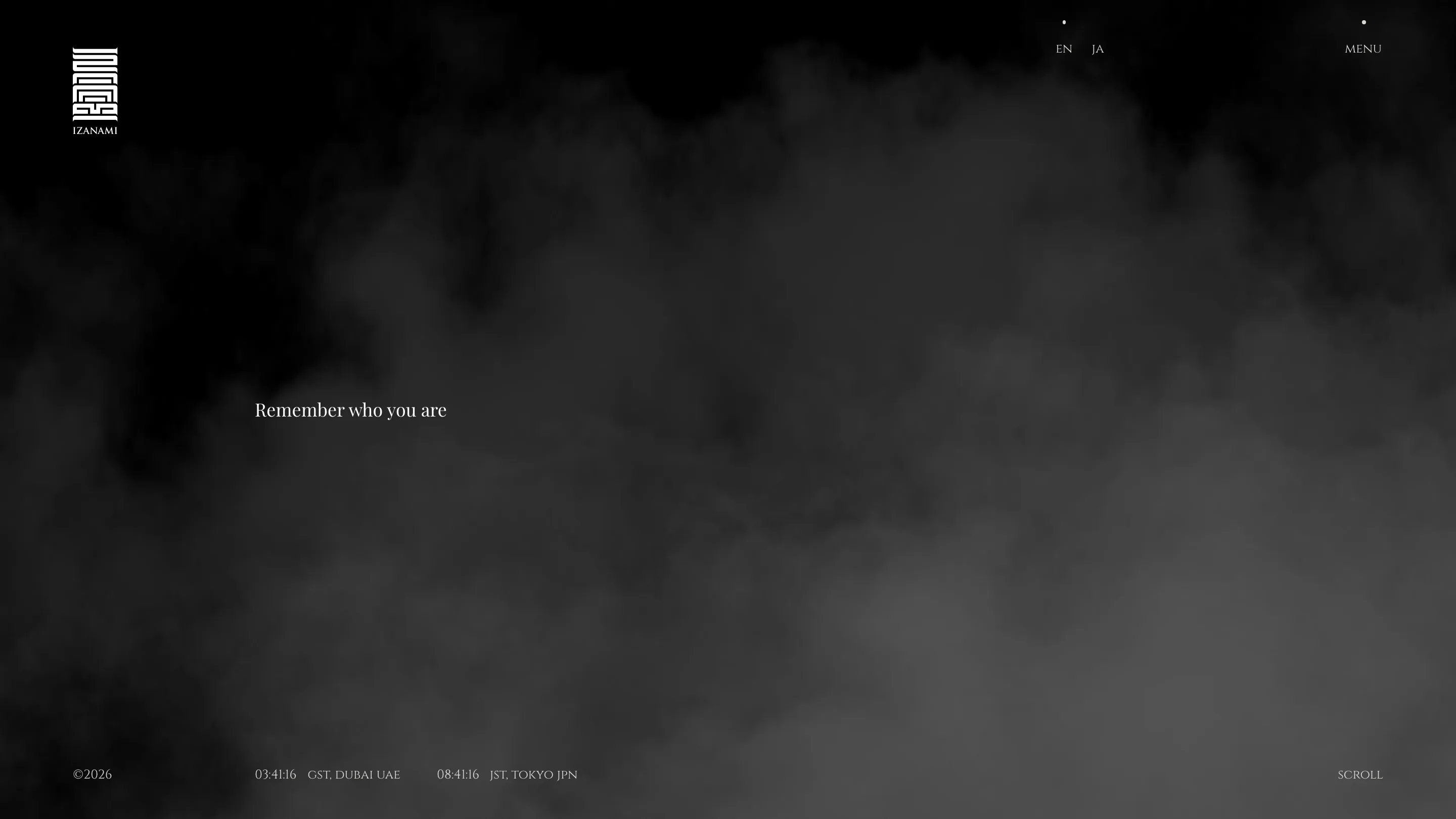
Izanami is my top pick this week, and the thing that sold me is how little is on the screen. The homepage is a near-black field with fog drifting through the middle, one small line of serif type, and a carved seal up in the corner. That is it. baqemono.inc took awwwards Site of the Day for it on 18 July 2026, with a 7.19. The restraint is the whole move, and it is harder to pull off than a busy page.
The seal does the branding
Top left sits a square seal, the kind you would stamp in red ink on a scroll. It reads like a woodblock hanko, right angles folded into a maze, with IZANAMI set small underneath. One mark carries the entire identity. Because the seal is so dense and specific, the rest of the page can stay empty and still feel anchored. I would steal this. When your logo is strong enough to hold a corner on its own, you do not need to fill the other three.
Two clocks, two cities
Down in the footer, two live clocks tick side by side: Dubai time and Tokyo time. The studio tells you where this thing lives without a paragraph of about-us copy. It is a small detail and it does real work. A designer notices that the clocks keep running while the fog moves, so the hero never feels frozen. I had not seen a world clock used as a quiet way to place an organization between two cities, and I will remember it.
The serif carries the weight
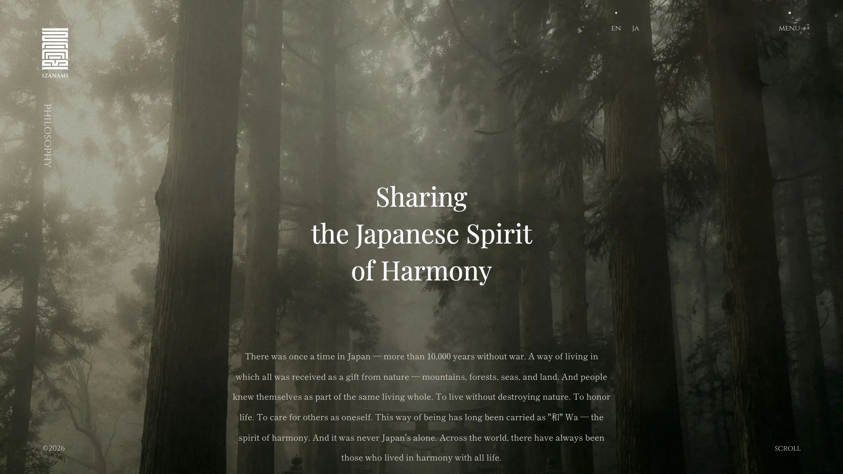
Scroll into the philosophy page and the type steps up. "Sharing the Japanese Spirit of Harmony" is set in a high-contrast serif, thin hairlines against thick stems, centered over a photo of a fogged cedar forest. The body sits under it in the same family, justified, calm. This is where the two-color palette earns its keep. Near-black and off-white, nothing else, so the photography does the coloring. The forest shot is muted and grey-green, and the type lays on top without a fight.
Art direction that holds across pages
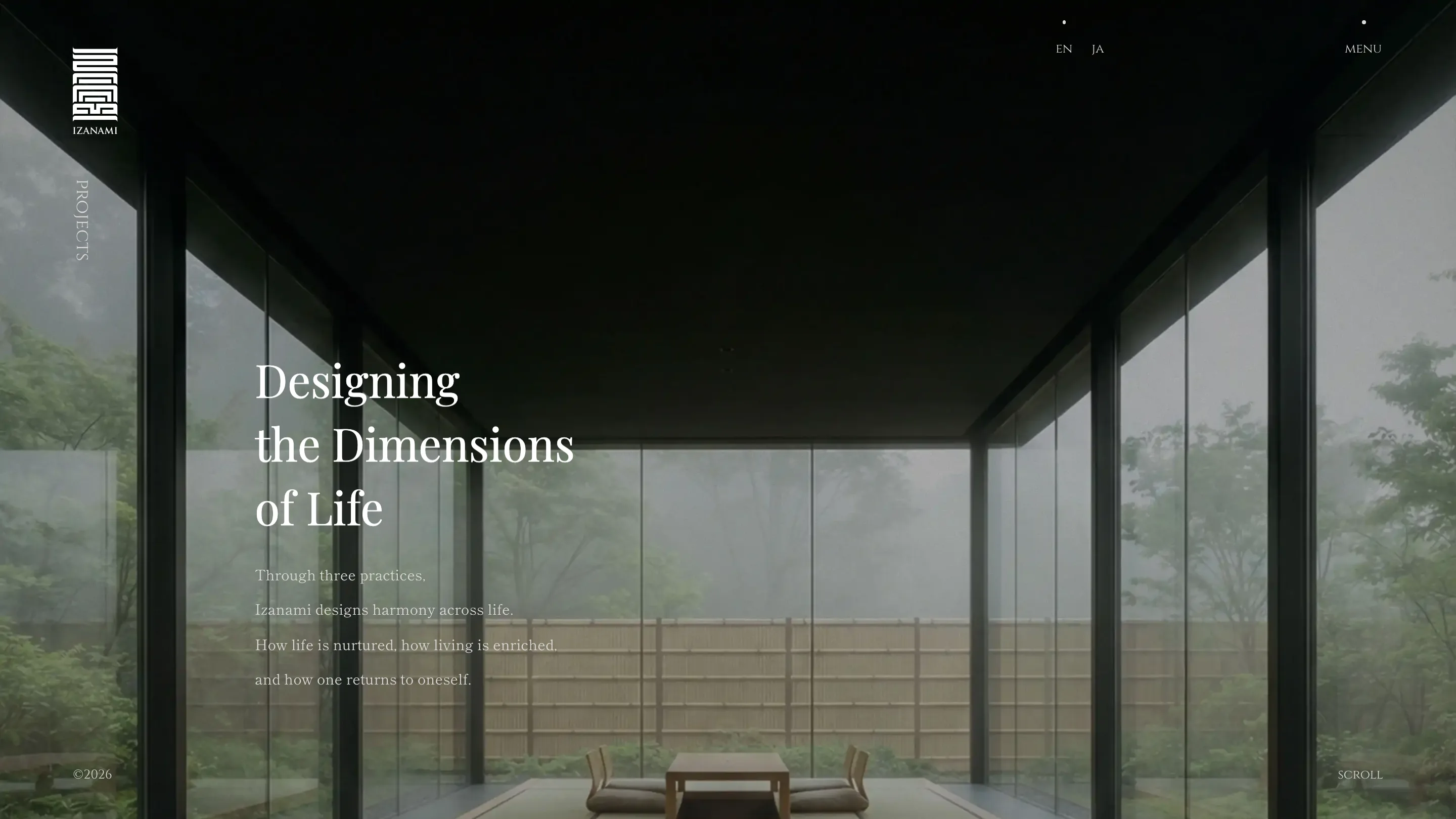
The projects page keeps the exact register. "Designing the Dimensions of Life" runs down the left over a shot taken from inside a minimalist room, looking through floor-to-ceiling glass at a misty garden and a bamboo fence. Same fog, same quiet, same serif. Every page is a variation on one mood, and the mood is patience. Nothing shouts. The vertical section label running up the left edge, PHILOSOPHY on one page, PROJECTS on the next, is the one repeating anchor, so you always know where you are.
What I would rate it
I would rate it a strong pick, a touch above its 7.19. The risk with this much restraint is that it reads as empty instead of calm, and Izanami stays on the calm side because the seal, the clocks, and the serif each pull their weight. The lesson I am taking to my own work: pick two colors, one strong mark, and one photographic mood, then trust them enough to leave the screen mostly bare. Credit to baqemono.inc and designer Tomoyuki Nakata for the discipline.
Featured: baqemono.inc