Mosby's Files runs an architecture archive out of a filing cabinet
A study of American modernism built as a literal dossier: color-coded folder tabs, a paperclipped portrait on aged paper, and three typefaces each doing one job.
My pick this week files eight architects into a cabinet and lets you pull the drawers. Mosby's Files, a study of early American modernism, took awwwards Site of the Day on August 13, 2026, scored 7.23, and picked up a Developer Award on the same entry. It's by Tubik, and the reason I rate it is one committed idea: the whole site is a physical dossier, drawn in the browser.
The folder tabs are the navigation
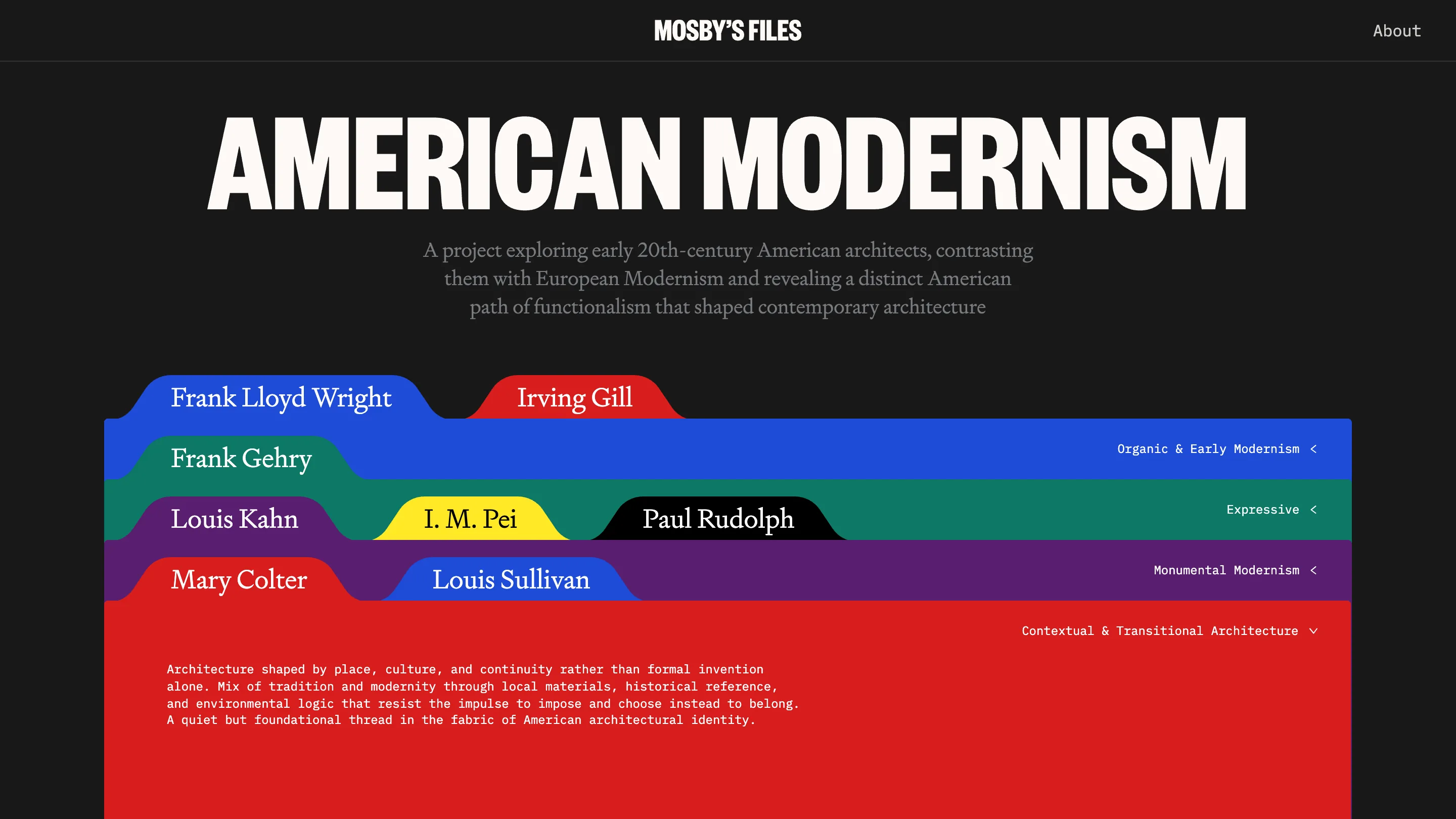
The home page is a charcoal wall with the wordmark AMERICAN MODERNISM set huge in a condensed grotesque. Under it, a stack of colored folder tabs: blue, red, green, yellow, black, purple, one hue per category. Frank Lloyd Wright rides the blue tab, Irving Gill the red, I. M. Pei the yellow. The category names sit on the right in monospace, Organic & Early Modernism, Expressive, Monumental Modernism, like the printed labels on a real drawer. You read the whole taxonomy before you click anything. That's the navigation doing double duty as the concept.
Then the folder opens
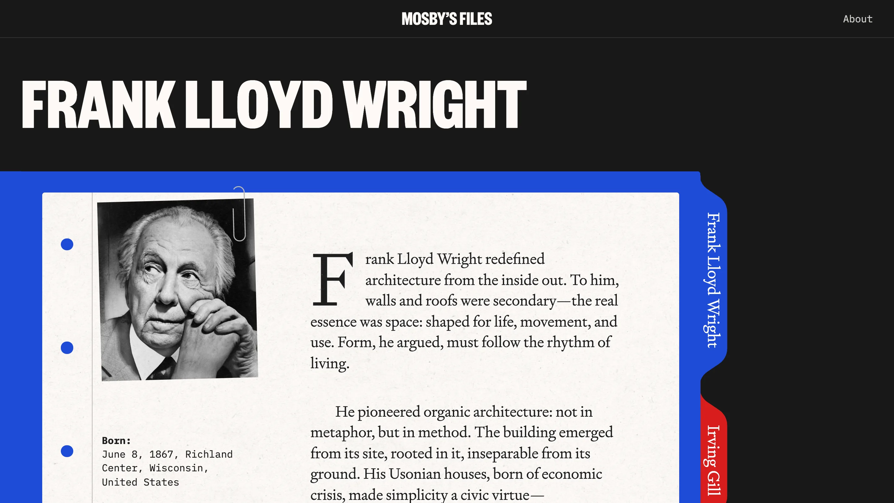
Click a name and the folder opens onto a sheet of aged, off-white paper. Punch-holes run down the left margin. A paperclip holds a black-and-white portrait in place. The body copy starts on a drop cap and reads in a warm book serif, with the birth data set in monospace underneath: Born, June 8, 1867, Richland Center, Wisconsin. The clever part is the right edge, where the other architects' tabs stay pinned as a live index, so you feel the rest of the cabinet sitting behind the page you're reading. It's the kind of detail that would be easy to drop and they kept it.
Three typefaces, three jobs
The type system is where a working designer will slow down. Three faces, and each one has a clear post. The condensed grotesque carries the loud display names in caps. The book serif carries every line you actually read for meaning. The monospace carries metadata, labels, captions, anything that behaves like a stamp on a file. Nothing overlaps. When I see a site hold three families this cleanly I trust the rest of the decisions, because that discipline is hard to fake.
The writing earns the design
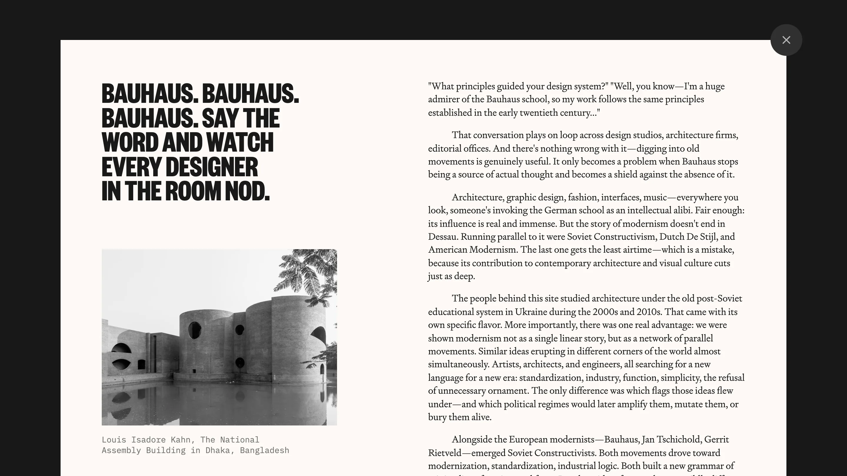
The About panel is the moment the project shows its hand. A cream modal, a black condensed headline reading "Bauhaus. Bauhaus. Bauhaus. Say the word and watch every designer in the room nod," then two columns of real argument about why American modernism gets less airtime than the German school. A photo of Louis Kahn's National Assembly Building in Dhaka sits in the left column with a monospace caption. The copy has a point of view and a voice, which is rare on an award site, where the text is usually filler around the animation.
What I'd steal, and where I'd push
The move I'd take is the tab-as-index: navigation that stays visible as content, so the structure of the whole thing is always on screen. It beats a hamburger and it teaches the taxonomy for free. I'd rate this an easy Site of the Day, and the 8.00 the judges gave the animations feels right, the folders open with weight. Where I'd push: the metaphor leans hard on one gesture, and a couple of the case pages read a little same-y once the trick is known. Small note against a genuinely good build. The craft here is restraint plus commitment, and both are on the page.
Featured: Tubik