Glitch&Grit pins its name to the corners and lets the film run
The nav sits along the top edge in three pieces, the wordmark along the bottom in three more. Everything between them is footage. It is a cheap trick and it carries the whole site.
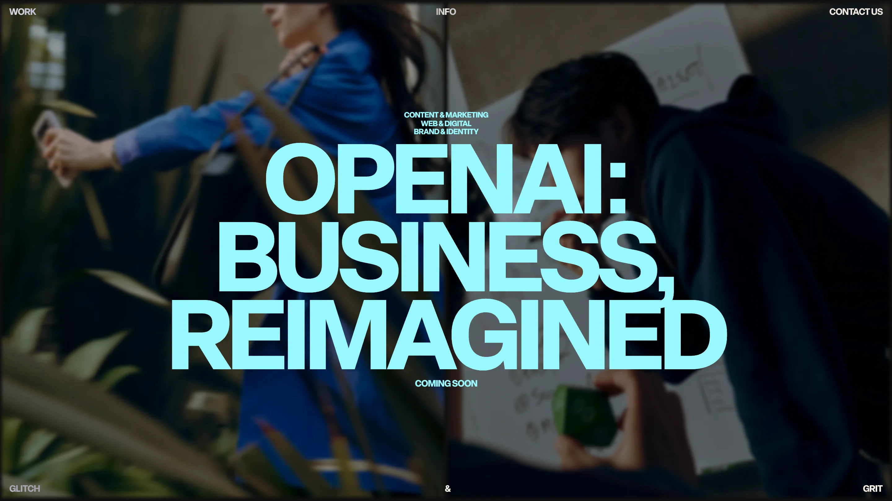
The first thing I noticed on Glitch&Grit is that the site has no header. It has a border. WORK sits in the top left, INFO dead center, CONTACT US in the top right, all at the same small caps size. Then at the bottom edge: GLITCH left, an ampersand in the middle, GRIT right. Four corners and two centers, and the studio name is stretched across the full width of the browser instead of sitting in a lockup. Everything inside that rectangle is video.
It took awwwards Site of the Day on 19 July 2026 with a 7.17. I'd have gone a bit higher on design and a bit lower on development, which is roughly what the jury did anyway (7.26 and 6.67).
The chrome is the frame
Most studio sites put the logo in the top left and then spend the rest of the page fighting it for attention. Here the wordmark is dismantled and hung on the edges, so it reads as the edge of a screen rather than as a brand mark asking to be looked at. The result is that the home page feels like a monitor in an edit suite. Full-bleed footage, one headline, no scroll cue.
The headline on top of that footage is the loudest thing on the site. OPENAI: BUSINESS, REIMAGINED, set in a tight grotesk at something like 180px, in a pale cyan that has no business working over a moving image and works anyway. Above it, three lines of 10px caps naming the disciplines. Below it, COMING SOON. The type does the whole job: the size gap between the headline and the two labels is enormous, maybe 15 to 1, and that gap is what makes a single video slide feel composed instead of like a screensaver.
Two colors, and one of them is a cream
The palette is #FFFBF7 and black. That's it. The home and the work index are black, the info page flips to the cream, and the flip lands hard because nothing else has changed. Same type, same corners, same nav, inverted. I've seen a lot of studios reach for an accent color to signal "about page" and this does more with less: the cream reads warm and human right where the copy gets human.
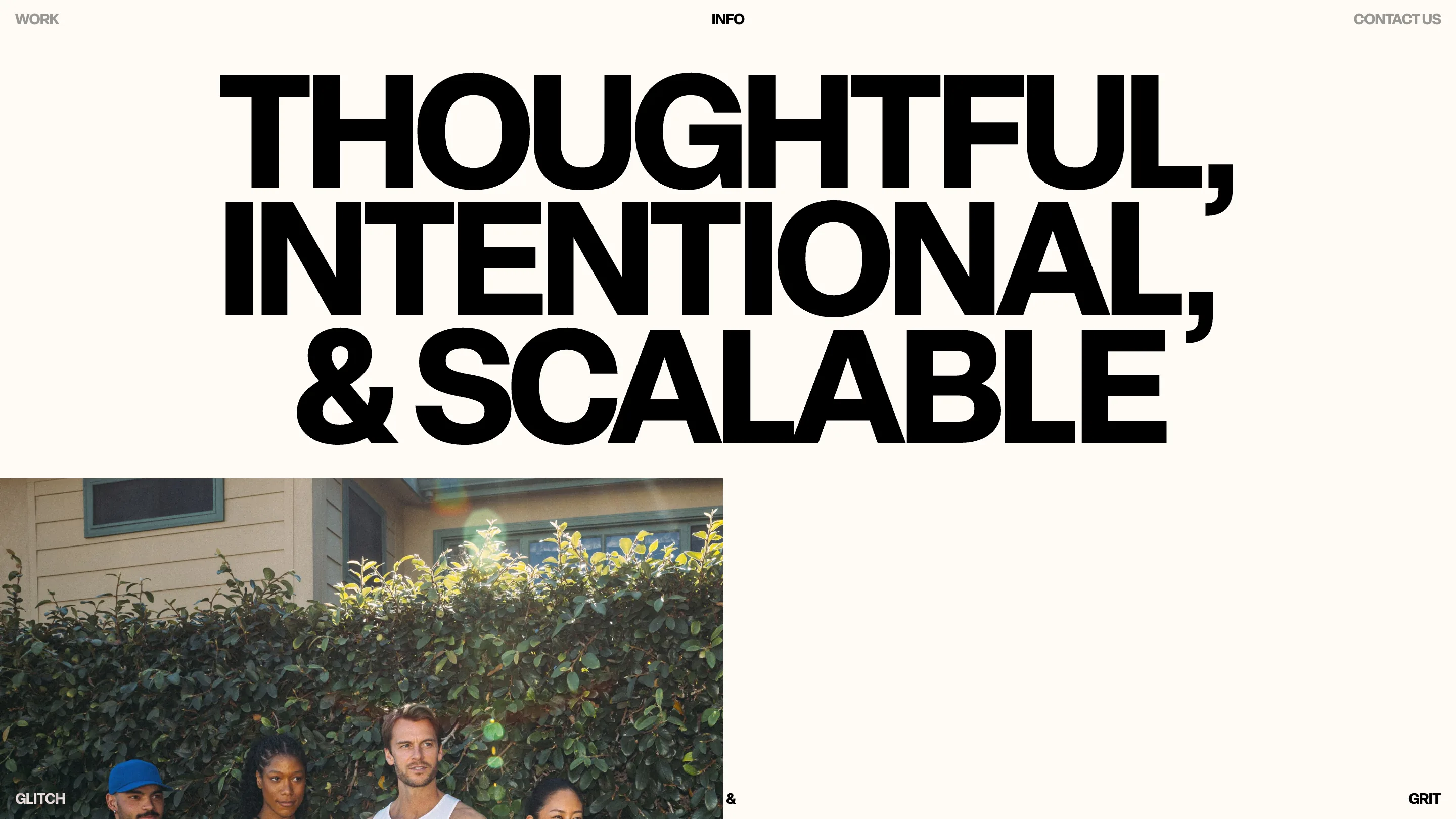
On that page the manifesto line sits inside actual quotation marks, at display size, with the closing curl hanging past the right edge of the last word. Somebody sweated that. It's the sort of detail that costs an hour and reads as care for years.
The filter is a sentence
The work index is where I'd argue the craft is highest. Instead of a row of pill buttons, the categories are set as one running line of display type: "All Work, Brand & Identity, Content & Marketing, Film & Documentary, Web & Digital." The active one is white, the rest are a mid grey. You filter by reading. It costs nothing to build and it turns a utility control into the second headline of the page.
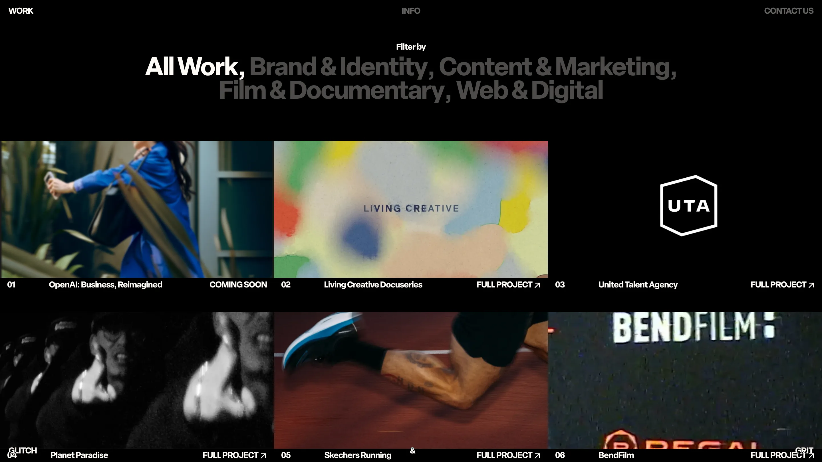
Under the grid, each project gets a numbered row on a shared baseline: 01, title, FULL PROJECT with an arrow, pushed to the far right of its column. The thumbnails have different aspect ratios and different crops, one is a UTA logo on flat black, one is a VHS-degraded BendFilm title card, one is a running shoe mid-stride. A weaker studio would have forced them all into the same 16:9. Letting the crops fight each other is what makes the page look like a reel.
What I'd steal
The corner frame, mostly. It's a layout move that gives you a persistent identity on every route without a single pixel of header chrome, and it makes full-bleed media possible everywhere by default. Then the filter-as-sentence, which I'd use tomorrow on any index page with four or five categories.
Where it gives up ground is depth. The home is one slide for an unreleased project, so the site asks you to click through to work before it shows you much. And the corner labels sit close enough to the viewport edge that on a laptop they graze the browser chrome. Small things. I'd still rate this an 8 on the strength of the type alone.
Featured: Glitch&Grit