Top Picks · 3 min · 17 July 2026
Hiroto Sato builds his portfolio nav out of 3D street signs
A creative developer's portfolio that renders its own wayfinding as 3D street furniture. Strong art direction, and a couple of moves I'd borrow.
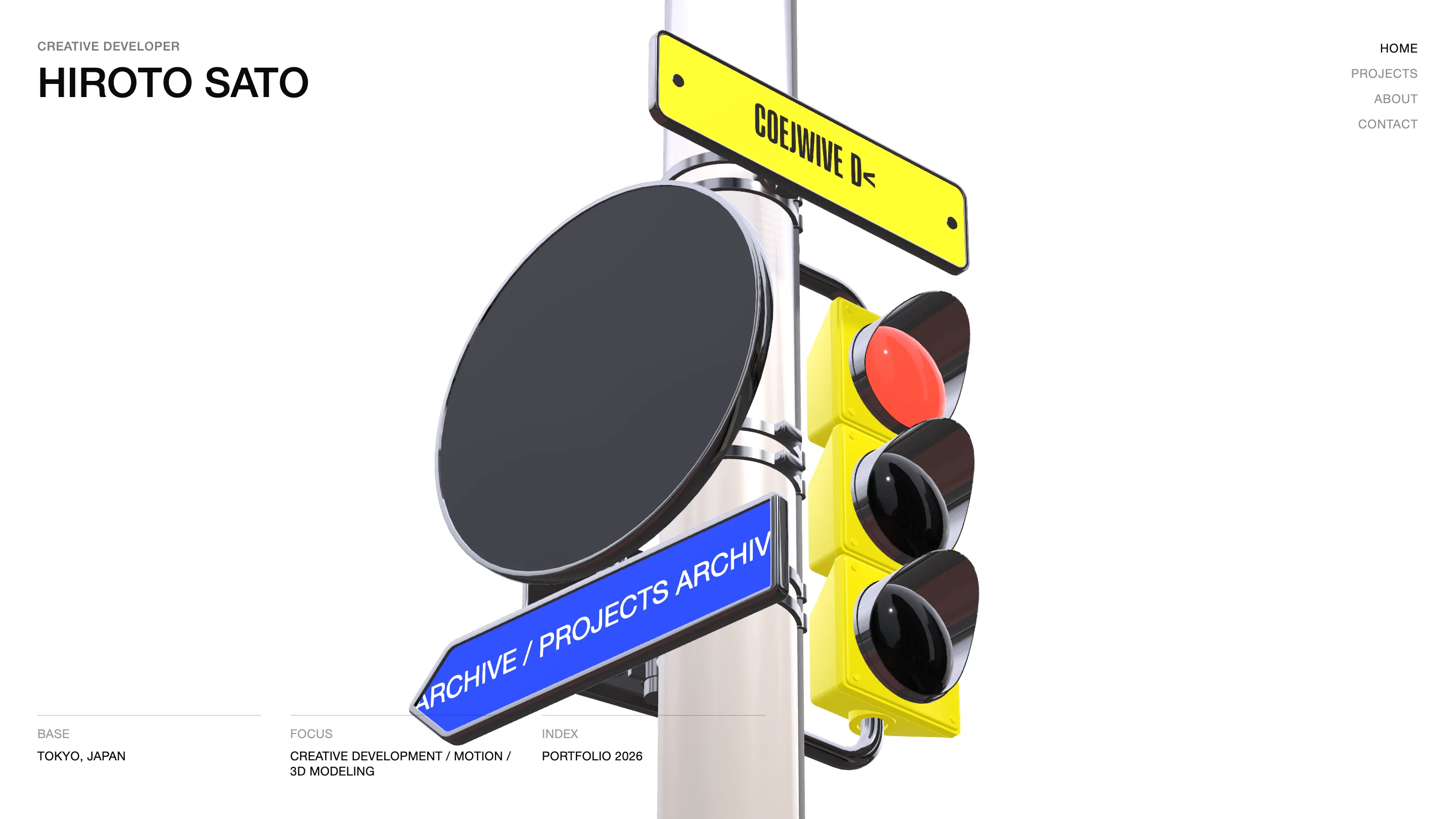
Hiroto Sato's portfolio took awwwards Site of the Day today, and a Developer Award with it. I get why. It's a creative developer's site out of Tokyo, and instead of a menu bar doing the wayfinding, the homepage builds a small 3D street corner: a chrome pole, a glossy traffic light, and road signs that point you toward the archive and the projects. The navigation is the art direction. That's the move I keep coming back to.
The nav is a physical object
Sato builds the navigation out of the same 3D craft the site is selling. The yellow sign runs a text-scramble as it settles, decoding into place, while a blue 'ARCHIVE / PROJECTS' marker aims off to one side. Rendering the menu as street furniture does two jobs at once. It proves the WebGL and 3D chops a creative developer gets hired for, and it gives you a reason to look before you click. The restraint is the other half of it. One scene, three signs, a lot of white around them.
The index framing
Down the left he sets his name in a big grotesk, with 'CREATIVE DEVELOPER' as a quiet overline above it. The bottom of the screen carries a small meta row: BASE, Tokyo. FOCUS, creative development, motion, 3D modeling. INDEX, Portfolio 2026. It reads like the cover of a print annual, and it does the positioning in about a dozen words. You know who he is, where he works, and what he makes before you scroll.
The work rail earns the hero
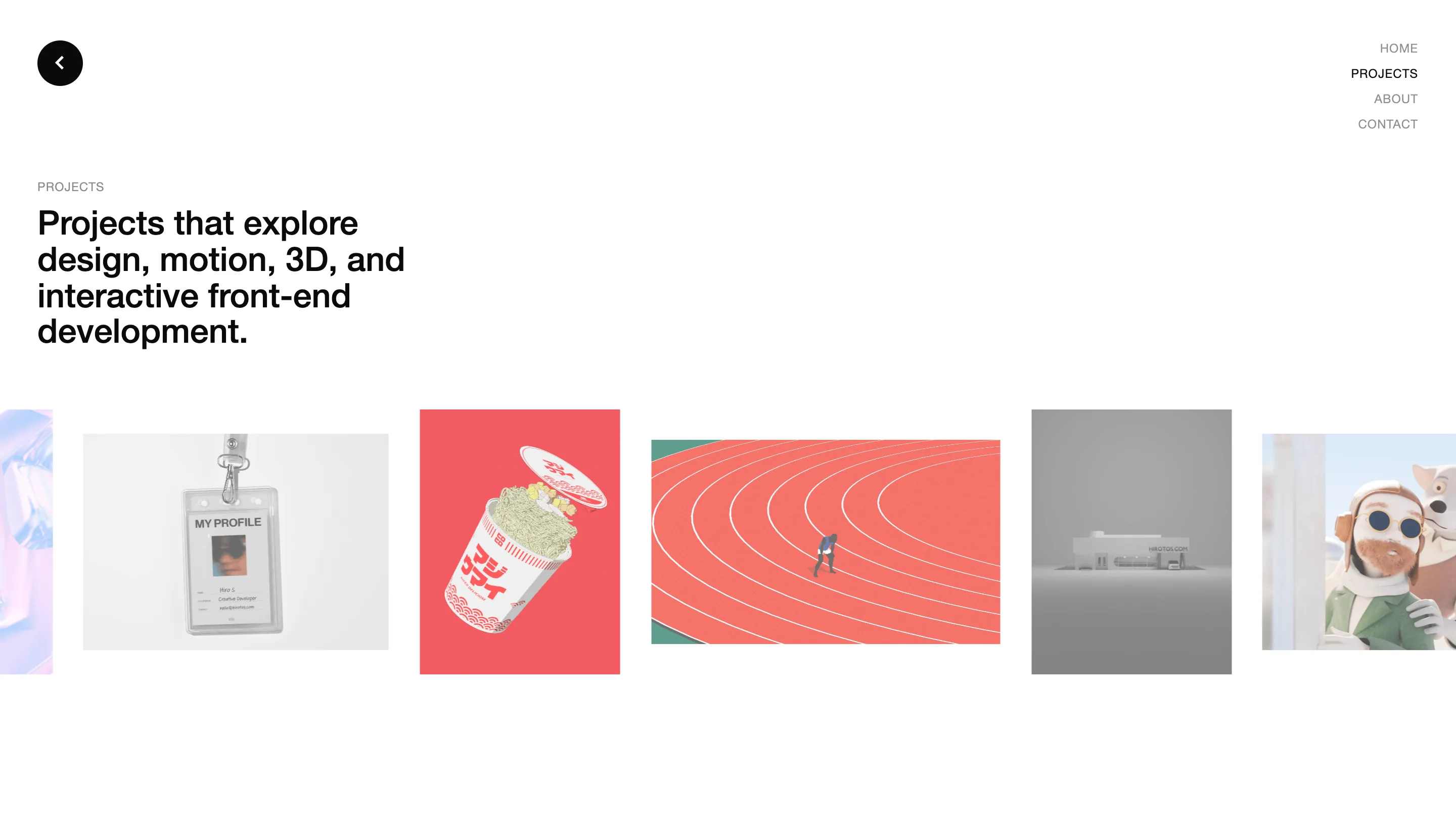
Click into Projects and the promise holds. A line of thumbnails runs across the page: an iridescent blob, a lanyard ID card reading MY PROFILE, a cup-noodle render with katakana on the label, an aerial of a red running track with a single runner, a grey model of a building signed HIROTOS.COM, a claymation figure in a green jacket. Every tile sits in a different 3D or motion register, so the rail doubles as a range reel. The headline stays plain on purpose: 'Projects that explore design, motion, 3D, and interactive front-end development.' He lets the images carry the weight.
What I'd borrow
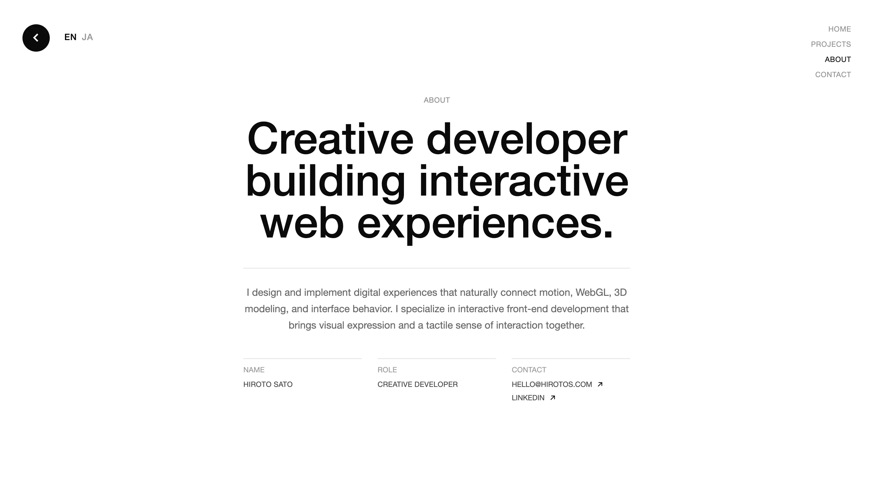
The About page is the calmest screen on the site. One oversized line, 'Creative developer building interactive web experiences', an EN/JA toggle, and a tidy NAME, ROLE, CONTACT row. After the 3D theatrics up front, the plainness lands harder. Here's the lesson I'm taking. Pick one idea that only your medium can pull off, spend the whole budget on it, and keep every other screen quiet. For a creative developer that idea is the interactive hero. For the rest of us it might be a single motion, one photograph, a type moment held a beat longer. Sato's version is a traffic light, and it works. See it live at hirotos.com.