Normal is Boring saves the italic serif for the word that matters
A property developer site that builds every headline from two typefaces and hands the punchline to an italic serif. My pick for the craft in the type.
My pick today is Normal is Boring, a site for a Spanish residential developer that took awwwards Site of the Day on July 23, 2026, along with the Developer Award. Built by the studio LaNegrita. What made me stop was the type. Every headline runs in a clean grotesque, and then the last word swaps to an italic serif and carries the whole sentence.
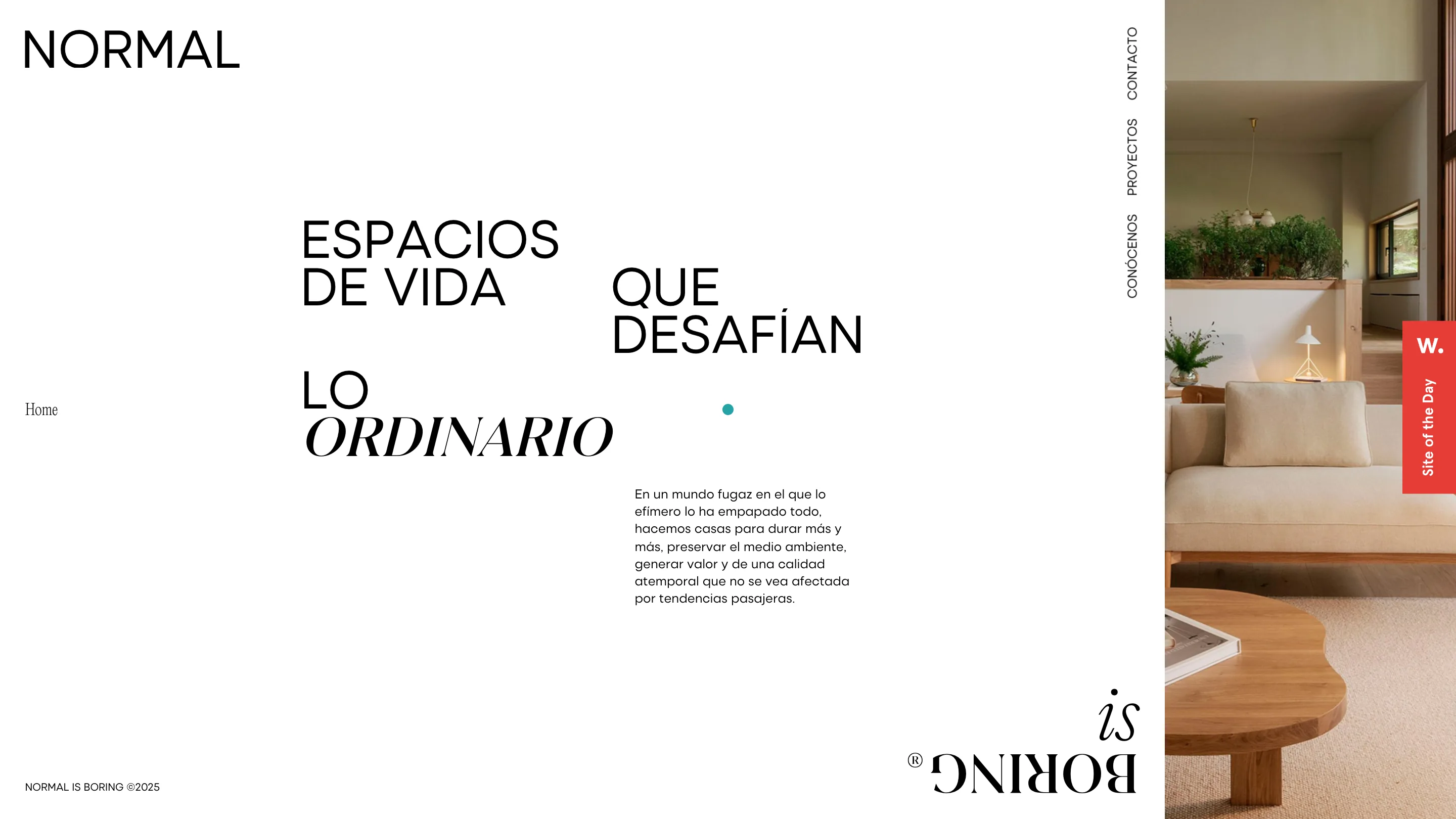
On the home page the line reads "espacios de vida que desafían lo ordinario." Everything is set in a tidy uppercase sans, big and matter-of-fact, until ordinario, which arrives in a large italic Didone. One word does all the emotional work. The projects page pulls the same move: "proyectos que redefinen los espacios y lo extraordinario," and again the italic extraordinario is the payoff. It's a small idea, executed with real discipline. The restraint is the point.
The words are scattered, not stacked
The headline isn't a neat left-aligned block. The words sit staggered across a wide canvas with gaps between them, so your eye travels the sentence instead of reading it in one gulp. A single accent dot floats in the negative space. There's a lot of air here, and the layout trusts it. For a developer selling homes as "timeless," the slow read matches the pitch.
The palette flips per route
Here's the detail I'd steal. The home page is warm off-white. Click into projects and the whole thing inverts to black with white type, same layout, opposite palette. Even the accent dot changes color: teal on the home page, coral on projects. It works as wayfinding without a single label. You know you've moved because the room went dark.
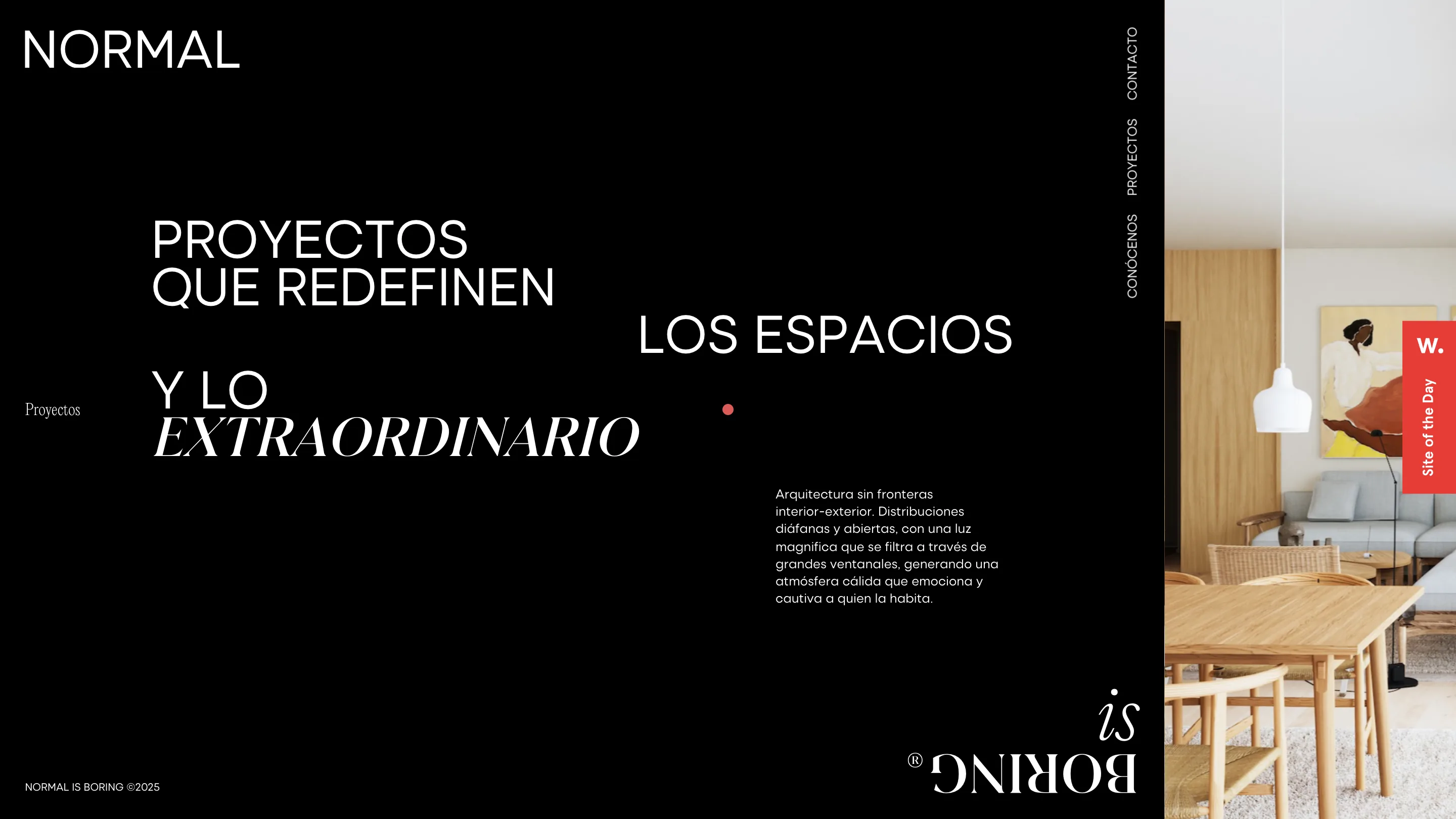
Both versions carry the same warm architectural photography on the right third: oak, limestone, wishbone chairs, a wavy-edged wood coffee table. The imagery is calm and the type does the talking, which is the correct division of labor for this kind of work.
The project name becomes the image frame
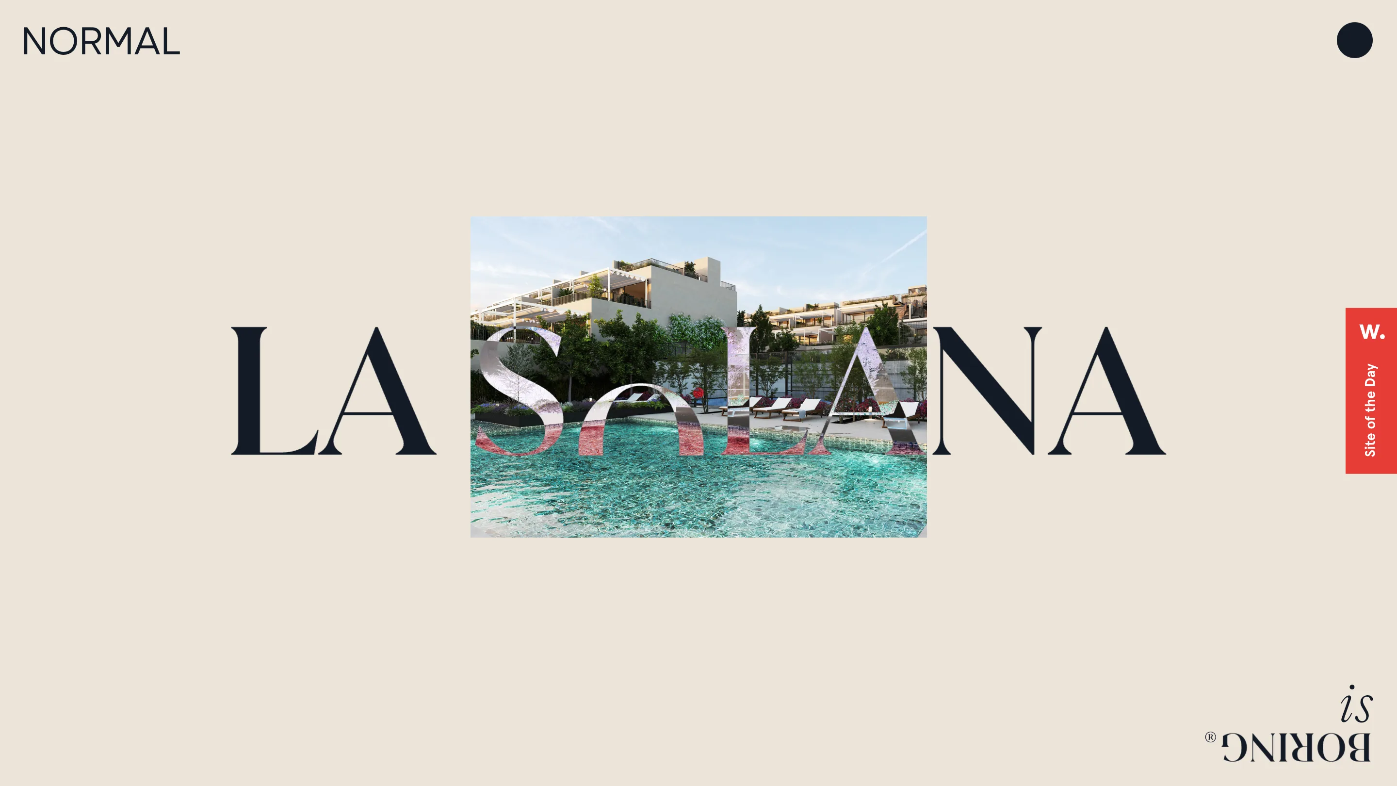
The best single moment is on the project pages. Open La Solana and the name is set huge in a navy serif, and the render of the development sits clipped inside the letterforms. The pool and the apartments show through the middle of the word. The type isn't sitting next to the image, it is the window onto it. It's an old idea, text as mask, but here it's tied to the one thing a buyer wants to picture, and that makes it land.
The signature detail
Down in the bottom-right corner, on every page, the "Normal is Boring®" wordmark sits rotated a full 180 degrees, upside down. It's a small joke that fits the name, and it anchors the corner the way a stamp would. The vertical rotated nav on the right edge keeps the same logic: quiet, sideways, out of the way until you need it.
What I rate here is the confidence to do less. Two typefaces, one accent color per state, a lot of white space, and one clever type-as-frame trick reused with restraint. The move I'd take into my own work is the single italic word at the end of a grotesque line. It costs nothing and it gives a headline a voice.
Featured: LaNegrita