House of Honey writes a giant pink script across every room
An interior studio running one signature move on every page: an oversized hot-pink script laid over the photography, with a small serif title sitting on top of it.
House of Honey took awwwards Site of the Day on 14 July, and it's the most confident use of type over photography I've seen in a while. Edoardo Lunardi built it for an interiors studio, which means the photography has to carry the sale, and the whole design is about how to put words on those pictures without dulling them.
The masthead is a real lockup
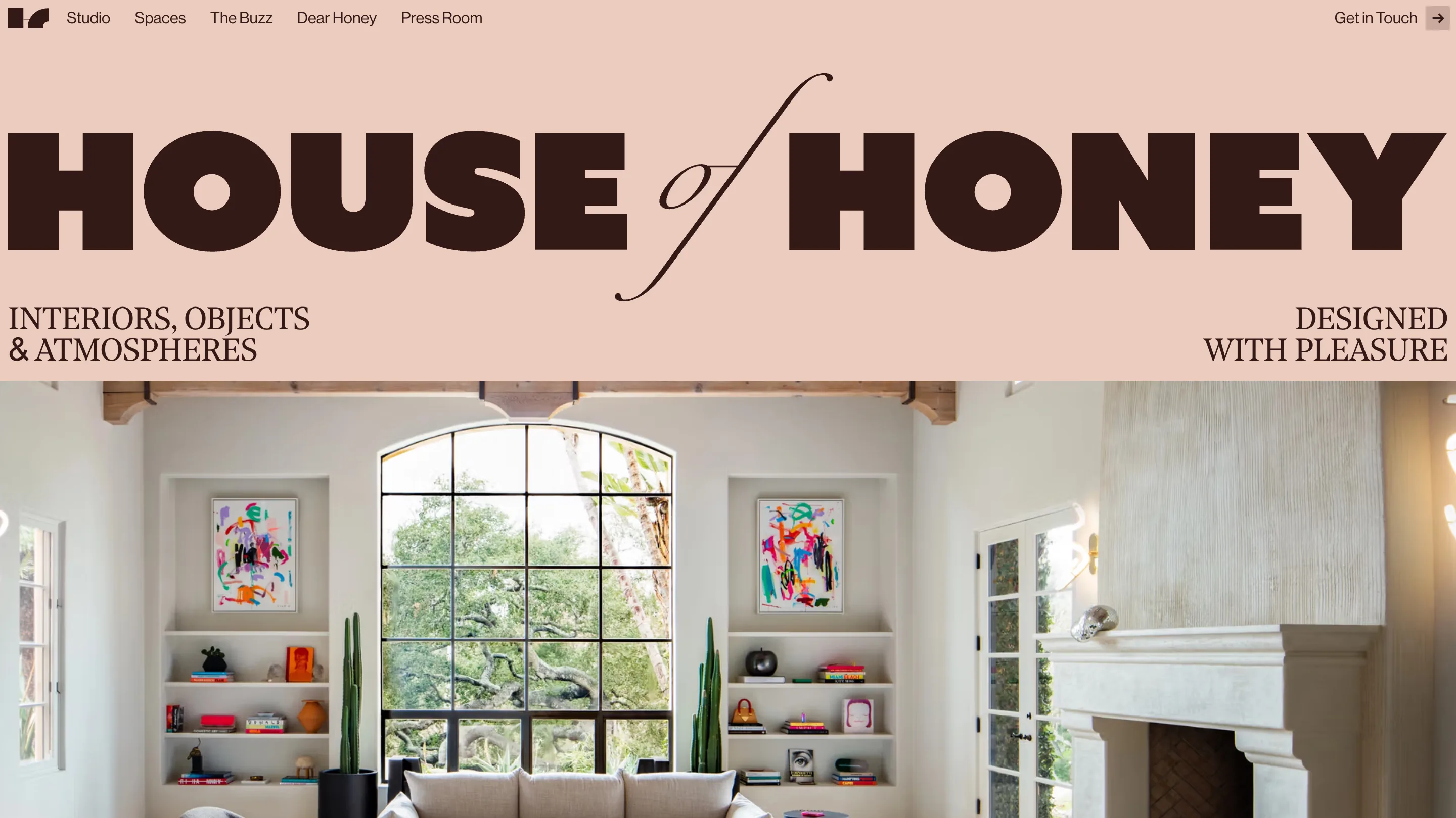
The home opens on a blush band with HOUSE of HONEY set enormous in chocolate brown. The word 'of' is the detail: it's a fine italic script, dropped between two heavy grotesk words, with its tail swinging under the baseline. That contrast is doing the work a logo usually needs a mark for. Underneath, two lines of serif caps sit in opposite corners, INTERIORS, OBJECTS & ATMOSPHERES on the left and DESIGNED WITH PLEASURE on the right, so the band reads like the cover of a magazine before you scroll into the first room.
One move, repeated with discipline
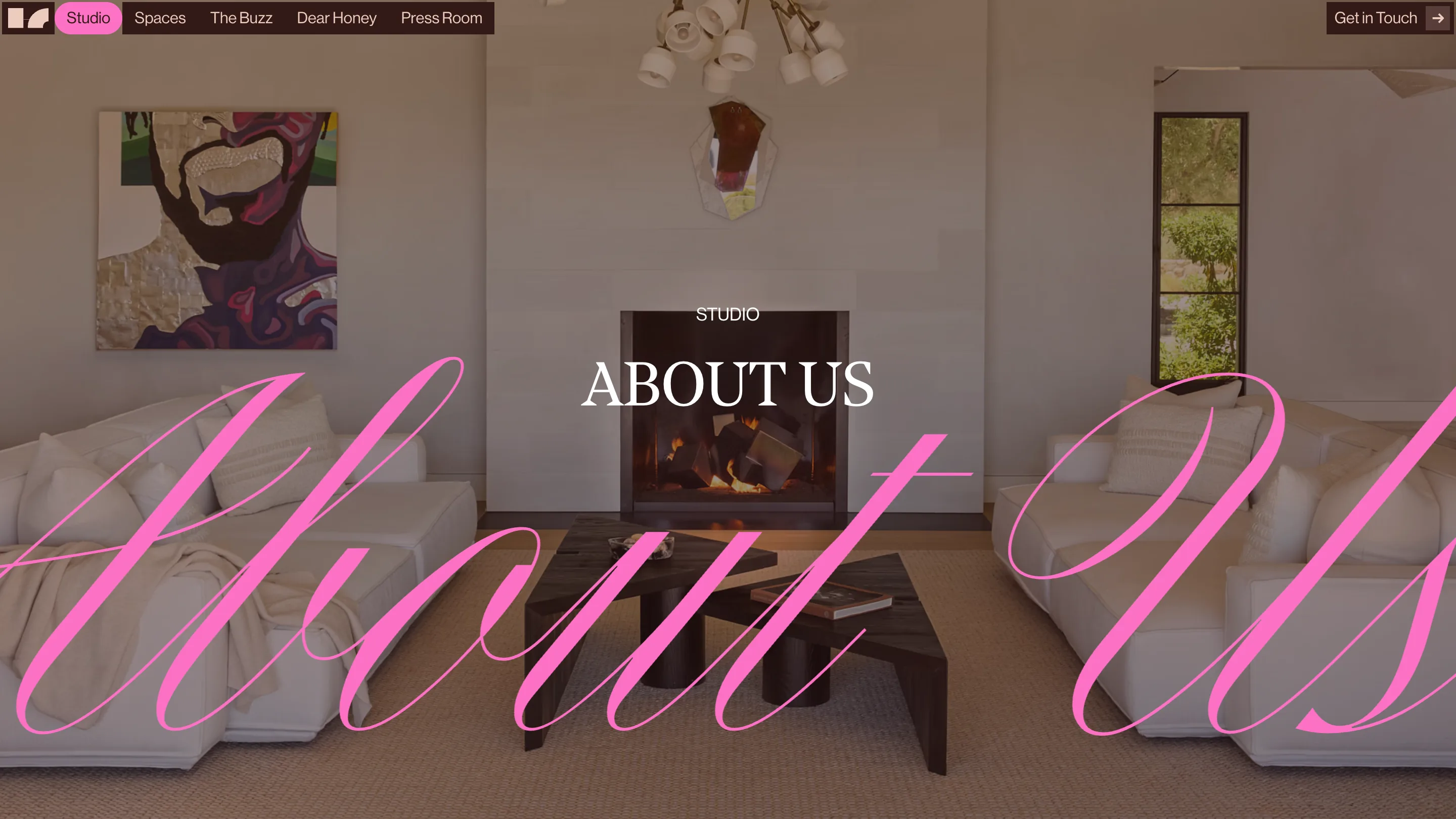
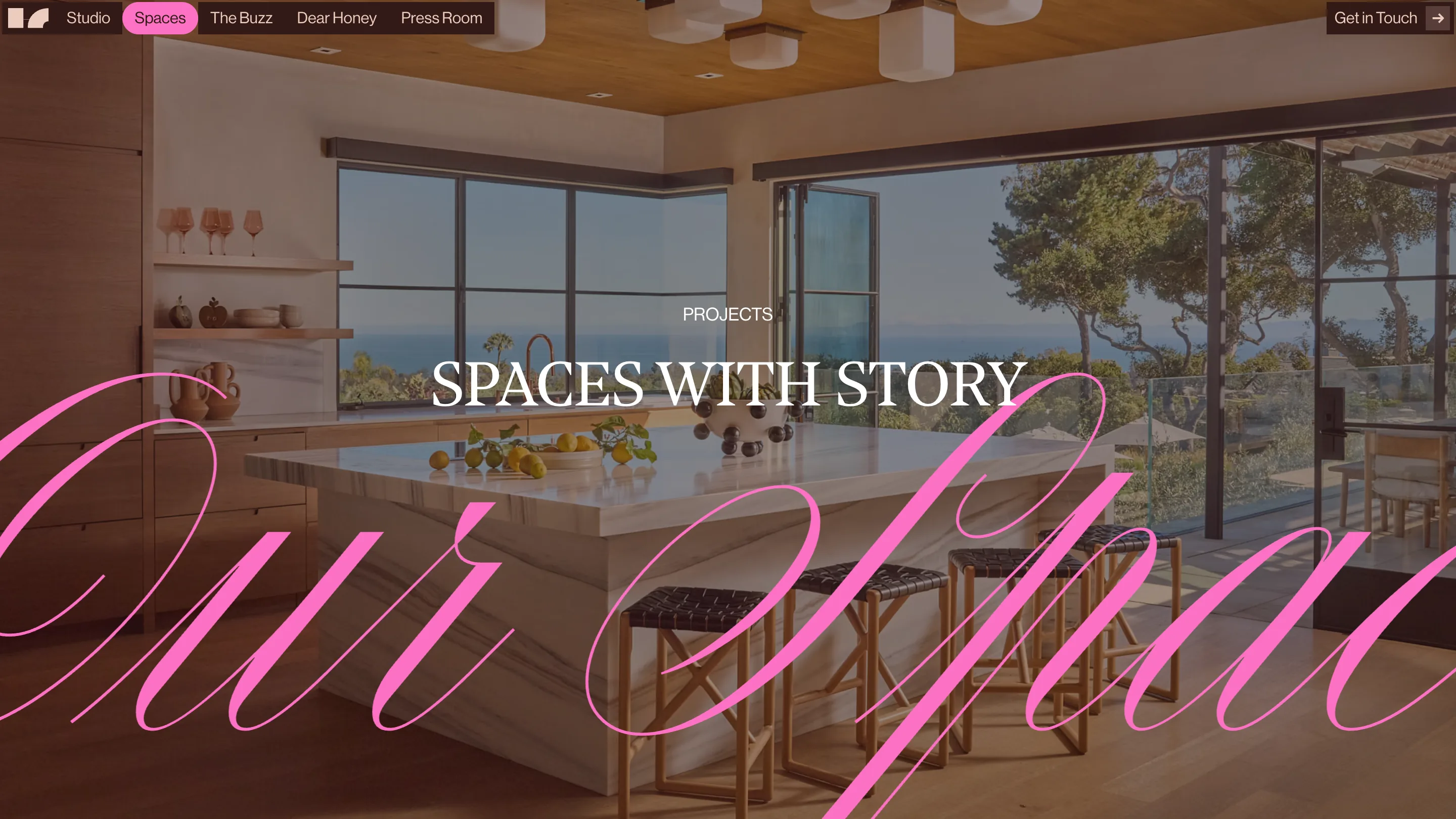
Every section page does the same thing. A full-bleed interior photograph, a small label in white caps, a serif title centred, and then a hot-pink script word running right across the frame at a size that ignores the edges of the screen. Studio gets 'About Us'. Spaces gets 'Our Spaces'. The script is set semi-transparent so the room still reads through it.
What I like is the restraint underneath the loudness. The pink only ever appears as that script and as the active pill in the nav. Everything else stays brown, cream, white. It's a single gesture with a rule attached, which is why it reads as a system rather than a decoration, and it means every new project page is already art directed before anyone opens the file.
The naming does brand work
Look at the nav: Studio, Spaces, The Buzz, Dear Honey, Press Room. Two of those are ordinary and three carry the brand. 'Dear Honey' as the name for an enquiry section tells you the tone of the studio faster than an about page would. I've sat in too many projects where the nav got labelled Services, Portfolio, Blog and all the personality lived in a paragraph nobody scrolls to. The names are free real estate.
What I'd borrow
The photograph is never dimmed. A lot of sites solve text-on-image with a black overlay at 40 percent, and the room goes grey. Here the type is either sitting in a solid band above the picture or set in a colour bright enough to hold its own against it. Same problem, better answer, and the client's work stays the brightest thing on screen.
See it live at houseofhoney.com.
Featured: Edoardo Lunardi