Longbow frames every car inside a visible design grid
A limited-edition car brand that leaves the layout grid switched on, selection handles and all, and uses it as brand furniture. The type system is the other half.
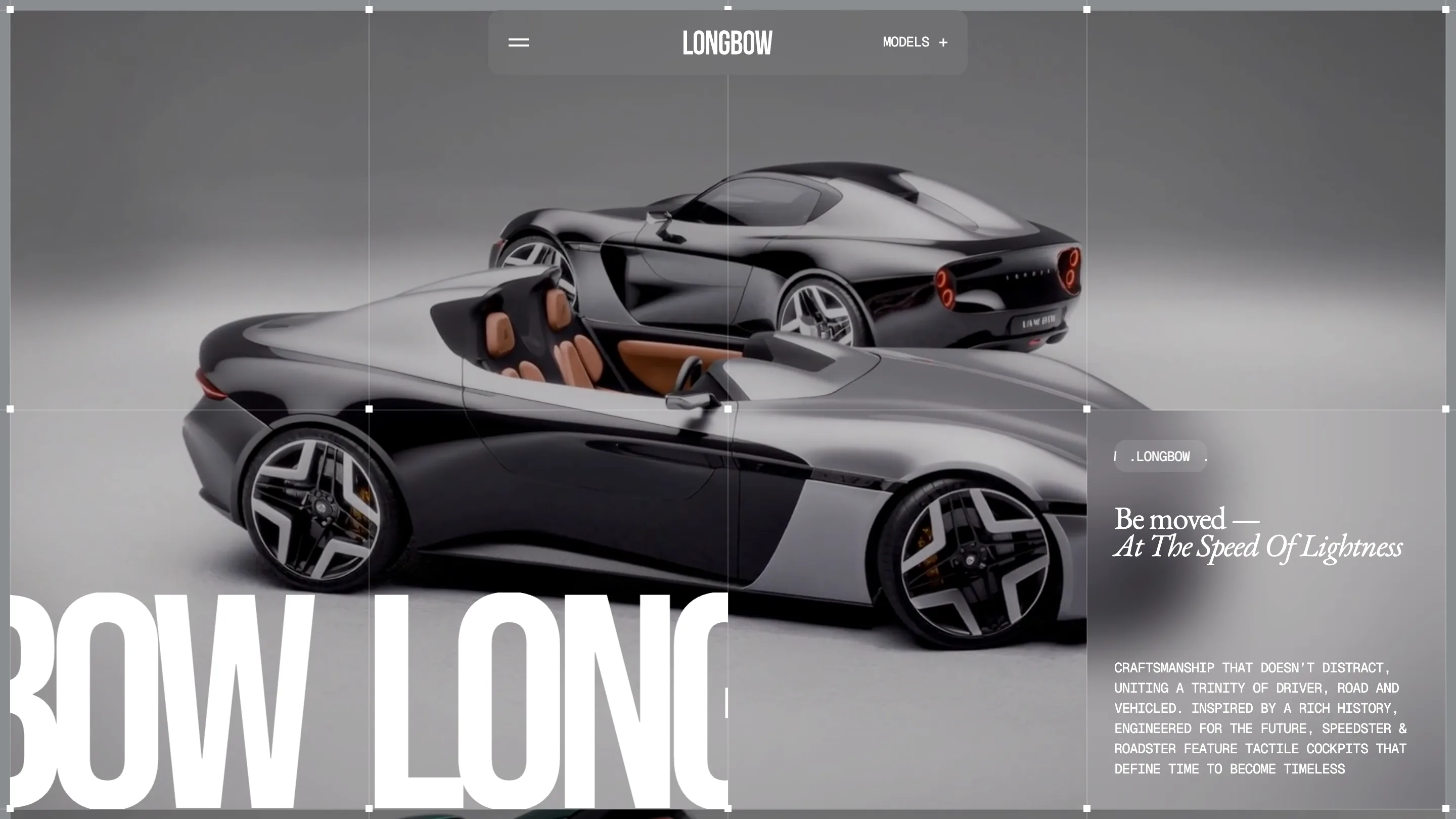
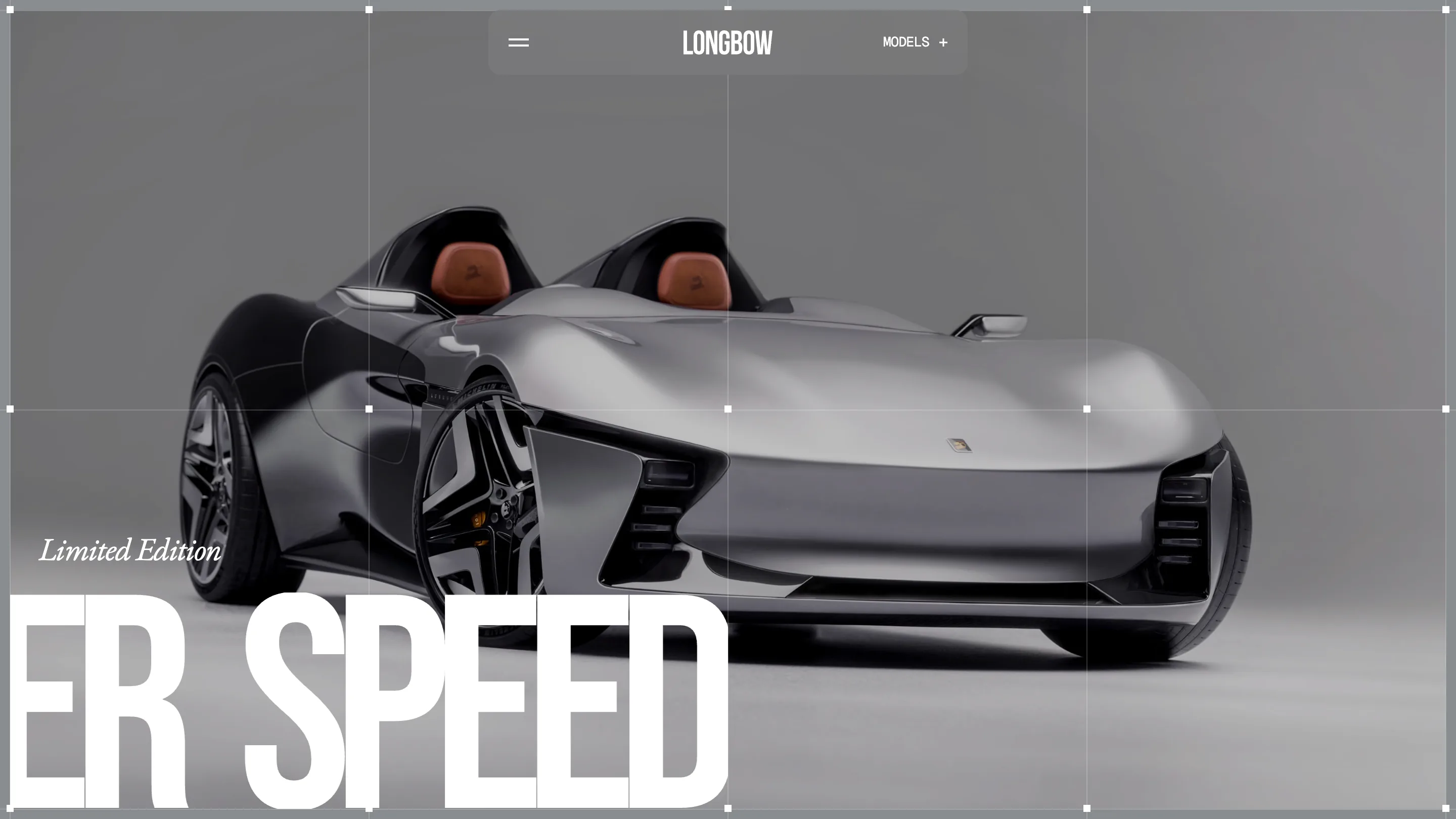
Longbow took awwwards Site of the Day on 12 July. It's a limited-edition sports car brand built by Digital Butlers, and the device I keep thinking about is the grid. Thin white rules cross the viewport with small square handles sitting on the intersections, exactly like an object selected on a design canvas. The car sits inside that frame as if someone left it selected.
Design-tool chrome as brand furniture
It shouldn't work. Selection handles are interface, not identity. But for a company whose pitch is engineering, a permanent measuring frame around the product reads as blueprint rather than decoration, and it gives every page a structure to hang on. It also quietly tells you the car is a render, which is honest, and it makes the studio-grey backdrop feel like a set instead of a stock scene.
The nav plays the same game: a small translucent pill holding a hamburger, the wordmark, and MODELS with a plus. Nothing else floats. Everything on screen is either the car, the frame, or one of three type registers.
Three voices, each with a job
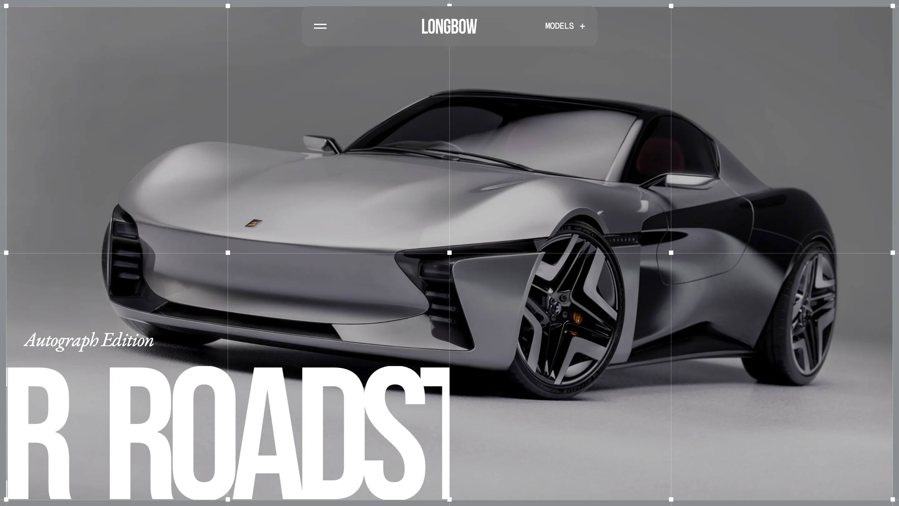
The typography is the part I'd take to a client. A huge grotesk runs as a cropped marquee along the bottom, so you only ever see a fragment: BOW LONG, ER SPEED, R ROADST. A serif italic carries the romance, 'Be moved at the speed of lightness', 'Limited Edition', 'Autograph Edition'. A monospace in caps handles the technical paragraph. Three faces, three jobs, and no confusion about which one is speaking. Most brands would have picked two and made one of them do everything.
The template repeats and that's the point
Speedster and Roadster are the same page. Same camera angle, same backdrop, same grid, same corner labels. Only the car and the edition line change. It makes the two models read as one family and turns the site into something closer to a configurator than a brochure. When you're selling two products, resisting the urge to art direct them differently is the harder and better call.
What I'd change
The words. The technical paragraph reads 'uniting a trinity of driver, road and vehicled', with the typo sitting there in monospace caps, and closes on 'tactile cockpits that define time to become timeless', which I've read four times and still can't parse. On a site this controlled, the copy is the only thing that isn't. A brand that spends this much care on a grid should spend an afternoon on twelve sentences.
See it live at db-longbow.webflow.io.
Featured: Digital Butlers