PP Neue Montreal publishes its type specimen as a travel guide
A typeface microsite that borrows the format of a 1960s tourist brochure, and lets the city and the font share the same chapters. The conceit does real work.
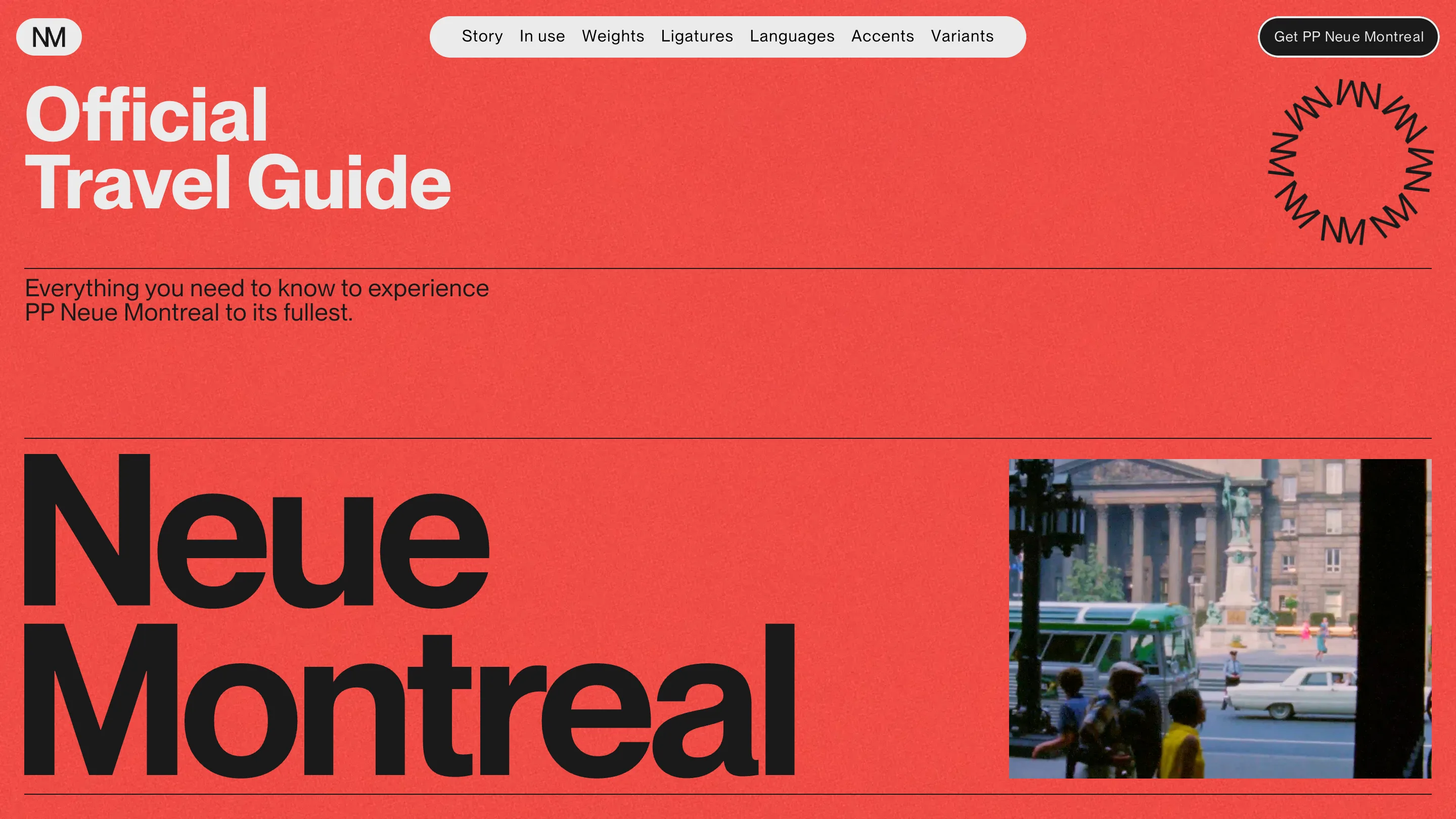
PP Neue Montreal took awwwards Site of the Day on 13 July, and it's my favourite kind of idea: one that solves a boring brief with a borrowed format. A type specimen has to show weights, ligatures, language coverage. Nobody reads that. So Demande Spéciale published it as the Official Travel Guide to Montréal, and suddenly every one of those sections is a chapter you'd actually turn to.
The pun is the architecture
Read the nav: Story, In use, Weights, Ligatures, Languages, Accents, Variants. Half of those work in both registers at once. Accents is a typographic feature and a thing you hear in a city. Languages is script support and what people speak. The conceit isn't painted on the surface, it's holding the information architecture up, which is why it doesn't wear thin after two screens.
The dressing is 1960s tourism print. Flat vermillion with a paper grain, headline in a heavy grotesk, a badge built from rotated M and W letterforms, and a period photograph of a Montréal street with a green bus and a boat-sized sedan. It looks like something you'd find in a drawer, and the typeface being sold is the same one setting the brochure.
It commits to the bit
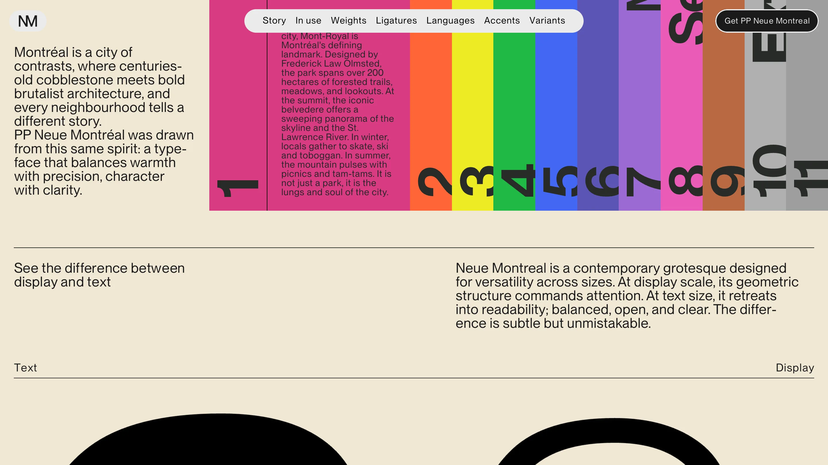
Here's where it earns the award. The story section actually teaches you about the city. There's a panel on Mont-Royal that names Frederick Law Olmsted as its designer, gives the park at over 200 hectares, and talks about skating in winter and tam-tams in summer. Real guidebook copy, sitting inside a band of numbered colour stripes that works as a chapter index. Next to it the type argument: a typeface drawn from a city where old cobblestone meets brutalist concrete, balancing warmth with precision.
Then it does the specimen job properly anyway. A display-versus-text comparison, with the line I'd steal for a client deck: at display scale the geometric structure commands attention, at text size it retreats into readability. That's a designer explaining an optical size decision in one sentence, no jargon.
Numbers instead of adjectives
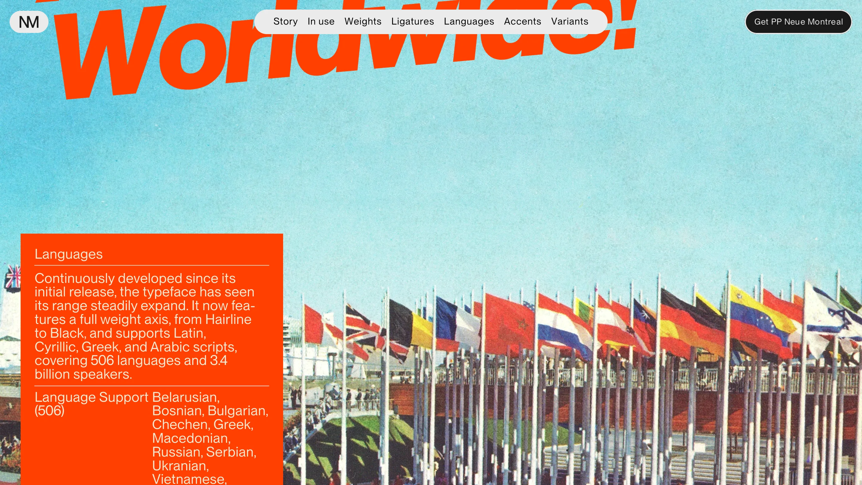
The Languages chapter runs a vintage shot of flag rows with a huge italic 'Worldwide!' cutting off the top of the frame, and the panel does the selling with figures: a full weight axis from Hairline to Black, Latin, Cyrillic, Greek and Arabic, 506 languages, 3.4 billion speakers. Then it lists the languages. No claim about global reach, just the count and the receipts.
What I'd borrow
Find the second format. When a page has to carry dry, obligatory content, look for an existing genre with its own furniture and conventions, then map your sections onto its chapters. Travel guide, field manual, menu, race programme. The reader gets a frame they already know how to read, and you get an art direction brief for free. I have a client with a very long technical spec list, and this is the first idea I've had for it in weeks.
See it live at neuemontreal.com.
Featured: Demande Spéciale