RISK builds its studio site out of edit-suite furniture
A Paris post-production studio that borrows its interface from the tools it works in: timecode, director credit, column rules, and a wordmark that refracts the footage behind it.
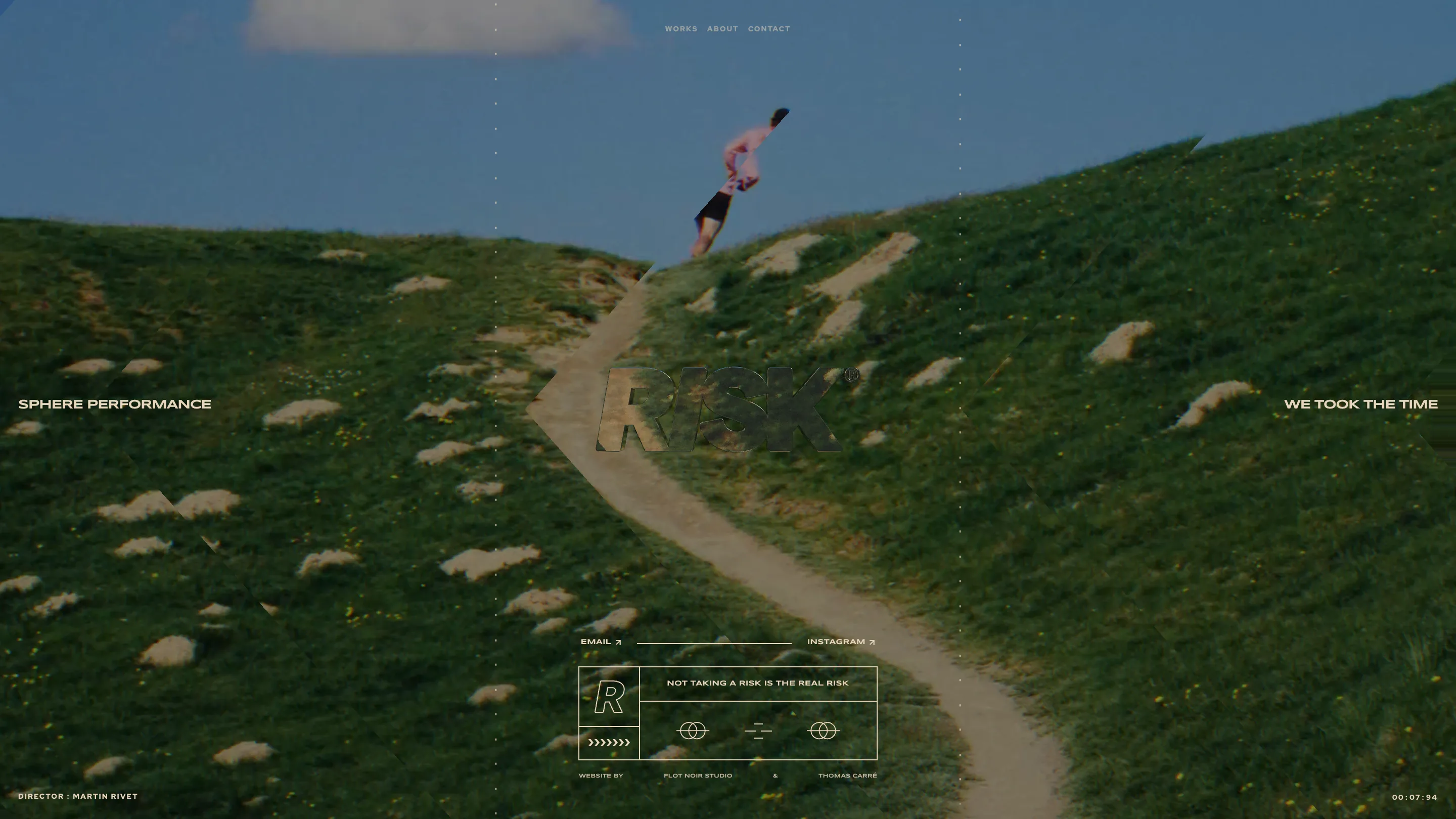
RISK took awwwards Site of the Day on 15 July, and the reason it works is that the studio built its site out of the furniture of its own craft. This is a Paris post-production house, so the chrome is an edit suite: a running timecode in the bottom corner, a director credit in the other, dotted vertical rules splitting the frame into columns like a reference grid. FLOT NOIR made it with Thomas Carré, and the whole thing behaves like a viewer you're sitting in front of.
The wordmark works like a lens
The home is a full-bleed still of a runner cresting a green hill, and the RISK wordmark sits dead centre as a glass knockout. The footage refracts through the letterforms rather than sitting behind them. It's a small thing and it does a lot: the logo stops being a sticker on top of the video and becomes something the video passes through. For a studio that sells colour and finishing, that's the portfolio piece and the mark in one move.
Around it, the labels stay flat and functional. SPHERE PERFORMANCE on the left, WE TOOK THE TIME on the right, DIRECTOR : MARTIN RIVET along the bottom, and a timecode reading 00:07:94. Nothing is styled as marketing. It reads like metadata, which is exactly the register a post house should be speaking in.
A second register for the brand
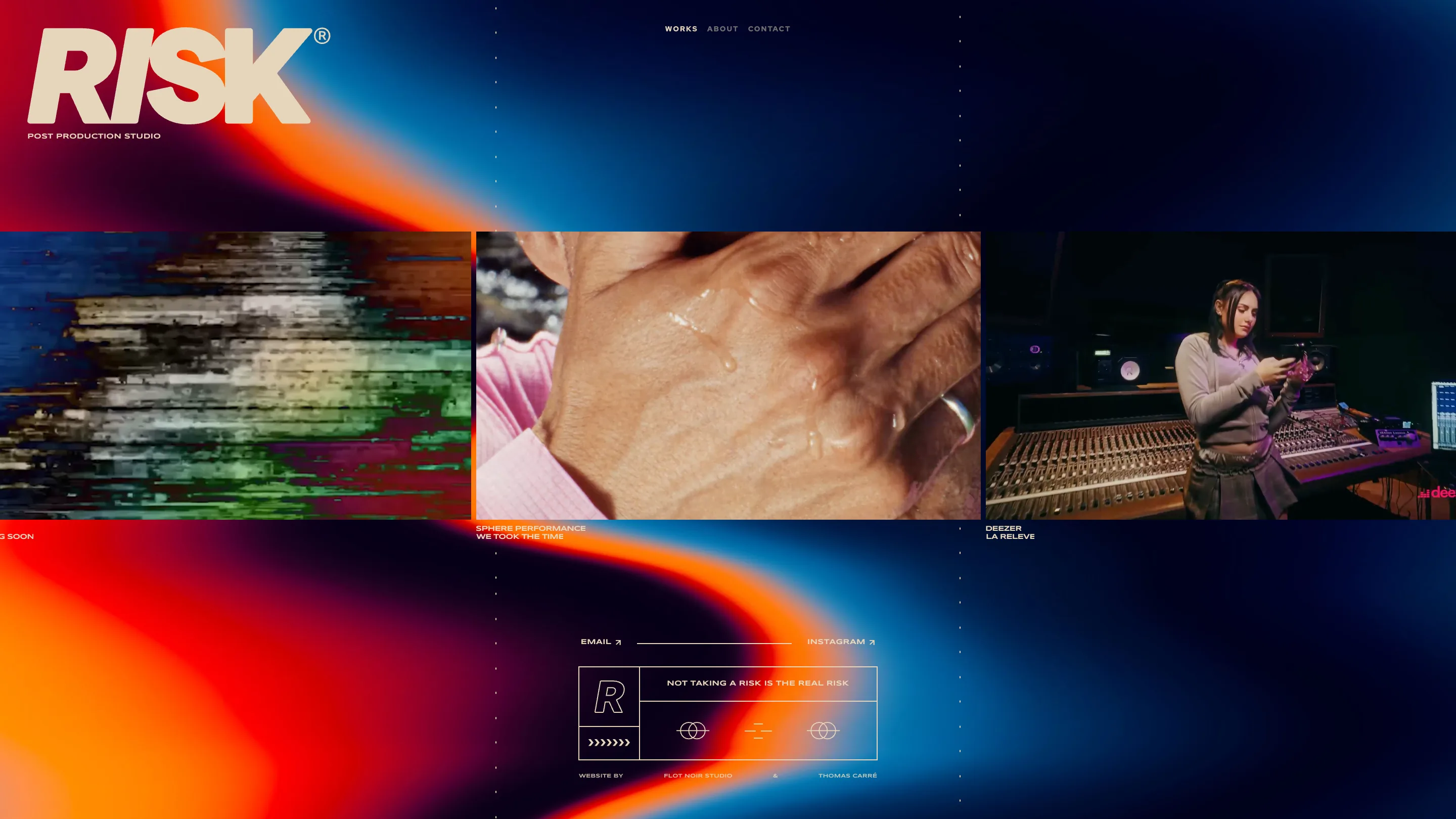
Click into Works and the grass is gone, replaced by an orange and blue bloom that looks like a thermal read. It's a strong choice. The footage is naturalistic, so the brand layer around it goes fully synthetic, and the two never compete. Three stills sit in a row: a datamosh frame smeared into RGB, a close-up of a hand beaded with water, a woman at a mixing desk for Deezer. No descriptions, just client and project. If the frames are good enough, that's all the copy you need.
The overlap I'd argue about
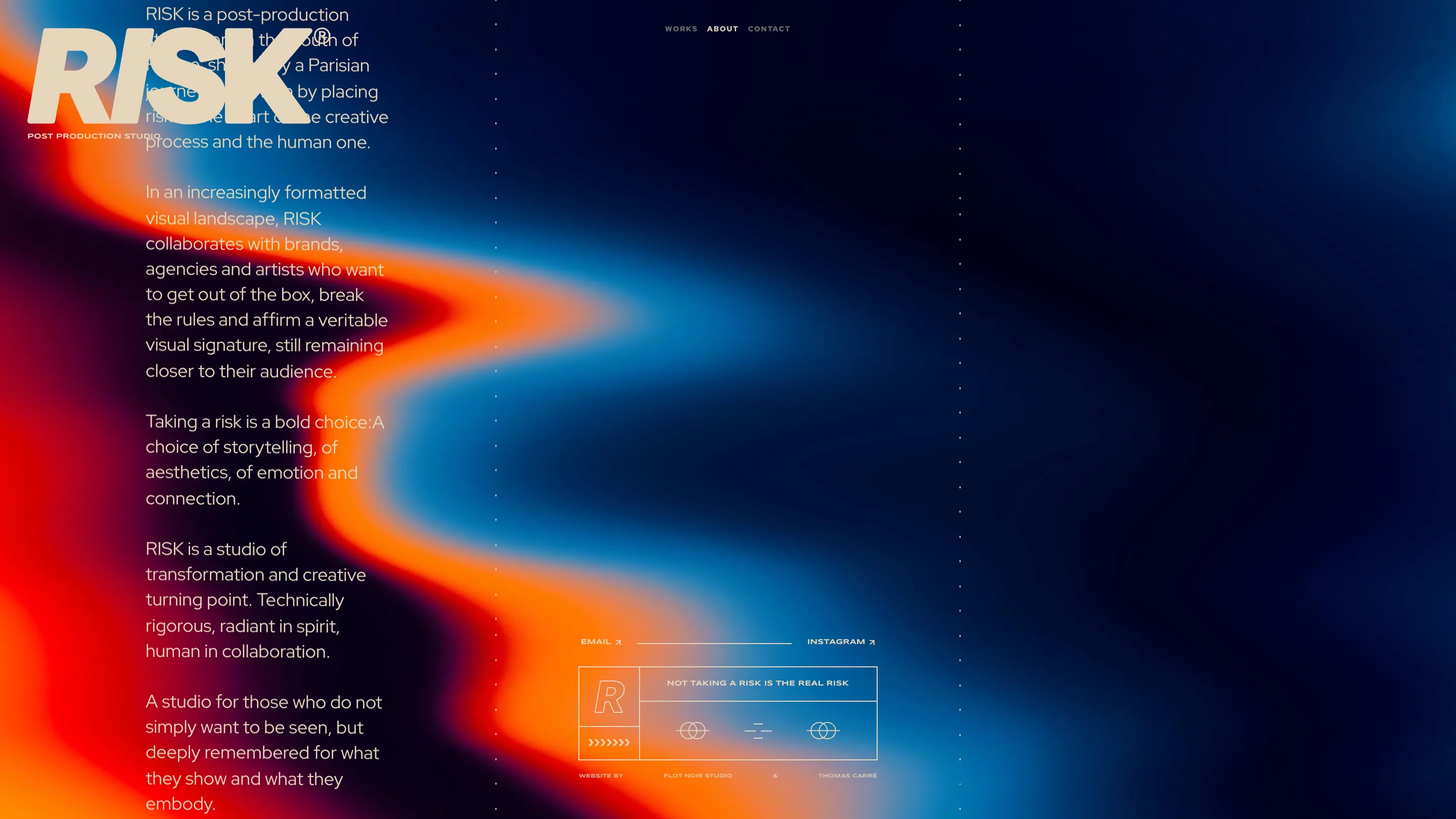
About runs the manifesto in a narrow column on the left, and the big wordmark sits right on top of the opening paragraph. The first four lines are genuinely hard to read. I go back and forth on it. It's a deliberate collision and it looks good in a screenshot, but the sentence it eats is the one explaining what the studio is. I'd keep the overlap and start the copy one block lower.
What I'd borrow
The persistent module in the footer: a bordered box with a big R, the line NOT TAKING A RISK IS THE REAL RISK, and a row of small technical glyphs. It repeats on every page and works as a stamp, so the site feels signed rather than templated. A fixed brand module in a functional frame costs almost nothing and gives a small site a spine. That one's going in my notes.
See it live at risk.film.
Featured: FLOT NOIR