The archive page: StageCrew publishes the work that never shipped
StageCrew gives its discarded experiments a page in the main nav, with catalogue numbers and credits. I'd steal the whole idea, and the split-column layout it sits in.
StageCrew keeps a page for the work that never shipped, and I think it's the best idea on their site. It's called Backstage. It sits in the top nav next to Work and Info, same size, same weight, and it holds experiments, discarded concepts, branched versions of old jobs. I found it on Minimal Gallery and went straight past the portfolio to that.
The archive page, and why it reads as confidence
Most portfolios show finished work with a client name attached. An archive page shows the versions that lost. StageCrew, a small international studio that works mostly around cultural spaces, catalogues theirs like a library: SC.A—25 for an external business card, SC.B—26 for a piece of internal kinetic typography called Full Disclosure. Each entry gets a code, an internal or external tag, and where there's a person behind it, a name. The business card credits Dustin Popiel.
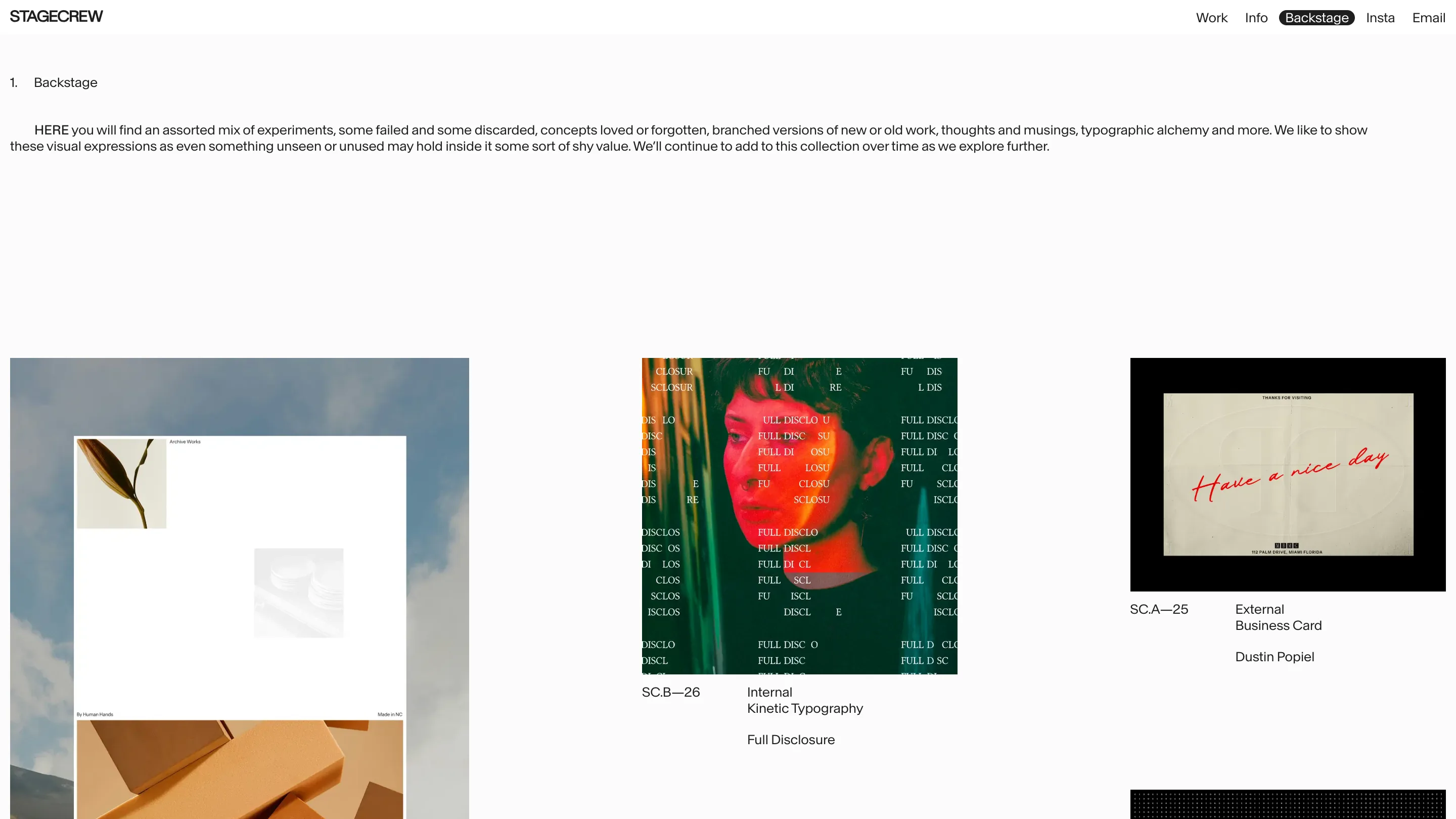
The codes are what sell it to me. Numbering the discards means somebody keeps them in a system, revisits them, adds to them. A folder of screenshots is a mood board. A numbered archive is a body of work. Their own line for the page is that something unseen may still hold some shy value, and the ID scheme is what turns that from a nice sentence into a habit.
The split column doing the quiet work
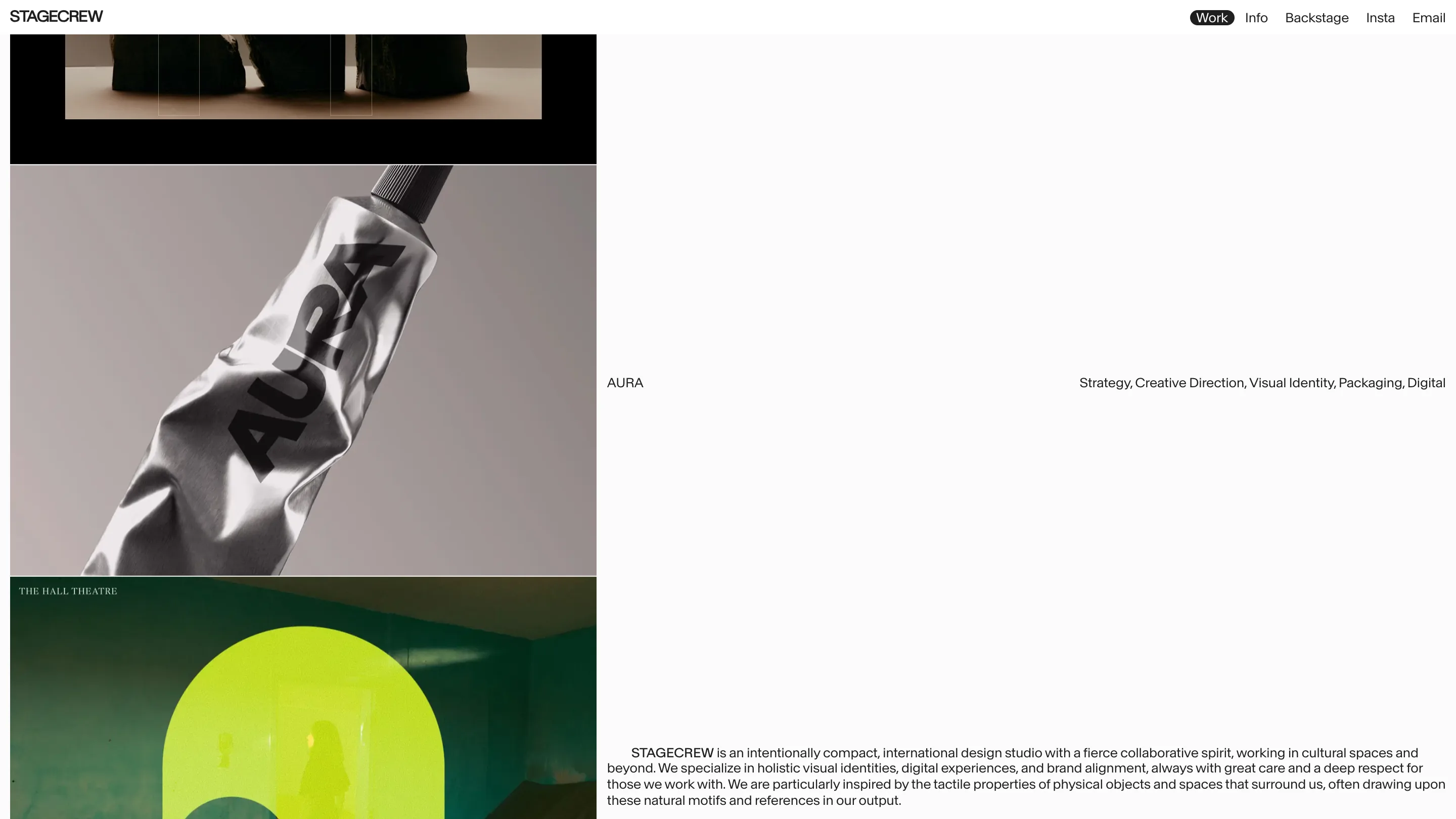
The home page runs on one asymmetric split. Images stack down the left, taking maybe 40% of the width. Everything written lives on the right. Project names sit at the left edge of that text column and the service list sits flush right on the same baseline, so AURA and "Strategy, Creative Direction, Visual Identity, Packaging, Digital" bookend one long line. It reads like a catalogue caption, and it means you can scan either edge and get a different index of the same work.
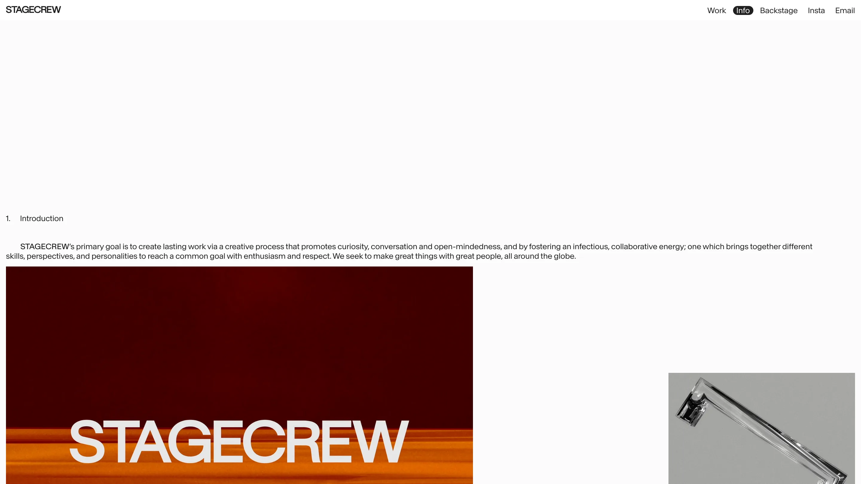
The Info page keeps the same manners and borrows a few more from print. Sections are numbered (1. Introduction). The opening paragraph carries a first-line indent. The first word runs in caps as a lead-in, so STAGECREW and HERE do the job a drop cap would. Small moves, and they're the reason a page that is mostly empty off-white still feels set rather than unfinished.
One piece of chrome in the whole interface
The nav is plain black text on off-white. The only decoration anywhere is a black rounded pill behind the active item. That's it. No underlines, no hover borders, no color. When a site holds this much empty space, every extra box you add reads as noise, and they clearly knew it. Restraint is easy to claim and hard to hold for three pages.
What I'd keep
The archive page, first, with an ID scheme attached so it accumulates instead of drifting. The caps lead-in and the indent, because they cost nothing and they signal that somebody typeset the page. And the single pill: pick one piece of chrome, use it for one job, delete the rest.
Found via Minimal Gallery. Site and work by StageCrew.
Featured: StageCrew