Bracketed labels: Serotoninn runs its whole shop like a spec sheet
A fashion store where every label sits in brackets and every filter value gets a marker scribble. Serotoninn annotates its own interface, and the trick holds the whole site together.
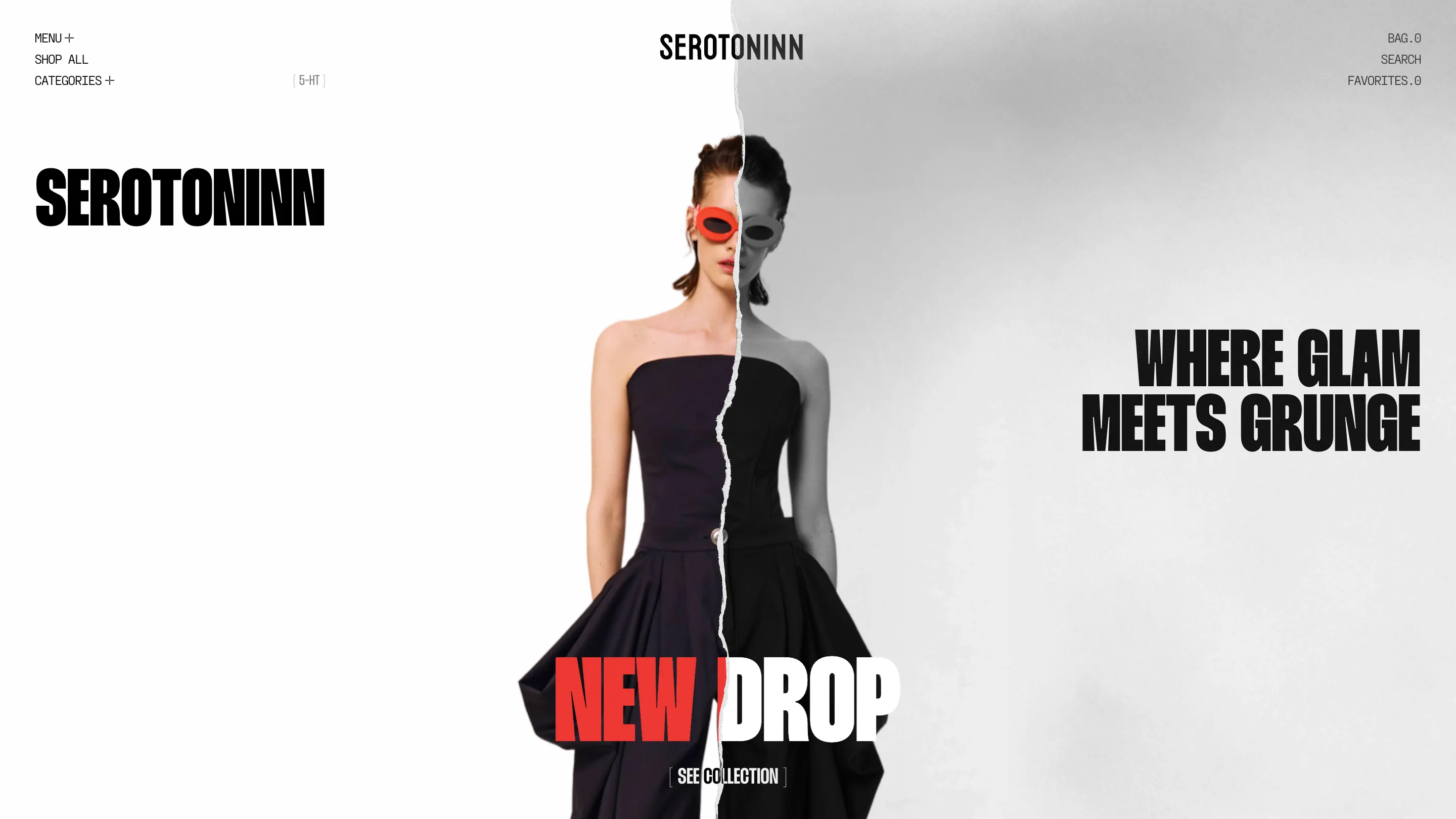
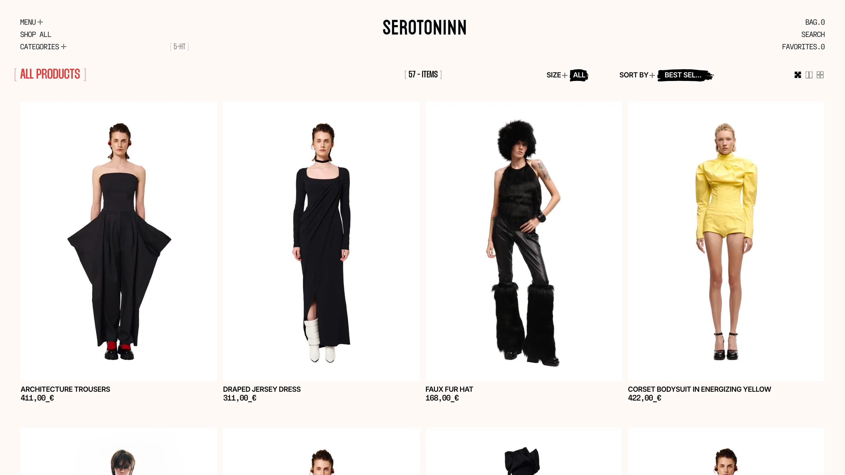
The thing I kept staring at on Serotoninn is the brackets. Every label wears them. The logo reads [5-HT], the catalogue header is [ ALL PRODUCTS ], the count next to it says [ 57 - ITEMS ], the hero button is [ SEE COLLECTION ]. The whole interface is annotated like a spec sheet, and once you clock it you read the site differently. This is a fashion shop by Blacklead Studio (BL/s), and I found it on minimal.gallery.
Bracketed labels as an interface signature
Here's why the bracket idea works. Serotoninn sets almost every control in a monospace face, and the bracket does the job an icon usually does: it frames a word so your eye reads it as a button, not as prose. The bag counter isn't a badge, it's BAG.0. Favourites is FAVORITES.0. Writing the count as a decimal is a small, odd choice, and it's the kind of detail that tells you one person cared about every string on the page.
The move I'd steal is the consistency. One annotation system, applied top to bottom, so the navigation, the filters, and the product counts all sound like the same voice. A lot of shops decorate the hero and forget the utility screens. This one carries the accent into the catalogue.
The torn seam in the hero
The homepage splits its model down the middle. The left half is in colour, warm, with red oval sunglasses. The right half is the same frame in black and white, and the two are joined by a ripped-paper seam running vertically through the body. The tagline sits to the right in a heavy condensed sans: WHERE GLAM MEETS GRUNGE. Then NEW DROP in red, torn across the same seam. It's a literal illustration of the pitch, and it earns the drama because the rest of the type is quiet.
Marker scribbles over the filters
The catalogue is where the personality really shows. Look at the filters: SIZE+ ALL and SORT BY+ BEST SEL…, each active value sitting on a hand-drawn black brush stroke, as if someone highlighted it with a marker. The grid runs four across on a cream ground, product shots on white cards, names in condensed caps. Even the prices get styled: 411,00_€, with an underscore holding the space before the euro sign. Nothing here is default. The filter row could have been a plain dropdown and instead it reads like a page someone marked up by hand.
The about page reads like a printed page
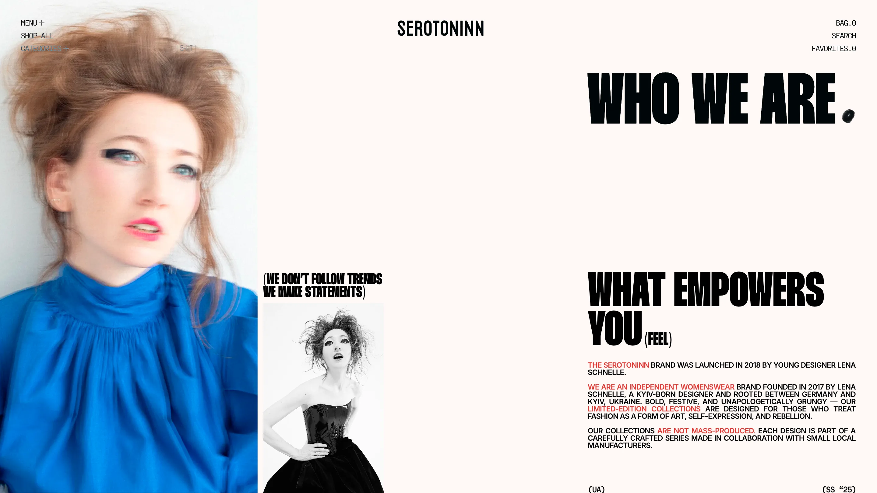
The story page is set like editorial. A big blurred portrait on the left, WHO WE ARE. in that same heavy condensed face with the full stop rendered as a black blob, and body copy justified into a tight column with the key phrases picked out in red: the brand name, an independent womenswear, are not mass-produced. Small parentheticals do the annotating instead of brackets here: (WE DON'T FOLLOW TRENDS WE MAKE STATEMENTS), (FEEL), and down in the corner (UA) and (SS '25). It's the founder, Lena Schnelle, a Kyiv-born designer, and the layout treats her copy like a printed spread rather than a scroll.
What I'd keep
The lesson I'm taking is that a single annotation system can carry a whole small brand. Serotoninn doesn't have a big budget's worth of custom illustration. It has one idea, the bracket and the marker and the decimal counter, and it runs that idea through every screen until the shop feels like a considered object. Credit to Blacklead Studio for the design, and to minimal.gallery for the find.
Featured: Blacklead Studio (BL/s)