The staged specimen: Trulytype gives every typeface a scene
A type foundry that shows each font at full scale, staged with photographed objects. The specimen becomes a scene, and the scene is what you remember.
I keep a folder of type foundry sites, and Trulytype just earned a spot. The design idea I want to name is the staged specimen. Every typeface here gets a scene: a photographed object, set at full scale beside the letters, carrying the mood the letters alone can't.
Most foundries reach for a paragraph of dummy text and a weight table. Trulytype puts a real thing in the frame with the type, and lets the two argue it out. It works, and it's the kind of move you can lift.
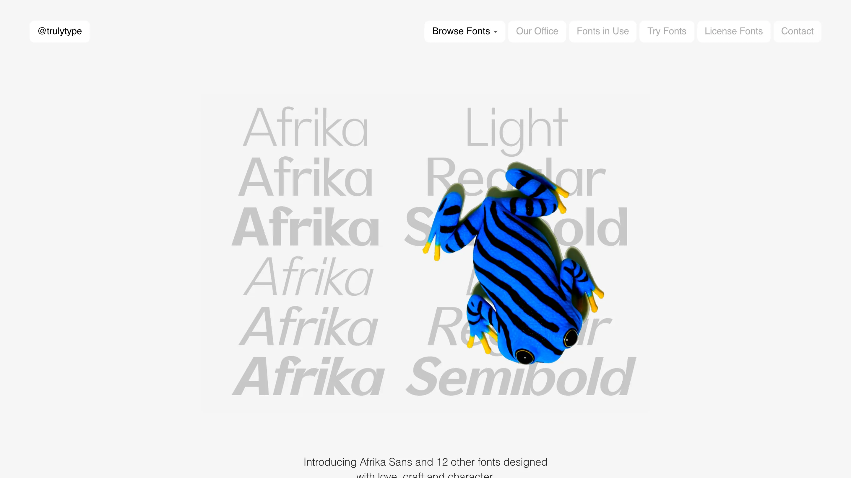
The homepage sets the weights, then drops a frog on them
The landing page stacks the word Afrika down the middle in Light, Regular and Semibold, each weight a slightly different gray, overlapping like a contact sheet. The weight names repeat to the right in the same ghosted tone. Then a blue-and-black striped frog, rendered in full photographic detail, sits right on top of the type.
That frog is the whole trick. It gives a pale gray page its only jolt of color, and it hands you something to remember in the same glance that shows you the weights. The line underneath is plain: Afrika Sans and 12 other fonts, "designed with love, craft and character." No manifesto. The animal does the talking.
The specimen page is red on black, ringed with bronze
Click into Afrika Sans and the room goes black. The name is set huge in a hot red, filling the width edge to edge. Around it stand cast bronze figures: a bird-like statuette top left, a kneeling figure holding a disc in the center, a smooth head bottom right.
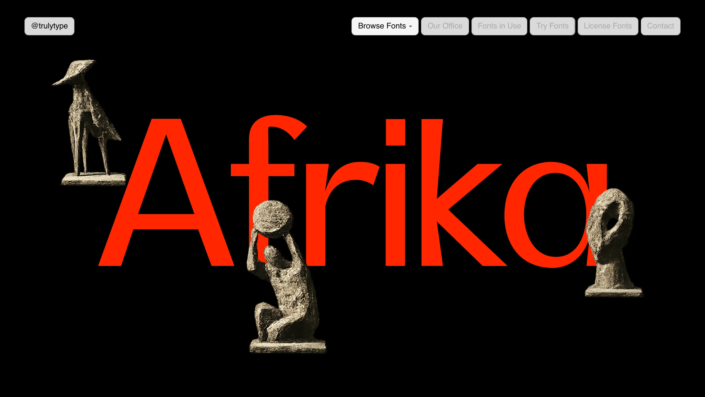
The objects pun on the name and give the letters something to stand among. What I like is the restraint underneath the drama: the type is the biggest thing on screen, the sculptures orbit it, and the palette is red, black, bronze and nothing else. Red on black is the loudest contrast you can pick. They earn it by picking only that.
Fonts in Use is where the type earns its keep
This is the page that closes the sale. Not the font on a gray card, but the font on a client's stationery, shot like a product. The And Objects identity fills the screen: a red catalogue printed with orange line drawings of lamps, a green envelope, a cream letterhead, a blue business card, all set in Afrika Sans in blue and orange.
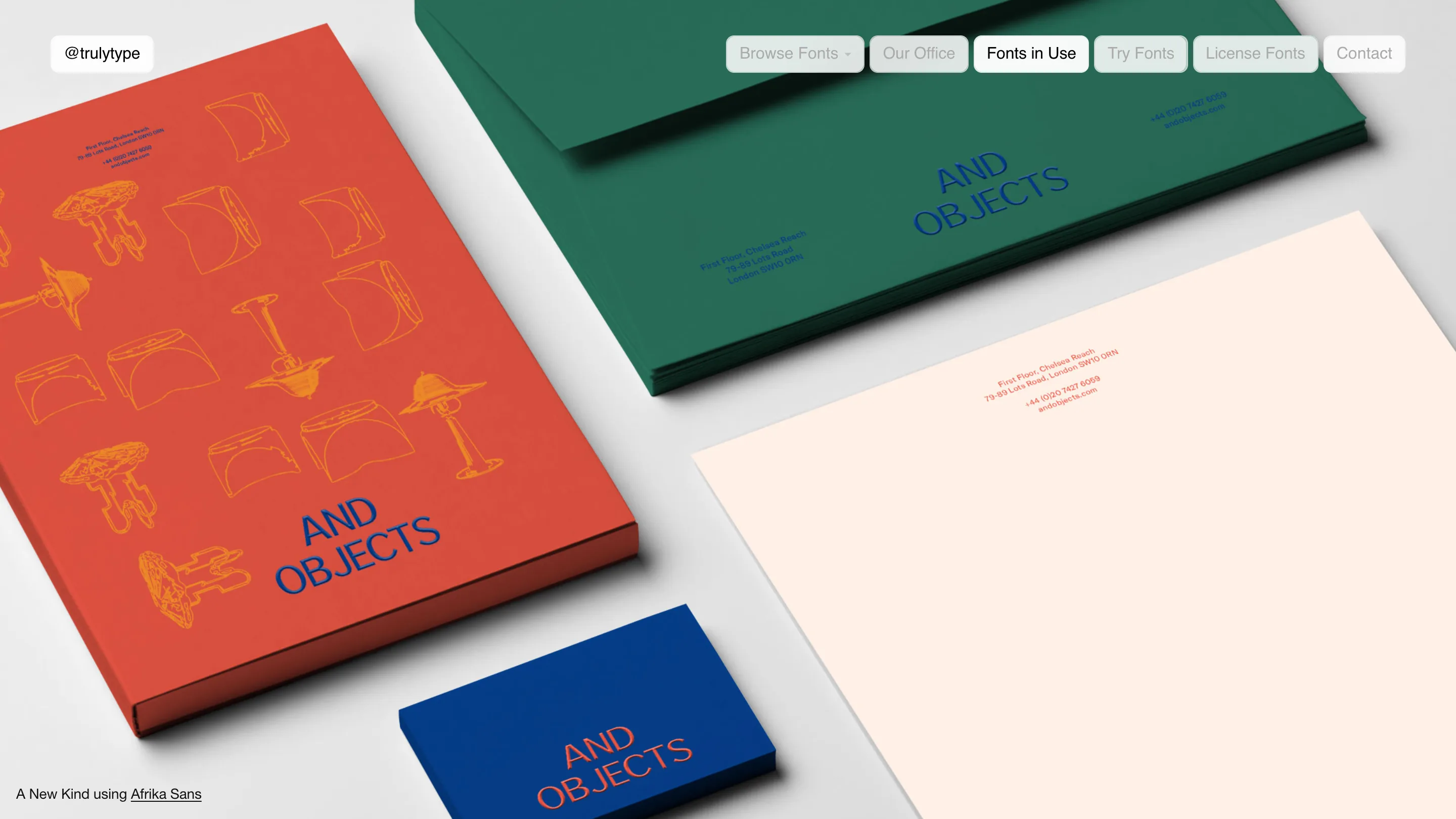
Seeing a face carry a full brand, color-blocked and lit, tells me more than any glyph chart. The caption stays quiet, "A New Kind using Afrika Sans," and lets the photograph do the arguing. If I were deciding whether to license the thing, this is the page that would tip me.
What I'd keep
Three things I'm taking back to my own folder:
- One object per face. A single well-chosen prop beats a mood board. The frog, the bronzes, the stationery each belong to their page and nowhere else.
- Real photography over lorem ipsum. Color, light, an actual thing in the frame. It gives a specimen a pulse that set text never has.
- The pill navigation. Rounded pills up top, the active one filled, the rest ghosted gray. Small, but it keeps a loud hero calm and reads at a glance.
The risk of the staged specimen is obvious: the object upstages the type, and you've made a nice photo of a frog. Trulytype dodges it by keeping the letters the biggest thing in every frame, so the scene serves the face and not the other way around. That's the part worth stealing.
Found via Minimal.gallery. Type and site by Trulytype, out of Los Angeles.
Featured: Trulytype