Inspiration · 3 min · 2 August 2026
The console layout: Artemii Lebedev runs his portfolio like software
Artemii Lebedev pins a monospace console around his work and loads each project into it like a panel. The fixed frame is the part worth keeping.
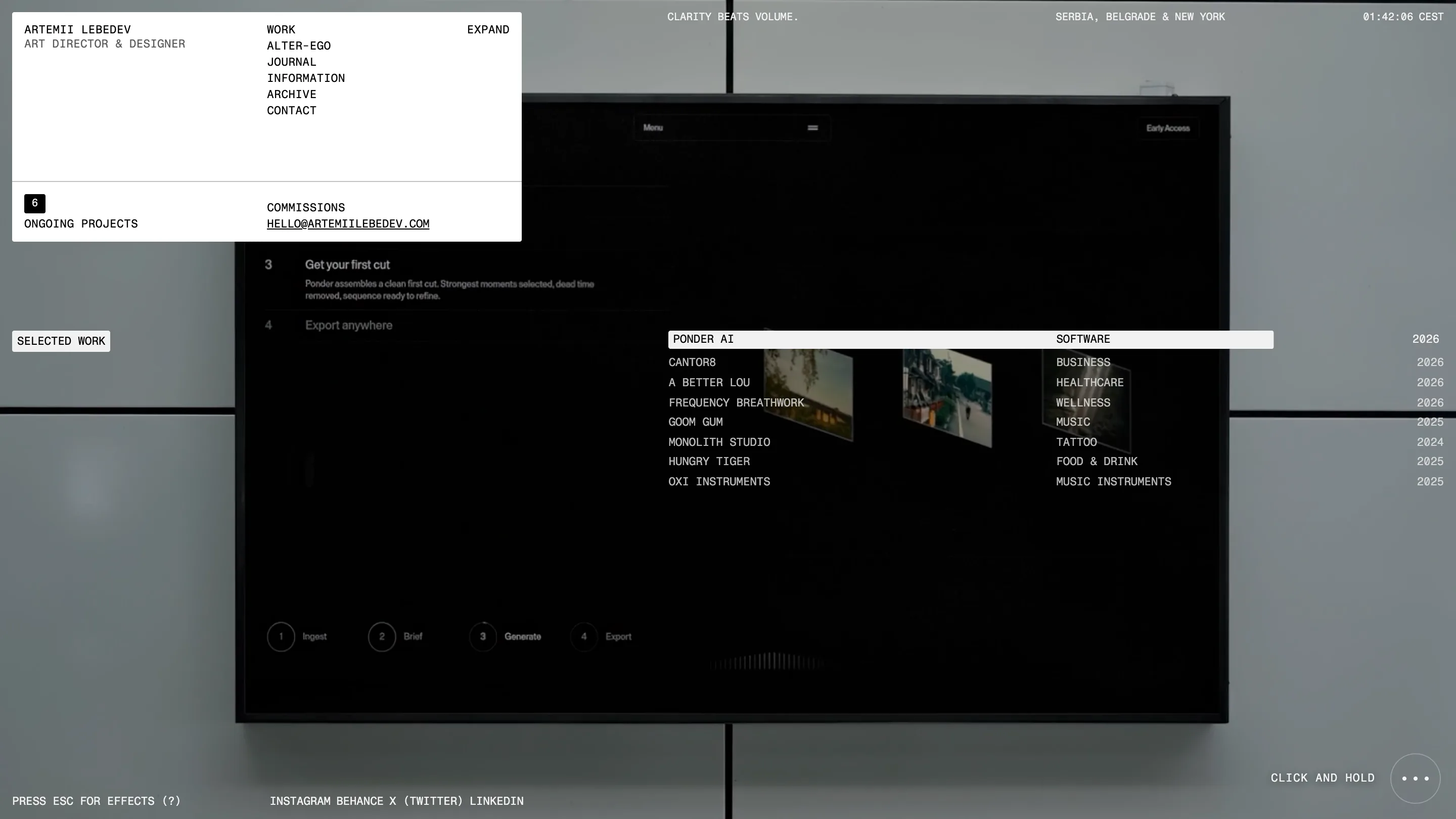
Artemii Lebedev built his portfolio like a piece of software, and I mean that as the compliment. The chrome never gets out of the way. A white index card stays pinned top-left with his name and the nav, a live clock runs in CEST top-right beside "SERBIA, BELGRADE & NEW YORK", and a motto holds the top edge ("CLARITY BEATS VOLUME."). Everything is monospace, uppercase, hairline-ruled. It reads like a console, and the console is the idea I'd steal from his site.
The console layout does the framing for you
Here's why it works: the frame is fixed and the stage swaps. Open the home page and the center is a big dark screen showing a Ponder AI mockup, an editing tool laid out as Ingest, Brief, Generate, Export. Under it sits a short list of selected work, category on the right, year hard against the margin. None of that furniture moves when you click through. You're operating a machine that loads a fresh panel into the same casing, and that gives a one-person site the composure of a product.
Work is a database you hover
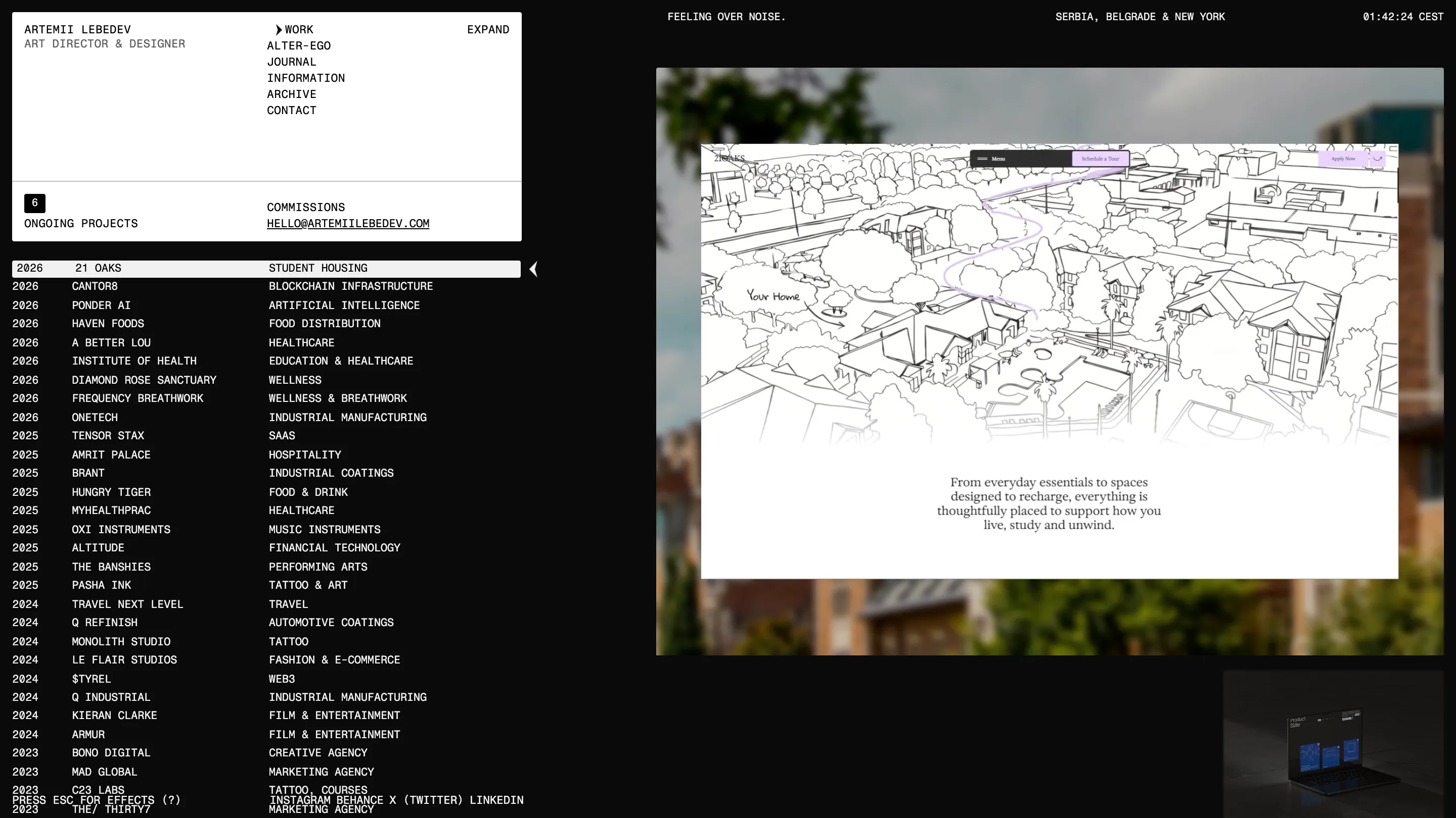
The work page is where the idea earns its rent. Every project is one row: year, name, industry. 21 Oaks student housing, Ponder AI artificial intelligence, Tensor Stax SaaS, Pasha Ink tattoo & art, thirty-odd of them stacked as a plain index. Hover a row and a live preview loads on the right. For 21 Oaks it's a hand-drawn line map of a housing block with "Your Home" annotated on it. The list stays deliberately dull so the preview can carry the color, and I like that restraint. A grid of thumbnails would have flattened thirty jobs into wallpaper. The index keeps them legible and lets one breathe at a time.
The archive drops the grid and turns moody
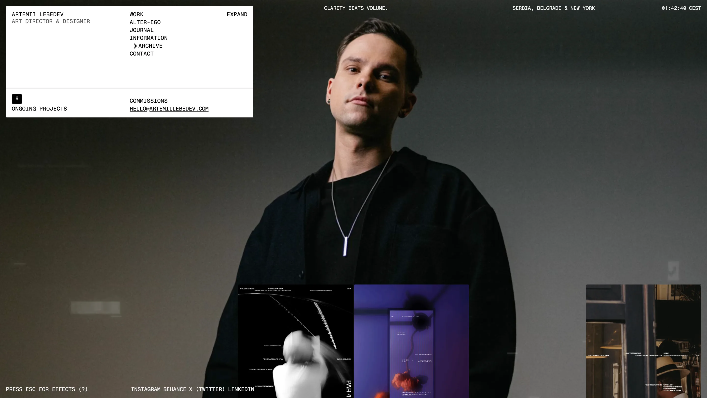
The archive is the release valve. Same console chrome up top, but the stage goes full-bleed: a portrait of Artemii in black, shot dark, with poster and photo thumbnails floating along the bottom like cards left on a table. After the rigor of the work index, the looseness lands. It tells me the system is deliberate, because he can switch it off when the content wants air.
The small signals sell it
The details are what make the console believable. The top motto changes per section, so the work page reads "FEELING OVER NOISE." and the frame feels alive rather than printed. "6 ONGOING PROJECTS" sits in the index card like a status readout. "PRESS ESC FOR EFFECTS (?)" waits at the bottom, an opt-in for motion that respects the reader who just came to see the work. Each one reinforces the fiction that you're inside an application.
What I'd keep
The move I'd take into my own work is the fixed frame plus the swappable stage. It solves a real problem, which is how you show thirty jobs without the site becoming a scroll of cards. You build a shell that stays put, drop a live index in it, and let each project load into the same window. Found it on Minimal Gallery, credit to Artemii Lebedev for the build.