The standing rail: Porto Rocha runs its whole site from a column that never moves
Porto Rocha's new site keeps one column fixed while the rest swaps under it. It's a master-detail layout with a live clock, and it lets the work carry all the color.
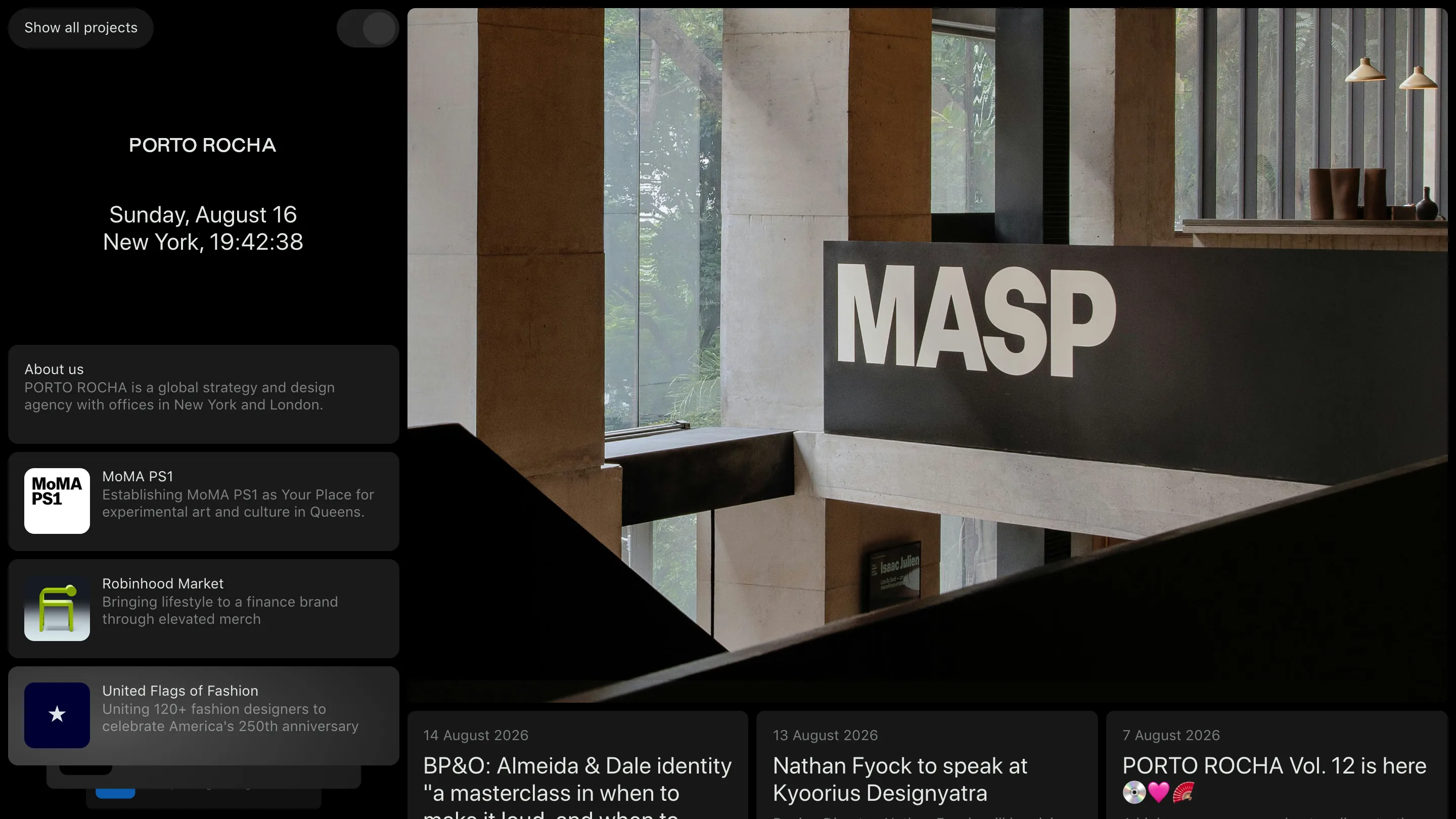
Porto Rocha built their site as two panes that behave differently on purpose. The left column holds still. The right one does all the changing. I opened a project, then the about page, then a project again, and the left rail with the wordmark, a live clock, and a stack of project cards stayed exactly where it was the whole time. It's a master-detail layout, the pattern you know from a mail client, pointed at a design portfolio. I'm keeping this one in the reference folder for the discipline of it.
The rail that never moves
Top of the left column: Porto Rocha in spaced caps. Under it a date and a clock. Under that, a stacked list of cards, each with a tiny rounded app-style icon: About us, MoMA PS1, Robinhood Market, United Flags of Fashion. That list is the navigation, and it never scrolls off. Click any card and only the right pane redraws.
This is the move a designer would search for as master-detail, or a persistent sidebar. Most portfolios reload the world on every click, so the header animates back in, the grid re-lays-out, you lose your place. Here the constant stuff (who they are, what they've done) stays put, and the variable stuff (the actual imagery) gets the whole right half of the screen. The rail is the index. The pane is the story.
The clock is the tell that it's alive
Look at the time under the wordmark. It reads New York, and it ticks. Across the three screenshots I grabbed for this post the seconds ran 19:42:38, then 19:42:53, then 19:43:03. A running clock is a small thing, and it does one job well: it tells you the page is a live app, not a static export sitting on a CDN. On a studio that sells strategy and craft, that half-second of movement in the corner is a quiet flex.
Color comes from the work, nothing else
The canvas is near-black. Text is white and gray. The cards are dark elevated chips, barely lifted off the background. There is no brand accent anywhere in the chrome, which is the point: the only color on the page comes from the work itself. Open MASP and the right pane goes full red with the wordmark set huge in a heavy geometric sans (FT Aktual MASP, a custom cut by Formula Type). Robinhood brings a lime-green glyph. The interface stays out of the way and lets each project supply its own palette.
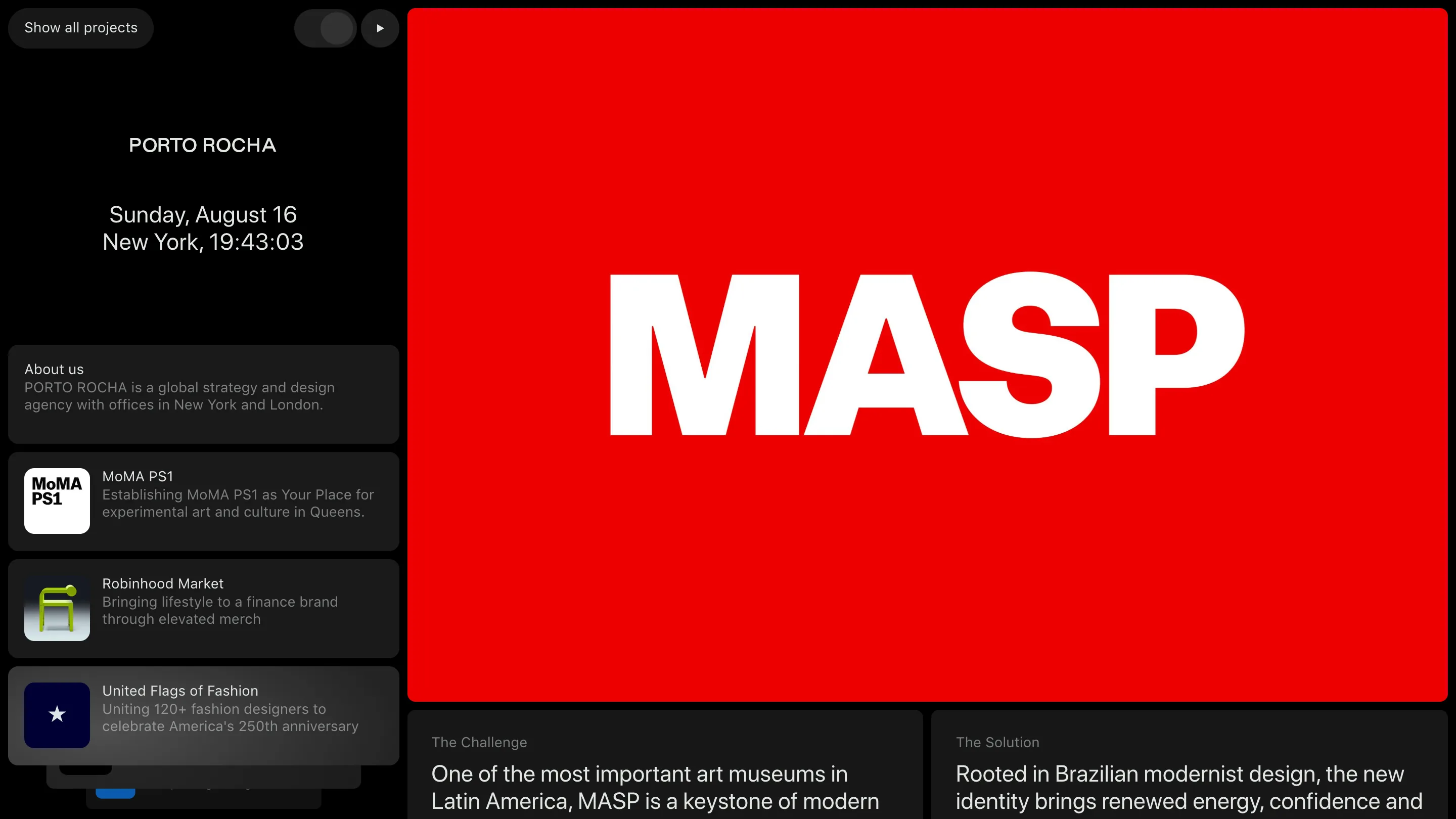
Under the red block sit two labeled columns, The Challenge and The Solution, so the case study reads like a brief before you scroll a single image. Same restraint as the rest of the site: say the thing plainly, then show it.
The about page is the same machine
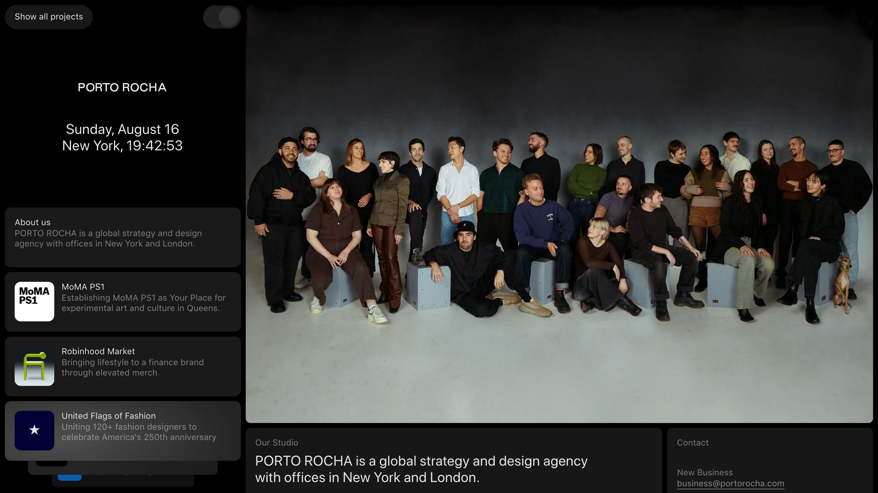
The about page proves the layout isn't a one-off for projects. The rail doesn't budge. The right pane fills with the whole studio photographed on a seamless gray backdrop, dog included, and below it a short line of copy and a contact address. It's the same two-pane machine driving a different payload. Once you build the rail, every page is cheap: you just feed the right side.
What I'd steal
The move worth keeping: put the constants (identity, index, one live signal) in a rail that never moves, and give the detail pane the full frame for imagery. It makes navigation feel instant because nothing you rely on ever redraws, and it hands the color budget to the work instead of the UI. Credit to Porto Rocha, the studio Leo Porto and Felipe Rocha run out of New York and London. I found it on Minimal Gallery, which is where I go when I want restraint done well.
Featured: Porto Rocha (Leo Porto and Felipe Rocha)