Panel navigation: Beats in Space never leaves the page
Beats in Space opens every section as a panel over the same canvas, so the mix keeps playing while you browse. Thomas Hervé Studio's redesign is the cleanest case of panel navigation I've seen this year.
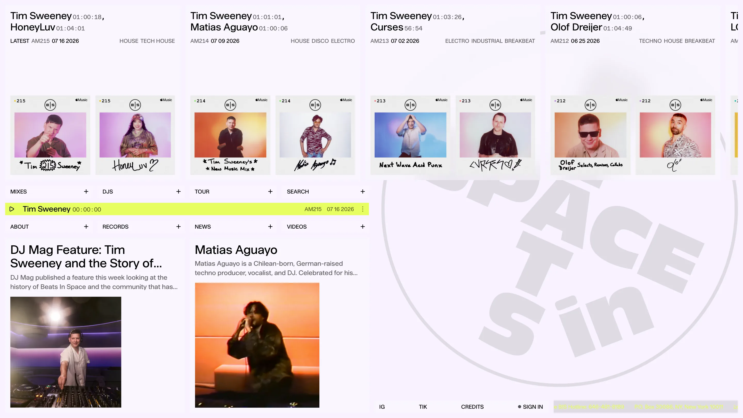
Beats in Space runs its entire site on one screen. Mixes, DJs, the record catalogue, the news: each section opens as a panel over the same canvas, and the mix you started keeps playing underneath. Thomas Hervé Studio art directed the redesign, Web Sessions built it, and it's the cleanest case of panel navigation I've seen this year.
Tim Sweeney has been running the show for 25 years. The archive is the product, so the site had one real problem to solve: let people dig without ever cutting the audio. Panels solve it.
Panel navigation, with a plus and a cross
The menu sits in the middle of the home page as eight cells in two rows. MIXES, DJS, TOUR, SEARCH on top. ABOUT, RECORDS, NEWS, VIDEOS below. Each cell carries a small + pinned to its right edge. Click it and the section rises over the page, the cell turns acid yellow, and the plus becomes a cross.
What I rate here is that the open state lives inside the menu. The cell you clicked is the thing telling you it's open, and clicking the cross is how you get back. No breadcrumb, no back arrow, no page title repeating what you already know. Twelve pixels of glyph do the work three components usually do.
The yellow is rationed to match. It marks the open cell and the player bar, and nothing else on the site is that color. So the eye reads it as one meaning: this is live right now.
The DJ wall is a photo booth
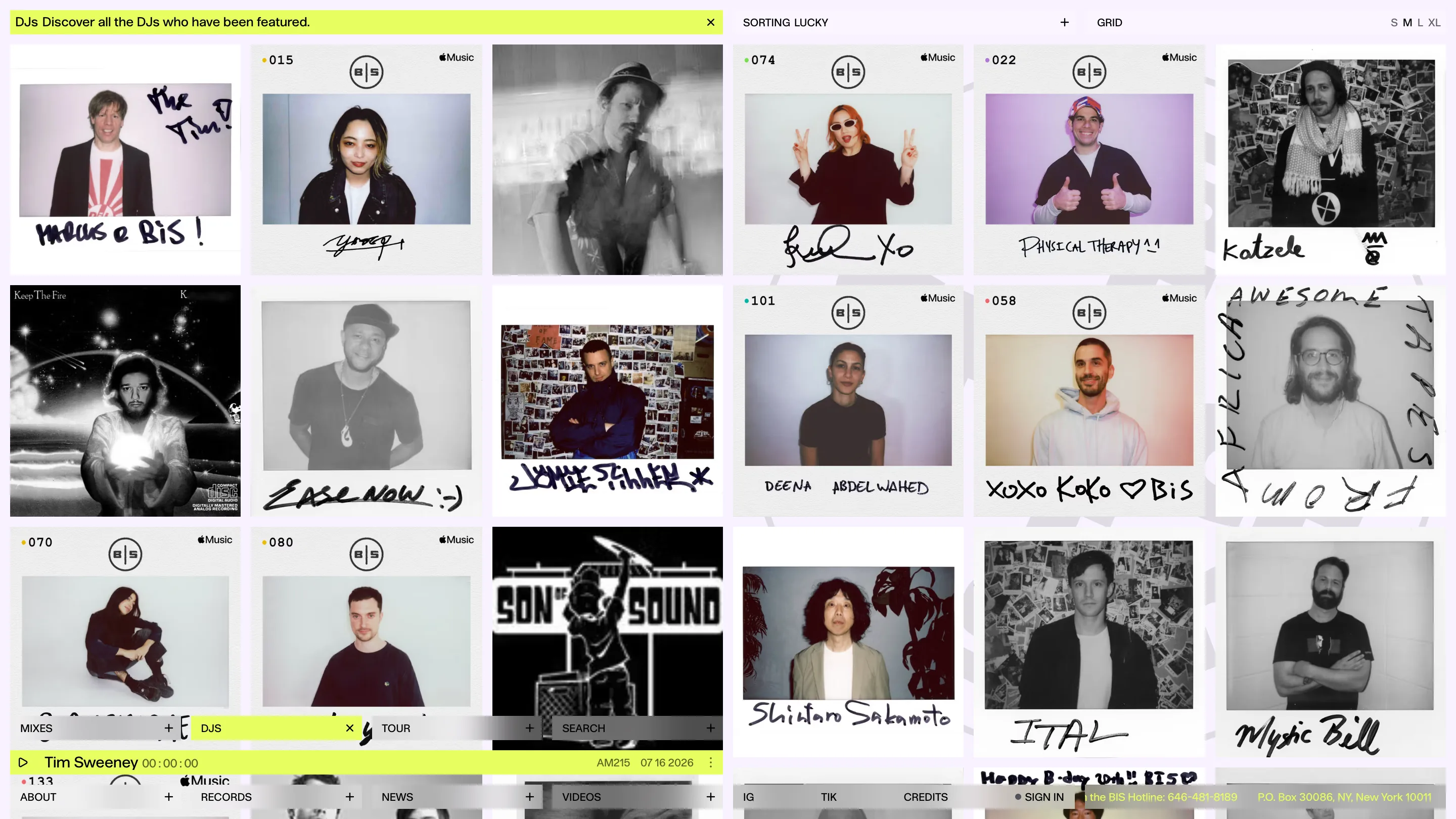
Open DJS and you get a wall of scanned Polaroids, every one signed by the guest in marker across the bottom. "MARCUS @ BIS!" in fat black pen. "EASE NOW :-)". "xoxo koko" with a heart. Half the frames are black and white studio shots, half are shot against the studio's own wall of Polaroids, which means the photos contain the archive they belong to.
The controls in the top right are worth stealing on their own. A sorting toggle set to LUCKY, and a size switch reading S M L XL that rescales the whole grid. Handing the visitor the tile size is a two-hour build and it changes how long people stay in a set of images.
Metadata carries the typography
Look at a mix card and there's no decoration doing the layout. The DJ names run large in a tight grotesque, and everything else is small caps and figures on the same baseline: duration as 01:00:18, catalogue number AM215, date as 07 16 2026, then the genre tags in caps at the end of the row. HOUSE TECH HOUSE. ELECTRO INDUSTRIAL BREAKBEAT.
Those fields come straight out of the database. The design decision was to set them at one size and one weight and let the density be the texture, rather than styling each field into a badge. It reads like a label sleeve, which is exactly what it is.
Records, flush and uncaptioned
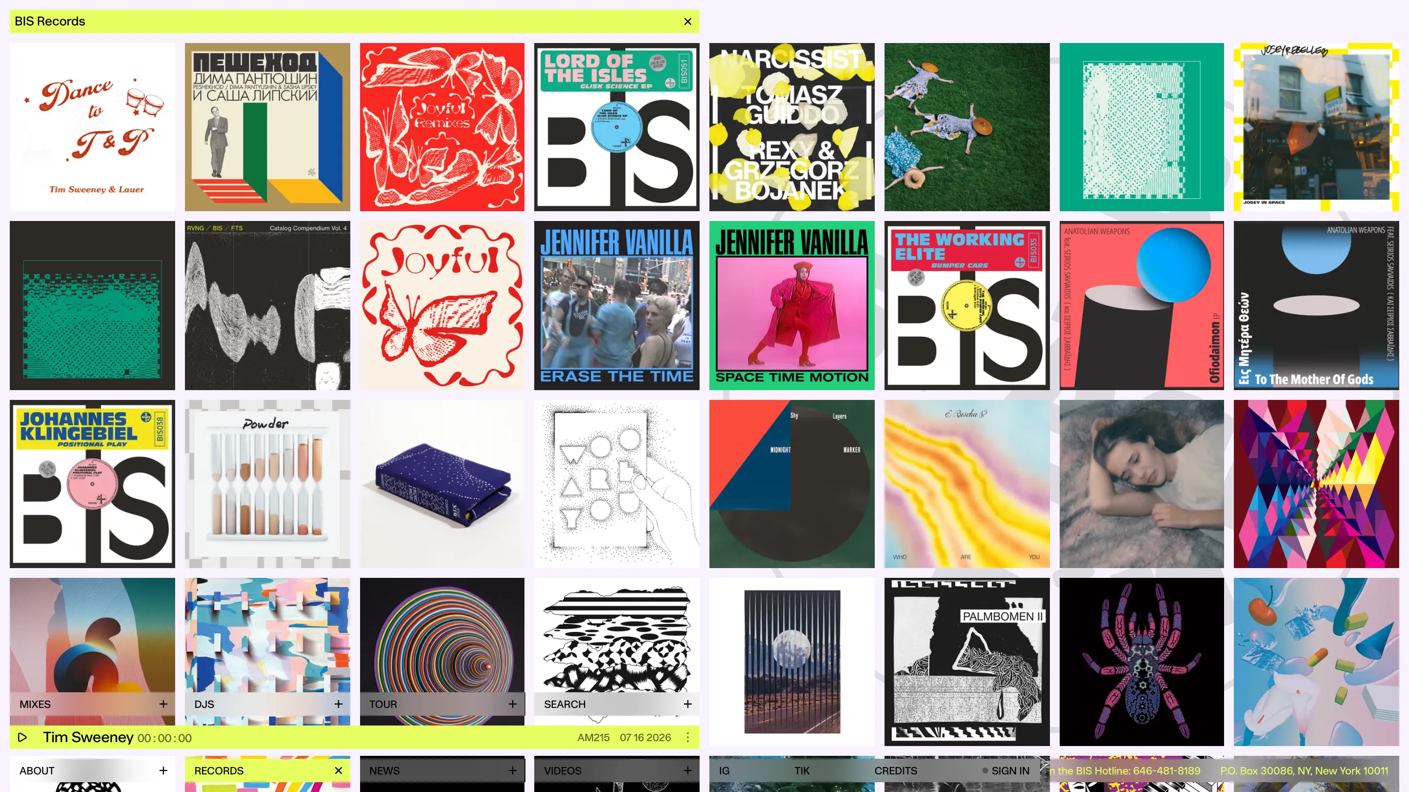
The records panel packs eight sleeves per row, edge to edge, with no gutters and no titles underneath. Twenty years of covers sit next to each other and the color does the sorting for you. A red butterfly print lands beside the big BIS logotype sleeve, beside a Cyrillic Bauhaus grid, beside a photo of two people lying in grass.
Stripping the captions is the brave part. It trusts that anyone on that page recognises sleeves the way other people recognise faces, and it turns the catalogue into a single image.
What I'd keep
Three things go in my folder. The plus that becomes a cross, because it collapses navigation state and page identity into one control. The user-controlled grid size, because it costs almost nothing. And the discipline of rationing one loud color to a single meaning across a site with 200 record covers screaming at each other.
Found via Siteinspire. Site by Thomas Hervé Studio for Tim Sweeney.
Featured: Thomas Hervé Studio