Beats in Space turned 25 years of signed polaroids into the interface
The new Beats in Space site by Thomas Hervé Studio builds its whole visual system out of the polaroids guest DJs signed in the studio. The archive supplies the art direction, and the layout gets out of the way.
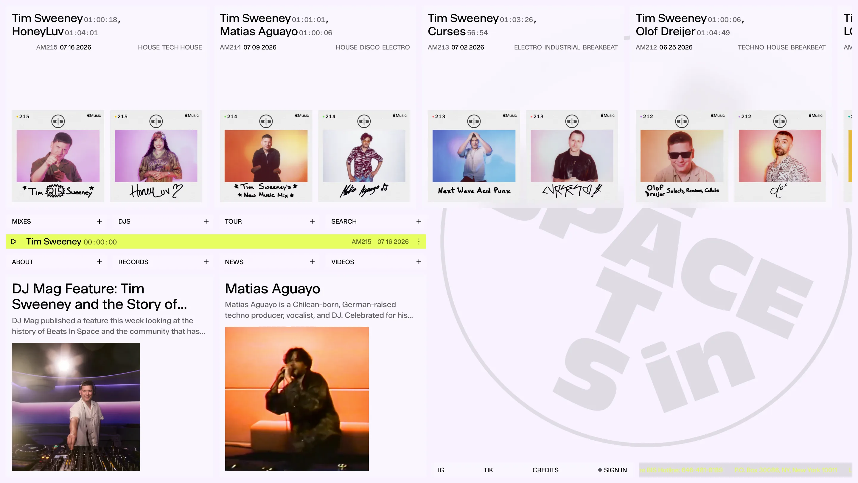
Since 1999 every DJ who played the Beats in Space show in New York signed a polaroid on the way out. The new site by Thomas Hervé Studio takes that pile of paper and makes it the interface. No illustration, no generated gradients, no photography commissioned to fill a grid. The collection is the design, and I've been thinking about it all week.
The archive does the art direction
Open the DJs page and you get a wall of polaroids, four or five across, each one signed by hand in marker. Krystal Klear scrawled across a red curtain. "No Regular Play" in fat black caps along the bottom border. Two biro faces where someone couldn't be bothered to sit for a photo. The wall carries every shift in film stock and studio lighting across two and a half decades, and the page does nothing to normalise any of it.
That restraint is the decision I rate most. A weaker version of this site would have run a duotone filter over the lot to make it feel like one system. Hervé leaves the black-and-white next to the pink flash next to the blown-out yellow, and holds it together with the frame instead: white paper margin, a coloured dot with the episode number top left, the Apple Music badge top right, the same crop every time. Consistent chrome, wildly inconsistent contents. It reads as one thing.
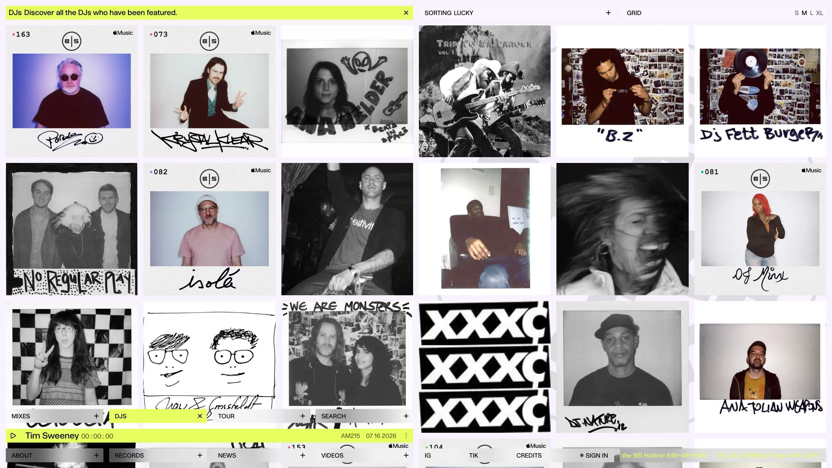
The sort control on that page is labelled SORTING LUCKY. It shuffles. For an archive this deep that's the honest browse mode, and it's a better joke than most site copy manages.
Runtime set as part of the name
On the mixes page each card reads Tim Sweeney 01:00:18, HoneyLuv 01:04:01. The guest name is large grotesk, the duration sits inline right after it in grey, same baseline, same line. Runtime is normally a footnote in six point type. Here it's promoted into the title because on a DJ archive the length of the mix is half the decision, right up there with who's playing.
Under it, one quiet row: mix number and date on the left, genre tags right-aligned. AM215, 07 16 2026, HOUSE TECH HOUSE. That's the whole metadata budget, and I can scan sixteen mixes without slowing down.

A nav that refuses to move
Eight cells, fixed to the bottom of the viewport, always in the same order. MIXES, DJS, TOUR, SEARCH on one row. ABOUT, RECORDS, NEWS, VIDEOS on the other. The player bar sits between the two rows in acid yellow, so the nav is split around whatever is playing. Land on a section and its cell turns the same yellow and swaps the plus for a cross.
I like that the yellow is doing two jobs with one colour: it means playing, and it means you are here. The site only owns one accent and spends it well.
What I'd have done differently
The inline runtime gets ambiguous when a card lists two names. Reading Tim Sweeney 01:00:18, HoneyLuv 01:04:01 cold, I first parsed it as one mix in two parts before I worked out those are two separate sets. A thin rule or a slightly wider gap between the pairs would fix it without touching the idea.
The DJs page also offers density sizes S M L XL, and at S the polaroids drop to thumbnails where the signature is the only thing left legible. Names and dates are gone. Fine as a texture view, but I'd have kept the name under the frame at every size.
The move I'm stealing
Look for the artefact the client already has before designing anything. Beats in Space had a box of signed instant film and 25 years of episode numbers, and the site is mostly a good decision about how to frame them. Most of my clients have something like that sitting in a drawer. I've started asking earlier.
Featured: Thomas Hervé Studio for Beats in Space