Websites · 3 min · 5 August 2026
TRIONN puts a small dare under every hero
Every page on TRIONN's new site hands you a dare: hold to blast the wireframe, drag the strips on the lion. The studio bets that letting you play with the work earns more trust than showing it clean.
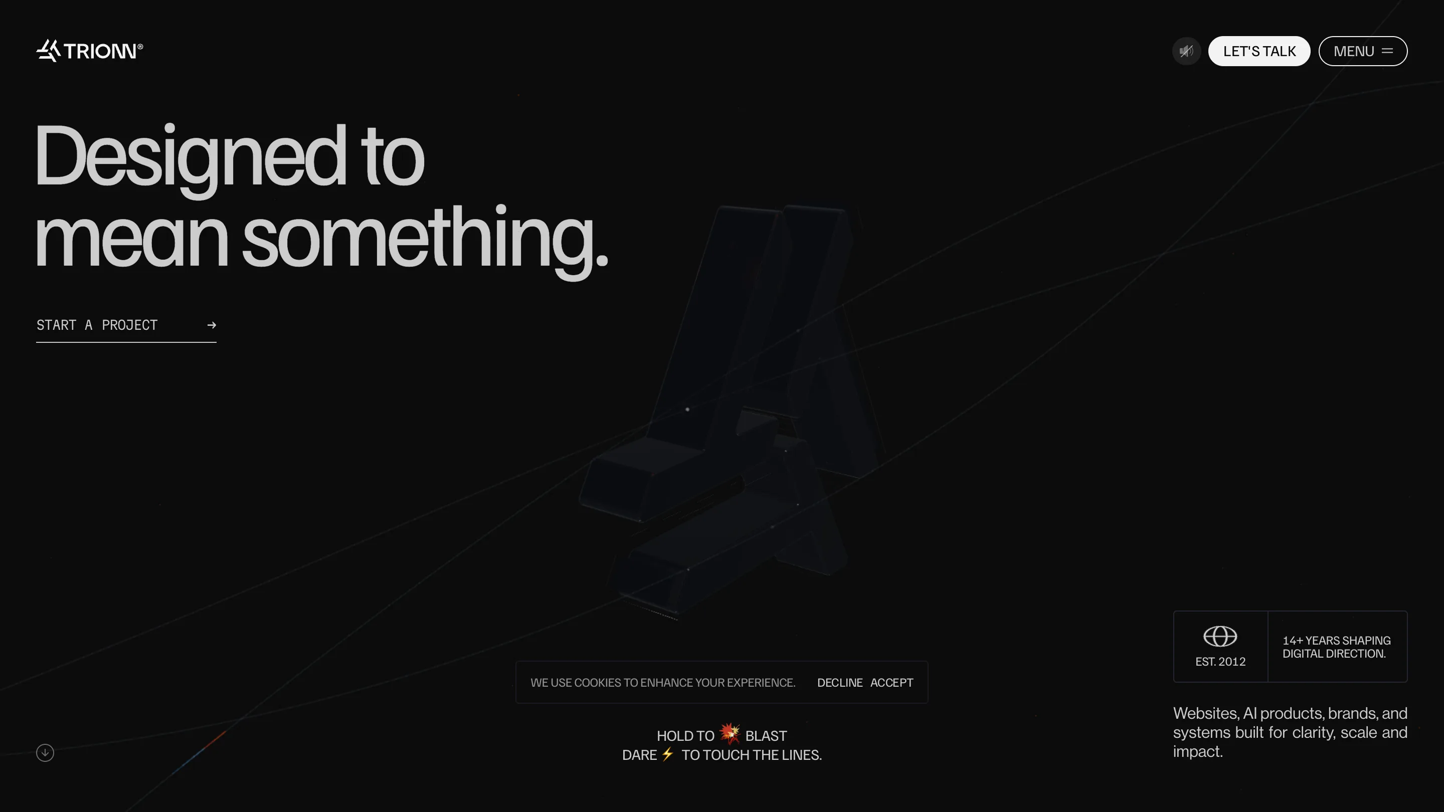
I spent a while on TRIONN's new site before I read a single line of it, because every page kept asking me to play first. Under the home hero, in small type: hold to blast, dare to touch the lines. On the about page: dare the lion, drag the strips with sound on. It's an independent digital studio out of India, running since 2012, and the whole thing rests on one bet: that letting you mess with the work earns more trust than handing it to you clean.
The dare under the hero
The home page is a dark room with a chrome version of their arrow-mark floating in the middle, thin lines running off it into every corner. Nothing announces that it's interactive. There's just a quiet line near the bottom that reads HOLD TO BLAST, DARE TO TOUCH THE LINES. So you hold, and the thing reacts. That's the move. Most studios park a showreel or a scroll cue under the hero. TRIONN parks a small, lowercase-energy dare, and it turns a static composition into a toy with no tutorial overlay and no coach-mark.
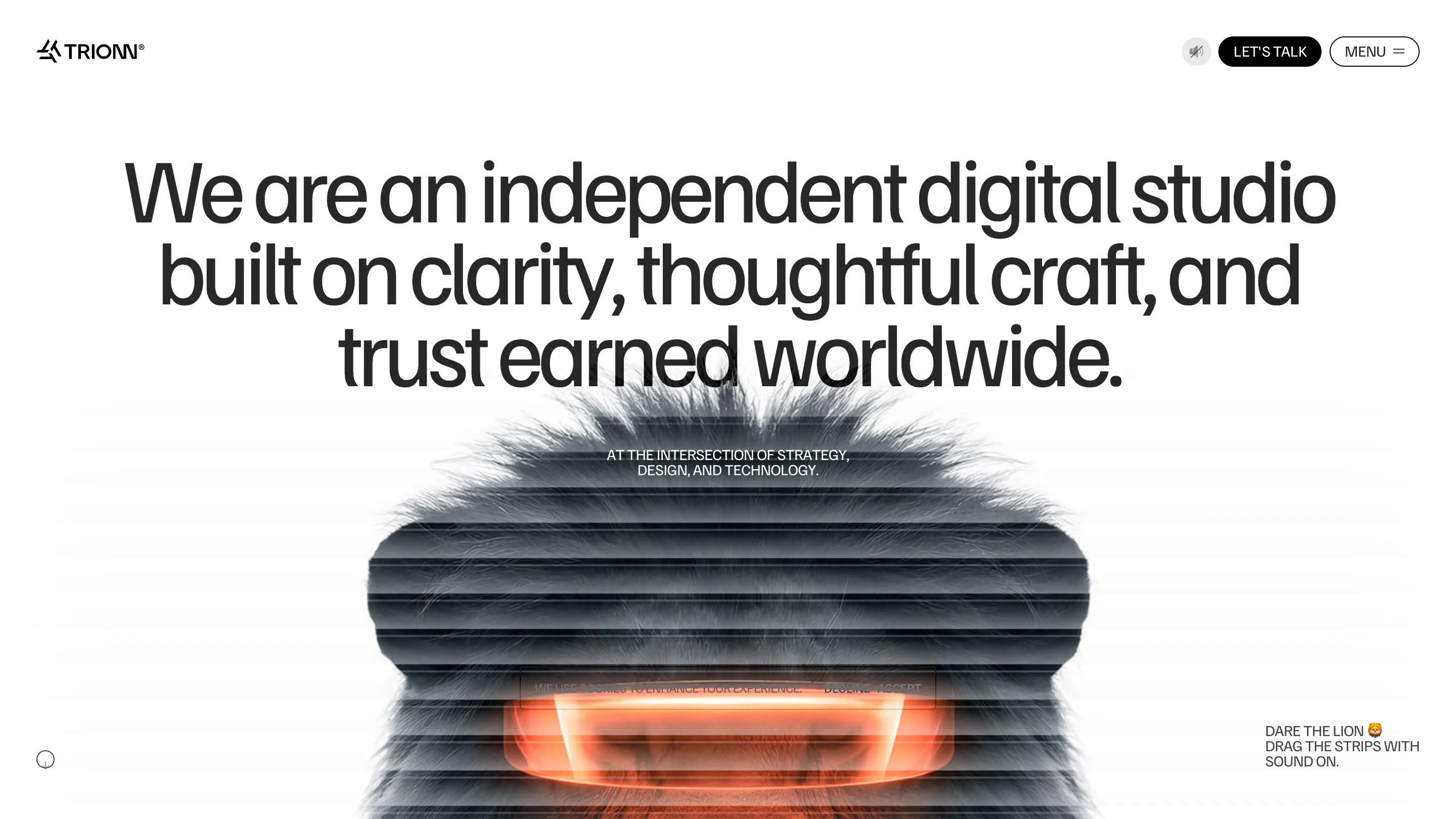
What I rate is that it's consistent. This isn't a one-off trick on the landing page. The about page runs the same grammar: a lion's face built from horizontal venetian slats with a glowing orange core, and the prompt DARE THE LION, DRAG THE STRIPS. New toy, same invitation. By the second page you know the site's personality, and you trust it more because it keeps making the same promise and keeping it.
The type does the opposite job
Here's the part I like most. The interaction is loud, so the typography goes completely calm. "Designed to mean something." sits in a plain neo-grotesque, off-white on near-black, set tight, no tricks at all. On about it flips to black on white: "We are an independent digital studio built on clarity, thoughtful craft, and trust earned worldwide." Big, flat, sure of itself. The words carry zero motion, which is exactly why the 3D reads as play instead of noise. If the type were animated too, the whole page would feel like a screensaver. The restraint is what makes the toy land.
The work page is a scatter, not a grid
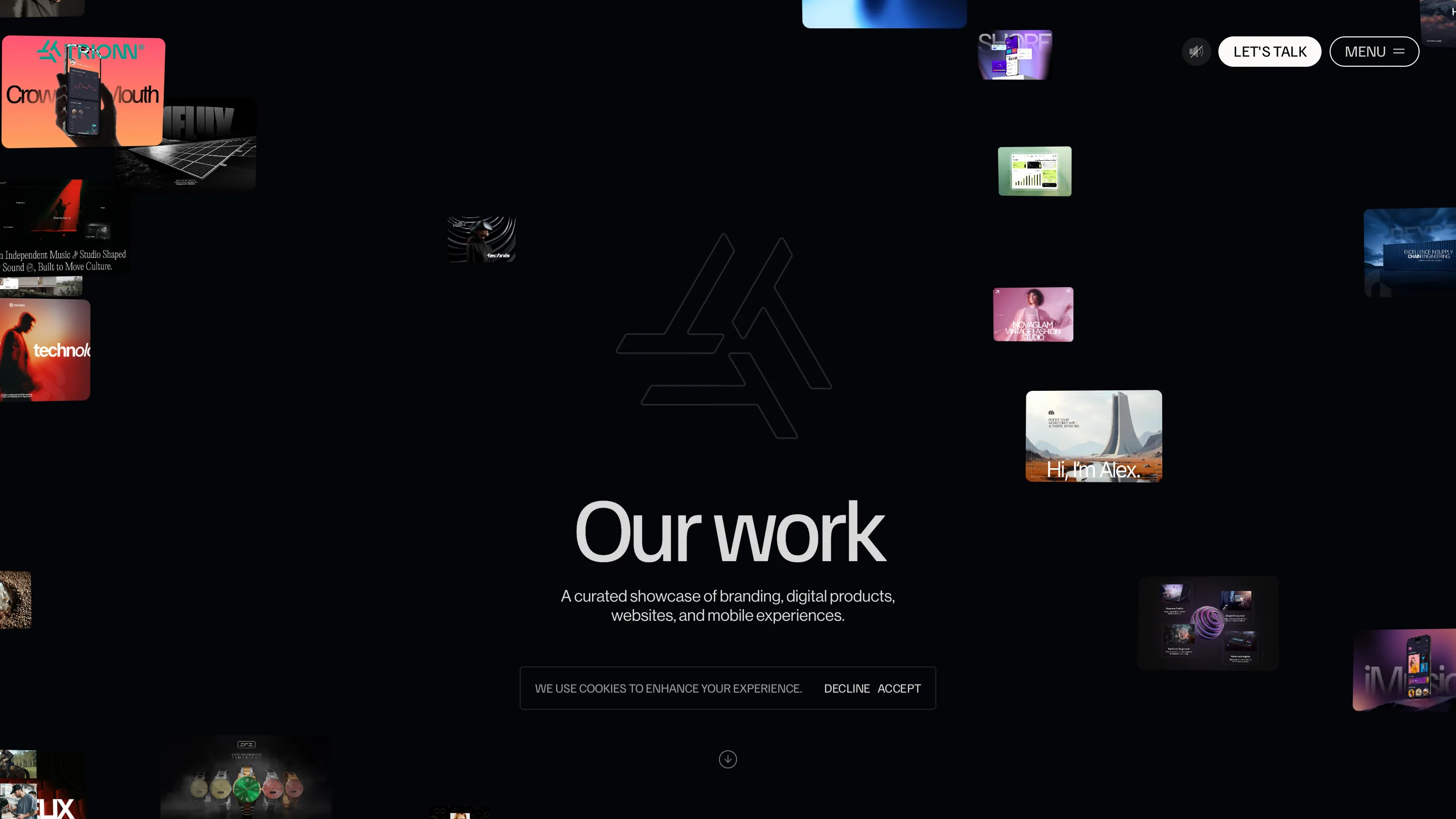
On /work the thumbnails don't sit in a tidy grid. They float around the edges like a constellation, with a ghosted logo behind a big "Our work." I go back and forth on this one. It reads alive and it matches the loose, playful tone. But it also strands the work at the margins and makes it hard to scan what they've actually shipped, which is the one job a studio work page has to do. I'd keep the scatter as the first impression and let it settle into something scannable as you scroll.
The one thing I'd move
The cookie band sits dead-center, low on the hero, on every page. On about it lands right across the lion's glowing mouth, the exact spot the whole page wants you to look at. For a site this careful about composition, a gray consent bar parked on the money shot is a shame. Tuck it in a corner. Small thing, but it argues with the point.
The move I'm taking into my own work is the dare itself: a short, plain line under the hero that invites you to break the composition, in place of a button that explains it. It trusts the visitor to be curious and lets them find the reward on their own. Credit to TRIONN for committing to it on every page, not just the front door.