'kin makes its client list do the navigating
A studio site where the roster of client names is the work index itself: hover a name, its photo fills the screen. Plus a mono-for-metadata rule I'm stealing.
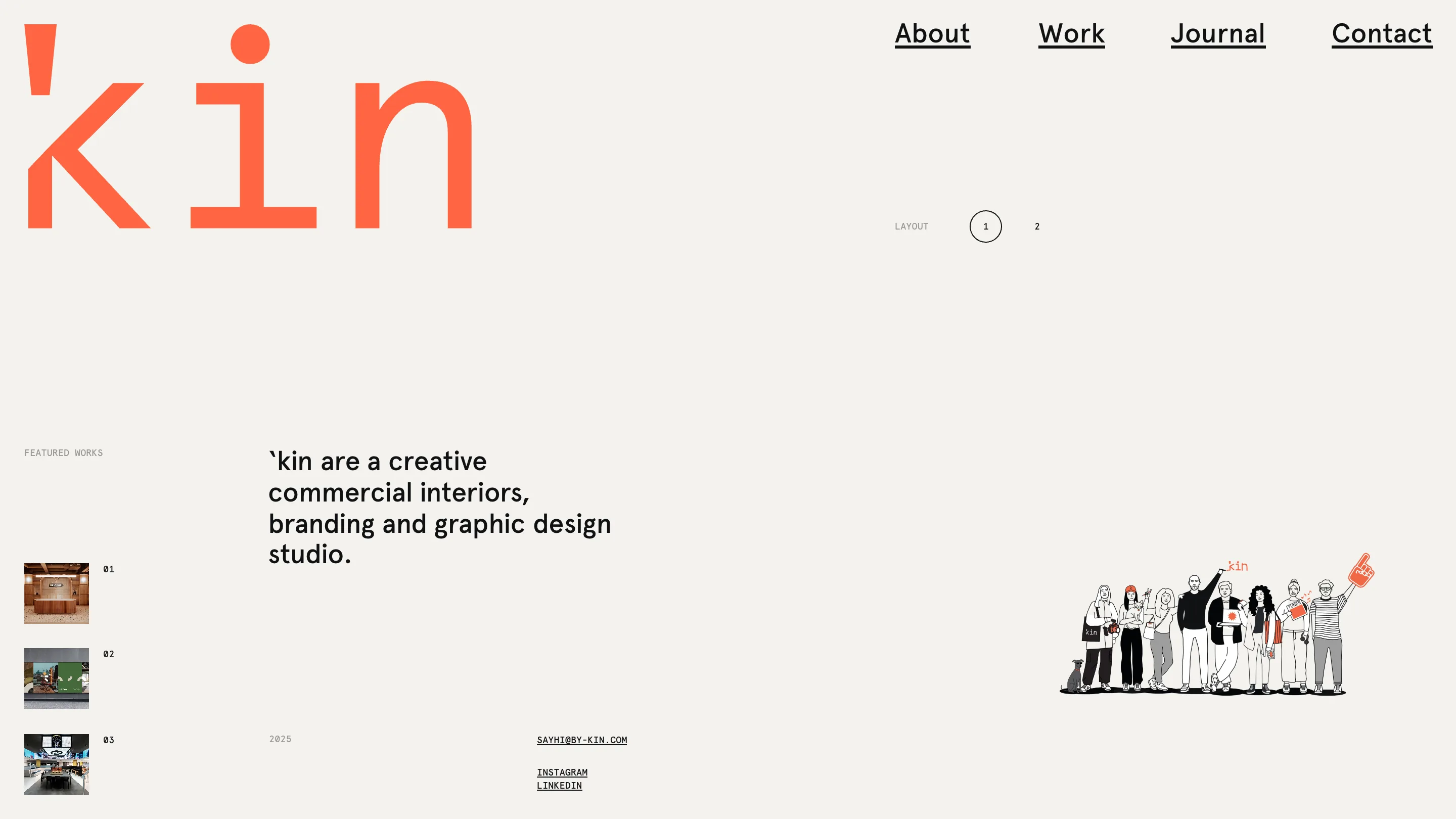
I keep a soft spot for studio sites that make you do a little something before they show you the work. 'kin, a commercial interiors and branding studio out of the UK, has one of those. The home screen is mostly cream, a coral wordmark the size of a door, and one control I didn't expect: a LAYOUT toggle marked 1 and 2. You get to pick how the studio introduces itself. I clicked it twice just to watch the page rearrange. Credit to 'kin for the whole thing.
The client list is the navigation
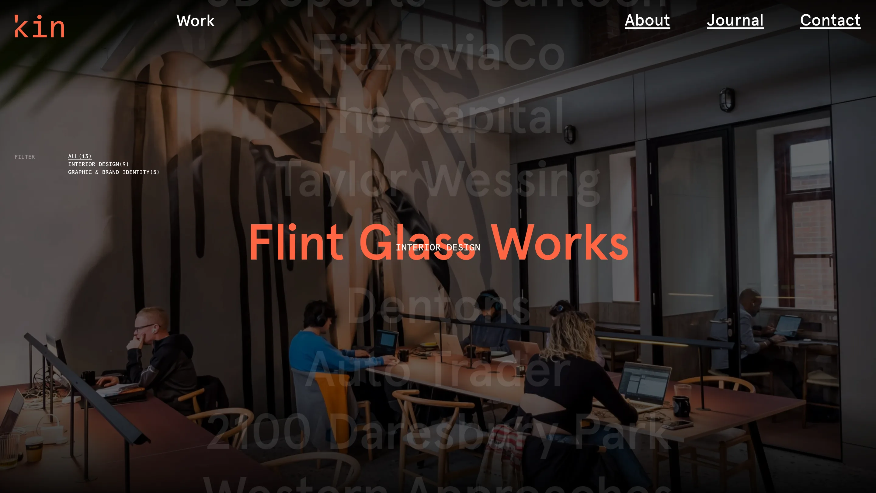
The Work page is the move I rate most. Instead of a grid of thumbnails, 'kin stacks the roster of client names down the page in big ghosted type: FitzroviaCo, Taylor Wessing, Dentons, Auto Trader. Hover a name and the background fills with that project's photo, the title dropped across the middle in coral. Those names carry the whole navigation. There's no thumbnail grid waiting behind them; the list is the index.
It's a confident thing to do. You need a client roster worth reading before you can turn it into the interface, and 'kin clearly has one. The filter sits up top in small mono, ALL(13), INTERIOR DESIGN(9), GRAPHIC & BRAND IDENTITY(5), counting the work so you know the size of the room before you walk in.
One coral, one cream, mono for the labels
The system underneath is tight. One accent, that hot coral. One ground, a warm off-white. Black for the statements. And a rule I want to steal: every piece of utility text is set in monospace. Section labels, the filter, the project metadata, the email address, all mono. The sentences a person actually wrote, like the studio description, sit in a warm humanist sans. So the eye learns the difference between a label and a thought without being told. Metadata reads as metadata. Copy reads as copy.
A project opens as a panel, not a page
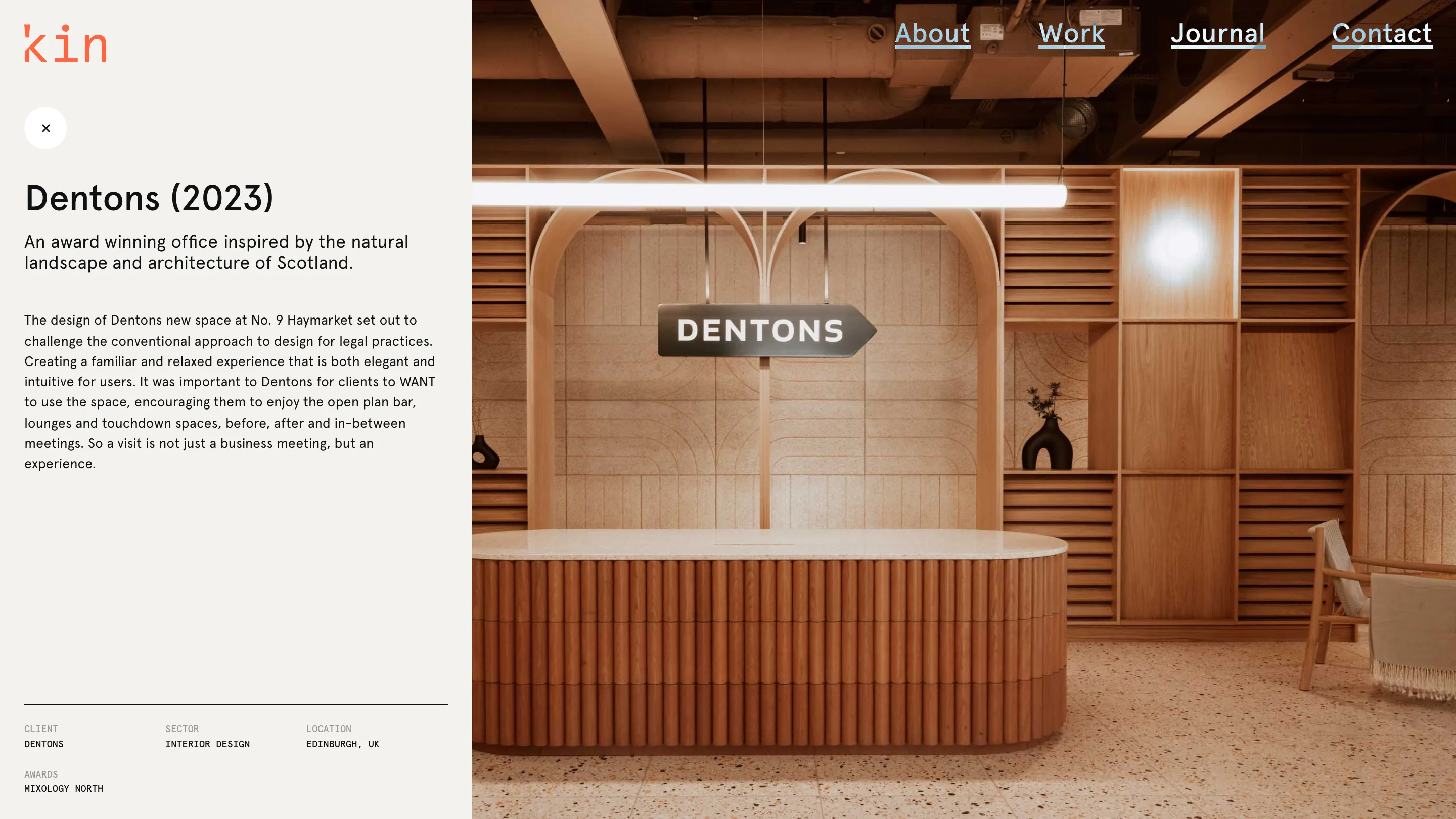
Click a project and it doesn't so much load a new page as slide a panel over the one you were on. Left side, a cream column: title, a one-line summary, the write-up, then the credits in mono (CLIENT, SECTOR, LOCATION, AWARDS). Right side, a full-bleed photo of the space. A round × sits top-left to close it. That small choice, a close button instead of a back button, is why the site feels like one continuous surface rather than a stack of pages. You're never really leaving the work index. You're opening a drawer in it.
What I'd change
The Work page at rest is busier than it needs to be. Before you hover, the ghosted names overlap the hero photo behind them, and the contrast gets muddy enough that for a second it reads as noise instead of a menu. The hover state is lovely. The resting state makes you work to see it's a list at all. I'd calm the background right down until a name is touched, then let the image bloom. Same trick, a bit more patience.
The move I'm taking
The mono-for-metadata rule. It costs nothing and it does real work: you can drop CLIENT, SECTOR, LOCATION anywhere on a page and trust the reader to file it as reference, not read it as prose. I've been reaching for size and weight to separate labels from copy. 'kin does it with one font choice. That's going into the next thing I build.
Featured: 'kin