Jeton named itself after a chip, then built the whole site out of chips
Büro gave a payments app one burnt-orange world and a hero object that is literally the product's name. I rate most of it. The desktop nav is where I'd push back.
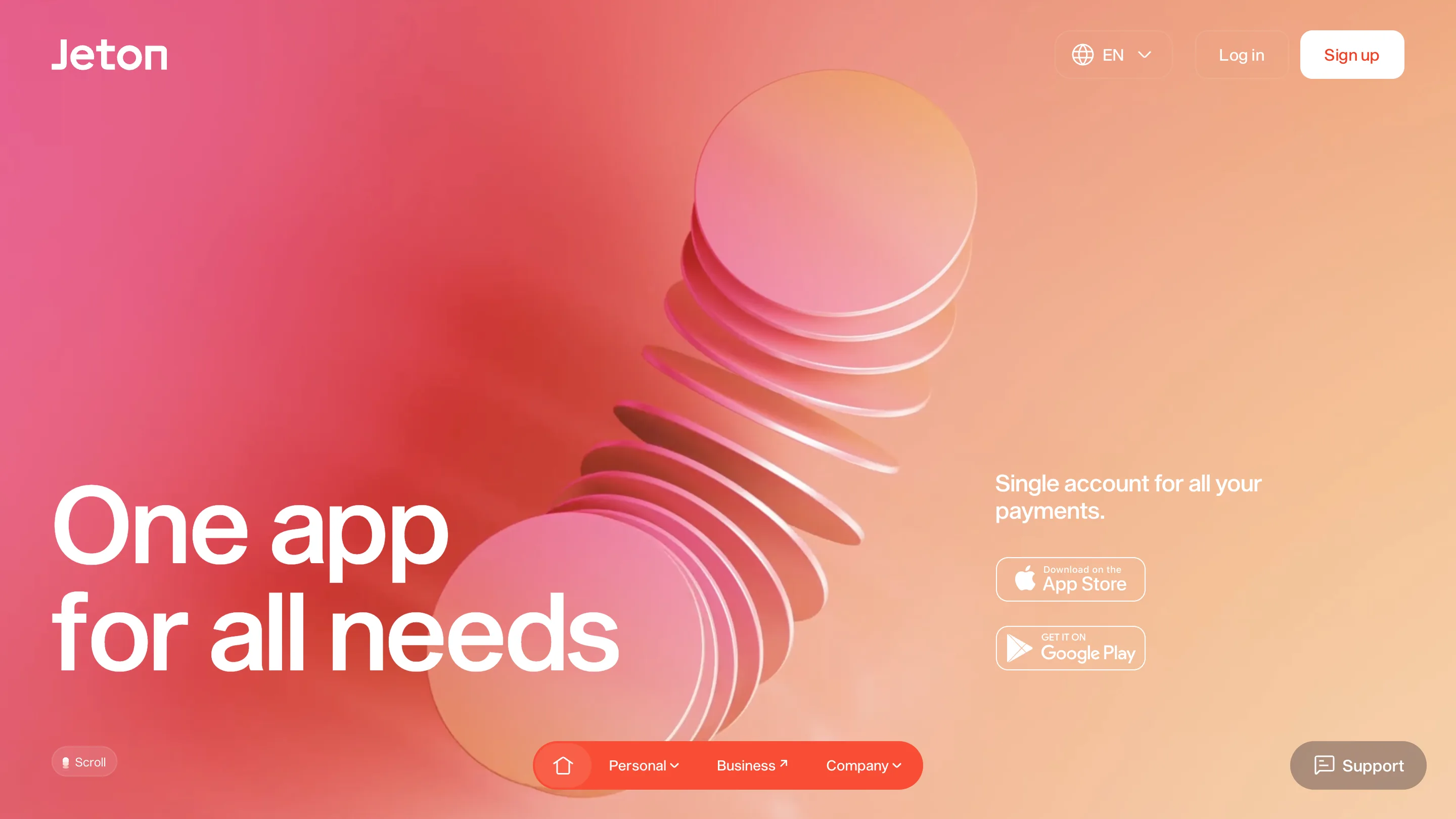
A jeton is a gaming chip. The French word for the little token you slide across a table. So when I opened Jeton and the hero was a stack of translucent chips fanning out like someone had just dropped them, I smiled. The site is made of its own name. That is the whole idea, and it carries the design further than any headline could.
Büro built this in 2024, and the one decision I keep coming back to is the color. They said they almost didn't use black in the CSS. You can feel that. The entire surface is a burnt-orange gradient, warm the whole way down, pink at the edges. Fintech usually reaches for cool blue because blue reads as a bank. Going this warm is a position, and it holds because every page commits to it.
The object is the argument
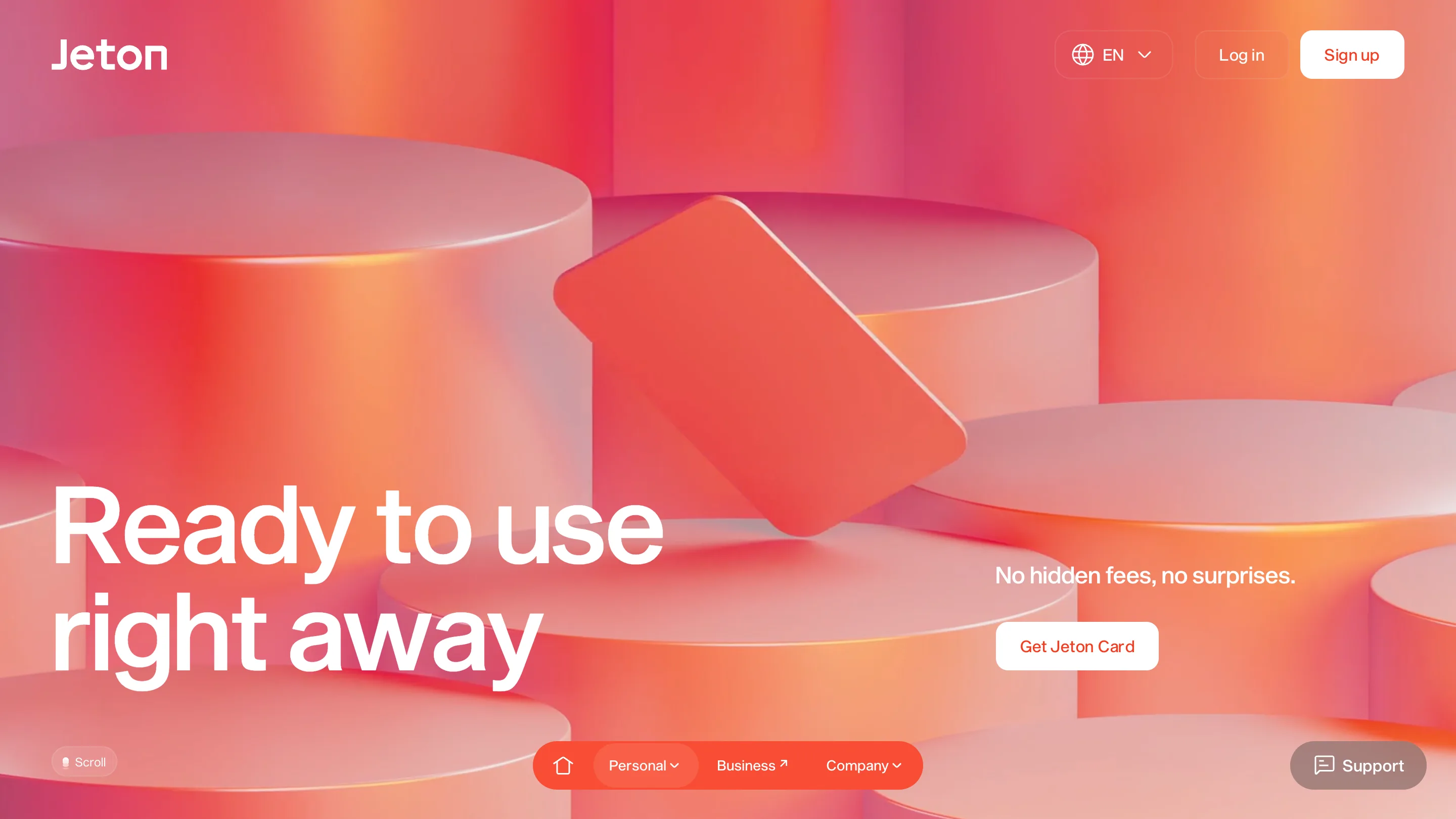
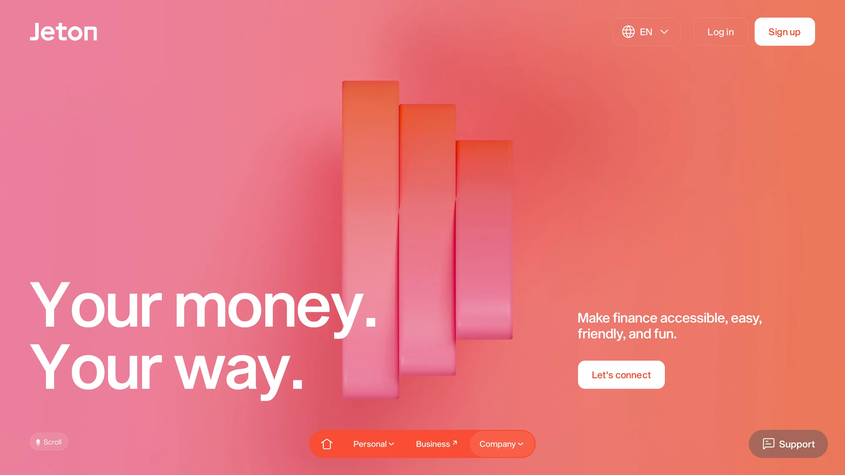
Look at what the 3D is doing. The home page has the chips. The card page floats a single tilted card on soft cylindrical podiums, lit like a product still. The about page stacks three rounded columns that read as a bar chart without ever calling themselves one. Same studio lighting, same matte-and-glass material across all of them. The copy stays short because the render is carrying the meaning. "One app for all needs" doesn't have to explain itself when a pile of chips is doing the explaining.
That is the move I rate most. One object per page, and the object is the point. It is easy to do this badly, to drop a spinning blob next to a headline and call it a hero. This is the opposite. The material world is consistent enough that the pages feel like a set, not a template filled three times.
One skeleton, worn well
Every page runs the same layout. Huge white grotesque headline pinned left, a small subhead and a single pill button on the right, the 3D object in the middle. "Ready to use right away" with Get Jeton Card. "Your money. Your way." with Let's connect. The button is white with orange text, and there is only ever one of them per hero. That restraint is doing a lot of quiet work. On a page this loud with color, a second CTA would split the eye. Keeping it to one makes the click obvious.
The skeleton could read as lazy. It doesn't, because the object changes and the material stays. That is the trick worth stealing: build a small kit of materials and lighting you reuse, and let one bespoke object per page do the talking. A repeated grid stops feeling repeated the moment each cell has something made in it.
The one thing I'd change
The primary nav lives in a floating pill at the bottom of the screen. Home icon, Personal, Business, Company, docked center. The top right holds only language, Log in, and Sign up. On a phone that pill is perfect, right under your thumb, straight out of an app tab bar. On desktop I'm less sure. A first-time visitor hunts at the top left for the menu, and here the menu is 900 pixels south, sharing the bottom edge with a Scroll hint and a Support button. It looks great. I think it costs a beat of discoverability that a payments product can't really spare.
What I'm taking
Make the hero object be the product, or the name, or the promise, so the words get to relax. Then hold one material world across the whole site so the templated pages read as made rather than stamped. Büro did both, and the burnt-orange gamble is what makes it stick in the memory. Credit to Büro.
Featured: Bürocratik (Büro)