Collection puts the punchline where the client name usually goes
On Collection's site every project leads with a one-line joke at hero size, and the client and services get demoted to a whisper underneath. The inversion is the whole idea.
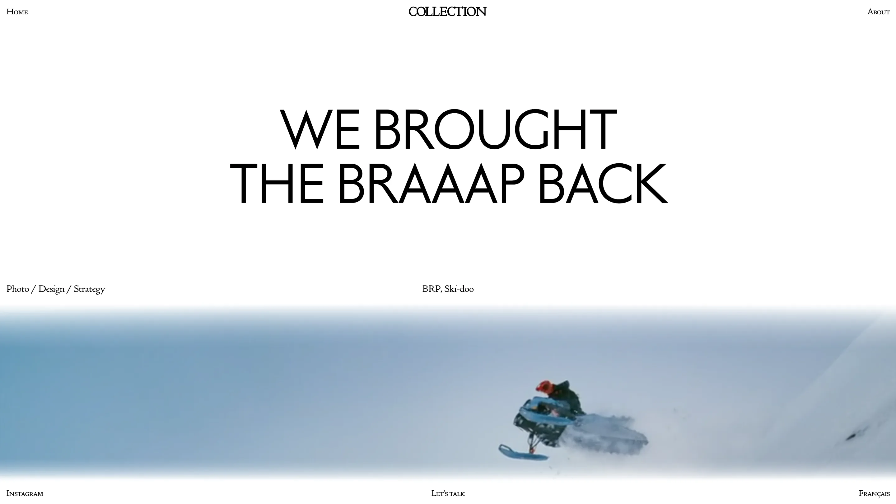
The first thing Collection tells you about a job is the punchline. Open the Ski-Doo case and the page leads with We brought the braaap back, set huge and centred. The client, BRP, and the work, Photo / Design / Strategy, sit under it in a thin line of small caps you could almost miss. Most portfolio sites run this the other way round: client logo big, one-liner small. Collection flips it, and the flip is the whole idea.
The line does the selling, the metadata whispers
On a normal studio site a project card gives you three facts: who, what year, what services. Collection gives you a sentence with a voice. "We brought the braaap back" tells me more about how these people think than any services list would. It's specific, it's a little smug, and it makes me want to scroll. The credits are still there for anyone who needs them, just shrunk to a size that says they're footnotes. I rate this because it treats me like someone who showed up for the idea.
A headline built to dissolve
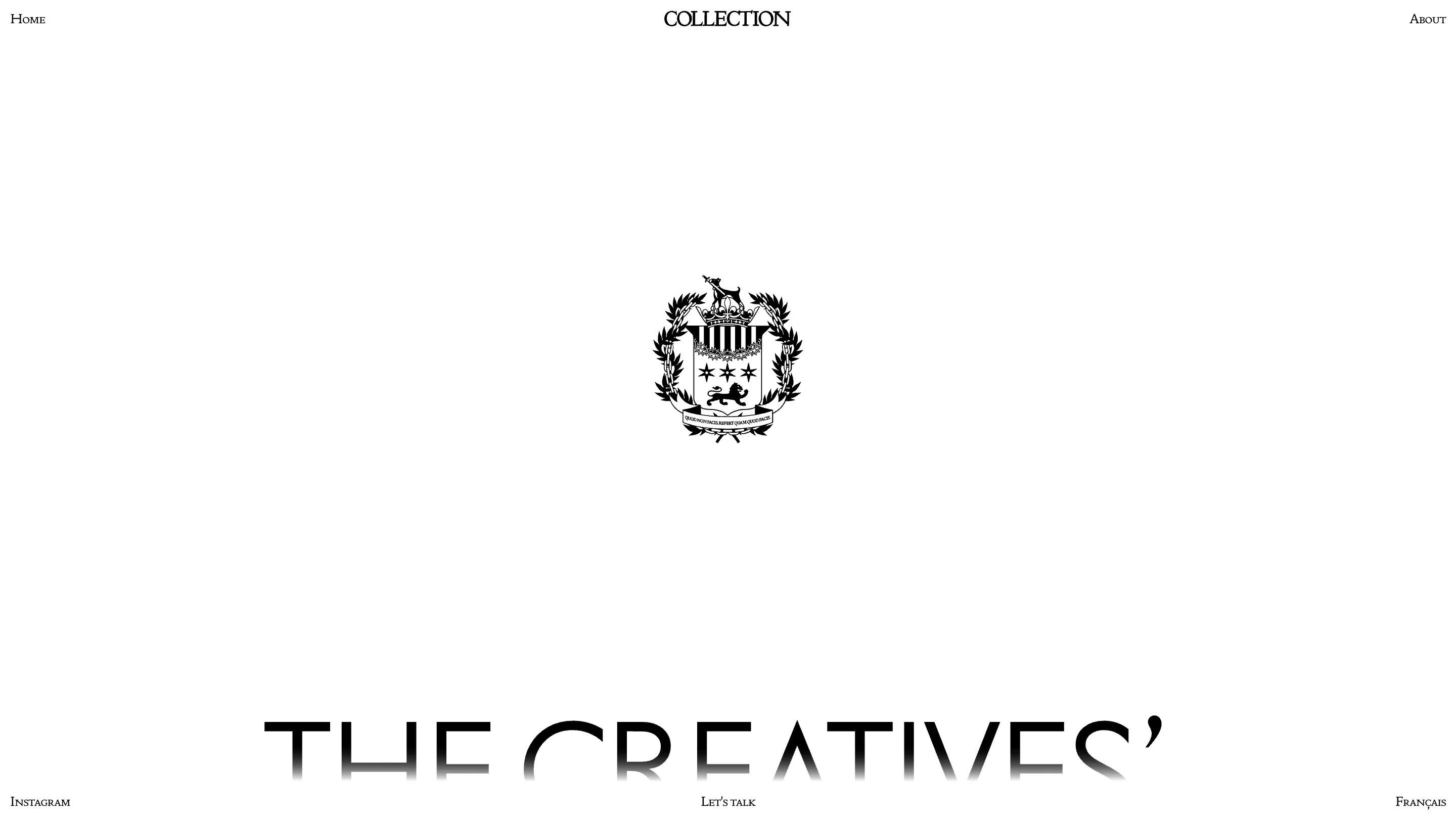
The home page is one giant phrase, "The creatives' creatives", and the bottom edge of the type fades to nothing, as if the words are sinking into the paper. It's a vertical mask, cheap to build, but it does real work: it pulls your eye down and tells you the page keeps going. The face itself is a thin, high-contrast display cut, closer to a fashion masthead than a tech studio. Paired with a Didone wordmark where the C and T knot into one ligature, the top of the page reads like a magazine cover from 1962. For a shop selling taste, that's the right reference.
An about page that turns the lights off
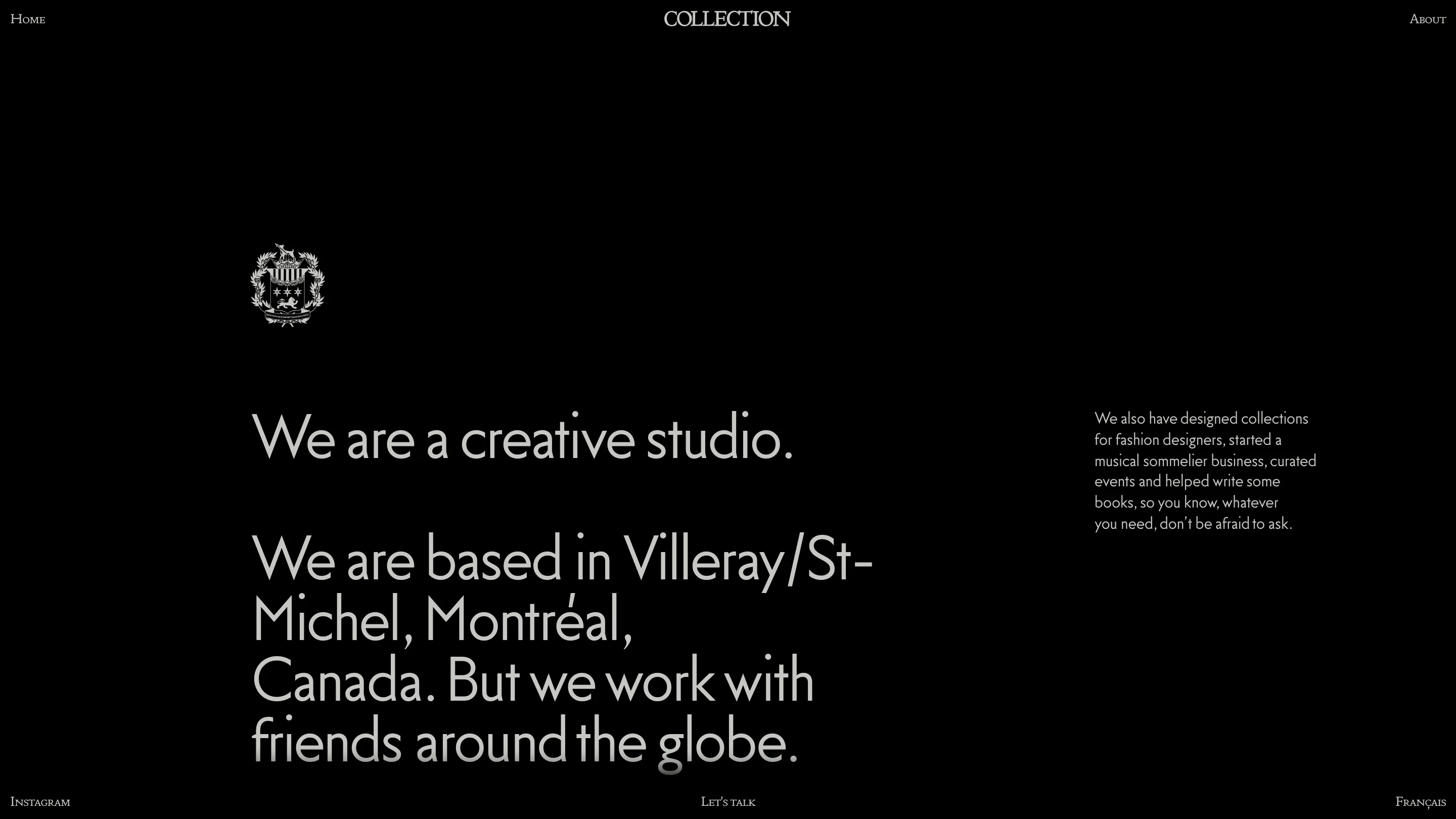
Click About and the site inverts. White becomes black, the work disappears, and you get a mock coat of arms with a lion and a Latin motto. "We are a creative studio. We are based in Villeray/St-Michel, Montréal, Canada. But we work with friends around the globe." Off to the side, in small type, they've "designed collections for fashion designers, started a musical sommelier business, curated events and helped write some books, so you know, whatever you need, don't be afraid to ask." The crest is a joke about self-importance told by people confident enough to make it. I'd have pushed the inversion further and let one work page go dark too, so the switch felt like a system rather than a one-off. The tone, though, is exactly right.
The move I'm stealing
Lead the case study with the idea, not the org chart. I catch myself opening project pages with client, year, role, the safe metadata, and burying the one line that actually says what we did. Collection puts that line at hero scale and lets the facts hang around underneath for the people who care. Credit to Domaine Public, the Montréal studio that built the site for Collection. It's a small inversion of the usual template, and it changes how the whole thing feels.
Featured: Domaine Public