Berlin's city museum renamed itself, and built the logo out of the street
Stadtmuseum Berlin is now the Berlin Museum, on a new domain, with an identity by Stan Hema drawn from U-Bahn signs and currywurst stands. The interesting move is what happens when that identity meets a website.
Stadtmuseum Berlin changed its name to the Berlin Museum this month, moved to a new address at berlin.museum, and gave the whole thing a new face. The institution holds 4.5 million objects across the Märkisches Museum, the Nikolaikirche, the Ephraim-Palais and the open-air Museumsdorf Düppel, and for years too few Berliners could tell you it existed. The fix started with the name. The identity, by Berlin studio Stan Hema, is the part I keep coming back to.
The rename was the first design decision
"Stadtmuseum Berlin" carried the smell of a dusty archive. "Berlin Museum" says what it is in two words, and it says it in more or less any language a visitor arrives speaking. The old stadtmuseum.de now 301s to berlin.museum, a .museum domain that reads as a label rather than a URL. I like that the naming and the address were treated as the same job. Most rebrands spend their budget on a mark and leave the words alone. Here the words did the heavy lifting first.
A wordmark pulled off the street
Then the fun part. Stan Hema built the logotype out of letters found around the city: U-Bahn station signage, building facades, the lettering on the corner currywurst stand. Typographer André van Rueth describes gathering forms from all over Berlin and setting them in dialogue, so the mark is deliberately mismatched, coral and lime and sky blue, with a small arrow made of tiny crosses tucked into the lockup. One writeup counted 81 different versions of the logo. Before any of it shipped, the studio ran an open call asking Berliners to argue about how the museum was seen. The result feels like the city talking over itself, which is the point.
Online it picks one strong form
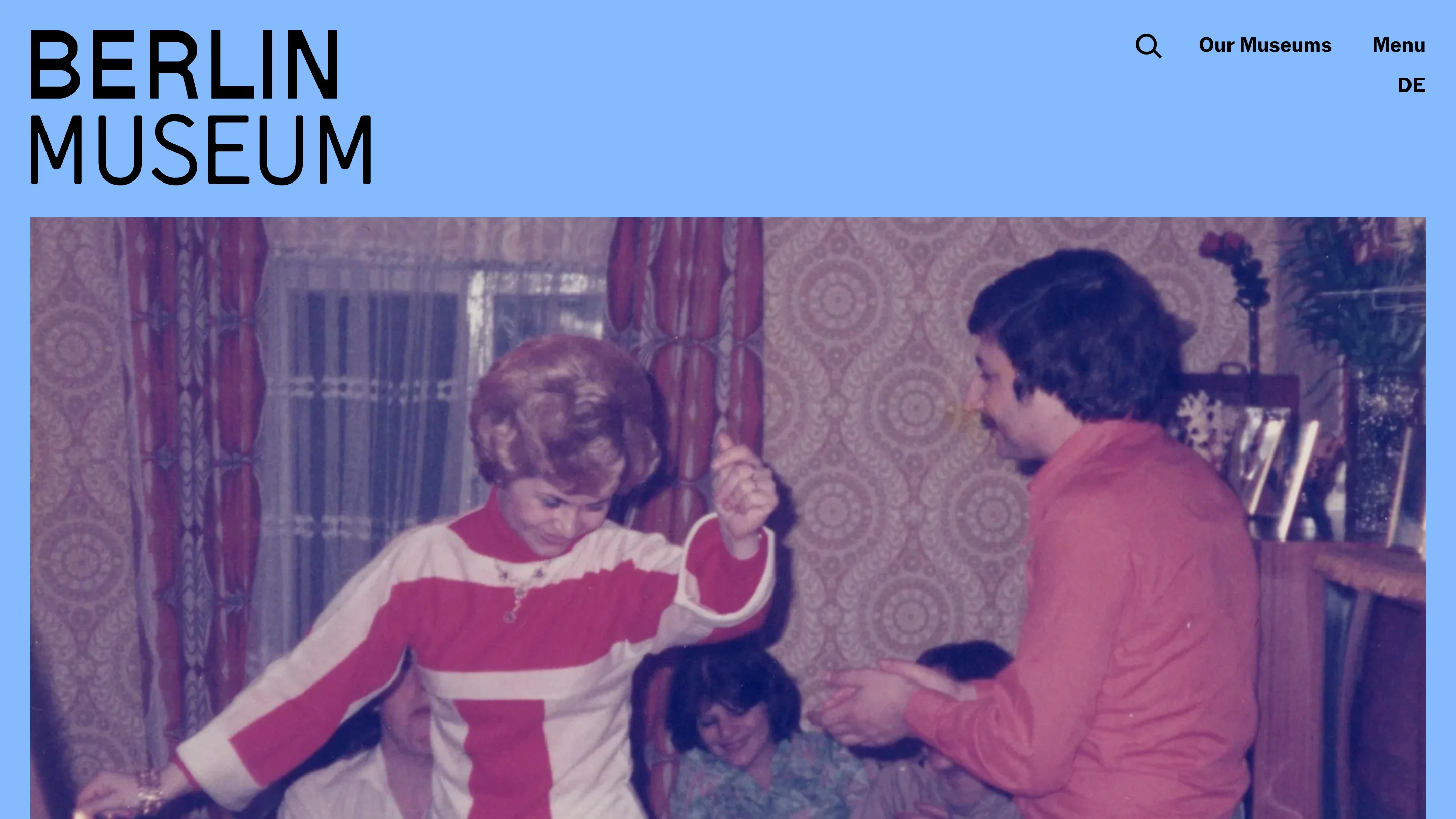
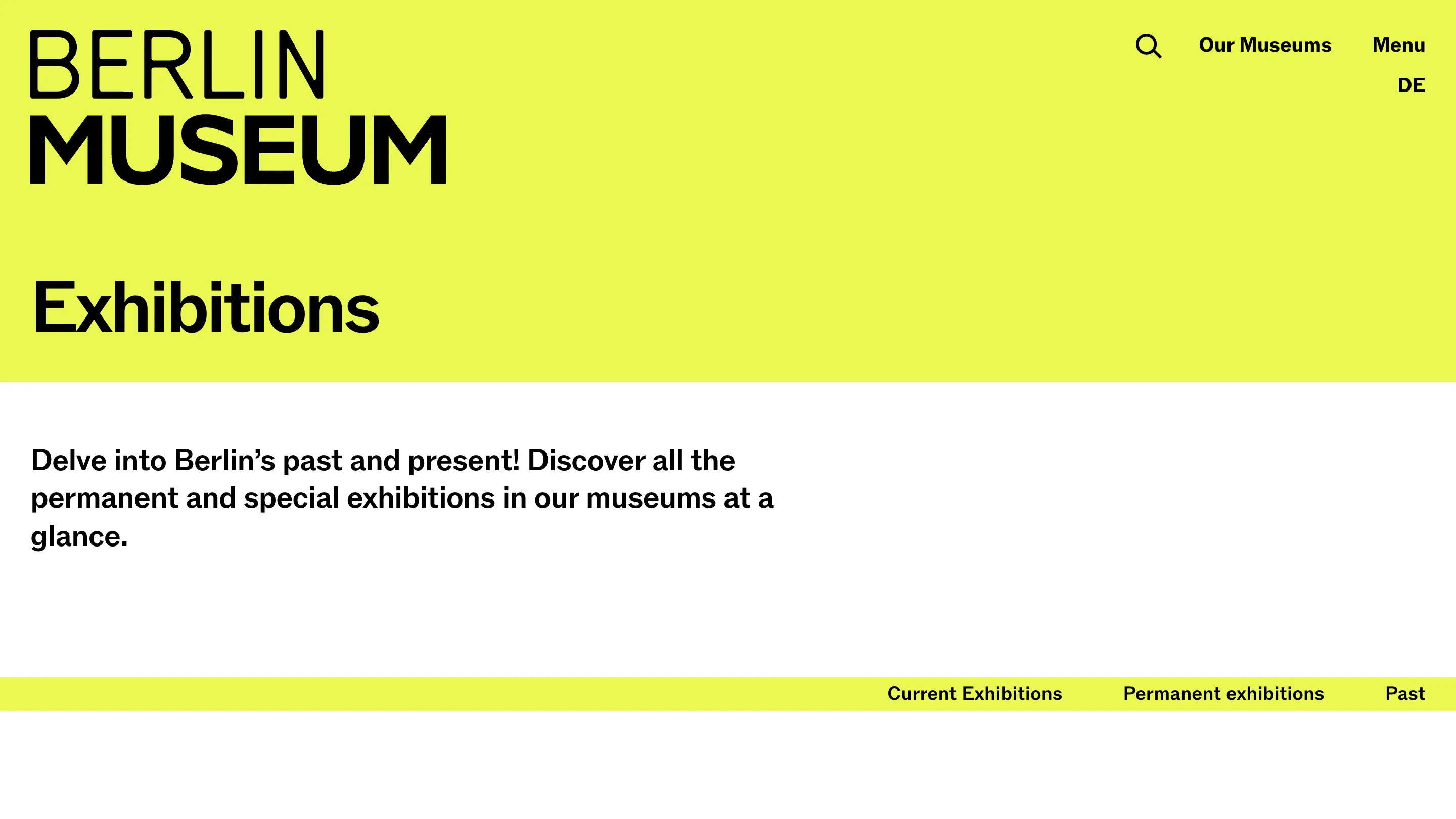
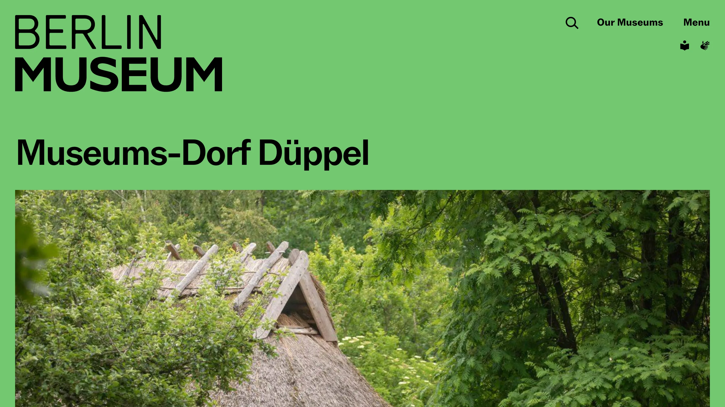
Here is what I did not expect. On the website the chaos calms down. The wordmark settles into one confident grotesk lockup, BERLIN over MUSEUM, and the system moves into color instead. Each section and venue gets its own full-bleed panel: sky blue on the home page, acid lime for exhibitions, a leafy green for Museumsdorf Düppel. Archive photography sits under the color, a 1970s living room on the home page, a thatched roof for the open-air village. The flexible, 81-logo idea lives in the campaign and the print. The digital surface keeps one mark and lets color do the sorting.
Why it matters if you build products
A generative identity is easy to admire in a case study and hard to run in a CMS. Editors do not have time to pick the right one of 81 marks for every page, and a homepage that reshuffles its logo on each visit reads as broken, not lively. Stan Hema drew the wild version for the places that can carry it and shipped a calm version for the places that have to work every day. The variety got pushed into a color token, which any content system can apply by section without a designer in the loop. That is the move I would steal. Draw the expressive thing, then decide which single form goes on the product, and let one cheap variable, here it is color, carry the range. The street stays in the identity. The website still loads a logo you can trust.
Featured: Berlin Museum, identity by Stan Hema