Coca-Cola shipped one visual system, and the rulebook now compiles
On 20 July Coca-Cola published a single global identity built by JKR, Superultrarare and Brody Associates. The packaging got the headlines. The part worth reading is the governance layer underneath it.
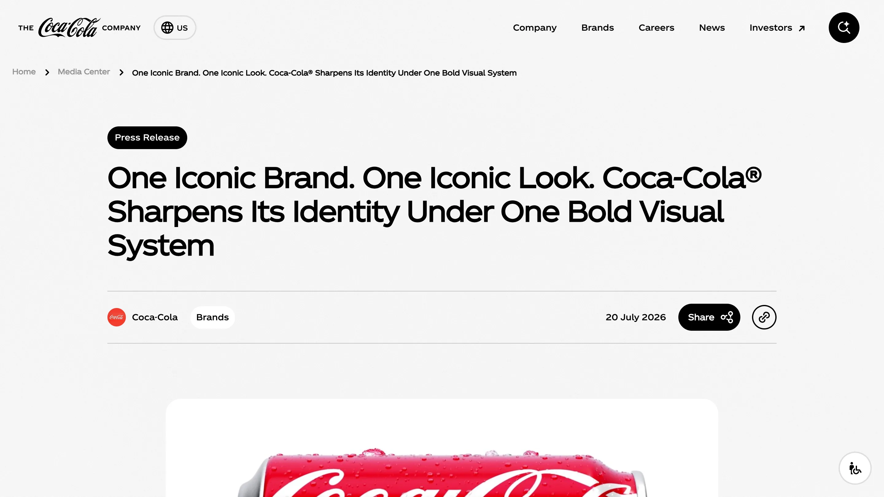
Coca-Cola published a new global visual identity on 20 July. The packaging got the headlines. The thing I keep coming back to is the sentence buried under it: the brand rulebook is being rewritten so a machine can read it.
What actually changed
JKR did the identity, Superultrarare the packaging system, Brody Associates the typography. The moves are small and load-bearing. On cans the Spencerian wordmark turns vertical. On multipacks a can lies on its side and the Dynamic Ribbon runs the full back panel, with the Arden Square parked top left. Zero Sugar keeps its black cap and black ribbon, sheds most of the other black, and sets the words "Zero Sugar" larger, in a serif.
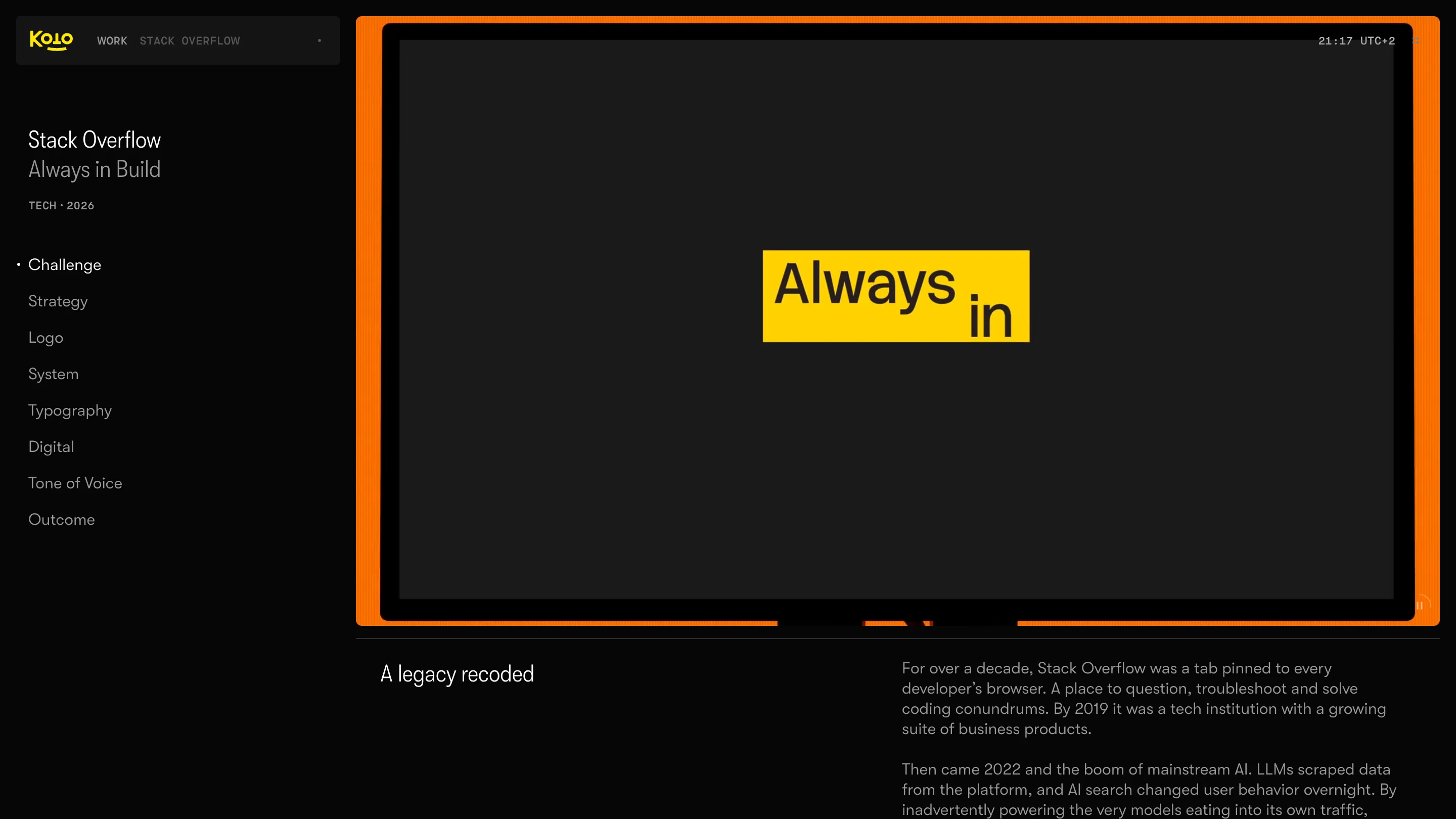
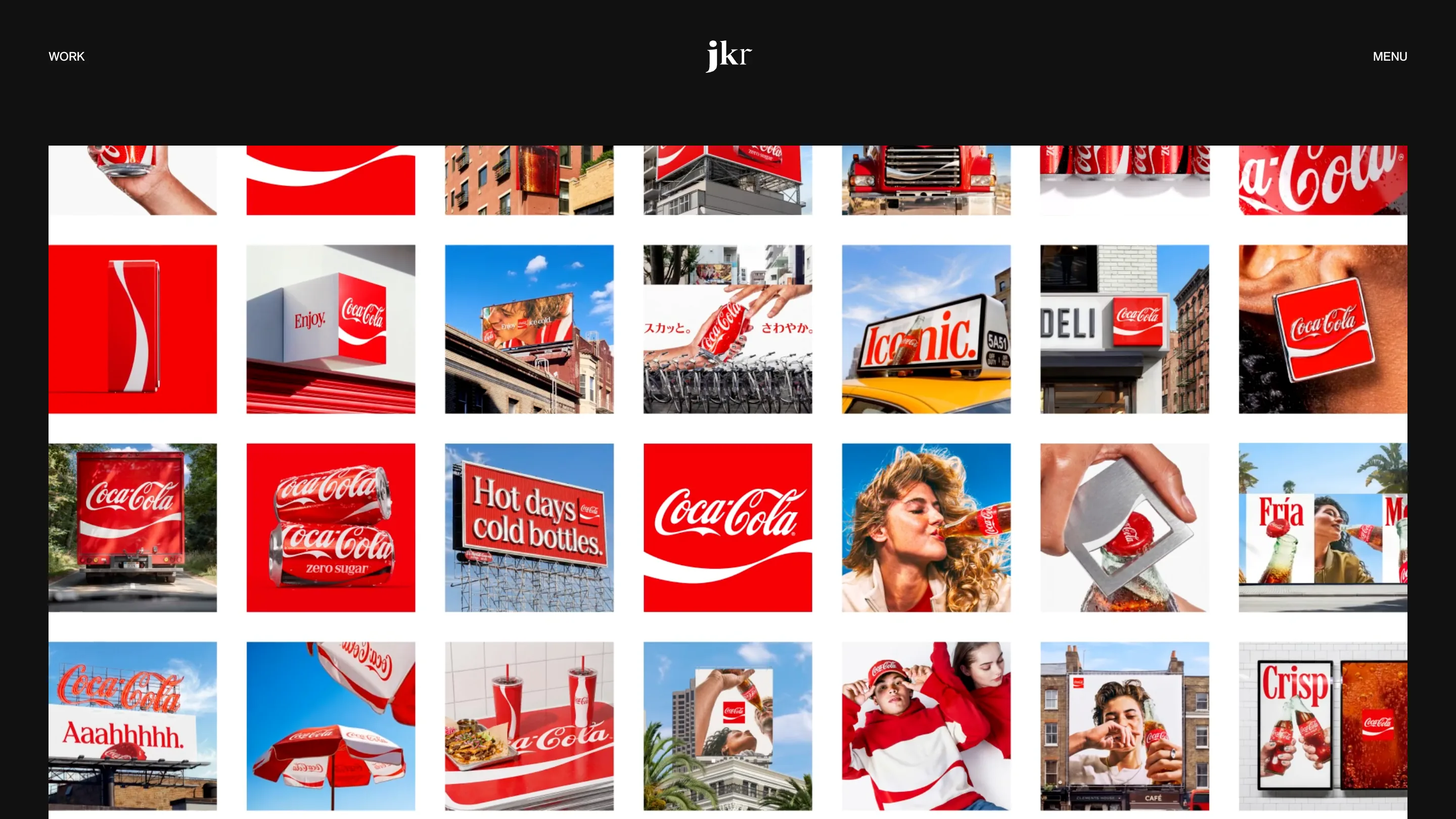
The Arden Square is the revival I rate. Lippincott & Margulies drew it in 1969 and it has drifted in and out of the system since. Bringing it back gives Coca-Cola a container that survives every crop: it reads at forty metres on a gantry billboard and at forty pixels as an app icon. Scroll JKR's work grid and you can see the logic. Truck, deli awning, taxi topper, parasol, a cinema-sized "Hot days cold bottles." board. The red square is the one unit that holds across all of them.
The rollout tells you what kind of project this is
Europe, the Middle East and India go first. Latin America and Asia follow. North America waits until 2027. Coca-Cola counts more than 200 markets. So this is a two-year staggered migration with two identities live at the same time in different territories, which is the same problem any of us hit moving a product onto a new design system, except the old version is printed on aluminium and already in a shop.
Arnab Roy, president of Coca-Cola's global category, framed the goal as "being clearer and more consistent in how we show up, wherever people experience our brand." Rapha Abreu, the global VP of design, called it "a single, bold brand experience." Consistency is the whole brief. Nobody is claiming a new look.
The rulebook became software
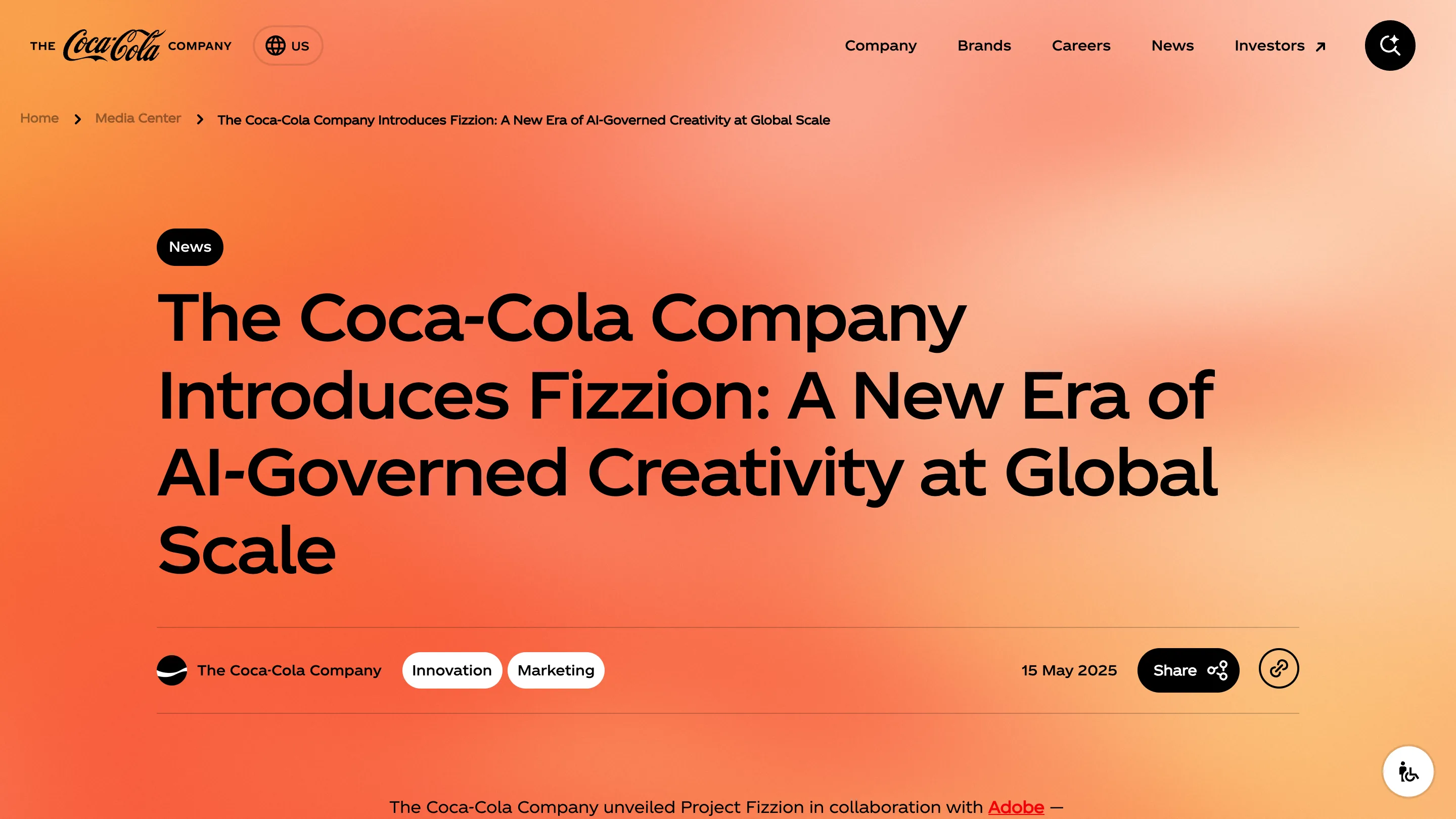
Alongside the identity, Coca-Cola pointed at a new Brand Center and a set of Design Intelligence tools for internal teams and agency partners. That thread starts on 15 May 2025, when the company announced Fizzion with Adobe. Fizzion runs inside Illustrator, InDesign and Photoshop. It watches a designer make layout and type decisions and encodes that intent as a StyleID, a machine-readable version of the rule the designer just applied. Coca-Cola's own description of the problem is the honest part: a 139-year-old identity across 200 countries, governed by PDFs that machines can't parse and people read differently.
Anyone who has shipped design tokens already knows this shape. A value gets defined once, named, and consumed by whatever renders it. What Fizzion adds is capturing the rule at the moment of the decision instead of writing it up afterwards in a document nobody opens.
What I'd take from it
I'd take the ordering. Coca-Cola did the identity and the governance tooling as one piece of work, and the tooling was in market fourteen months before the identity landed. Most rebrands I see run the other way: launch, then discover in month six that 200 local teams each have their own interpretation of the red.
My one opinion, and I'll defend it. The vertical wordmark will get all the critique posts, and it deserves about a paragraph. The decision with consequences is that Coca-Cola stopped treating brand guidelines as a document and started treating them as an interface with an API. If your brand book is still a PDF, the next two years are going to feel expensive.
Identity by JKR, packaging by Superultrarare, typography by Brody Associates. Announcement and imagery from The Coca-Cola Company.
Featured: The Coca-Cola Company