Dragonfly pins its name to the four corners and lets the page move inside it
Studio Freight put one serif letter in each corner of the viewport and built the rest of the site to live between them. An ASCII dragonfly, portraits lit to disappear into black, and a portfolio that stays a list.
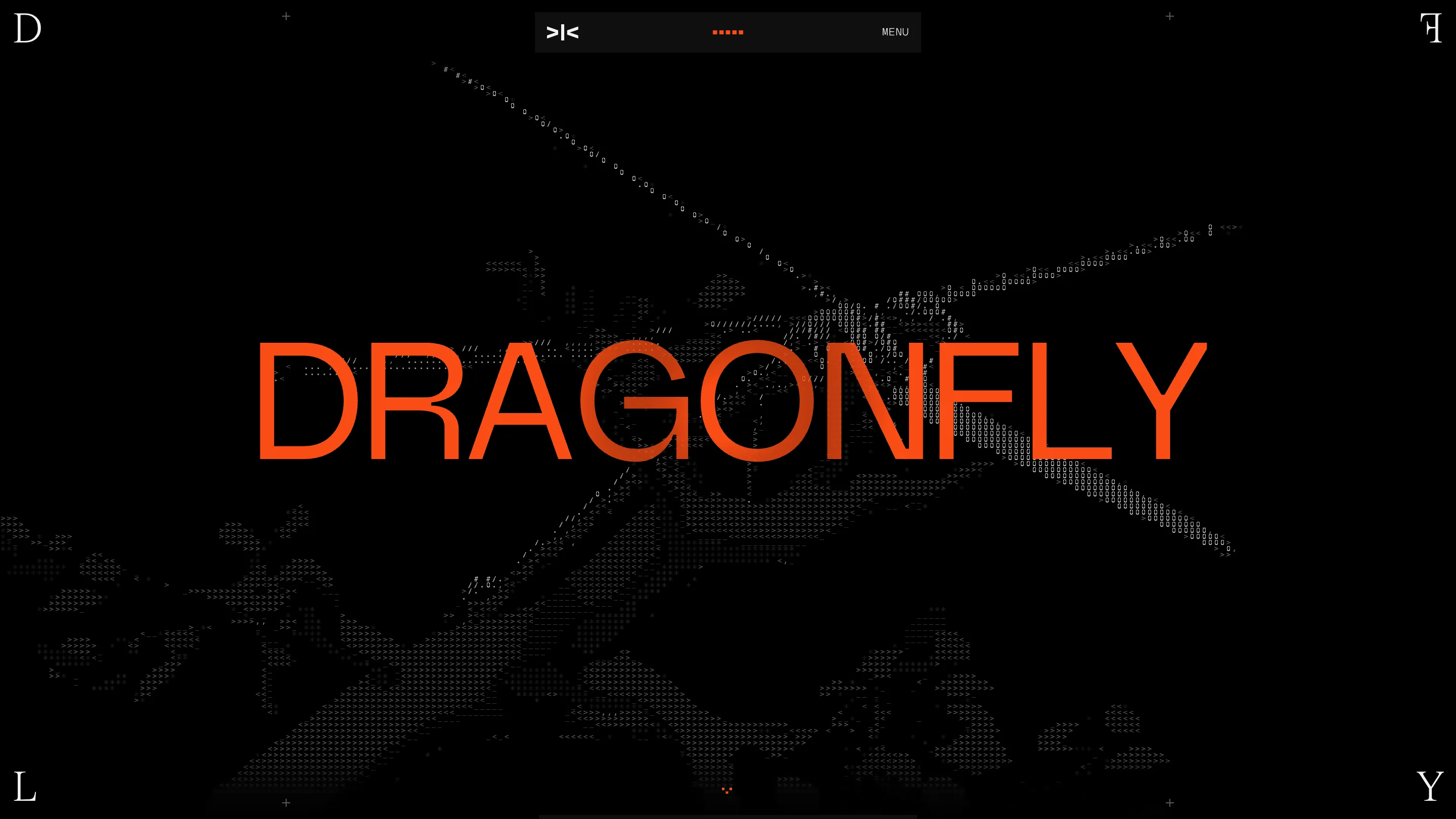
The best move on Dragonfly's new site sits in the four places most sites leave empty. One serif letter in each corner of the viewport: D and L down the left edge, a mirrored F and a Y down the right. DFLY, the fund's short name, wrapped around the frame of the browser window. The letters don't scroll. Everything else moves inside them.
It took awwwards Site of the Day today, 22 July 2026, with a 7.39. Studio Freight built it, and the live site is at dragonfly.xyz.
The frame is doing the branding
Type pinned to the edge of the page is an old poster trick, and on the web it usually breaks. The letters collide with content at some breakpoint, or they sit so close to the browser chrome that they read as an accident. These hold. They're set in a high-contrast serif while the rest of the site runs on a plain grotesk, so the corners register as a mark instead of as text you're meant to read in sequence. Mirroring the F is the part I keep coming back to. It makes the right edge behave like a reflection of the left, and it keeps DFLY from looking like a typo.
ASCII where the 3D render would have gone
The hero is a dragonfly drawn in hashes, slashes, angle brackets and zeroes, white on black, with the wings running off both sides of the screen. A fund writing $3M to $30M checks could have paid for a photoreal insect turning in WebGL. The ASCII version is the better call. It reads at any size, it weighs nothing, and it rhymes with the >|< mark sitting in the floating nav pill at the top. The word DRAGONFLY lands over it in orange, tracked out edge to edge, and the two layers fight in a way I like: the type is clean and corporate, the thing behind it is a terminal dump.
The portraits are lit to match the page
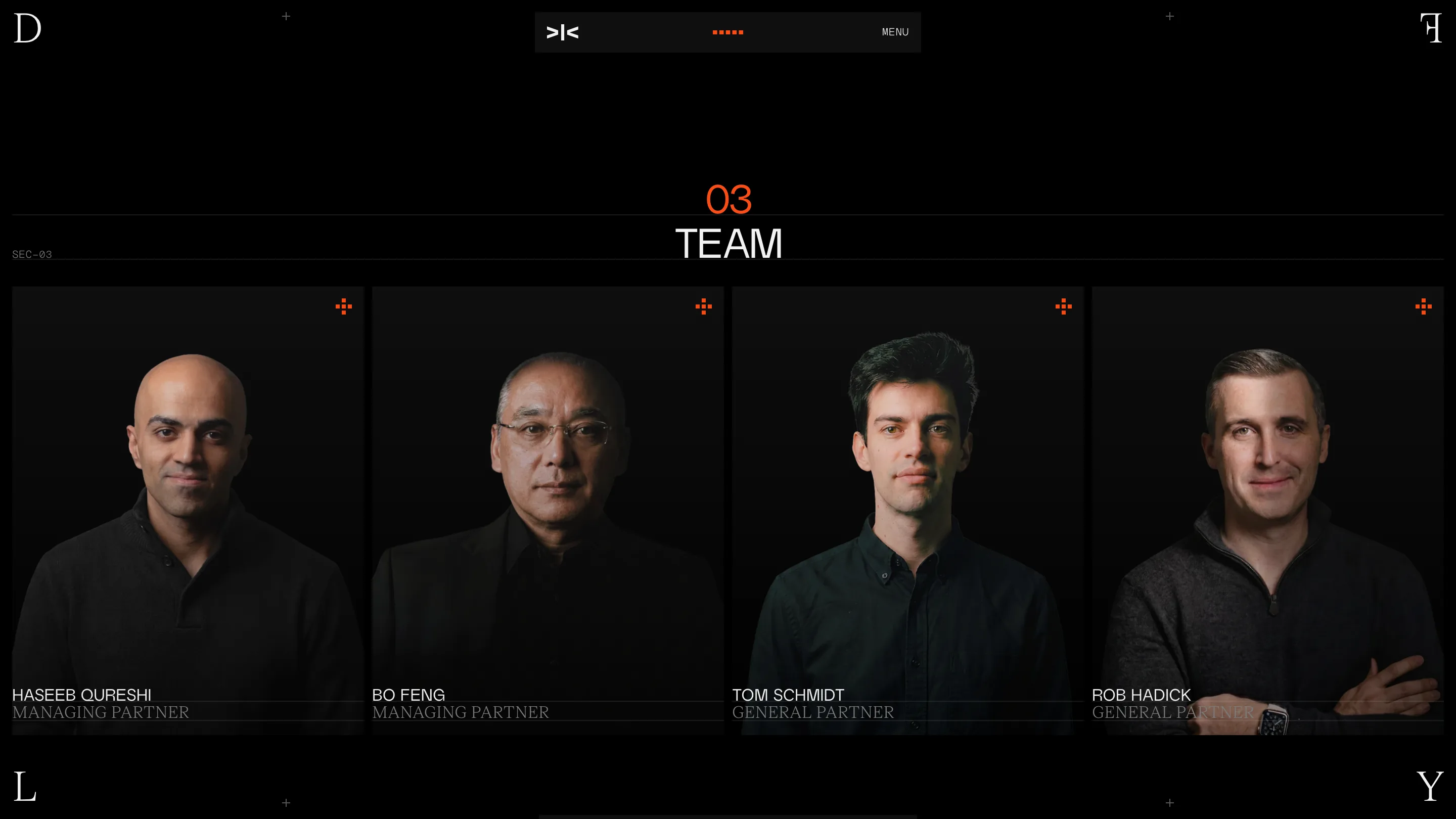
Four partners, shot on black with almost no fill light, so the card backgrounds dissolve into the page and only the faces and shoulders survive. Names in white caps, roles underneath in a grey serif. A small orange crosshair in the top right of every card. Above it all, an orange 03 over the word TEAM, with SEC-03 set in mono on the left of a hairline rule. Somebody decided this site was an instrument panel and then held that decision through every section. Photography usually gets treated as content that arrives later. Here it was art directed to sit inside the same black as the CSS.
122 companies, and the list stays a list
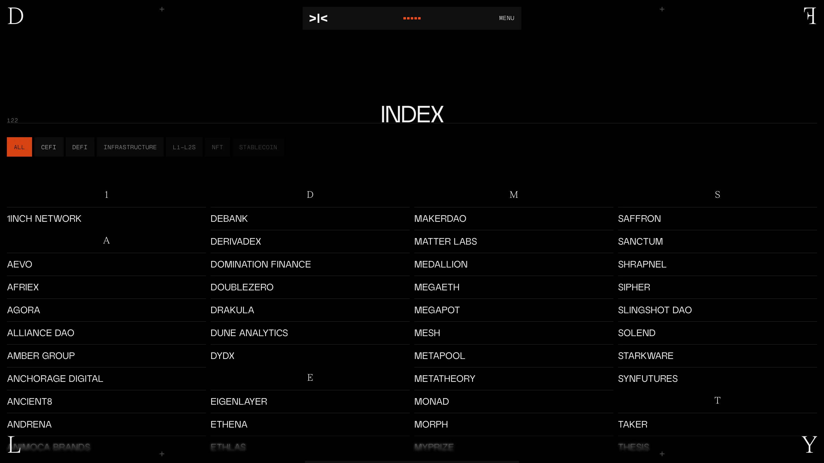
The portfolio section is called INDEX, and the number 122 sits in the hairline above it in mono, the way a page number sits in a running head. Filter chips across the top: ALL in solid orange, then CEFI, DEFI, INFRASTRUCTURE, L1-L2S, NFT, STABLECOIN. Under that, four columns of names, one per hairline row, with the letter dividers set in that same serif and centred over the column. No logo wall, no cards, no hover-to-reveal case study. For a fund with this many holdings, the alphabetical list is the honest form, and typography carries it.
What I'd steal
The corner letters, first. Any brand with a four-letter short name can put it in the margins and get an identity that survives every scroll position for the cost of four absolutely positioned spans. The second one is smaller: the count living inside the rule instead of next to the heading. It's a magazine habit, it makes a number look editorial rather than like a badge, and it works anywhere you have a filtered list.
Content scored 6.84, the lowest of the four marks, and I'd agree. The copy is thinner than the shell it lives in, and the site leans on the visual system to carry sections that don't say much. I'd put it around 8 on craft and let the rest sit where it sits. Strong pick.
Featured: Studio Freight