One portfolio, two type voices: Karol Ortyl keeps the play out of the work
Karol Ortyl's site runs two type voices, a hand-drawn one for personality and a flat grotesk for the work, and never lets them mix. The split is the whole idea.
I saved Karol Ortyl's portfolio for one move. The site is playful, and the play never touches the actual work. Two type voices run through it, one loose and drawn by hand, one flat and mechanical, and Ortyl keeps them in separate rooms. That split is the design idea worth stealing.
The maker is Karol Ortyl, a designer working across web, product and brand since 2014. I found the site on minimal.gallery.
The hero is all hand
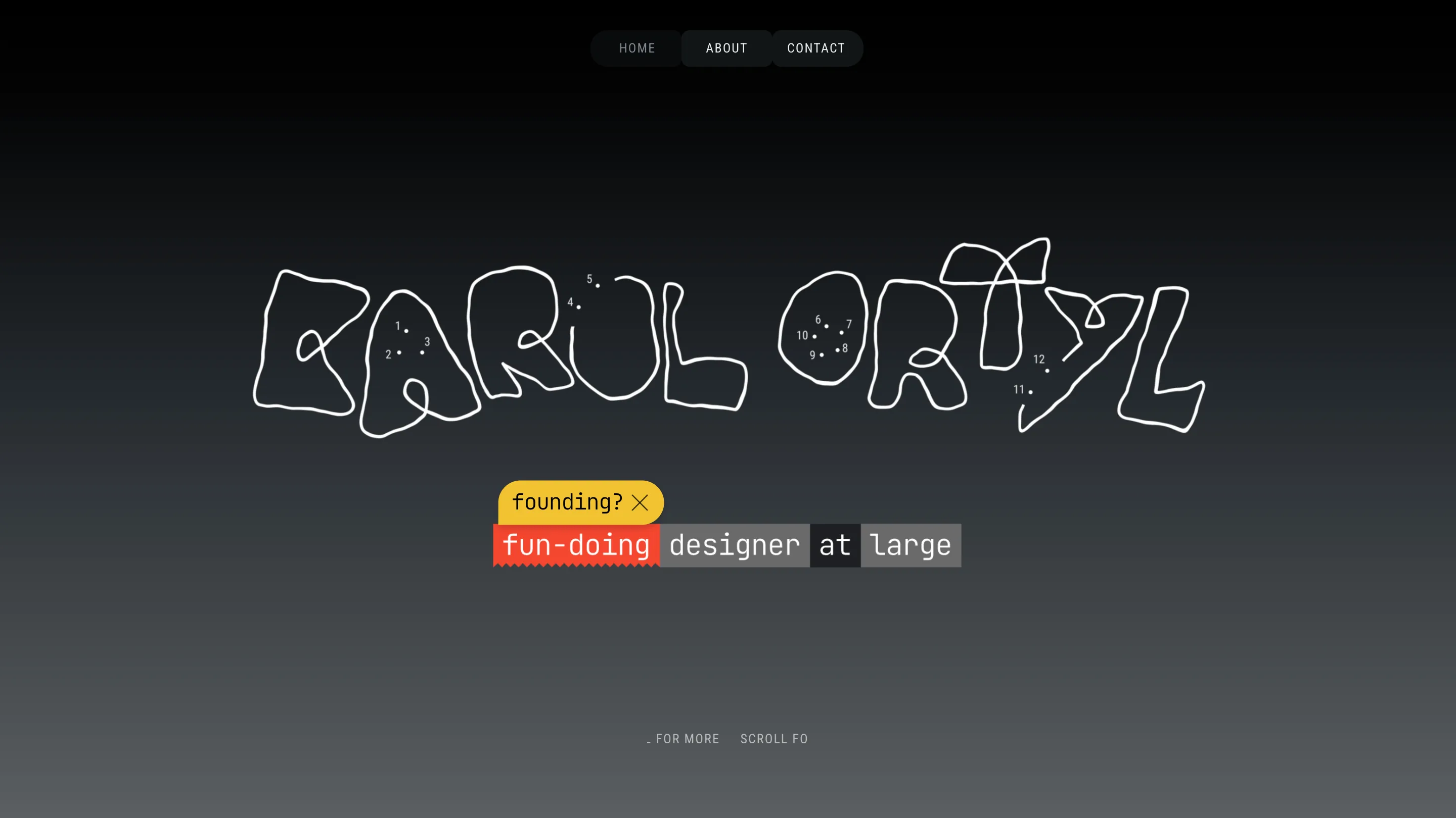
The homepage opens on his name drawn as one wobbling outline, the kind of single-stroke lettering you'd doodle in a margin. Inside the letters sit twelve numbered dots, a connect-the-dots puzzle nobody asked for. Under it runs a line marked up like a printout: "founding?" struck through with an X, then "fun-doing designer at large" in highlighter blocks, red and grey, each word boxed in its own swatch. It reads like a page someone annotated by hand.
None of this is subtle, and that's the point. The hero is where all the personality lives. It tells you Ortyl is a person before it tells you a single thing he has made.
The work switches to a flat grotesk
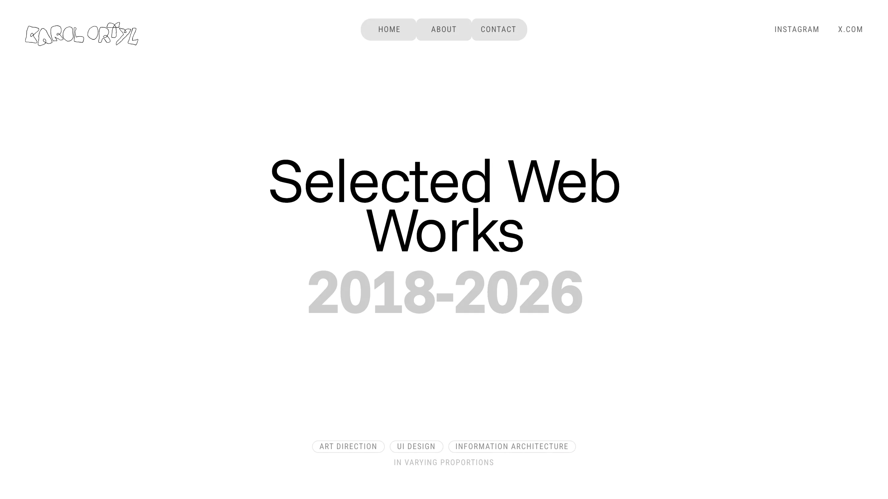
Click into the work and the voice changes completely. "Selected Web Works" sits in tight black Helvetica-style type, centered, no drawing, no color, no wink. The scribbled wordmark shrinks to the top-left corner and behaves. Same for the archive, the apps, the schema pages: each one is a clean full-screen title with nothing competing for attention.
This is the discipline I rate. A lesser version of this site would carry the doodles into the case studies and make the work look unfinished. Ortyl walls the play off in the wordmark and the hero, then lets the projects stand in a sober typeface.
The subtitle does the color work
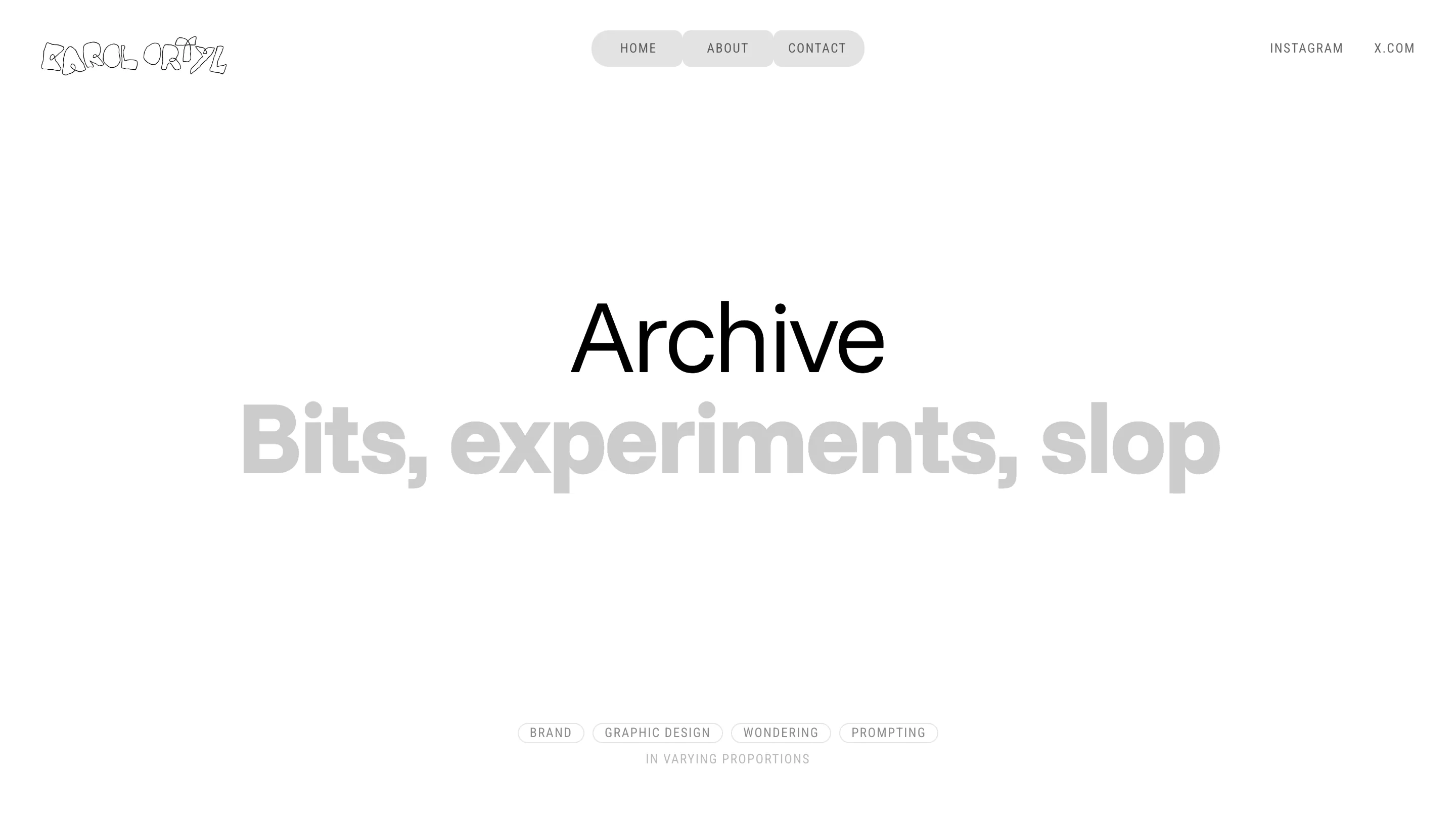
The section dividers share one small move I keep looking at. The title is black and medium-sized. The subtitle under it is bigger and set in light grey, so it reads as a whisper even though it is the largest thing on screen. "Archive" in black, then "Bits, experiments, slop" in grey at nearly double the size. The eye lands on the black first and the grey second, backwards from the sizing, and it works.
At the foot of each divider sits a row of outlined pills naming the disciplines, Brand, Graphic design, Wondering, Prompting, with a grey caption reading "in varying proportions". It frames the page like an index card. Honest, a little dry, and it earns a smile without a joke.
What I'd keep
The move worth keeping is the wall between the two voices. If you want a portfolio that feels like you and still makes the work look serious, decide which surfaces carry personality and which stay quiet, then hold that line on every page. Ortyl's hero is loud so his work pages can be silent. Blur the two and you land neither warm nor sharp. This site is both, in the right places.
Featured: Karol Ortyl