The Lacoste Polo Factory paints every room a single colour
Merci Michel gave each step of making a polo its own monochrome room and one physical button. The colour discipline is the reason it works, and the reason I rate it.

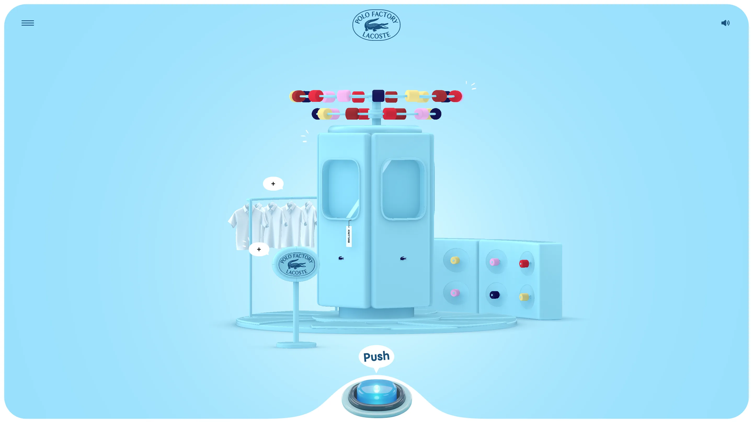
The move I keep going back to on the Lacoste Polo Factory is the colour discipline. Every step of making a polo gets its own room, and each room is painted one colour, top to bottom. Knitting is pale blue. Dyeing is butter yellow. Machine, floor, signage, the little Polo Factory sign on a pole, the shadows under it, all the same hue. Nothing in the frame argues with anything else.
It took awwwards Site of the Day on 21 July 2026 with 7.49, built by Merci Michel in Three.js. Creativity scored 8.13 and the transitions took 9.20, which matches how it feels to use.
One colour, then one exception
Painting a whole scene in a single hue only pays off if you break it once. In the knitting room the exception is the thread: two rails of spools running above the machine in red, navy, pink and yellow, the only saturated objects on screen. Your eye has nowhere else to go. In the dyeing room the exception is three finished polos, salmon, blue and yellow, hanging on a line above a machine that stays beige.
So the product is always the brightest thing in the room. That is the part I would steal on the next thing I art direct. It costs nothing and it does the job that ten arrows and a caption usually get asked to do.
The button is the whole interface
There is no scroll here, no drag, no tutorial overlay. At the bottom of the screen sits a chunky arcade button, lit from inside, and the white page frame scoops around it in a curve so it reads as part of a physical console rather than a UI element floating on top. One button, one job.
The verb on it changes with the machine. In knitting it says Push. In dyeing it says Hold, and holding is right, because dye needs time. Two words carry the entire instruction set. I like that a lot more than the usual explainer panel.
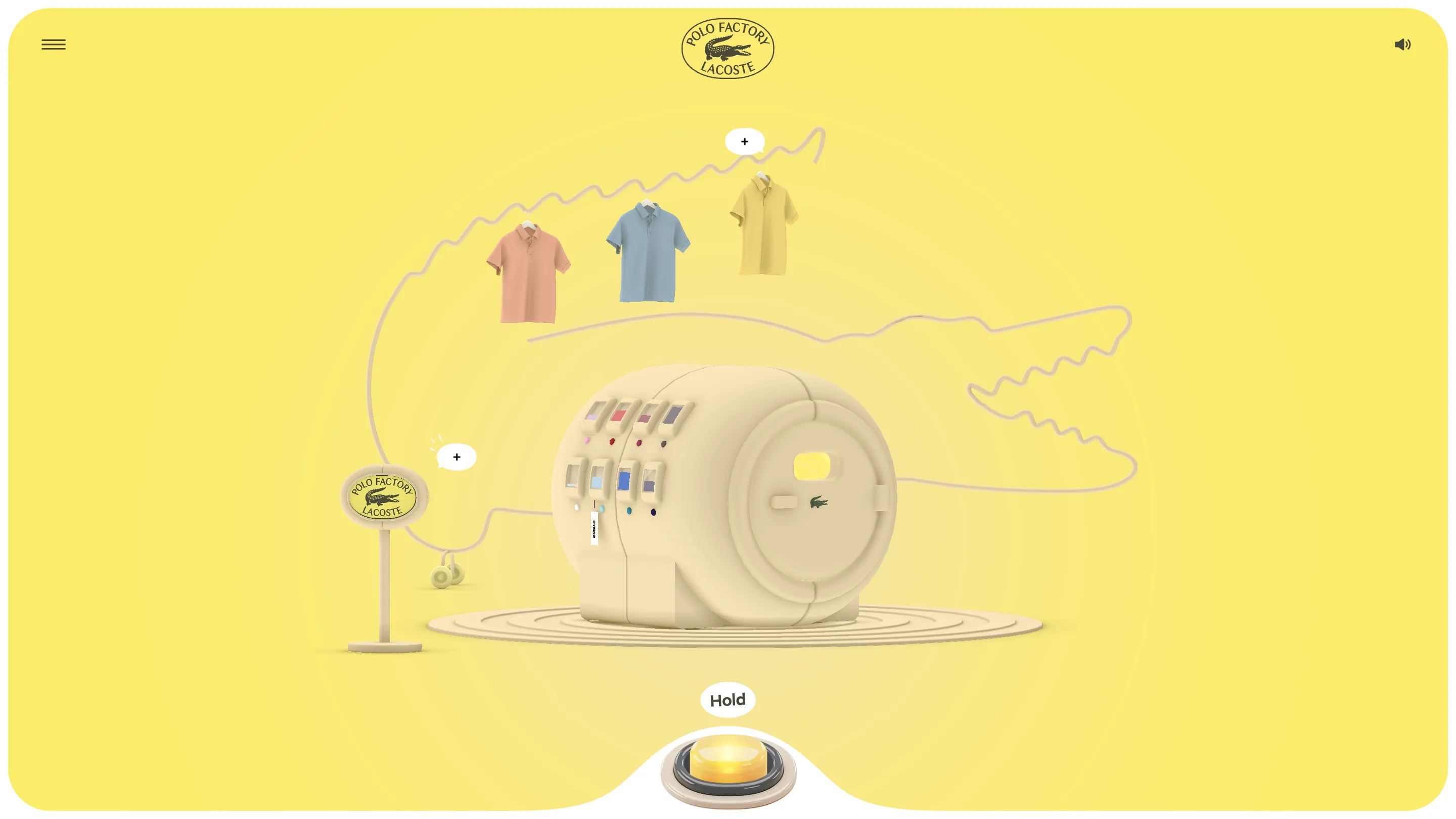
The dyeing room also has the best drawing in the piece: a crocodile traced across the back wall as one continuous thin line, the same weight as the cable running from the sign to the machine. It sits in the background without asking for anything.
The text got the same restraint
Little plus markers float near the machines. Open one and you get a full-bleed panel, dark blue type on white, no photo, no illustration, no card. THE POLO SHIRT, then a short read on René Lacoste inventing it to survive the heat of the American courts. It reads like a museum wall label, and against all the 3D it lands harder than any styled callout would have.
What I'd rate it
Usability came in lowest of the set at 7.09 and I understand why. The stage tabs at the top show you Knitting, Dyeing and Embroidering, then keep two of them locked until you finish the first. Showing three doors and opening one is a choice you make when the story matters more than the browsing, which is fair for a brand piece, and still the one thing that would annoy me on a second visit.
Everything else I would sign off on. The intro screen alone, with polos and moulded crocodiles drifting across a green field around a badge shaped like a bar of soap, sets the material language for the whole thing: soft, matte, slightly toy-like, never trying to look photographic. Strong pick.
Featured: Merci Michel