Zauberberg makes the director list the whole home page
51 names in one centred column, with the reel playing full-bleed behind them. Antinomy Studio built a roster site where the index is the hero and the images are the wallpaper. I rate the idea and I'd fix the contrast.
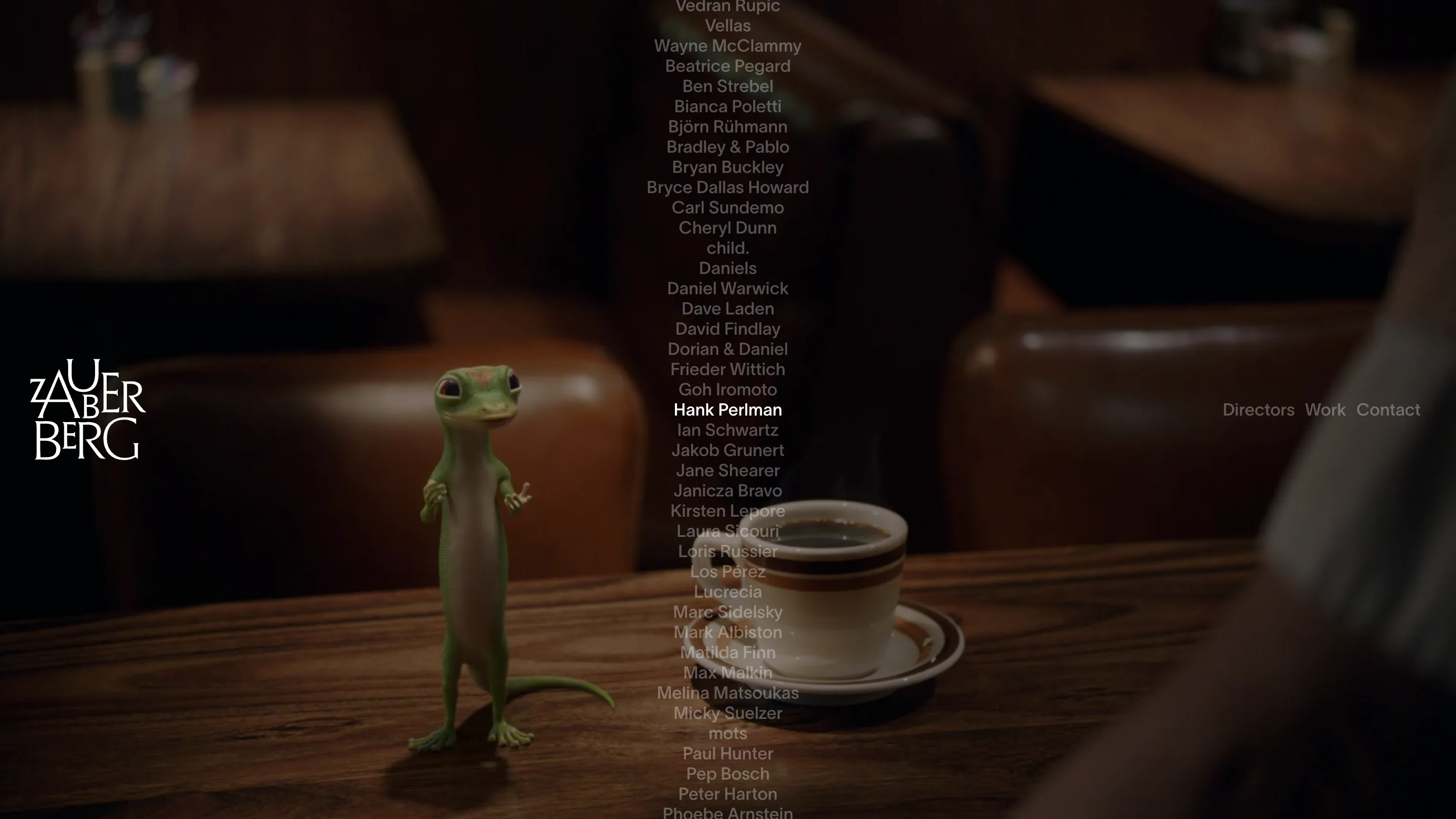
The home page of Zauberberg is a list of names. Every director on the roster, alphabetical, one centred column, sitting over a film that plays full-bleed behind them. Hover a name, the film swaps to that director's work. That is the entire home page. No cards, no thumbnails, no positioning statement.
Zauberberg is a Berlin production company. The site is by Antinomy Studio in Amsterdam, and the decision I keep coming back to is the one most roster sites get wrong.
The index is the hero
A directors' agency has a structural problem: 51 people, all of whom think they should be first. The usual answer is a grid of headshots or key frames, which flattens everyone into equal rectangles and makes the page look like a stock library. Antinomy went the other way. The names carry the page in plain grotesque type, and the moving image is demoted to background.
It works because of what a buyer is actually doing here. A commissioner arrives with a name in their head. They want to find Melina Matsoukas, watch ten seconds, and email the producer. A list is the fastest object for that. The film behind it is confirmation, not discovery.
The nice touch is that the column wraps. Past Wayne McClammy it comes back round to Beatrice Pegard, so the alphabet reads as a continuous band with no top and no bottom. On a roster where position is politics, having no first slot is a real answer, not a flourish.
The chrome sits on the middle line
Logo left, nav right, both locked to the vertical centre of the viewport rather than the top edge. It holds across every route I opened. The wordmark is worth a look on its own: ZAUBERBERG stacked on two lines with the U tucked into the shoulder of the A and the E nested into the B, so the counters do the spacing instead of the tracking.
Putting navigation on the horizon line is the kind of thing that goes badly nine times out of ten. Here it reads as a spine. Your eye enters at the left mark, crosses the content, exits at the nav, all on one axis. It also keeps the top of the frame free, which matters when the top of the frame is somebody's footage.
Where I'd push back
Contrast. The unhovered names sit at roughly 45 percent grey over live video, and video moves. In my capture, a warm restaurant scene ran under the list and half the names dissolved into the wood grain. On a light frame they'd disappear entirely. A scrim behind the column, or a lift to 65 percent on the resting state, costs nothing and the effect survives.
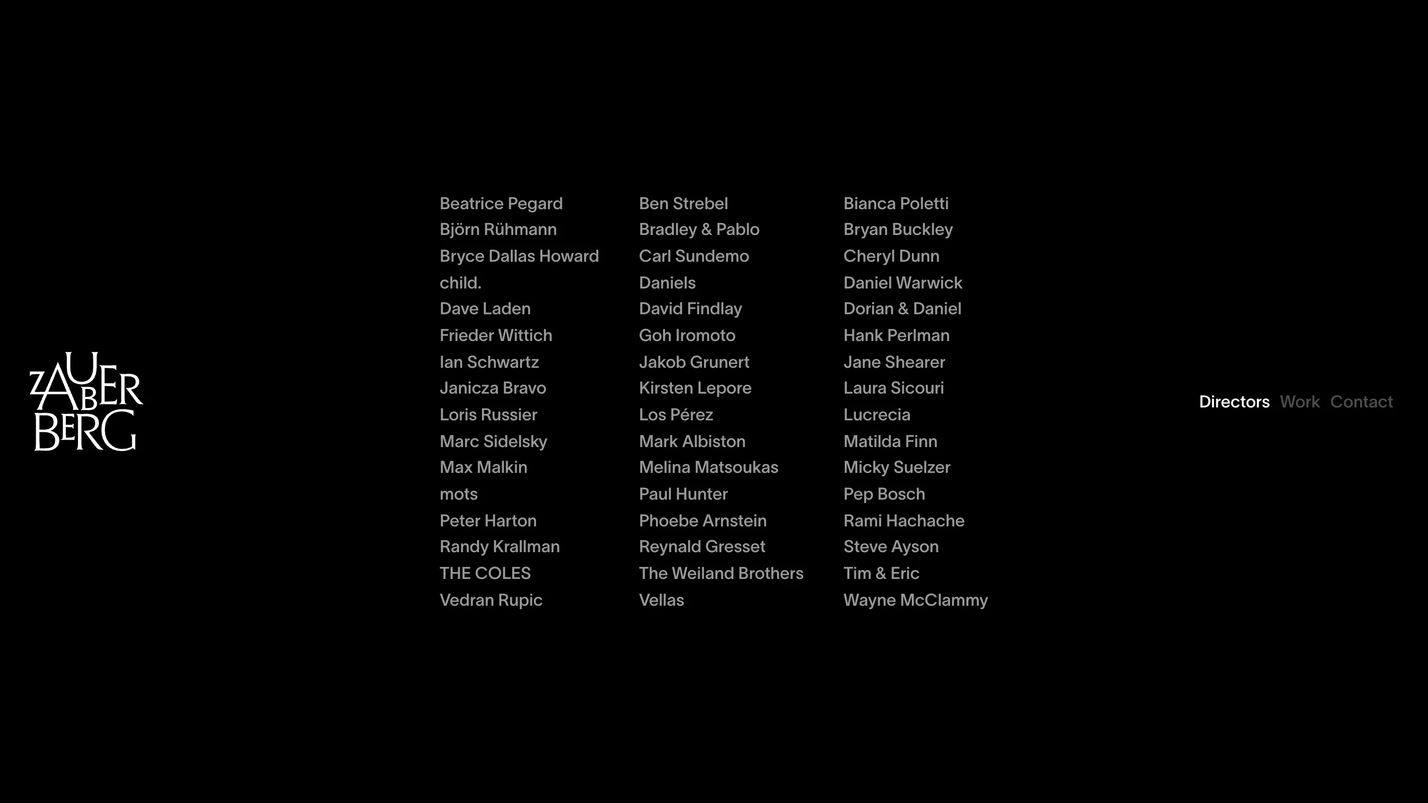
The /directors page proves the point by removing the video. Same names, three columns, reading size, black field. It is the most legible screen on the site and there is not a single image on it. I like that they let it be a document.
The work page is the weak one
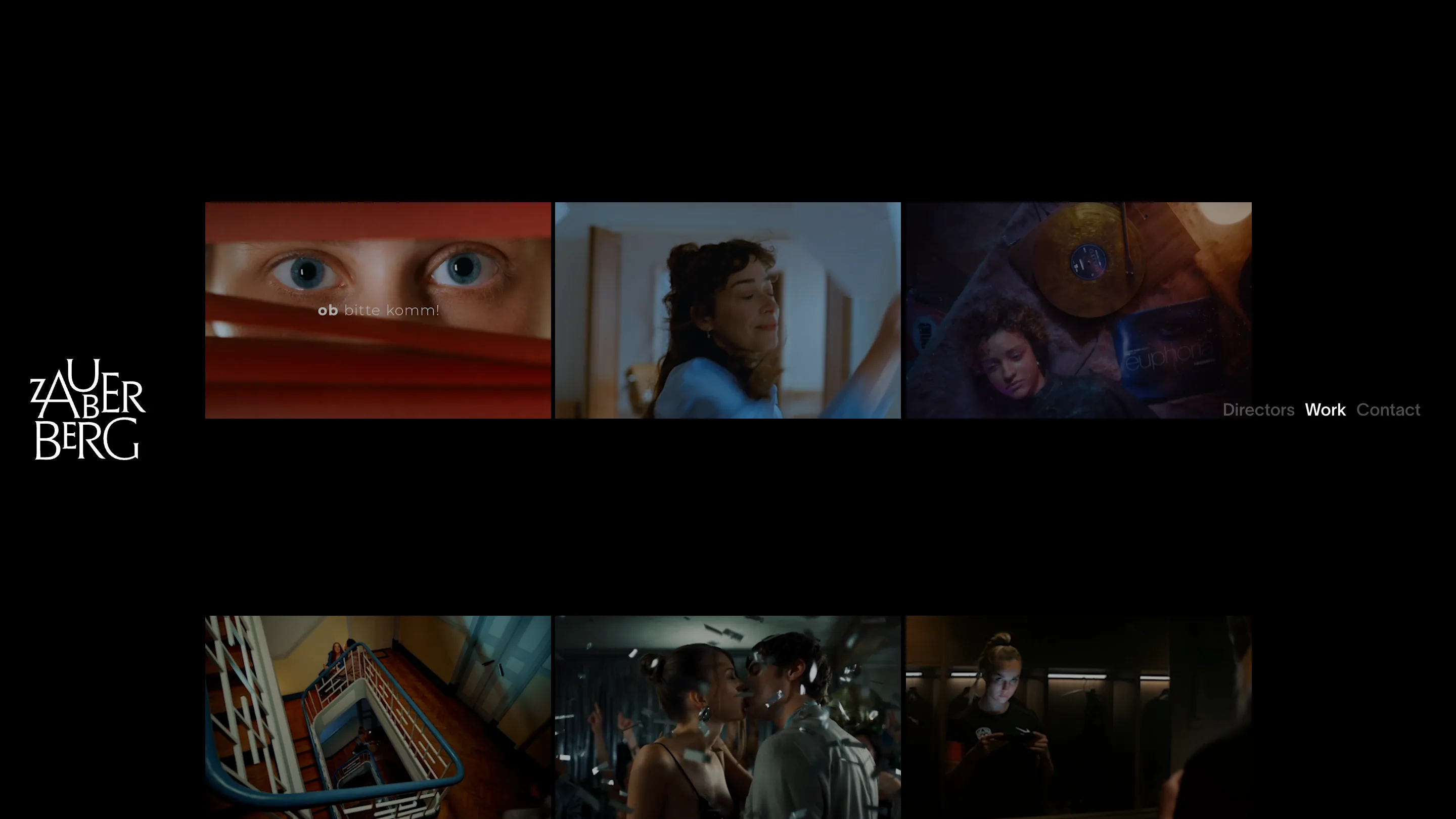
Six 16:9 stills, three across, wide black gutters, and no titles. No client, no director, no year. The restraint that carries the home page runs out here, because a still without a name is just a picture. I'd set a director credit under each frame in the same grey the roster uses. The page would lose nothing and gain the one piece of information the visitor came for.
The move I'm taking
Lead with the index, let the media play behind it. I keep building project pages where the imagery holds the top of the screen and the list of work sits underneath, and Zauberberg is a good argument for flipping that when the visitor already knows what they are looking for. Names are faster to scan than pictures. The pictures can wait one hover.