The title-page layout: Collection pins the whole interface to the edges
Collection's portfolio puts a crest in the middle of an empty screen and pushes every navigation item out to the corners. The layout holds across three very different pages.
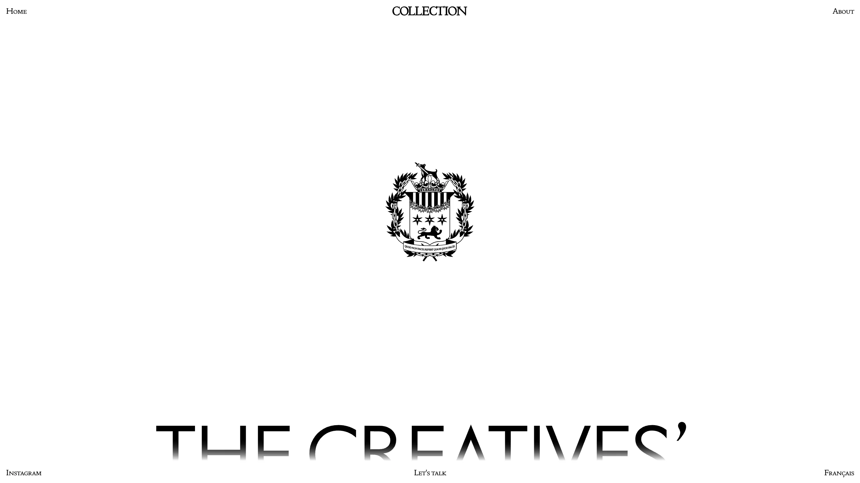
Collection's homepage reads like the title page of a book. An engraved crest sits alone in the middle of a white field, and every functional element is pushed to the edges: Home top left, the wordmark top center, About top right, Instagram bottom left, Let's talk bottom center, Français bottom right. Six anchors, one mark, nothing in between.
It's the site of a Montreal creative studio, designed by Pier-luc Cossette, and I pulled it out of the Siteinspire feed this week. What I kept it for is the layout idea, which is old and barely used on the web.
The title-page layout
A book title page works by scarcity. Publisher's mark, title, imprint at the foot, acres of paper. Your eye gets one place to land, and the empty space is what tells you the thing in the middle is worth the paper. Collection ports that onto a viewport. Because the six chrome items are pinned to the corners and the midpoints, the center of the screen stays clear for whatever the page is actually about.
The payoff is that the frame never moves. Home, about, case study, same six positions every time. You stop noticing the interface after the first click, which is the job.
Two typefaces, two jobs
All the chrome is set in a small-caps serif at around 13px. All the content is a thin geometric sans at display size. That split carries the whole design. The serif small caps read as furniture: labels, permanent, part of the window. The sans reads as voice. There's no third weight, no accent color, no icon anywhere except the crest.
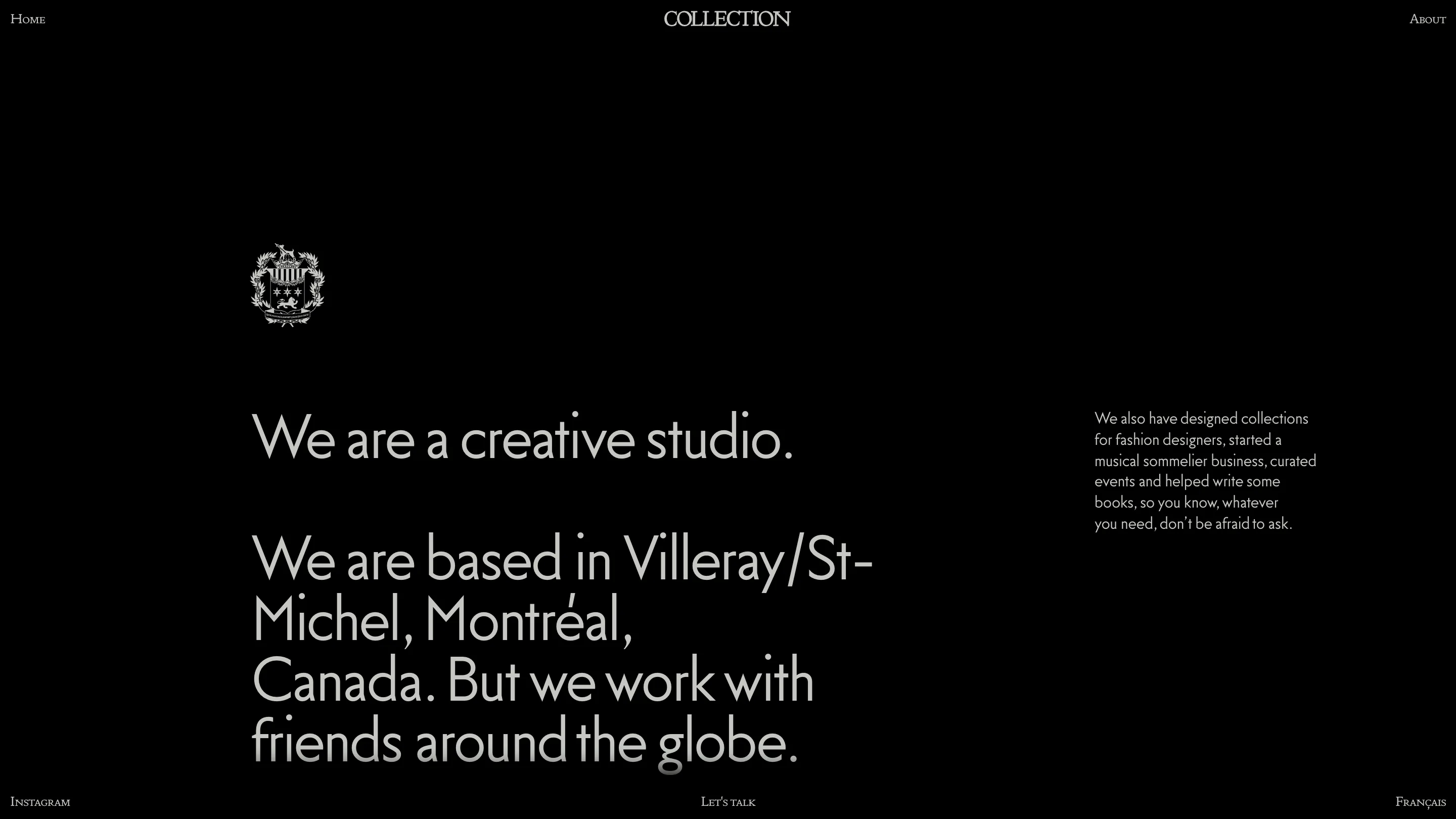
The about page flips to black and keeps every position identical. "We are a creative studio." runs at something like 90px down the left two thirds, a short paragraph sits parked in the right column, and the crest is reversed to white and shrunk into the upper left. Same skeleton, inverted values. The color flip is the only thing telling you the page changed, and it's enough.
The crest does the branding
The mark is a full heraldic engraving: lion, laurel, three stars, a motto ribbon under the shield. On a site otherwise built from thin modern type, that should clash. It doesn't, because it's the only ornament in the entire design and it's reproduced small enough to read as texture rather than illustration. One dense object, everything else plain.
The case study keeps the frame
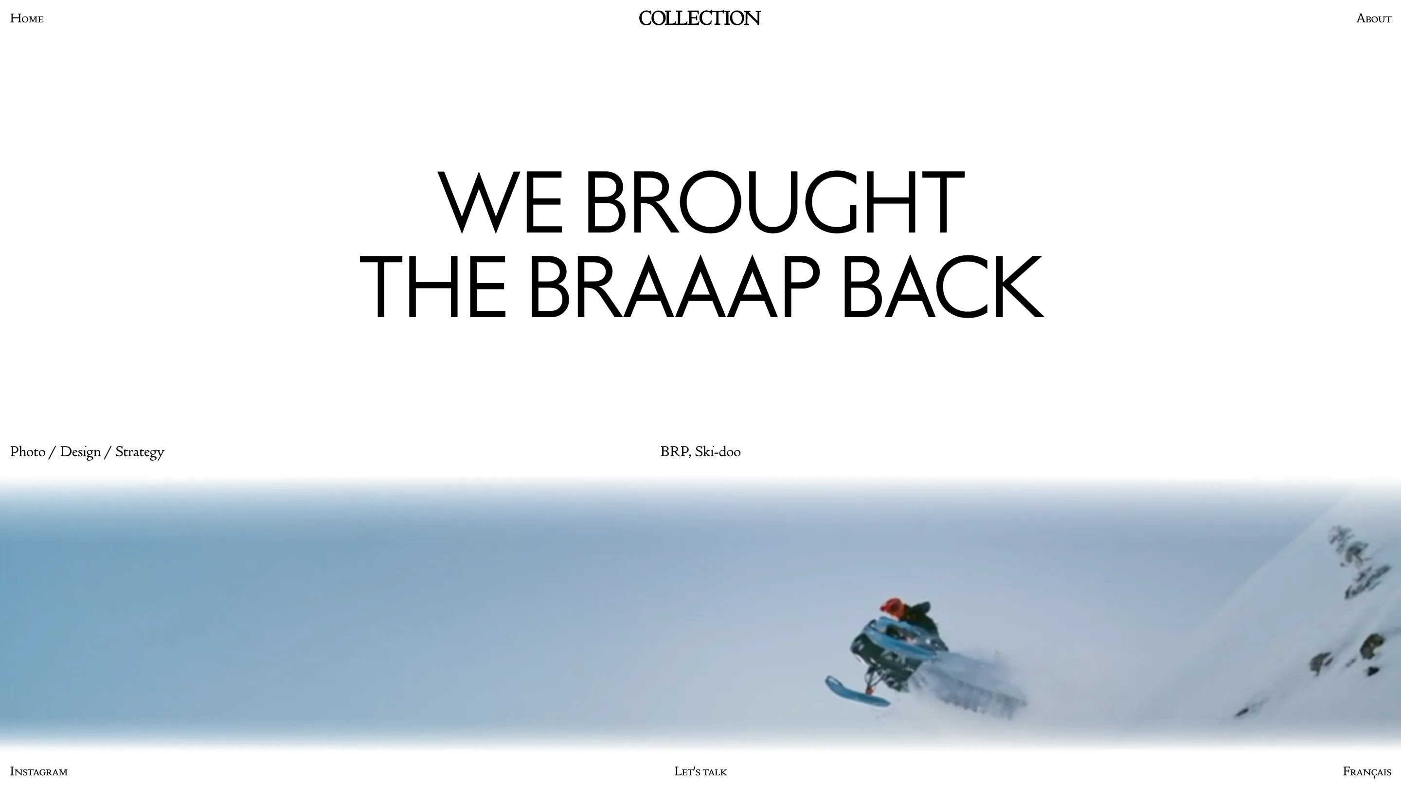
The Ski-Doo MY26 page opens with "WE BROUGHT THE BRAAAP BACK" in the same thin sans, two centered lines. Under it, one hairline row of metadata: Photo / Design / Strategy on the left, BRP, Ski-doo on the right. Then a full-bleed film of a sled throwing snow off a ridge. Headline, credits, work, in that order. You get the client name and the scope before a single frame of the campaign loads, and the six chrome anchors are still sitting exactly where they were on the home page.
What I'd keep
Two moves. The edge-pinned chrome, for any project where the content is visual and the nav is four items long. It buys you the entire center of the screen and costs nothing. And the one-ornament rule: Collection spends its whole decorative budget on the crest and runs plain type everywhere else, which is exactly why the crest lands. Spread that same budget across five effects and none of them register.
Filed in the reference folder under editorial layout, along with the note that this only works if you have something worth putting in the middle.
Featured: Collection (Pier-luc Cossette)