Lama Lama turns its nav bar into a running commentary
Lama Lama took awwwards Site of the Day today with a 7.51. The move I'd steal is the floating nav pill, which prints a different line on every route.
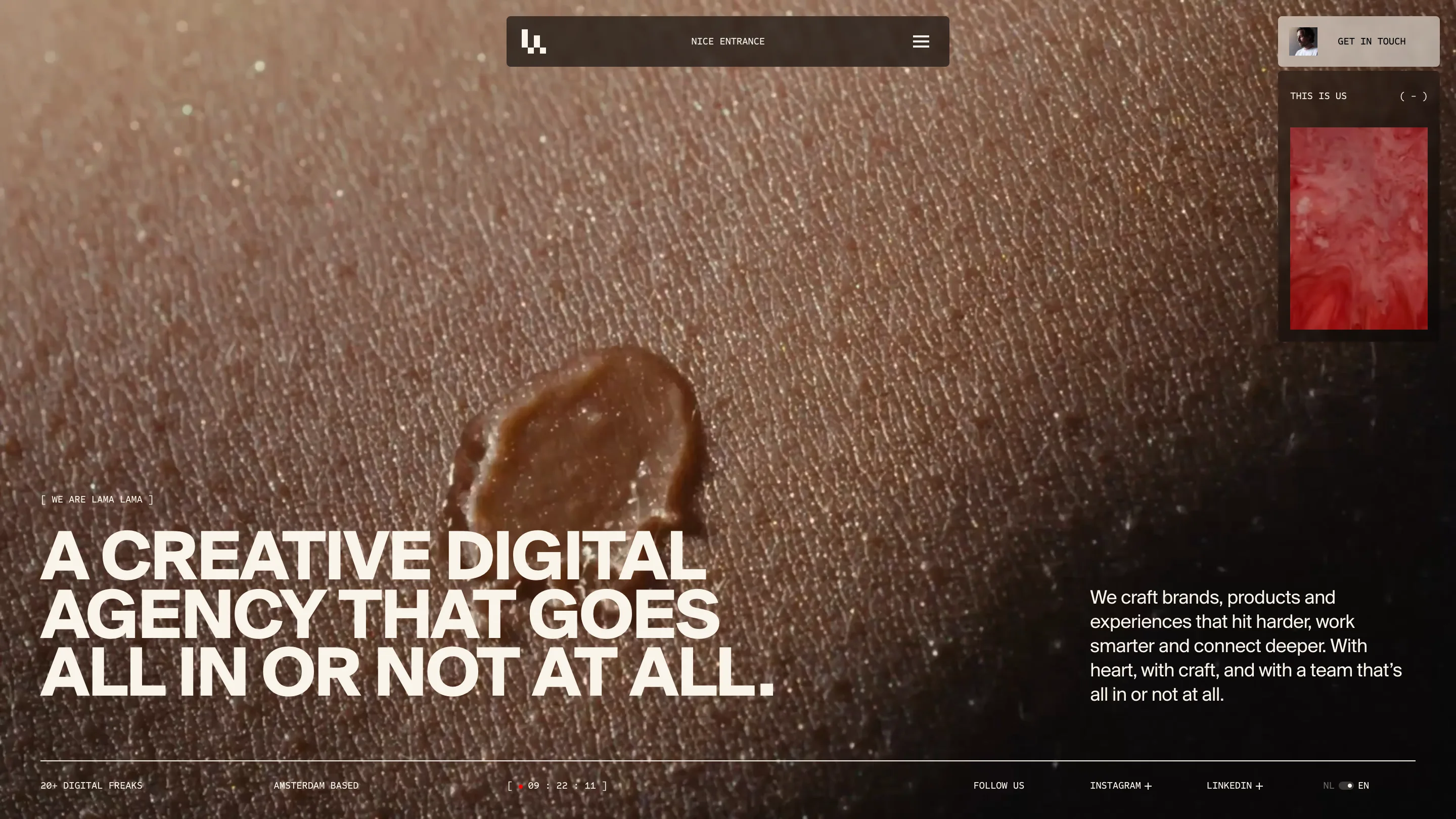
The nav bar on Lama Lama says NICE ENTRANCE on the home page. Open the work index and it says SWIPE-WORTHY SINCE DAY ONE. On the about page it reads GO BIG, OBVIOUSLY. Same pill, same position, new line every route. The Amsterdam studio took awwwards Site of the Day today, 20 July 2026, with a 7.51, and that small text slot is the first thing I'd take from it.
A text slot where most sites put nothing
The pill is the only fixed chrome on the page. Dark, rounded, centred at the top, logo mark on the left, hamburger on the right. The middle of that bar is dead space on almost every site built this way. Lama Lama filled it with a line of monospace that changes per route, and that one decision carries most of the personality on a site that is otherwise very quiet.
I'd use this tomorrow. It costs one string per page in the CMS, and it gives every route a voice without adding an element to the layout.
The corner widget swaps its payload
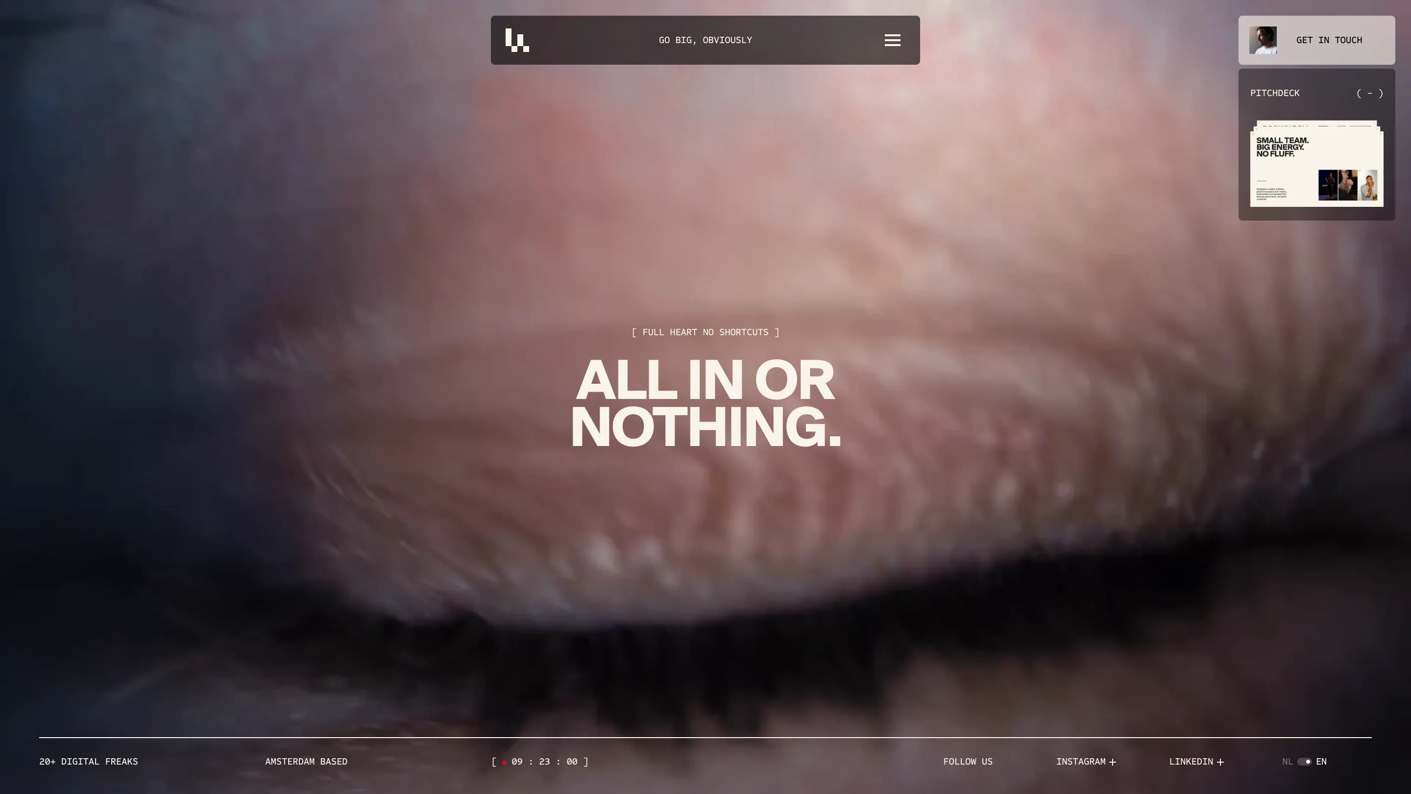
Top right sits a small panel with a collapse control, a bare ( - ). On the home page it's labelled THIS IS US and plays red ink blooming through water. On the about page the same slot is labelled PITCHDECK and holds a stack of deck slides reading SMALL TEAM. BIG ENERGY. NO FLUFF. Same frame, same corner, different cargo. It behaves like a widget you're allowed to close, which is a friendlier offer than a modal that opens itself over the work.
Two typefaces run the whole site
Headlines are one heavy neo-grotesque in cream, set enormous and tight. Everything else is monospace inside square brackets. [ WE ARE LAMA LAMA ] over the hero. [ FULL HEART NO SHORTCUTS ] over ALL IN OR NOTHING on the about page. [ NOTHING MORE, NOTHING LESS ] over the work index. The footer runs 20+ DIGITAL FREAKS, AMSTERDAM BASED, and a live Amsterdam clock ticking beside a red dot. Two voices, held for the whole site. That's the restraint I rate here.
The work page runs as rows
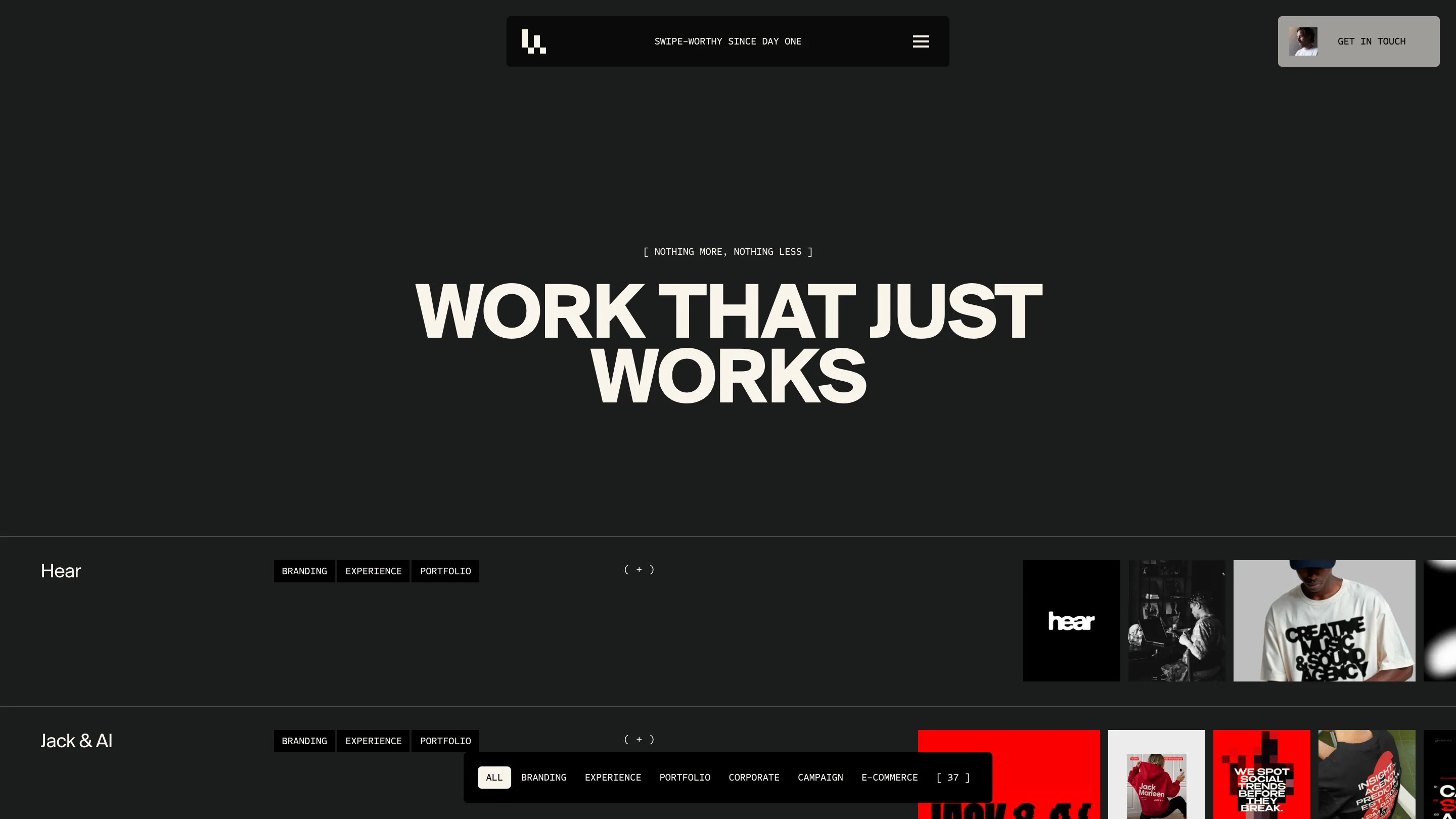
The index is a list. Each project gets a row: name on the left at reading size, tag chips beside it (BRANDING, EXPERIENCE, PORTFOLIO), a ( + ) in the middle, then a strip of thumbnails that bleeds off the right edge. The filter bar floats at the bottom of the viewport with the count in brackets, [ 37 ]. Scanning 37 rows is faster than scanning 37 cards, and the thumbnails running past the edge tell you there's more sideways without putting a scrollbar on screen.
What I'd rate it
Around an 8 for me, a little above the 7.51 it scored. The hero is macro footage of a caramel drop on skin. The about page opens on blurred llama fur in dusty pink and blue. Neither one shows the work, which is a confident call for an agency site, and it pays off because the imagery is warm and strange enough to hold you while the type does the talking. The thing I'd change: at that headline size, A CREATIVE DIGITAL AGENCY THAT GOES ALL IN OR NOT AT ALL is a lot of words to get through before you learn what they make.
Featured: Lama Lama