One number per project, set in a grey chip
MONOLOG gives every case study on its home page a single figure in a small grey highlight, and nothing else. It reads faster than any results grid I've built.
Every project on MONOLOG's home page gets exactly one number. It sits in a small grey chip, maybe 90px wide, next to a photograph that runs half the screen. OH Architecture: $2M+, in project enquiries within three months of launch. Supersolid: 58%, increase in average session duration. One figure each, no chart, no results grid, no before-and-after table. MONOLOG is Huy Nguyen's studio in Sydney, and that chip is the decision I keep coming back to.
The chip does the arguing
The row is built from four things: the client name at heading size, one sentence of scope in grey, the figure in its highlight, and a caption under the figure explaining what it counts. That's it. Because there is only one number, I read it. When a studio gives me six metrics per project I skim all six and retain none, which is what happens on most agency sites I open, including versions of my own I've shipped.
What makes it work is the caption. "$2M+" alone is a boast. "$2M+ in project enquiries generated within 3 months of launch" names the unit, the source and the window, so I can decide whether to believe it. Sizing matters too: the caption is set at body size directly under the chip, not floated off as a footnote, so the qualifier arrives in the same glance as the claim.
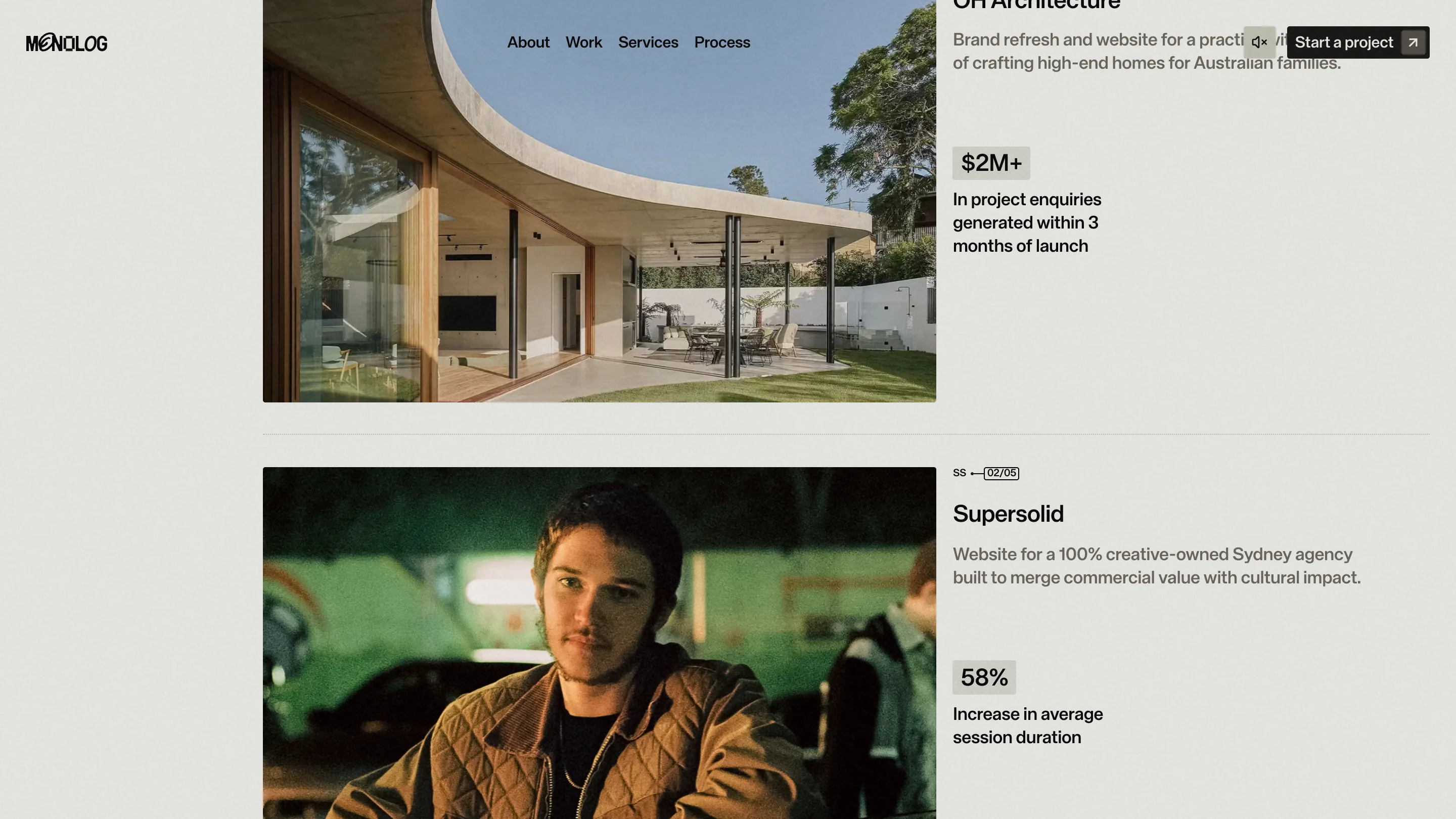
The row header is a nice touch as well. Above Supersolid there's a two-letter tag, SS, and a boxed counter reading 02/05. I know where I am in the list and how much is left, in about eight characters.
Bone white for proof, near black for process
The site flips ground colour by job. Proof runs on a warm off-white, close to unbleached paper, with black type and full-colour client photography. The process section drops to near black, and the imagery changes with it: over-the-shoulder video of hands on a keyboard, a screen recording of Webflow open on a build, a face lit by a monitor. Warm light for the client's results, cold and dim for the making.
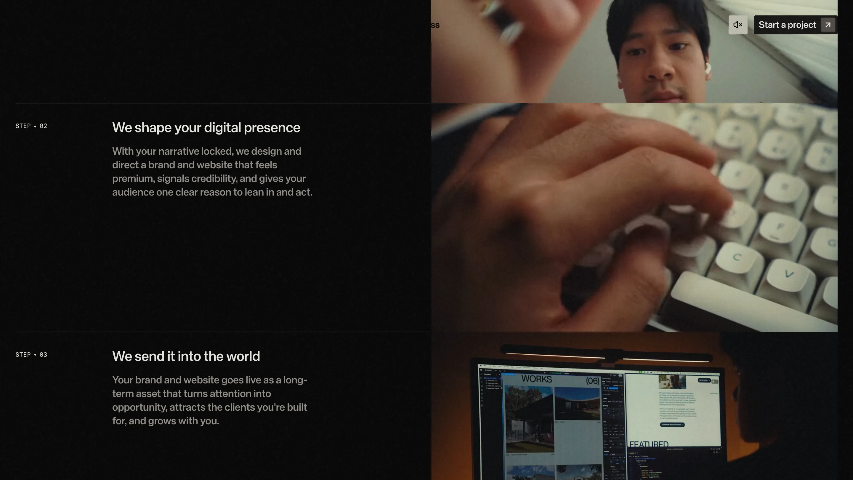
The steps are labelled STEP • 02 and STEP • 03 in mono at maybe 12px, which is the one place on the site where numbering earns itself, because these actually happen in order. The copy stays short. Three sentences a step, and each one ends on what the client gets.
The wordmark I'd have shrunk
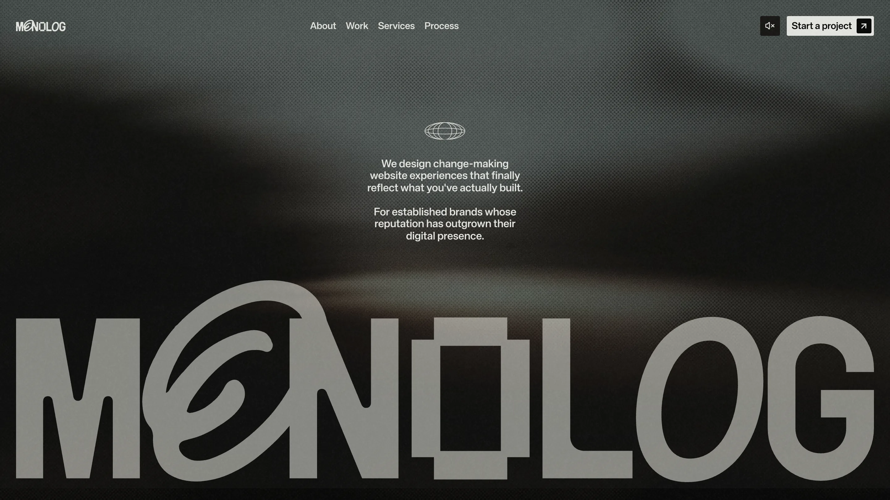
The hero is the part I'd argue about. MONOLOG is set across the full width of the screen, cropped by the bottom edge, over a blurred grey-brown video that reads like fog over a road. The letterforms are worth the space: the first O carries a hand-drawn spiral in its counter, the second is squared off, and the two changes give a plain grotesk a face. But the studio's own name is the largest thing on the page by a factor of about fifteen, and the sentence that says who the site is for sits above it at around 20px, centred, in the middle of dead space.
The rest of the page is disciplined about putting the client first. The hero isn't, and it's the screen everyone sees. I'd have flipped the ratio: positioning line at 60px, wordmark at a quarter of its current size, same video, same crop.
The move I'm taking
One number per case, with the unit and the window spelled out under it. I've been shipping results blocks with four stats side by side because the client had four to give. Picking the single strongest one and letting the caption carry the proof is harder to write and much easier to read, and the grey chip costs about six lines of CSS.
Featured: MONOLOG (Huy Nguyen)