Mother Design opened a shop, and half the shelf is their own client work
The New York studio behind Scribd, Tripadvisor and Cadillac just signed a retail lease in Los Angeles. The soda and the gum on the shelves are brands they designed.
Mother Design opened a store in Los Angeles this month, and part of the shelf is stocked with their own client work. Fhirst probiotic soda. Nuud plastic-free gum. Both are brands the studio built, and now a stranger can walk in off the street, pick one up, and pay for it.
What's in it
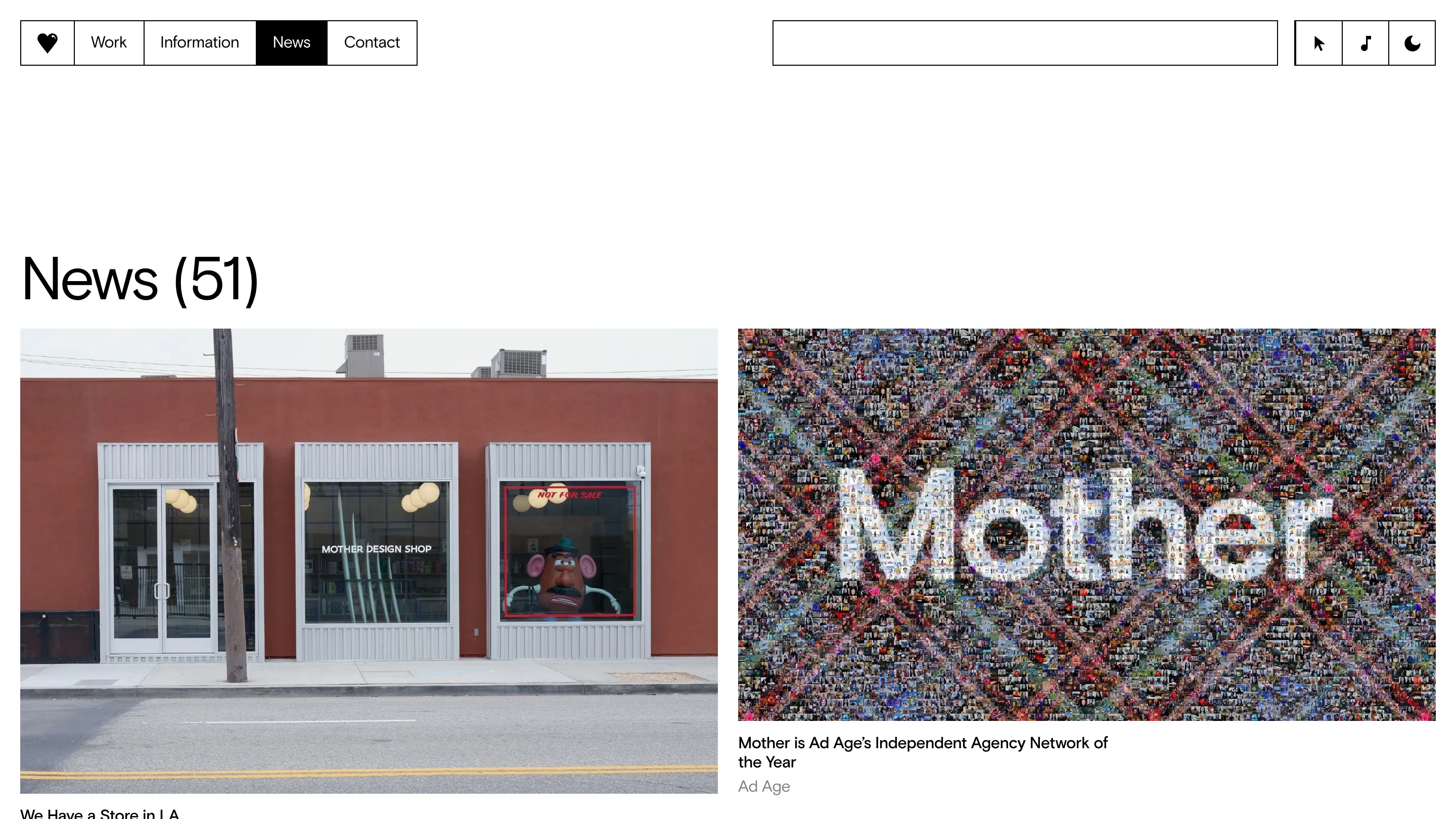
Mother Design Shop sits in West Adams, next to the studio's LA office on West Jefferson Boulevard. Terracotta wall, three grey window frames, the name set small in white on the middle pane. The right-hand window is a red-bordered vitrine holding a Mr. Potato Head in a hat, with a red sticker across the glass reading NOT FOR SALE. That tells you the register the whole thing is pitched in.
Inside there's Teenage Engineering electronics, surfboards by Tyler Warren, cocktail garnishes and mixers by Filthy, soap and skincare by Nursem, studio apparel, pre-loved books, ceramic housewares. Mark Sloan, the studio's Head of Design, calls it "a portal into our world" and "mostly an excuse to share our love of design with the general public, meet new people, and have unexpected conversations." It doubles as a workshop and a teaching space.
A shelf is a review nobody scheduled
This is the part I keep turning over. In client work the verdict arrives from someone you already know, in a room you booked, against a brief you wrote together. Everyone in that room has context. On a shelf, the verdict comes from a person who has never heard of you, holding the thing at arm's length, deciding in about four seconds whether to spend eleven dollars.
Studios almost never get that signal on their own work. Mother Design just bought it with a lease.
The site is doing the same job
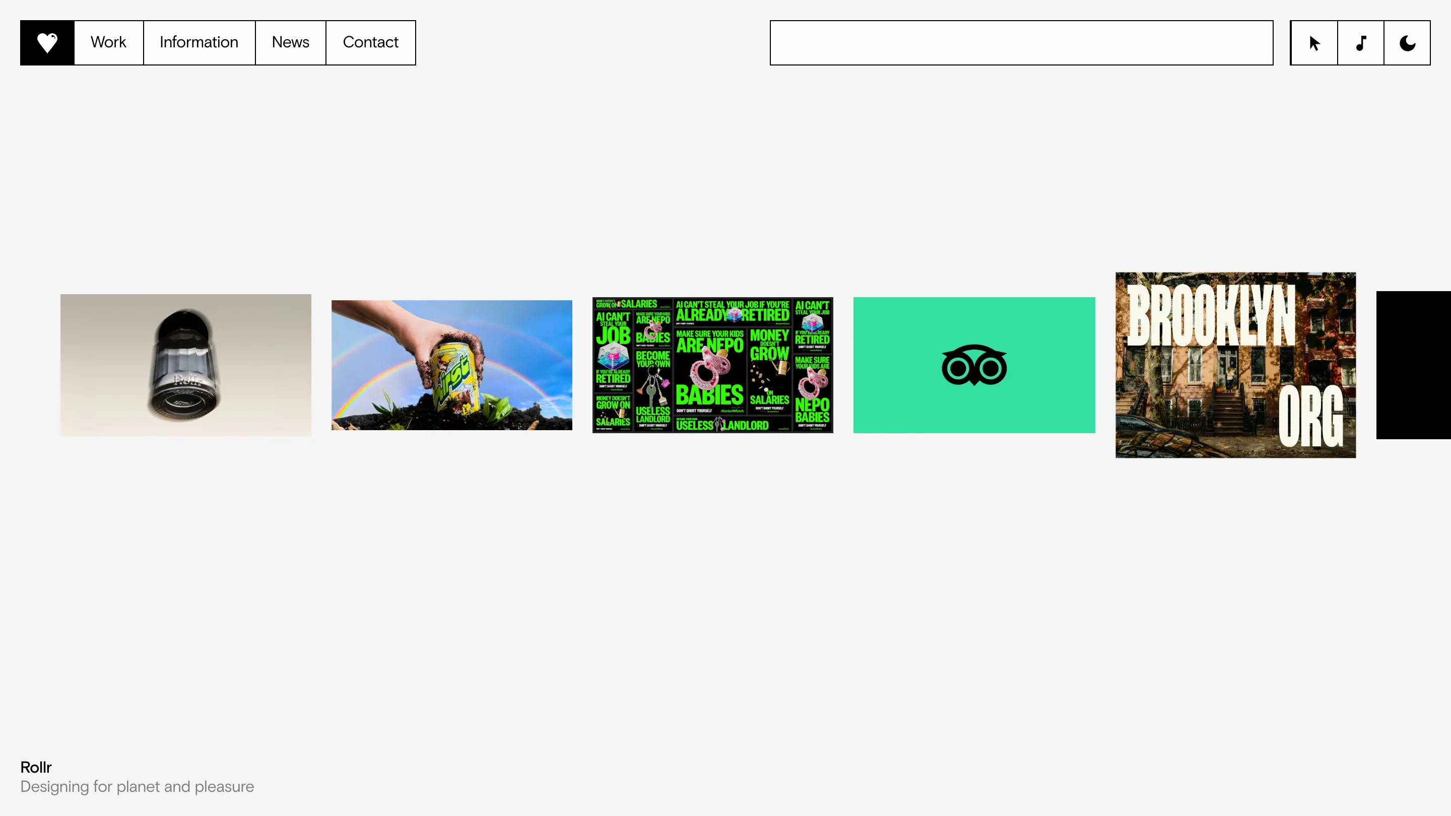
Their homepage is one horizontal strip of work on off-white, no hero, no headline. The caption for whatever sits under your cursor drops into the bottom left corner: Rollr, then two words on what it is. The nav is a row of boxed buttons with a heart as the logo, and top right there are three toggles for cursor, sound, and dark mode. Small controls, put in the reader's hands. It reads like a well-arranged table rather than a pitch.
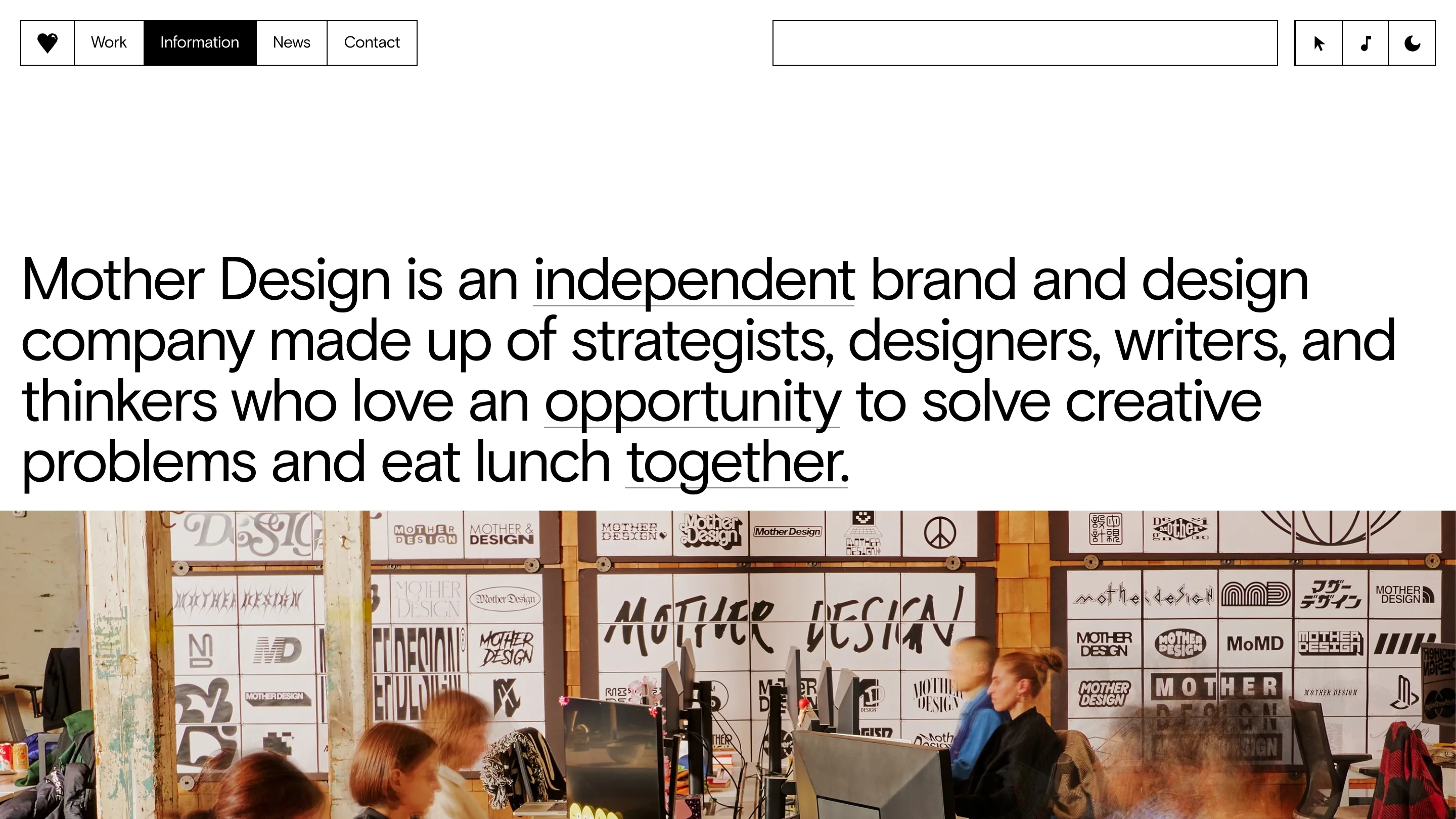
The information page is one sentence set large: an independent brand and design company made up of strategists, designers, writers, and thinkers who love an opportunity to solve creative problems and eat lunch together. Three words carry underlines. Independent. Opportunity. Together. Under it, a photo of the studio floor where the back wall is papered with something like forty hand-drawn versions of their own logo, every one different, none of them the official mark. I rate that more than any capabilities page I've read this year. It's a studio showing that its identity is a conversation the whole room is having.
What I'd take from it
The lesson is not "open a store." Most of us shouldn't. The lesson is that Mother Design found a way to be judged by people who owe them nothing, and paid rent for the privilege.
For anyone making digital products, the closest version is shipping something small with your own name on it and a price attached, then watching what strangers do. It's a cheap thing to say and an expensive thing to do. The studio's news page currently reads News (51), and the item at the top of it is a photo of a shopfront. Of everything on that page, the shopfront is the one that can lose money. That's what makes it worth reading.
Featured: Mother Design