The specimen site that cuts one letter in half to show you two cuts
PP Neue Montreal's site splits a single glyph across a hairline, Display above and Text below. It sells the difference between two cuts faster than any weights table I've seen.
The best screen on the PP Neue Montreal site is one letter, blown up until it runs off the frame, sliced across the middle by a hairline rule. Above the rule it's drawn as Display Extrabold. Below it, Text Medium. Same letter, two cuts, and you read the difference in about a second. Demande Spéciale built the site for Pangram Pangram, and that one idea does more work than a weights table ever has for me.
The letter is the argument
I've drawn my share of type specimen pages, and the default is a comparison table: two columns, two names, a paragraph of Lorem in each, good luck. The eye has to hold one shape in memory while it walks to the other. Nobody does that. Here the comparison is physical. The stroke arrives at the rule as one weight and leaves it as another, and because the shapes are aligned on the same axis, the jump is impossible to miss. The counter opens up. The stem thins. You see the decision the drawer made instead of reading about it.
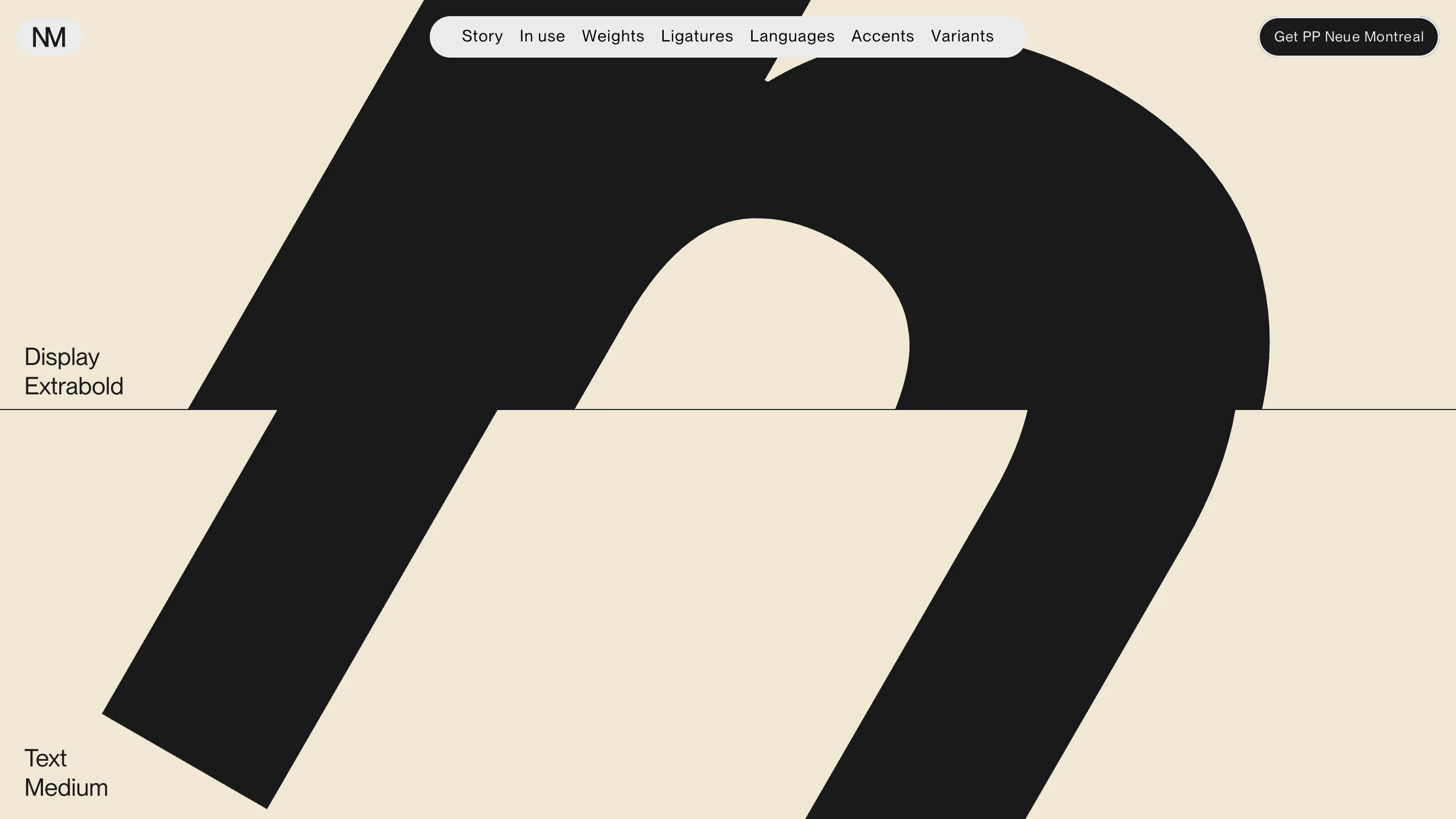
The labels are tiny and set flush left against the rule, at maybe 16px next to a letterform a thousand pixels tall. That ratio is the whole point. The type does the talking and the caption just confirms what you already worked out.
The image is the sidebar
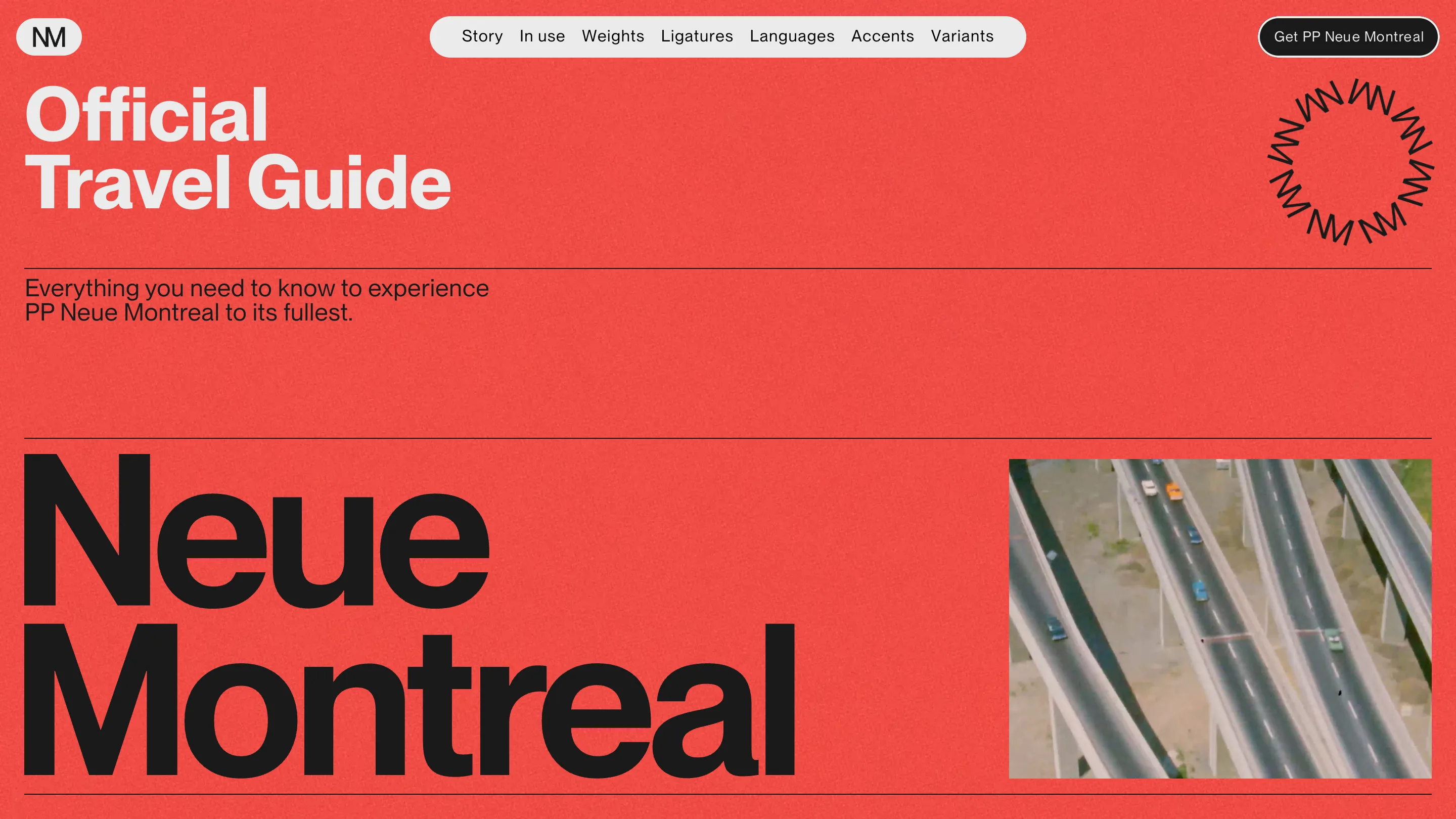
The hero inverts what most foundry sites do. "Neue Montreal" is set enormous in black on a tomato red field, edge to edge, and the photography gets a small rectangle on the right holding a drone shot of Montreal highway interchanges. Type is the hero. The picture is the footnote. On a site selling a typeface that's the correct hierarchy, and it's still rare enough that I noticed.
The red carries a visible grain, which keeps a flat fill from going dead on a large screen. Hairline rules divide every band. It's a Swiss grid with the volume up, and it holds because the restraint is real everywhere except the type size.
Why the travel guide conceit earns its place
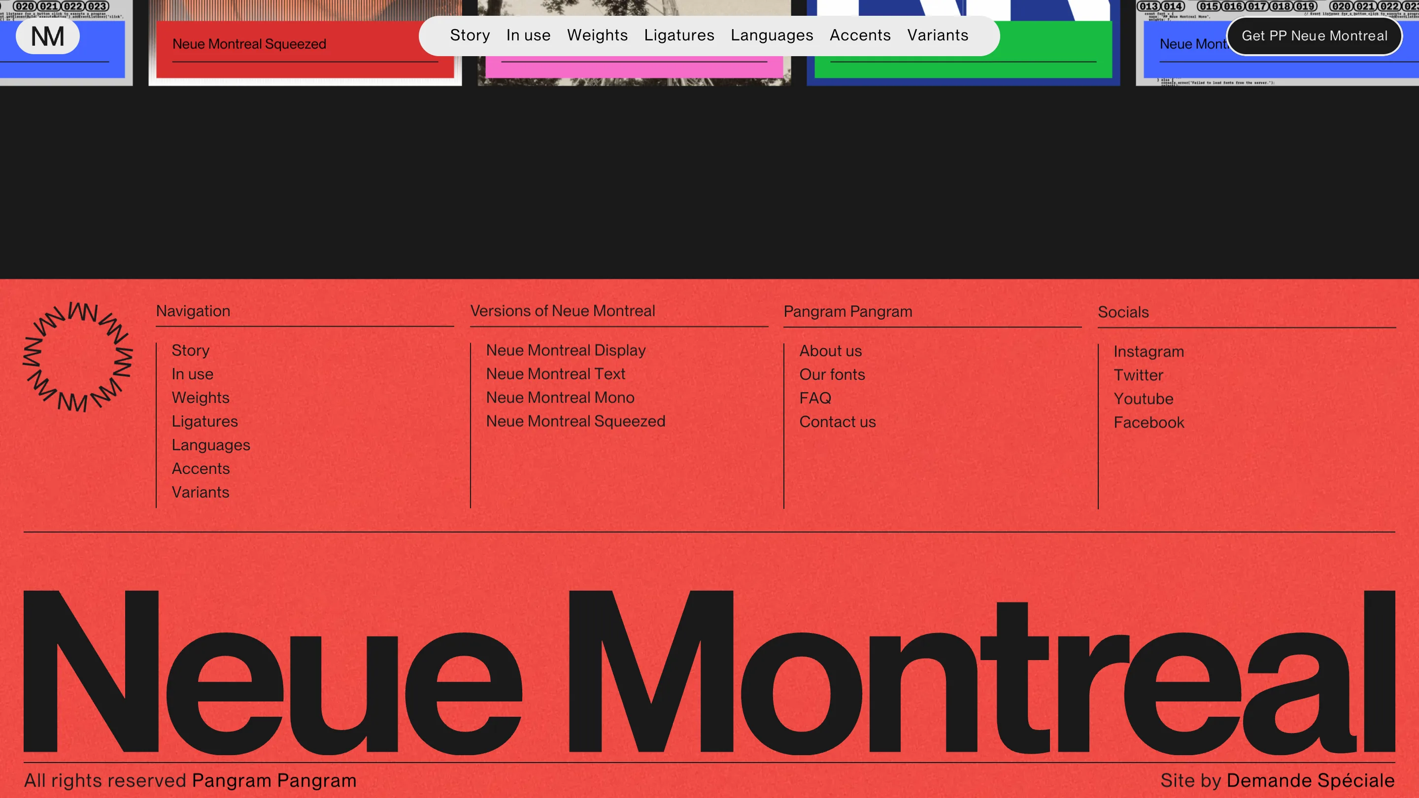
The page frames itself as an "Official Travel Guide" to the typeface. Everything you need to know to experience PP Neue Montreal to its fullest. The nav reads Story, In use, Weights, Ligatures, Languages, Accents, Variants. Those are spec sheet items. The conceit gives them a reason to be a tour rather than a table, and it lets the family boast about 506 languages without it landing as a stat dump.
The footer follows through: four link columns split by vertical hairlines, then the wordmark set as wide as the viewport will allow, with the credits sitting under it in small caps-height text. "All rights reserved Pangram Pangram" on the left, "Site by Demande Spéciale" on the right. I like a footer that signs its own work in the same voice as the hero.
The one thing I'd have changed
The nav is a floating pill, fixed, dead centre at the top. On the hero it's fine. On the split-letter screen it lands right on the glyph and clips the top of the shape, and over the in-use carousel it covers a specimen. When your entire pitch is full-bleed letterforms, a centred element that never moves is going to sit on top of the thing you're selling. I'd have pushed it to a corner, or let it hide on scroll down and return on scroll up.
The move I'm taking
The split rule. Any time I have to show a client two options that differ by a small amount, weight, radius, spacing, tracking, my instinct has been to put them side by side and label them. Stacking them on a shared axis and cutting across is better. The difference stops being something you explain and becomes something the reader sees before they've finished scrolling.
Featured: Demande Spéciale for Pangram Pangram